Make the case for enrichment
Enrichment classes are a choice on top of school. The site had to explain why thinking skills matter before it asked a parent to look at courses.
Pro Young EduEducation · Enrichment classes website
The website for Pro Young Edu, which runs Coding, Maths and English classes for children in Malaysia. Pro Young Edu wants students to understand why, not just what. So the home page gives the parent the reason first and shows the course cards later.
Pro Young Edu is an education platform in Malaysia that teaches children Coding, Maths and English, with classes in Kuala Lumpur, Johor Bahru and online. Potadot designed and built its website in English. The home page follows Pro Young Edu’s own teaching idea, that students should understand why and not just what. It opens with why thinking skills matter, shows how they are taught, and reaches the three courses only in its fifth chapter, followed by parent messages and one clear next step.
Pro Young Edu teaches Coding, Maths and English to children, and describes the three together as integrated learning. Coding covers Scratch, Python and Roblox. Maths covers Singapore Math and Math Olympiad. English covers SPM, PSLE and CEFR.
Classes run in Kuala Lumpur, Johor Bahru and online. Homework, progress and feedback go through its own online Learning Management System, to keep learning consistent at home and in class.
The headlines speak to “Your Child” and “Your Kid”, because the parent is the one deciding. The site had to look right for children and reason like an adult.
Enrichment classes are a choice on top of school. The site had to explain why thinking skills matter before it asked a parent to look at courses.
Coding, Maths and English could easily look like three unrelated classes. The site had to show the idea that joins them.
Who teaches, how much attention each child gets and how progress is followed. Each of these needed a plain answer on the home page.
Classes also run online for children across Malaysia, so many families may never visit in person. They needed a quick way to ask from wherever they are.
Pro Young Edu says it helps students “understand why, not just what.” A website for that kind of teacher should not open with a list of courses. So the home page keeps to the order in that sentence. First the reason, then the method, then the subjects. A parent reaches the courses already knowing what they are for.
 1
Promise
Confidence, stated in one line.
 2
Why
What children need now.
 3
Method
Question, explore, reason.
 4
What
Three subjects, three cards.
 5
Proof
Parents, in their own chats.
 6
Start
One round button.
“We help students understand why, not just what.” That sentence from the site decided the order of the home page.
A blue P and Y between two arrows, shaped like a tag in code. The same green, blue and orange colour the buttons, labels and bands.
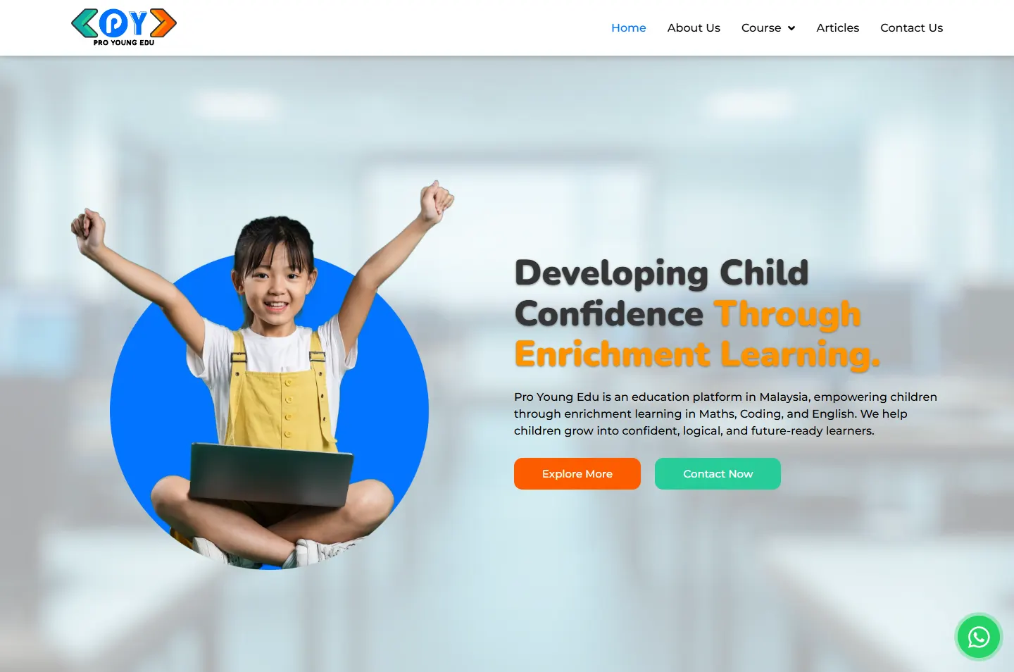
The first two photos show girls with their arms in the air, pleased with themselves. The heavy, rounded headlines and soft corners carry that same mood.
Two oranges, a strong blue and heavy rounded headlines give the page a child’s energy. Short sections and a steady layout keep it easy for an adult to read.
#FFFFFFReading sections#FFF7ECCourses and parent messages#FE9300Headlines and bands#FC5C00Icon tiles and main buttons#0273FFRound buttons and course buttons#27CD98Small labels and figuresMost headlines follow one habit: a dark first line, then an amber second line. The amber lands on the point of the sentence, such as “Isn’t Enough”.
Developing Child Confidence
Nunito · Main headlinesWhy Traditional Learning Isn’t Enough
Nunito · Section headlinesWe help students understand why, not just what.
Montserrat · Reading text and buttons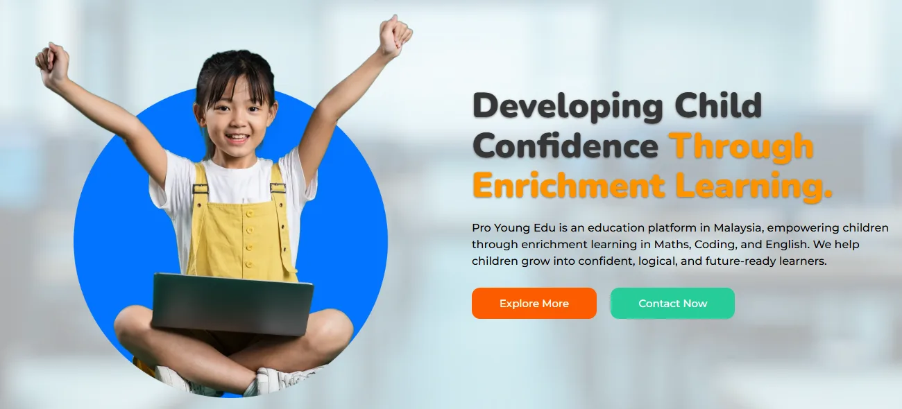
The girl sits in a blue circle, but her raised arms reach past its edge. It happens again lower down, when a woman and a girl cross the line between two oranges, and when the last girl rises above the orange band. Confidence is hard to show in a photo, so the layout shows it.
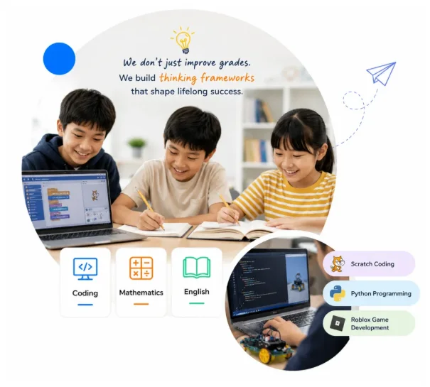
This one picture explains the range. Three tiles name the subjects, each underlined in a logo colour, and small labels list Scratch, Python and Roblox. Above them sits the argument of the whole site: “We don’t just improve grades.”
Colour marks the turns in the argument. Orange opens the case and closes it, cream holds the courses and the parents, and white carries the reading. The bar above is the real page, to scale.
Each chapter answers the question left by the one before it, from why thinking skills matter to how to start. The marked area on each screen is the part doing the answering.
The headline talks about a child’s confidence, not about classes. One short paragraph names the three subjects, then two buttons offer a choice: read on or get in touch.
Why A parent is thinking about their child, not a timetable. The first line starts there.
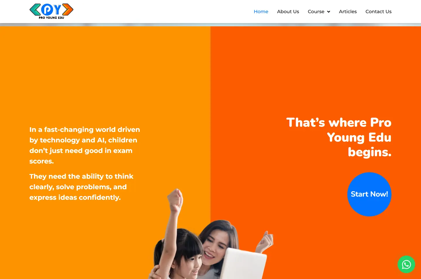
The screen splits in two. The left side says what children need in a world of technology and AI. The right side answers with Pro Young Edu’s name and a round Start Now button.
Why The parent meets the problem before any course appears. The two colours make it read as a question and a reply.
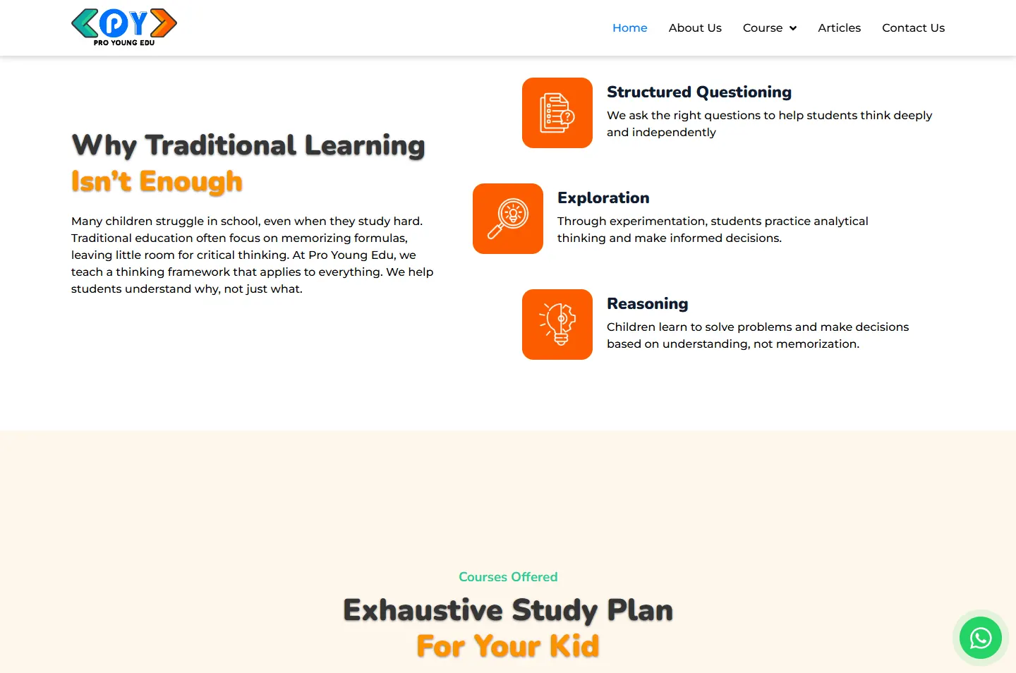
Structured Questioning, Exploration and Reasoning sit beside three orange icon tiles. The middle one is pushed to the left, so they read as a path and not a plain list.
Why The way of teaching is the reason to choose Pro Young Edu, so it comes before the subjects do.
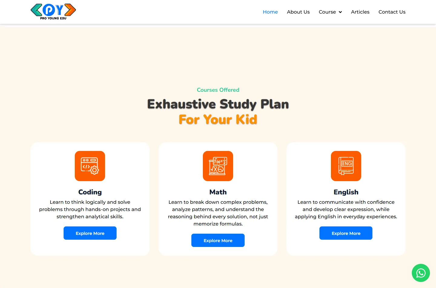
Coding, Math and English get matching white cards on cream. Each has one icon, a short description and a blue button.
Why Equal cards keep any subject from looking like an add-on. By now each description reads as the method at work, not a sales line.
Learning system, class size, teachers, learning pathway, competition training and future skills, each with its own icon and a few lines of text.
Why After the subjects, a parent wants to know what the classes are like. Six short notes answer that, and a parent can stop at the one that matters most to them.
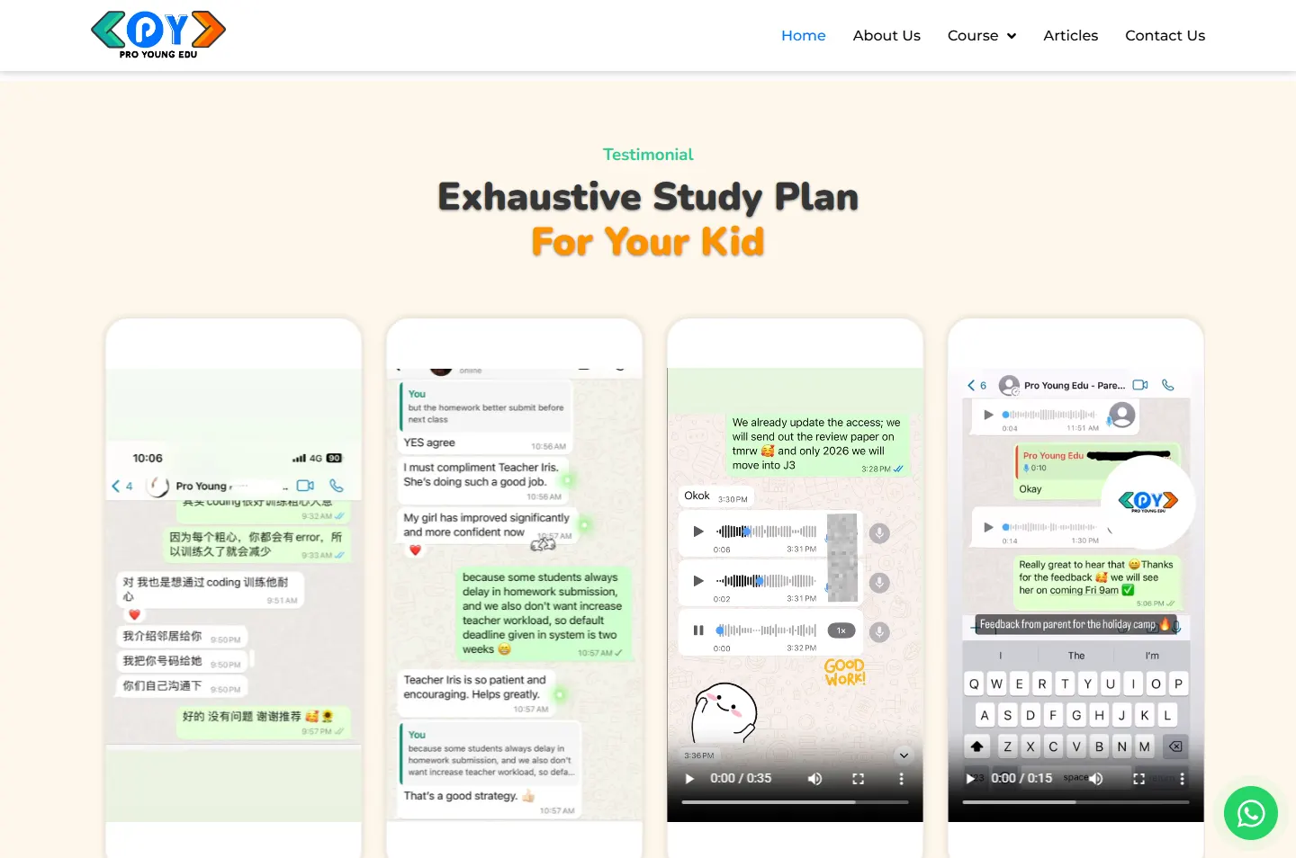
The testimonials are WhatsApp screenshots and video clips set in phone-shaped cards. The chats are in English and Chinese.
Why A chat with a teacher does not read like marketing copy, and parents know at a glance what a WhatsApp conversation is.
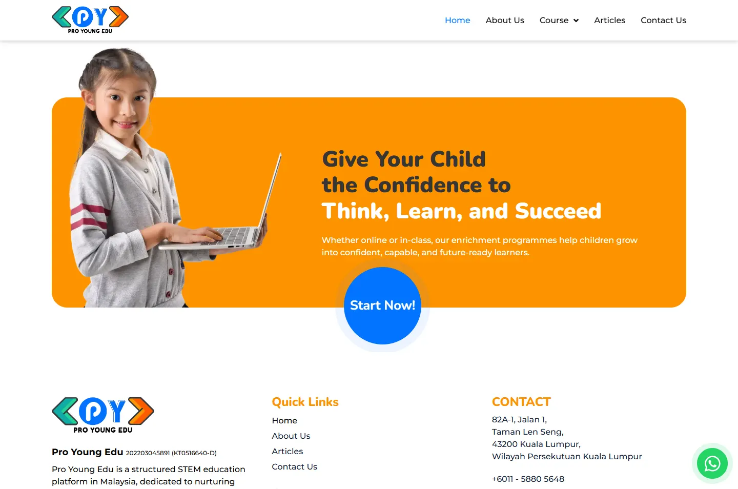
The last band returns to confidence, with a girl rising above the orange and a round Start Now button sitting on its lower edge.
Why The page opens on a promise and closes on the same one. The button breaks out of the band, so the eye lands on it last.
Confidence firstProblem left, answer rightThree steps of thinkingThree equal cards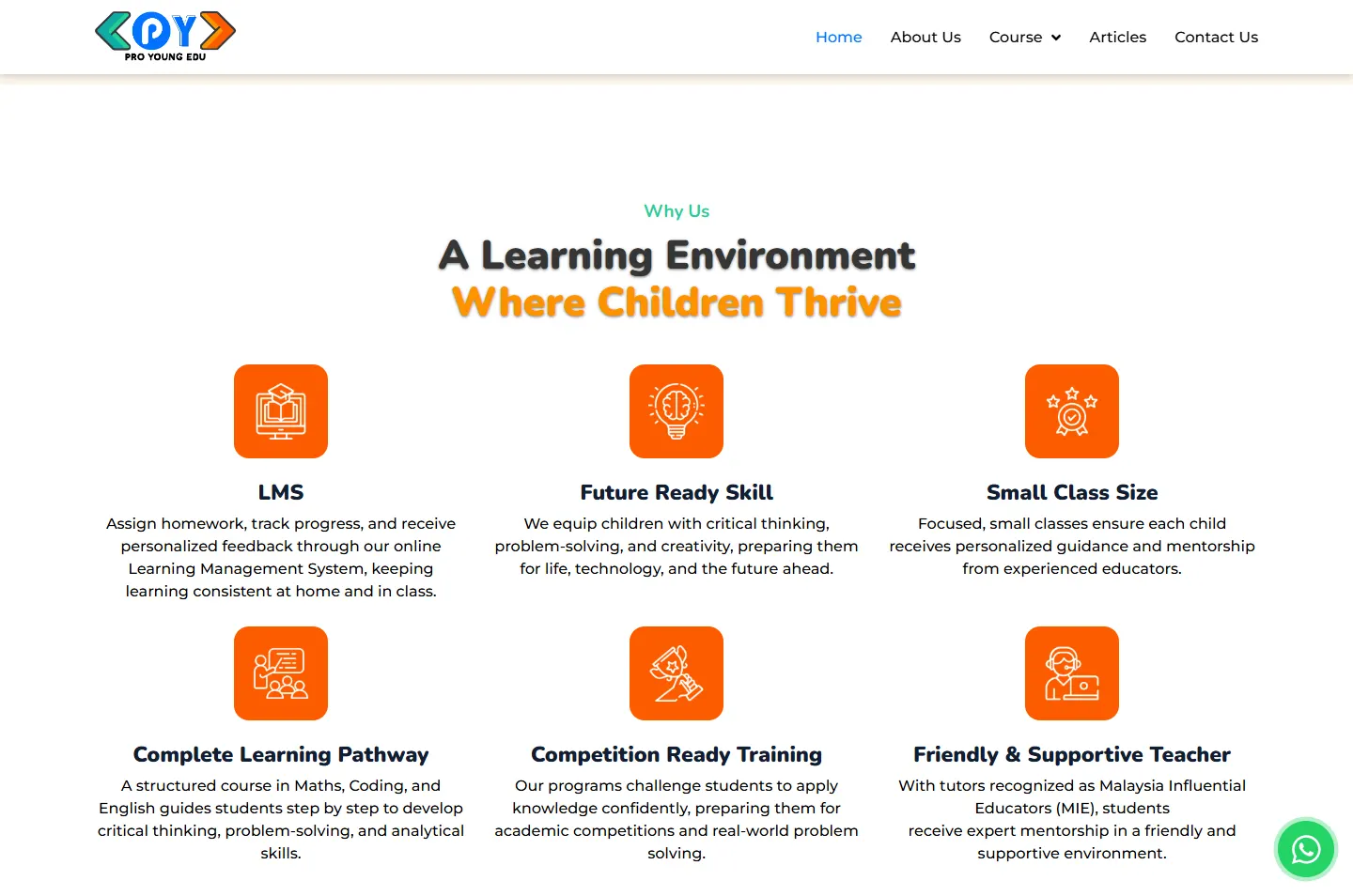 What classes are likeWhatsApp, not quotesOne last step
The order of the argument matters most, so the phone version keeps it and changes the layout around it.
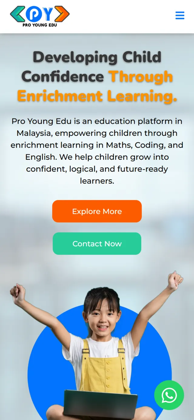
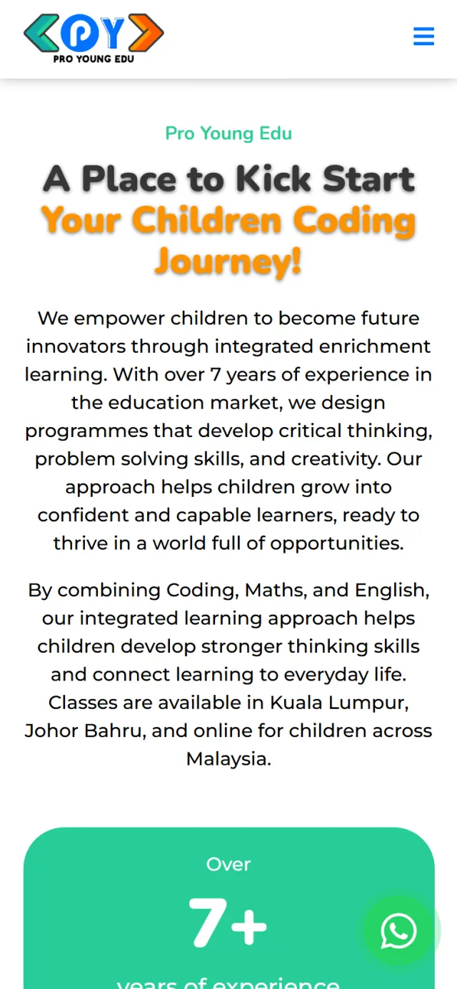
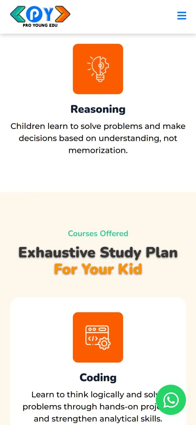
The look gets a parent’s attention. These parts help that parent find an answer and ask a question.
A round button stays on screen as you scroll. One tap opens WhatsApp with a greeting already written.
Coding, Mathematics and English each have their own page under the Course menu, so the home page only has to introduce them.
Guides on IGCSE Computer Science, the IB curriculum, the AEIS exam and Singapore Math versus Math Olympiad.
The page description names the subjects and both cities. Structured data lists the Kuala Lumpur and Johor Bahru branches with their addresses and phone numbers.
The logo and menu stay at the top while you scroll, so a parent can move to a course or to Contact Us at any point.
The registration number, address, phone number and email sit at the foot of the page.
Every Potadot project starts by understanding the client's situation before anything is designed. See all seven steps
What Pro Young Edu teaches, how it teaches, and what a parent needs to hear before asking about a class.
We shaped the message into a sequence: reason, method, subjects, reassurance, next step.
Logo colours and rounded type set the look, then each section was laid out for phone and desktop in WordPress with Elementor.
Titles, descriptions and structured data set up for the subjects and cities, then launch.
Running a learning centre? Tell Ricky about it on WhatsApp at +6011-1142 1029.
We worked out the concept, shaped the content, designed the pages and built the site in English, with search setup and a WhatsApp button that stays on screen.
Because Pro Young Edu teaches why before what, and the page does the same. A parent who understands the reason and the method reads the course descriptions differently. Anyone in a hurry can go straight to a subject from the Course menu.
The colour and rounded type bring the playfulness. The trust comes from order: one idea per section, plain answers about classes and teachers, and parents’ own messages.
Yes. Every site starts from the client’s own teaching and families, so yours would look different, but the same thinking applies. Tell us how you teach and we will show you how we would approach it.