Explain the name
Calia comes from Kallos, the Greek word for beauty. The site needed to show that idea from the first second, as well as say it.
Calia ResidencesProperty · Residential development website
The website for Calia Residences by PGB in Danga Bay, Johor Bahru. The name means beauty, so the whole site is treated as one artwork in gold and blue paint.
Calia Residences is a residential development in Danga Bay, Johor Bahru, by Paragon Globe Berhad (PGB). Potadot designed and built its website around the meaning of the name, which comes from the Greek word for beauty. Moving gold and blue paint opens the site, photographs have torn brush edges, and headlines change colour partway across. Behind that look sit pages for the layouts, facilities, location, gallery, a 360 tour and the approved advert details.
Calia Residences is developed by Paragon Globe Berhad, a developer listed on the Main Market of Bursa Malaysia. The development stands in Danga Bay beside Skudai Highway, with a shuttle service to CIQ and the RTS.
It has two towers, Tower A and Tower B, and four layouts that run from a one-bedroom suite to a three-bedroom dual-key home.

PGB launched Calia Residences in 2025, so the name is new to buyers. The site has to give it a meaning a visitor remembers, then hold the details a buyer will check.
Calia comes from Kallos, the Greek word for beauty. The site needed to show that idea from the first second, as well as say it.
The site talks to people looking for a home and people building a portfolio. Both need layouts, facilities and location in plain view.
The site’s story leans on Danga Bay and Skudai Highway. Visitors need named places and distances to go with it, from CIQ to the schools.
Behind the paint, the site still has to show the licence, sales permit, tenure and building plan reference. Those numbers needed a page of their own, not small print under an artwork.
A rendering of two towers cannot tell a visitor what Kallos means. A painting can. So the site is treated as one artwork: paint on textured paper, with a wave between chapters. The towers arrive after the mood is set.
 1
Open
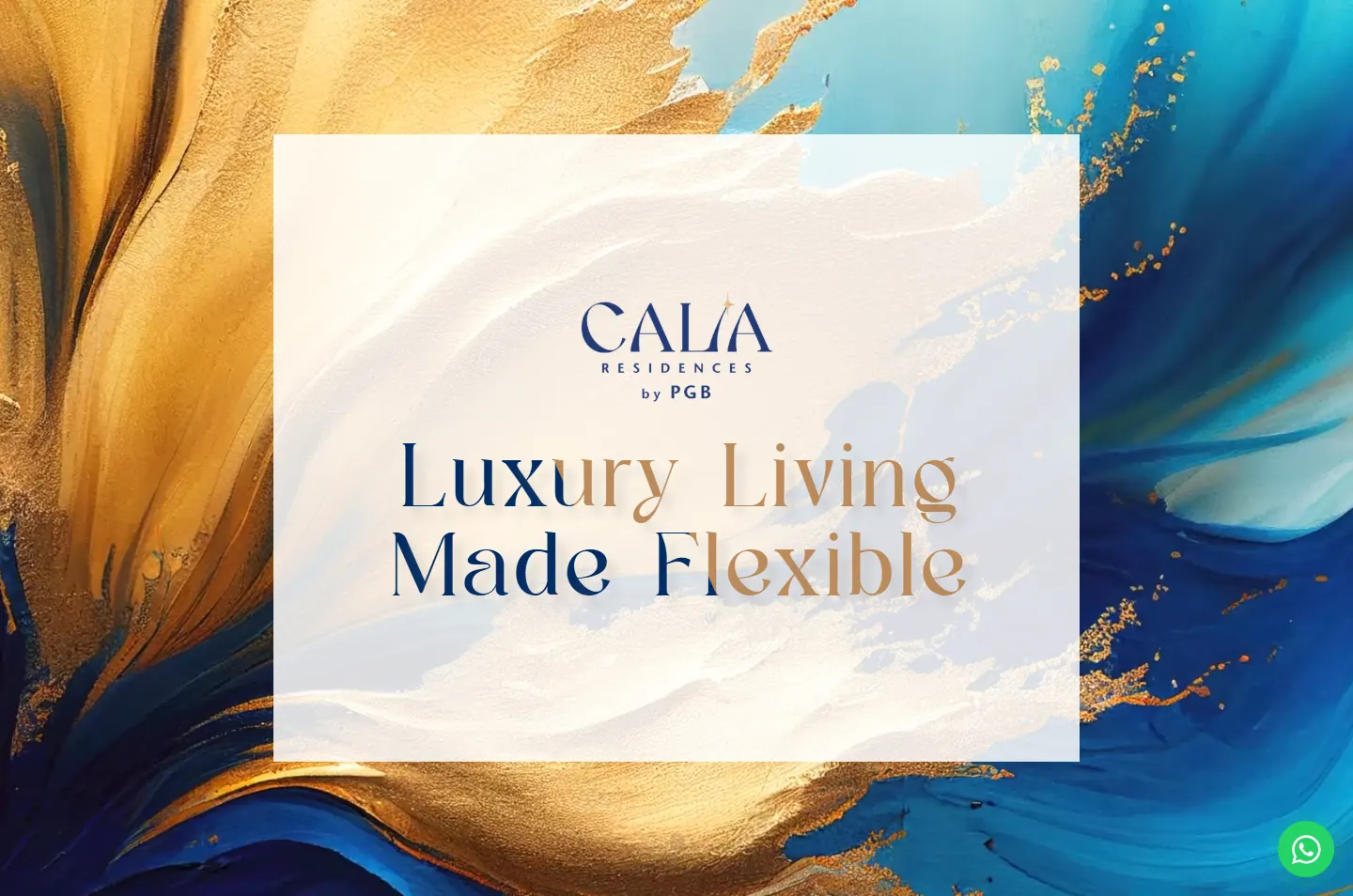
Paint moves behind a white card.
 2
Name
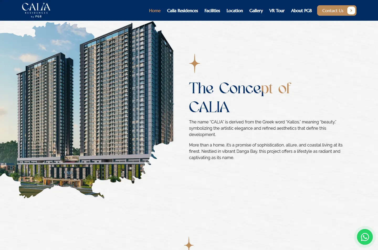
Kallos, beside the towers.
 3
Promise
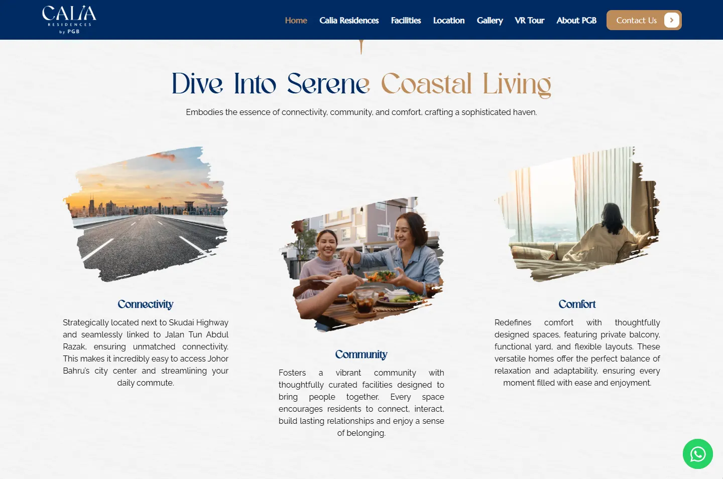
Three words, three brushed photos.
 4
Facts
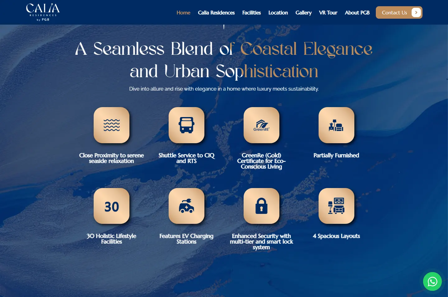
Eight gold tiles, rising in one by one.
 5
Place
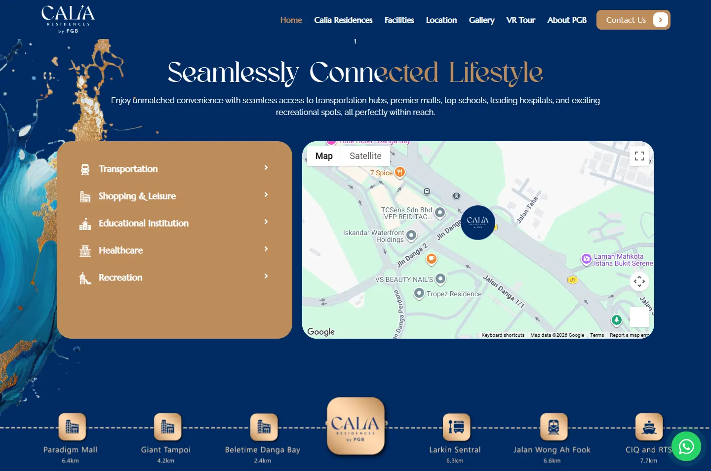
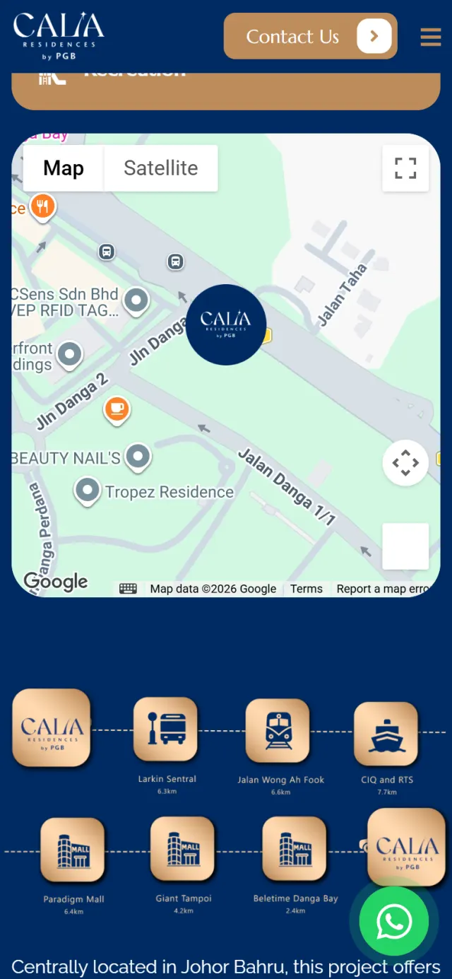
24 places, a map and a distance line.
 6
Register
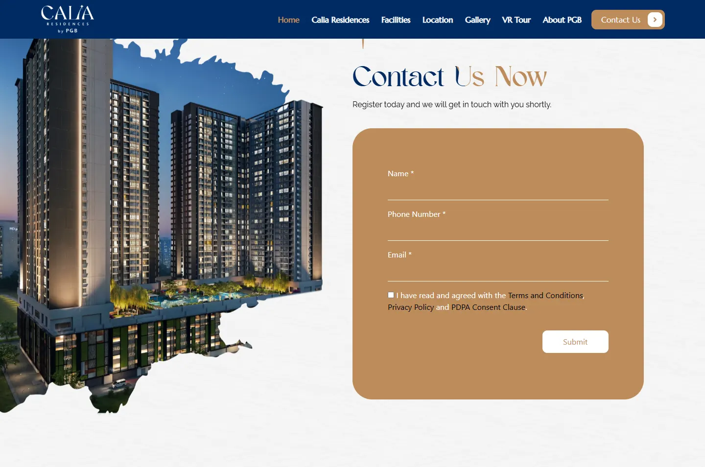
A form beside the towers at night.
Kallos means beauty. That one word turned a property page into an art piece, and it explains why the site opens on paint instead of a building.
The site places Calia on the Danga Bay shoreline, so the blue paint reads as water. Blue and paper chapters meet on a curved wave, which looks like a tide line on the page.
A small four-point star sits above the I in Calia. The site lifts it out as a marker above its headlines, and as a navy star that grows to fill the screen before the location chapter.
Two surfaces take turns: painted blue chapters and pale textured paper. Headlines are set in Dominance, a tall display face, and most of them change colour partway across a line, from navy or white into gold.
#FFFFFFTextured chapters and text on blue#002B64Header, footer and location#BE8C5BTiles, form and buttons#FFD9AFTitles on the facility bars#25D366The chat button aloneGreen is the one colour from outside the painting. It appears only on the chat button, so that button is easy to find on any chapter.
Shuttle Service to CIQ and RTS
Marcellus · Menu, buttons and tile labelsNestled along the enchanting shoreline of Danga Bay, Johor Bahru.
Raleway · Reading text and forms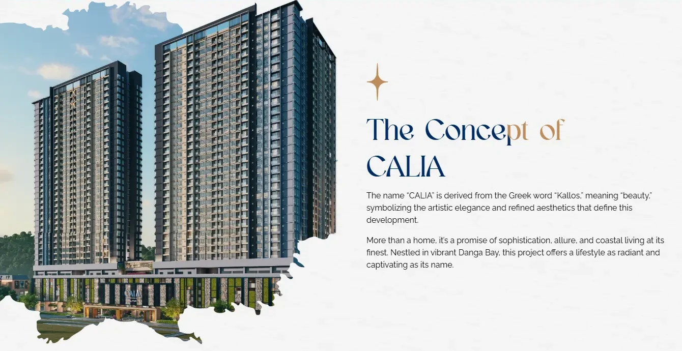
Photographs on the home page have no straight edges. Each one is cut to a rough brush shape, so the towers and facilities look painted onto the paper instead of placed in a box.
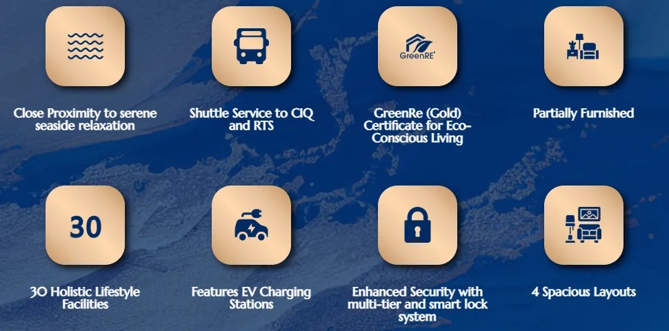
The key points sit on brushed gold tiles with soft shadows, which stand out on the painted blue. The same tile returns on the distance line, larger, holding the Calia logo.
Blue and paper take turns all the way down. A wave joins most changes, and the move into the location chapter is a navy star that grows to fill the screen as you scroll. The bar above is the real home page, to scale.
Follow the home page from the painted opening down to the form. The highlight shows where to look, and the note gives the reason.
Gold and blue paint moves in a looping video. A pale, see-through white card holds the logo and one line: Luxury Living Made Flexible.
Why This sets the mood before any building appears, and the card keeps the name readable over all that movement.
The towers appear with a torn brush edge, next to a short note on the word Kallos.
Why The picture and the meaning sit side by side, so the idea behind the painted look is clear in one view.
Connectivity, Community and Comfort each get a brushed photo and a short paragraph. The middle column sits a little lower.
Why Three words are easy to repeat. The stepped layout keeps them from looking like a standard block of three cards.
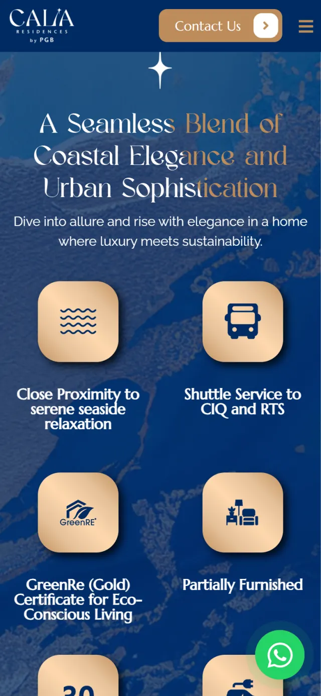
The tiles rise in one by one: shuttle service, GreenRE Gold certificate, EV charging, security, layouts and more. Then the block holds still while the paper chapter slides up over it.
Why A buyer comparing developments looks for these points. The pause keeps them on screen a little longer.
Facilities sit under five navy bars, from Community Hub to Kids’ Corner, each with its own short list.
Why Groups let a family look at one bar and a remote worker at another, without reading the full list.
Five tabs open 24 named places with their distances, beside a live Google map. Below them, a dashed line runs from Calia to six stops.
Why A named place with a distance tells a buyer more than a sentence about convenience.
Name, phone number and email, with a consent box for the terms and PDPA clause, on a gold panel beside the towers at night.
Why Three fields ask little of a visitor who is still comparing, and the sales team gets what it needs to call back.
One card, one lineThe towers meet the nameThree words, three photosEight tiles, held in place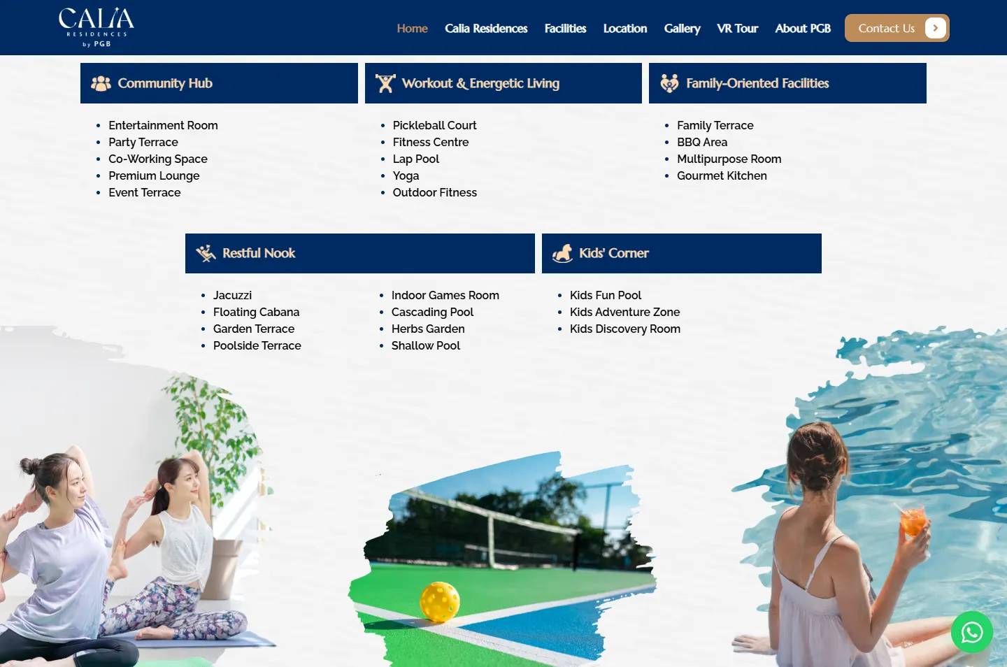 Five groupsTabs, map, distance lineThree fields
The painted opening, torn edges and wave lines all carry over. The wide parts, the tiles and the distance line, were laid out again for a narrow screen.
The home page sets the mood. The rest of the site does the detailed work for buyers and for the sales team.
A separate page shows Type A to Type D on tabs, with the size and the number of bedrooms and bathrooms.
A VR Tour page in the main menu lets a visitor look around online before making a trip.
Plans are split by tower and level, so a buyer can see where each facility sits.
An APDL page, linked in the footer, lists the licence, permit, tenure, approval and completion details.
Each page has its own title, and the site describes its pages and the organisation in a format Google can read.
The main pages end in the same form, and a WhatsApp button stays on screen. The Contact Us page adds the PGB Experience Gallery address and a map.
Every Potadot project starts by understanding the client's situation before anything is designed. See all seven steps
What Calia means, who it is for, and what a home buyer and an investor each need to check.
Short chapters for the home page, then separate pages for layouts, facilities, location and the advert details.
Paint, paper, the torn edge and the wave came first, then each chapter for phone and desktop.
Page titles and search data set up across the site, then launch and support.
Does your development have a story behind its name? Tell Ricky on WhatsApp at +6011-1142 1029.
We worked out the painted concept, wrote the content, designed the pages and built the site, with pages for the layouts, facilities, location, gallery, 360 tour and approved advert details, plus search setup.
The name comes from the Greek word for beauty, and a tower render says little about that. Opening on paint gives the idea first and gives the site a look of its own. The towers follow within the first few scrolls.
They get their own APDL page, linked from the footer. The painted pages stay uncluttered, and the licence, permit and approval details stay easy to find.
Yes. We start from your own name, location and buyers, so the idea would be yours and the look would be different. Tell us about your launch and we will show you how we would approach it.