Explain an unusual idea
A European concept in a traditional Johor neighbourhood could puzzle a first-time visitor. The site has to turn that into the reason to look closer.
Savanna Hill ResortHospitality · Resort website
The website for Savanna Hill Resort, a European concept resort in Ulu Tiram, Johor. Its own line reads “Truly Different Within a Traditional Neighbourhood”. The page shows that at a glance: neat frames in the middle, tropical plants coming in from the sides.
Savanna Hill Resort is a European concept resort in Sungai Tiram, Ulu Tiram, 27 km from Johor Bahru city centre. Potadot designed and built its website in English. The home page sets oxblood frames and serif headings on a paper texture, then lets palm fronds, monstera and hibiscus come in over the edges. A booking bar, four big numbers, five ways to stay and four experiences each get their own place, so a couple planning a wedding and a teacher planning a school trip can both find their way.
Savanna Hill Resort sits in Sungai Tiram, Ulu Tiram, a traditional neighbourhood 27 km from Johor Bahru city centre. It describes itself as a European concept resort, and its bungalows are themed Dutch, English, Swiss and French.
Stays range from hotel rooms and bungalows to trainer rooms, dormitories and the Dallas Suites Hostel. The site also covers leisure, weddings, meetings and events, and dining.
A couple, a company and a teacher arrive on the same page with very different questions. It has to explain the resort once, then send each of them the right way.
A European concept in a traditional Johor neighbourhood could puzzle a first-time visitor. The site has to turn that into the reason to look closer.
Hotel rooms and themed bungalows sit beside dormitories and a hostel. Each kind of guest needs a clear route to the one they came for.
Anyone organising a group first needs to know whether everyone fits. Those numbers have to be easy to find.
Weddings and group stays usually start with a conversation. Phone numbers, WhatsApp and a form all need to be close by.
The resort’s line sets something different inside something traditional, so the page does the same. Everything designed stays neat: the crest, the serif headings, the oxblood cards, the straight rows. Everything that grows comes in from the sides: palm fronds, monstera, hibiscus. The page looks the way the resort sounds, an orderly European idea with the tropics leaning in.
 1
Arrive
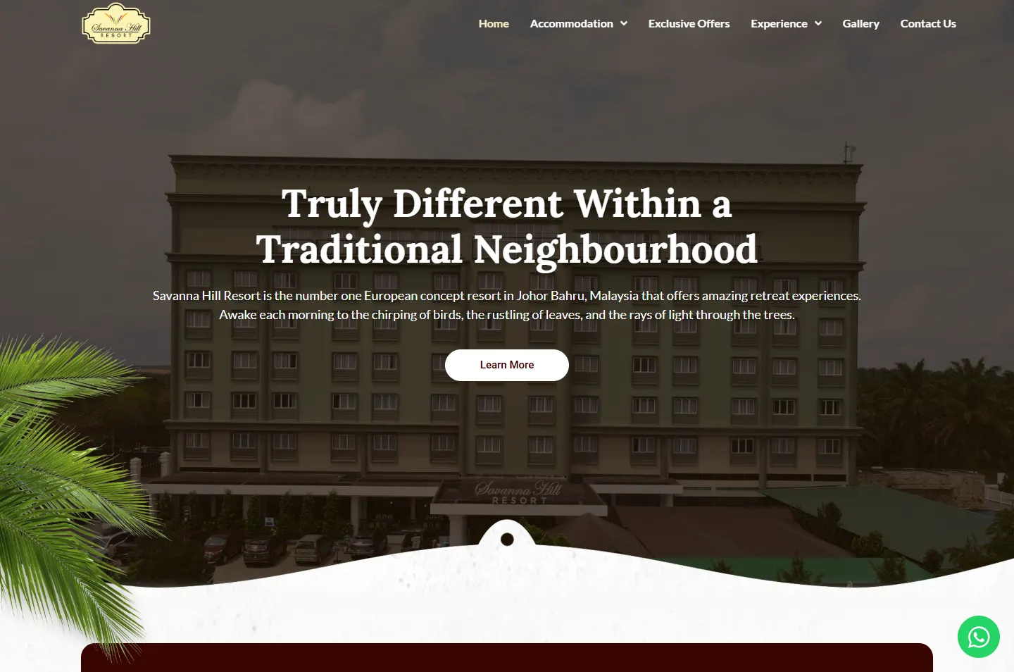
The hotel fills the screen, with a palm at the side.
 2
Pick dates
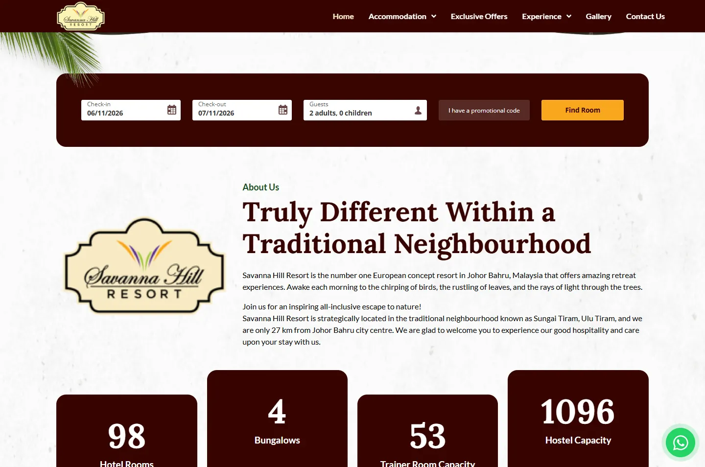
A booking bar sits just under the first screen.
 3
Size it up
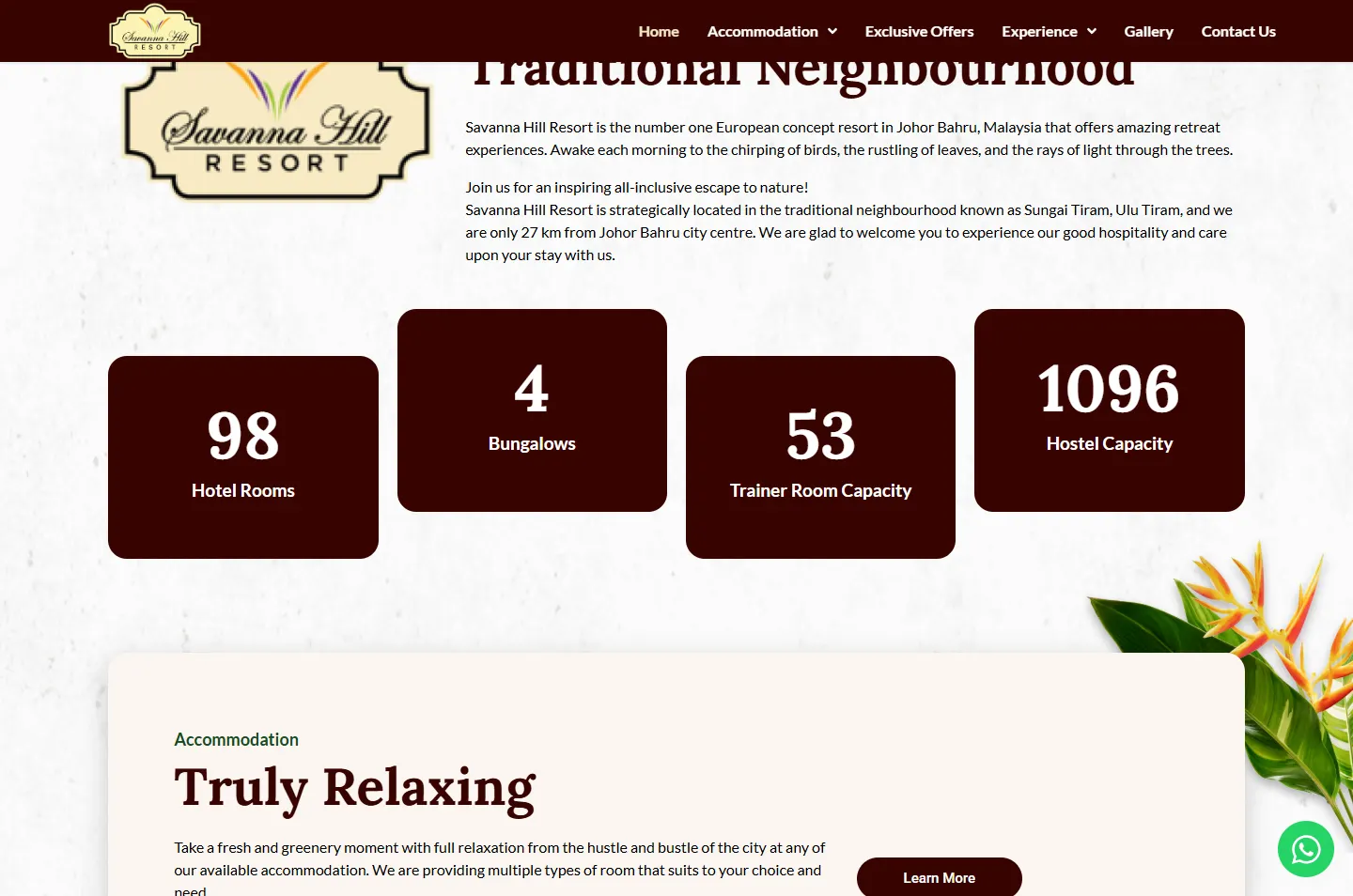
Four numbers on cards that step up and down.
 4
Stay
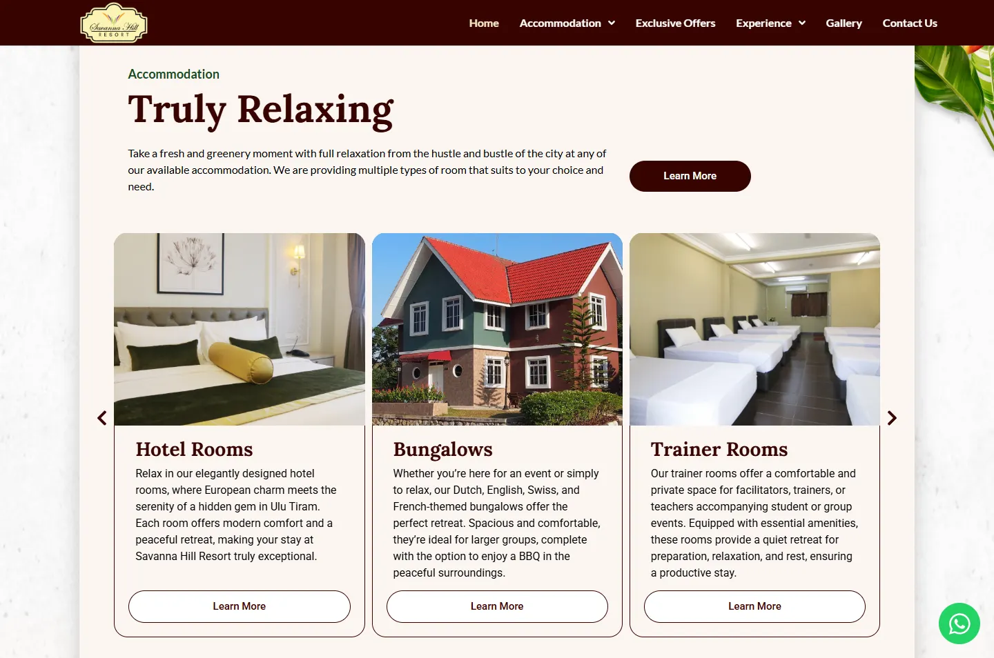
Five ways to stay in one sliding row.
 5
Choose
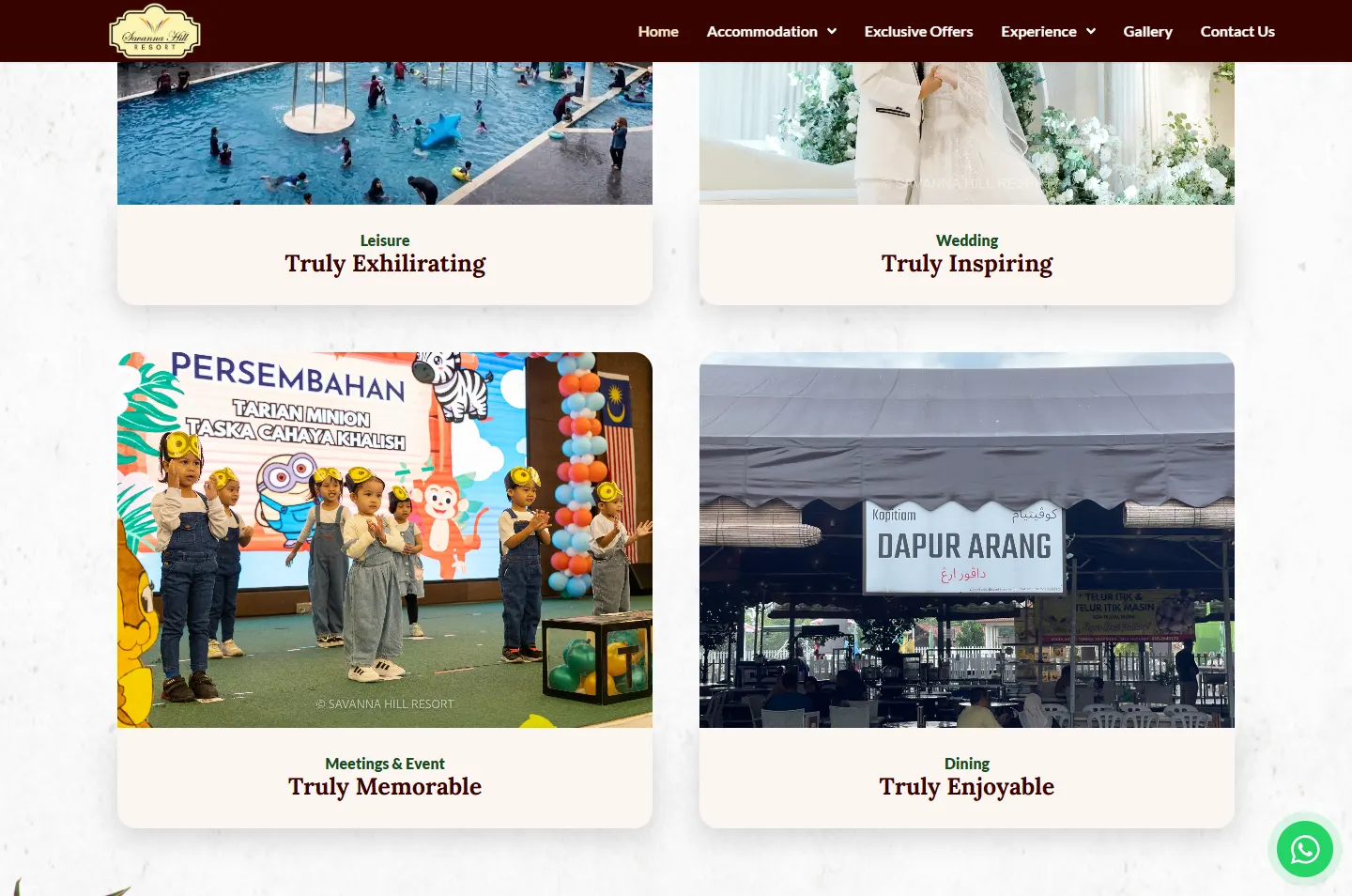
Four experiences, each with its own Truly.
 6
Ask
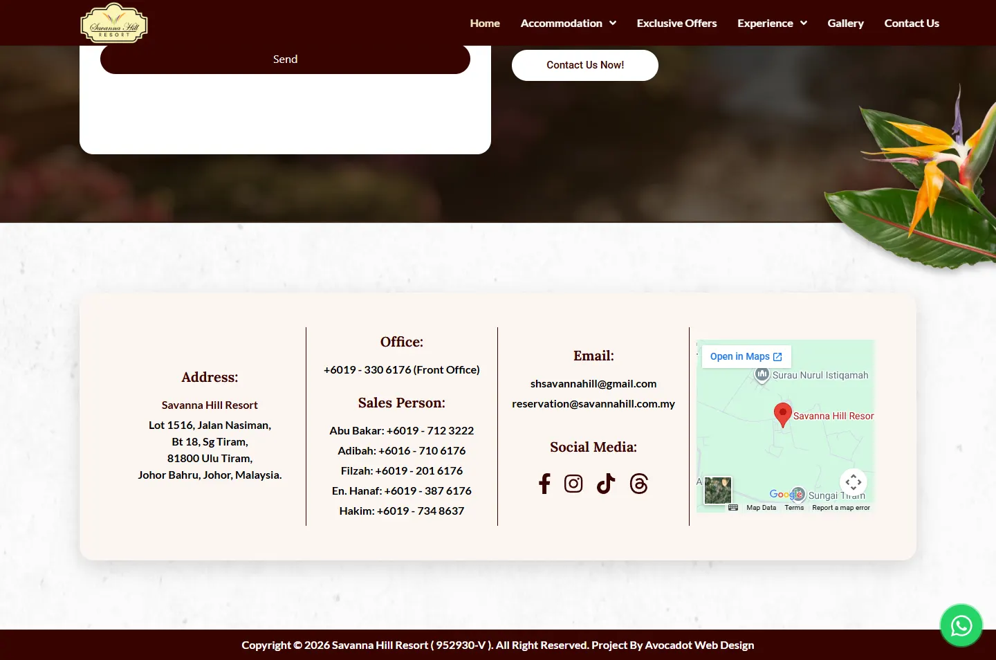
Six phone numbers, a form and a map.
“Truly Different Within a Traditional Neighbourhood.” It names two things, and the page gives each its own look. The word Truly then returns through the page: Truly Relaxing, Truly Inspiring, Truly Memorable, Truly Enjoyable.
The logo is a formal crest with stepped corners and a name in script. It sets the orderly side of the page: a serif typeface, deep oxblood and cards with tidy rounded corners.
The site describes waking to birds, rustling leaves and light through the trees. So real plants take the edges, cut out and laid over a paper background.
The colours stay few and formal. That leaves the greens, reds and oranges of the plants to do the talking.
#F9F9F8The textured page background#FBF6F2Panels and card captions#370401Number cards, booking bar, menu, headings#FFFFFFButtons and the form card#1B4A20The small label above a heading#F7EAC2The current page in the menuIn the layout, green stays in the small labels. The plants already bring plenty of it.
Truly Different
Lora · Headings and big numbersExclusive Offers
Lato · Labels and reading textSpacious and comfortable, they’re ideal for larger groups.
Roboto · Room cards and buttons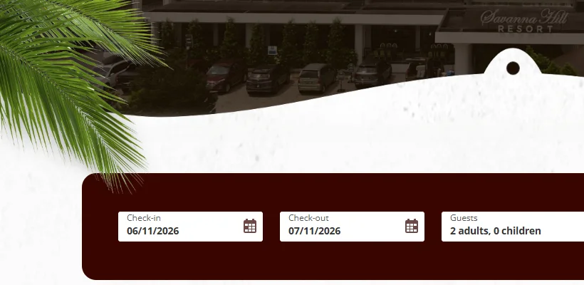
This is the move the page keeps repeating. A palm frond falls past a soft paper curve and over the corner of the booking bar. Further down, other plants do the same at the cream panel and the dark bands.
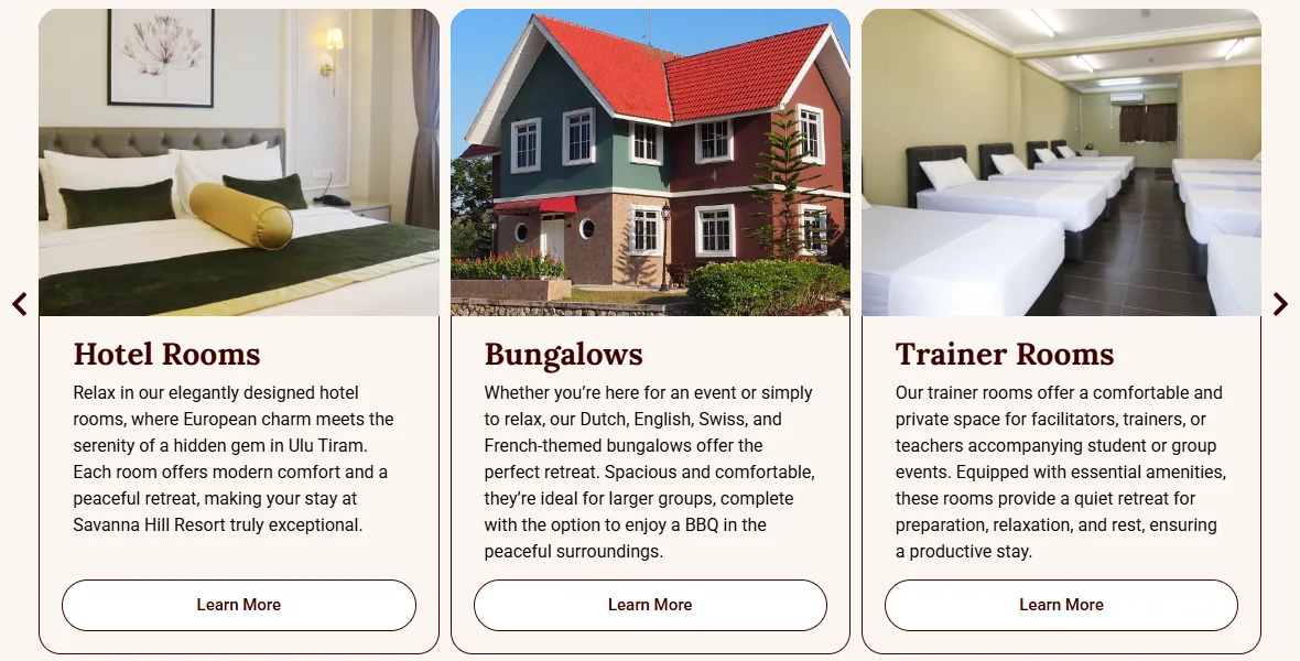
A thin oxblood outline runs down from each photo and around the text. It makes very different stays read as one family, from a hotel room to a hostel.
Three dark photo bands break up the long stretches of paper, and each has a soft curved edge, so the page feels cut by hand. The bar above follows the real page in order and to scale. The thin last band is the footer.
Scroll the way a guest would, from the hotel photo to the phone numbers. Each highlight marks one decision, and the note beside it gives the reason.
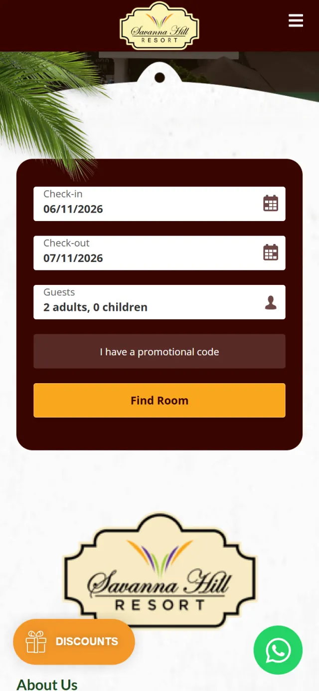
The hotel building fills the screen under a dark wash, with the line “Truly Different Within a Traditional Neighbourhood” and one Learn More button. A palm comes in from the left.
Why A straight, formal building and a loose tropical frond share one view. The contrast is there before a visitor reads the line.
Right under the first screen sits an oxblood bar with check-in, check-out, guests, a promotional code and a Find Room button.
Why A returning guest does not need the story again. Anyone who already knows the resort can start with their dates.
Hotel rooms, bungalows, trainer room capacity and hostel capacity sit on four oxblood cards. The cards step up and down instead of lining up.
Why A group organiser wants these figures early. The uneven line keeps a row of facts from feeling dry.
Inside a cream panel headed Truly Relaxing, a row slides on by itself and shows three cards at a time, with arrows at each end. Hotel Rooms, Bungalows, Trainer Rooms, Dormitories and Dallas Suites Hostel each link to their own page.
Why A dormitory and a themed bungalow are very different stays. Giving them the same card shows both belong here, and lets each guest go straight to theirs.
The offer band has the only tilted photo on the home page. It sits in a white paper border, beside a short note and one Learn More button.
Why Offers are easy to scroll past. A print left at an angle looks different from everything around it, so the eye stops.
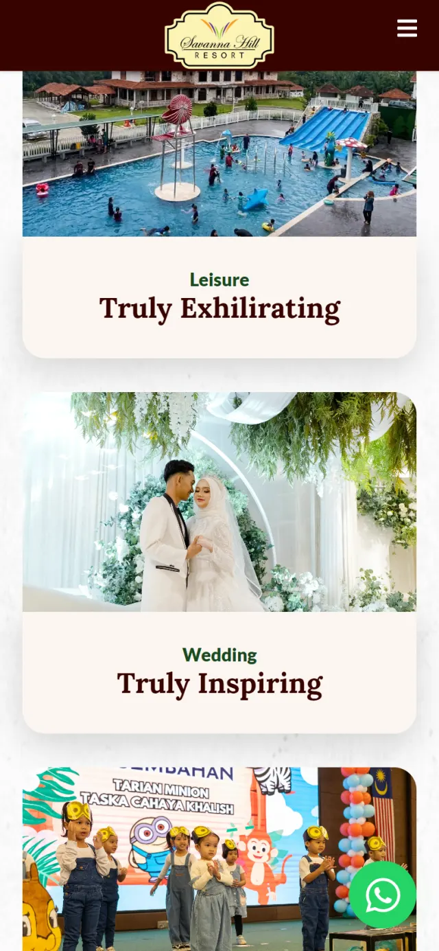
Experience opens into four large photo cards: Leisure, Truly Exhilarating. Wedding, Truly Inspiring. Meetings & Event, Truly Memorable. Dining, Truly Enjoyable. Each goes to its own page.
Why The same word changes its ending for each kind of guest. A wedding photo and a children’s stage show share one grid, and the word Truly holds them together.
Below the form, one card holds the address, the front office number, five named sales people, two email addresses, four social links and a map.
Why Weddings and group stays are rarely settled through a form alone. A name beside a number makes the first call easier.
Neat building, loose palmDates firstThe four figuresSame card, five stays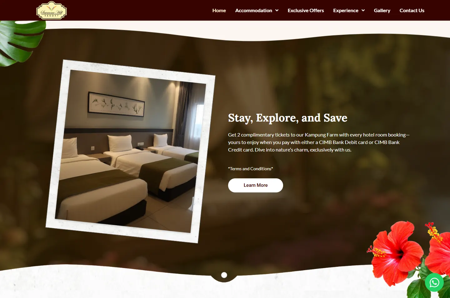 The only tilted photoTruly, four timesNames and numbers
On a phone the chapters stack into one column, and the leaves still come in from the edges, so the idea survives the small screen.
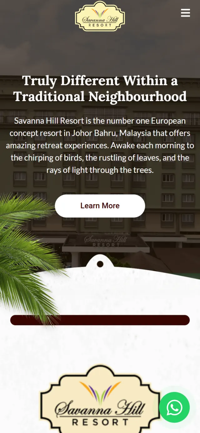
The plants get noticed first. These details help guests find the right page and reach the right person.
Hotel Rooms, Bungalows, Trainer Rooms, Dormitories and Dallas Suites Hostel each have their own page, listed under Accommodation in the menu.
Leisure, Wedding, Meetings & Event and Dining each have their own page under Experience, with Exclusive Offers and Gallery beside them.
A round button stays on screen and opens a WhatsApp chat with the resort, with a first message already written.
The form and the contact card sit in the footer, so they close every page, from Gallery to Dormitories.
A Google map sits in the contact card, and the site also links to directions in Google Maps.
The page describes the organisation, the website and the page’s place in the site in a format Google can read.
Every Potadot project starts by understanding the client's situation before anything is designed. See all seven steps
Who stays at Savanna Hill, from couples to school groups, and what each of them needs to find first.
We set out the stays, offers and experiences as short chapters, with the word Truly running through them.
Oxblood and paper came first, then the plants at each edge, then every chapter for phone and desktop.
Site details set up for Google, a page for each stay and experience, then launch and support.
Running a hotel or resort? Tell Ricky about your property on WhatsApp at +6011-1142 1029.
We worked out the concept, shaped the content, designed the pages and built the site in English, with search setup.
The resort’s line is about being different inside a traditional neighbourhood. The plants bring that neighbourhood onto the page, and because each chapter has its own, they also carry the eye down a long scroll.
It explains the resort once, then splits. Stays and experiences each have their own cards and pages, so a couple and a teacher can each go straight to what they need.
Yes. Here the idea came from the resort’s own line and its mornings. Yours would come from your property, so the site would look like your place. Tell us about your place and we will show you how we would approach it.