Let the rooms speak first
People choose an interior designer with their eyes. The finished work had to lead, with nothing on the page competing with it.
WLEA Interior DesignInterior design · Company website
The website for WLEA Interior Design, a design-and-build studio headquartered in Johor Bahru, with branches in Kuala Lumpur, Penang and Singapore. The page keeps its walls dark so the finished rooms give the light, and it ends inside a room.
WLEA Interior Design is a design-and-build interior studio with over 17 years of experience, headquartered in Johor Bahru, with branches in Kuala Lumpur, Penang and Singapore. Potadot designed and built its website in English. Between its three full-width pictures, every chapter sits on the same deep charcoal, like a room with dark walls, so the warmth on the page comes from photographs of finished homes. Headings run across those photographs, and the last screen is itself a room, with the contact details set on its floor.
WLEA designs and renovates landed homes, condominiums, offices, retail outlets and luxury residences across Malaysia and Singapore. Its in-house team handles space planning, 3D visualisation, custom carpentry and full renovation works.
The headquarters is in Johor Bahru. Each branch is listed under its own registered name, and the Singapore branch is A Warm Design Studio.

Someone choosing an interior designer is about to hand over their home or shop. The site has to show good taste straight away, then show that the same company can see the job through.
People choose an interior designer with their eyes. The finished work had to lead, with nothing on the page competing with it.
WLEA’s own page names the problem: juggling several contractors. Its answer is one team for the whole job, and a visitor should grasp that quickly.
WLEA calls itself a regional studio. Johor Bahru, Kuala Lumpur, Penang and Singapore had to read as one company with one standard, not four separate offices.
Cost is the first question in the site’s own FAQ, and a real figure depends on the property. The site had to say so plainly and lead to a quote.
Any interior designer knows what a dark wall does: whatever is warm in front of it looks warmer. WLEA’s photographs are full of timber, gold trim and lamp light, so we gave them that wall. One deep charcoal runs through the whole site and the colour comes from the rooms. Scrolling is a walk through a house, and it ends in a room.
 1
Walk in
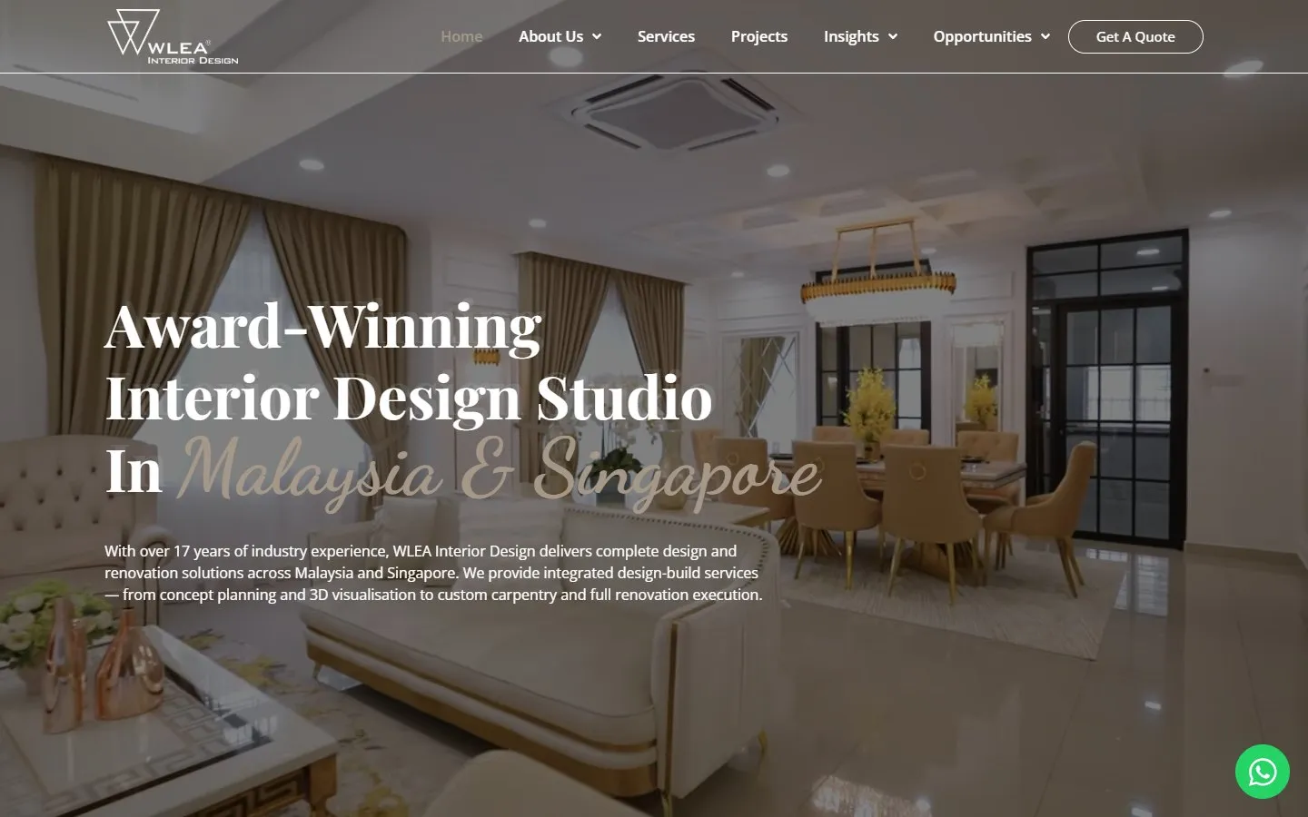
A finished home plays behind the heading.
 2
Meet the studio
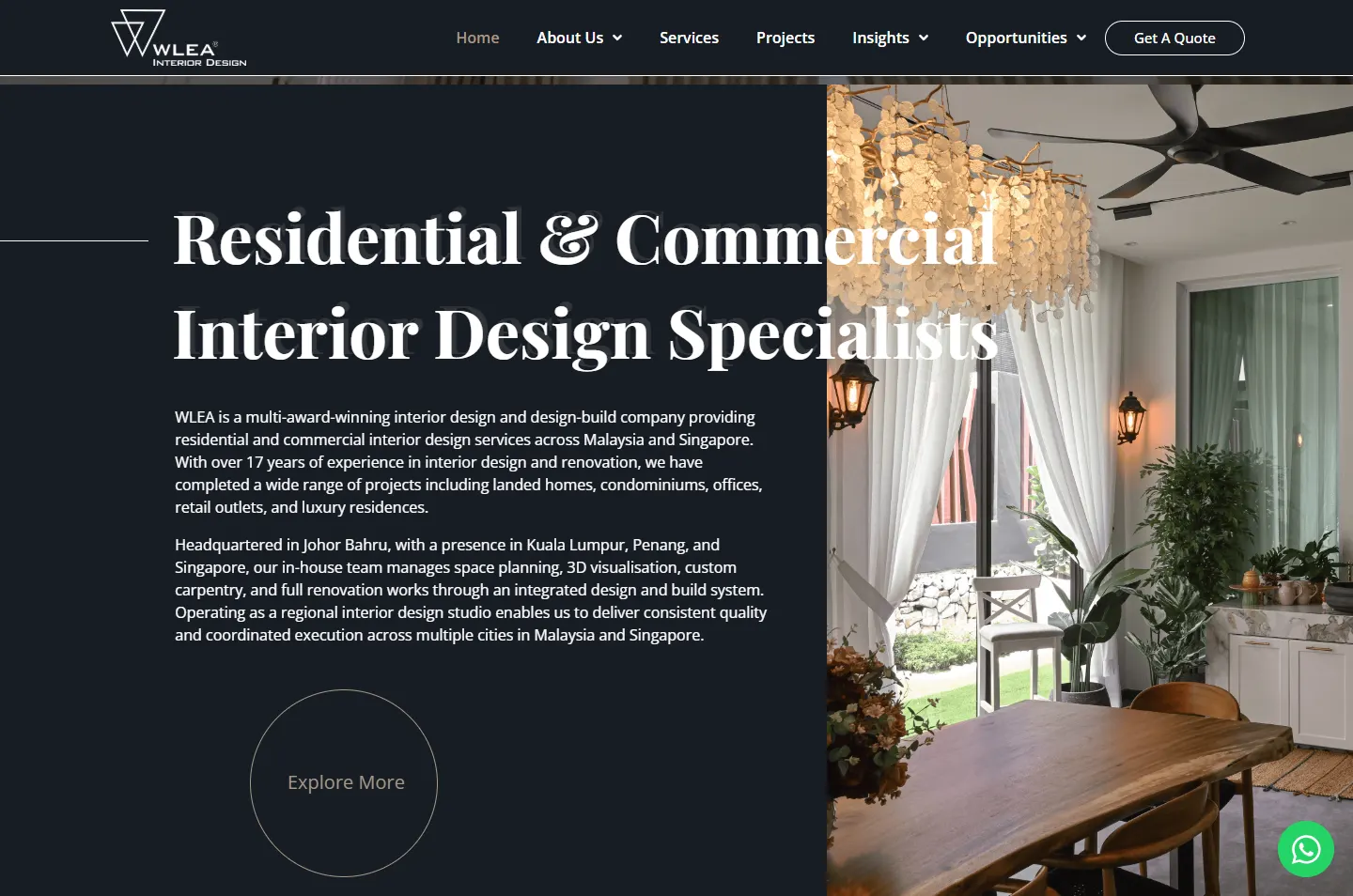
The heading crosses from wall to room.
 3
See who does what
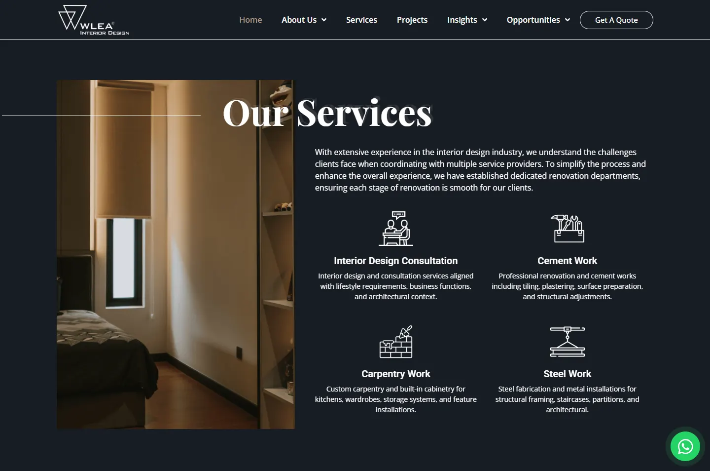
Four services under one team.
 4
Step outside
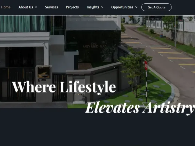
A house front fills the width of the page.
 5
Tour the rooms
Photos hung off-centre on the dark wall.
 6
Sit down
A last room, with the contacts on its floor.
Warm timber, gold trim, lamps, curtains in soft neutrals. Colours that warm need a cool, quiet setting, so the charcoal carries a little blue.
Two overlapping triangles drawn in a thin line. That same thin line returns beside the section headings, running in from the edge of the screen.
One team does the design and the building. So the words and the pictures do not sit apart: headings run straight across the edge of the photographs.
The design uses very little, the way a calm room does. Charcoal for the walls, white for the words, one warm taupe for small details, and the photographs provide the rest.
#181D24The wall behind every text chapter#FFFFFFHeadings, reading text, thin lines#A69888Script line, circle buttons, active menu link#25D366The one floating buttonTaupe sits close to the curtains and upholstery in the photographs, so the accent feels like part of the room. Green is kept for WhatsApp alone, which is why the button is easy to find.
Residential & Commercial
Playfair Display · HeadingsMalaysia & Singapore
Dancing Script · One line in the opening headingFrom concept planning and 3D visualisation to custom carpentry and full renovation execution.
Open Sans · Reading text and buttons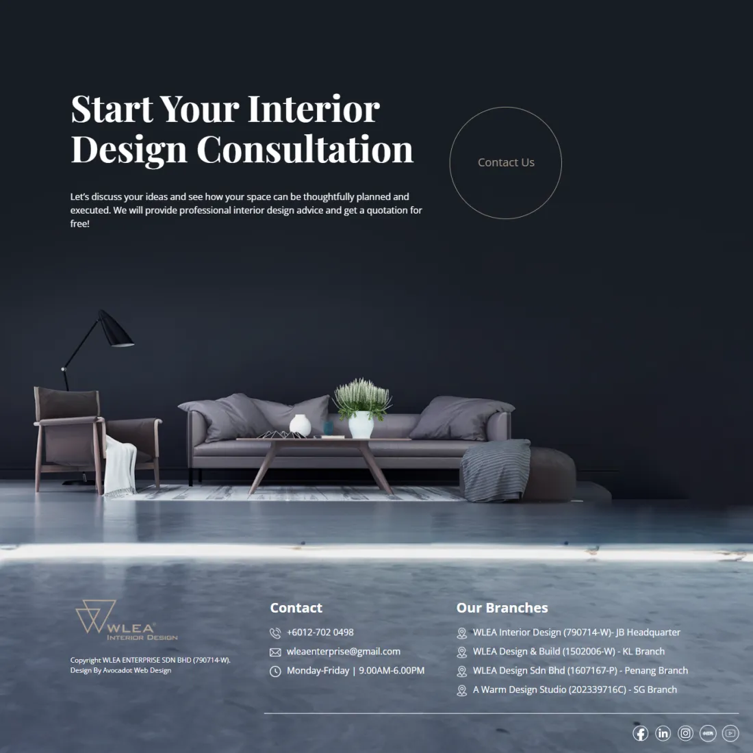
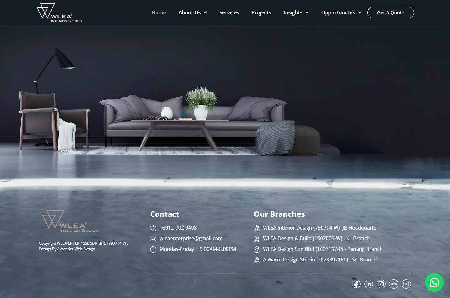
The site closes on one tall picture of a sofa against a dark wall. The invitation to talk sits on the wall, and the phone number, email and branches sit on the floor. A page footer has become the kind of place WLEA designs.
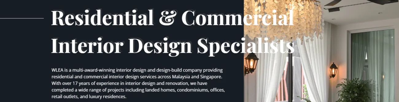
A heading usually stays in its column. This one starts on the charcoal, led in by a thin line from the screen edge, and ends over the photograph. A faint shadow of the same words sits behind it, which gives the type some depth, like a sign on a wall.
The bar is the real page, to scale. Only the opening video, the house front and the last room fill the whole width. Every other chapter keeps the same wall, so the page feels like one house and not a stack of sections.
This is the order a homeowner meets the site, from the front door to the last room. The highlight marks the part to look at, and the note gives the reason for it.
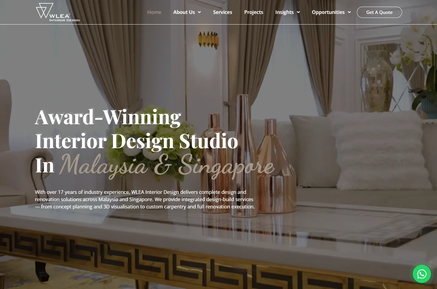
A video of a finished home plays behind the heading, dimmed so the white words stay clear. One short paragraph says what WLEA does and where.
Why A visitor wants to see a room before reading about one. The words only need to sit on top of it.
A thin white line runs in from the edge of the screen and leads to the heading, which starts on the charcoal and ends over a photograph.
Why Words on one side and pictures on the other feel like a brochure. Overlapping them joins what WLEA says to what it has built.
A short note names the trouble of dealing with several service providers. Below it, four line icons set out the services: design consultation, cement, carpentry and steel.
Why Cement and steel listed beside design explain design-and-build better than the term does. The company that plans the room also lays the tiles and fabricates the steel.
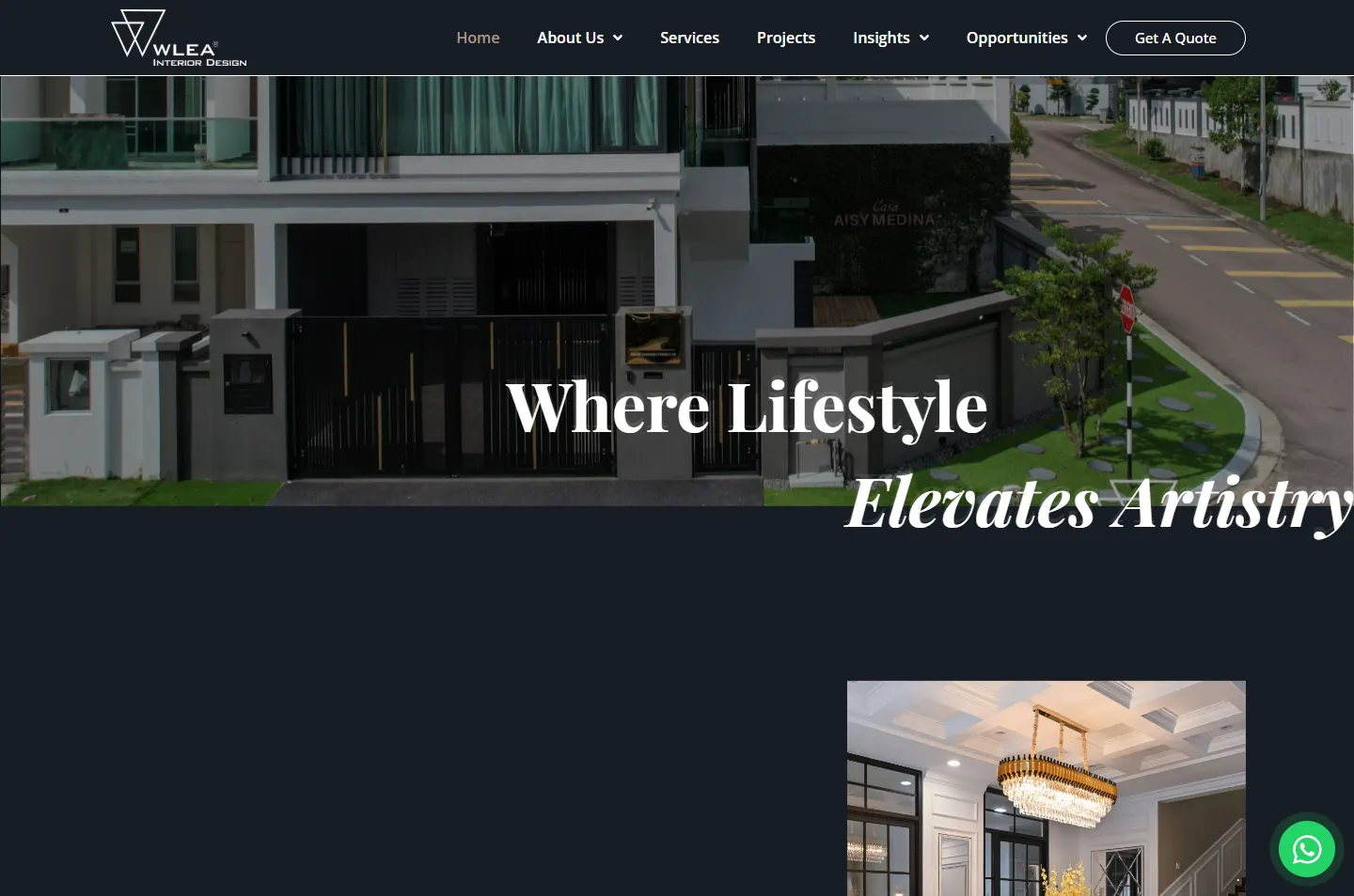
A house front runs the full width of the page. The line “Where Lifestyle Elevates Artistry” sits across its lower edge in two offset rows, the second in italics. Its four words start with W, L, E and A.
Why After the dark chapters, the scale of this picture feels like walking out of a door. It also shows the work reaches past the interior.
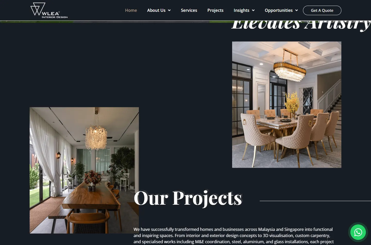
Project photos sit at different heights on the left and right, with open charcoal between them. The Our Projects heading overlaps the edge of the lower one.
Why A tight grid reads like a catalogue. Space around each photo lets a visitor look at one room at a time, as in a gallery.
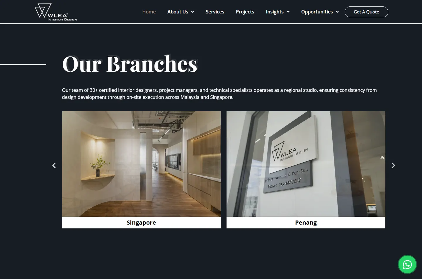
One sentence states that a team of more than 30 works as a regional studio. Below it, a slider shows photographs from Kuala Lumpur, Johor Bahru, Singapore and Penang.
Why Anyone can list four cities. A photograph of each branch, down to the WLEA sign at the Penang office, shows these are real places.
The last picture is a sofa and armchair against a dark wall, on a polished floor. The contact details and all four branches are set on that floor.
Why This is the idea carried to its end. The dark wall that held the whole site turns out to be a real wall, and the visitor finishes the page inside a room.
 Heading and one paragraphFrom the wall into the roomFour services, one team
 Two lines, offsetSpace around each room
 A slider of the four branchesContacts on the floor
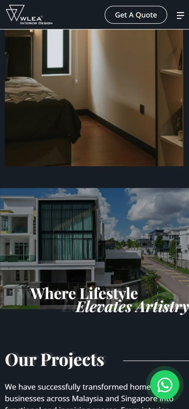
On a phone the page folds into one column. The charcoal, the headings and the thin lines all stay, so it still feels like the same place. Only the contact details move, from the floor of the last room to plain charcoal below it.

A good room hides its wiring. These parts keep enquiries moving and help people find WLEA.
The green button stays on screen all the way down the page and opens a chat with the first line already written.
Get A Quote leads to a form covering property type, size, location, budget, style and handover timing, so the team starts with useful details.
Four common questions are answered on the home page, starting with what interior design costs in Malaysia.
The home page title names JB, KL and Penang, and the page describes the company, its address and its services in a format Google can read.
Project photos carry written descriptions that name the project and the place, such as Kempas Utama in Johor Bahru.
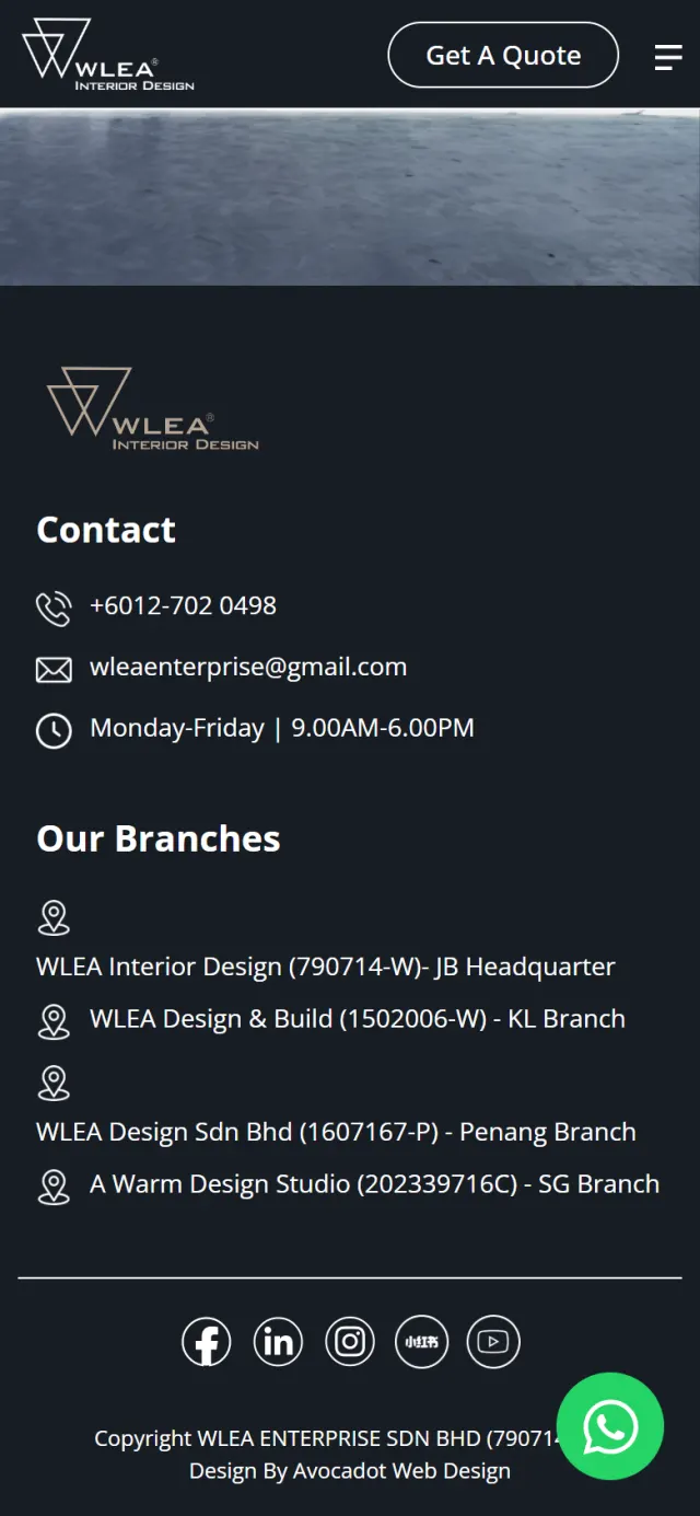
The footer lists all four branches, each with its registered name and number, and Singapore has its own page in the menu.
Every Potadot project starts by understanding the client's situation before anything is designed. See all seven steps
What design-and-build means for a client, how the four branches relate, and what a homeowner wants to see first.
WLEA’s services, branches and common questions set out as short chapters and plain answers.
The charcoal wall, the heading style and the thin line carried through every chapter on phone and desktop, down to the closing room.
Page titles, image descriptions and business details set up for Google, then launch and support.
Have work worth showing? Tell Ricky about your business on WhatsApp at +6011-1142 1029.
We worked out the concept, set out the content, designed the pages and built the site in English, with search setup, a WhatsApp button and a route to the quote form.
Because the photographs are warm. Timber, gold trim and lamp light look richer against charcoal than against white, so the dark page makes the rooms the warmest thing on screen.
The home page gives all four branches one slider, the footer lists each with its registered name and number, and Singapore has its own page in the menu.
Yes. WLEA’s dark walls came from its warm photographs, and your site would start from what your business has to show. It will look different, but the thinking is the same. Tell us about your company and we will tell you where we would start.