Show the whole range at once
Handerson started in trucking and now covers sea, air and warehousing too. Someone who knows it for one service should see the others straight away.
Handerson InterlogisticsFreight and logistics · Company website
The website for Handerson Interlogistics, a freight shipping and logistics company with branches in China and Southeast Asia. One dark navy page opens on a ship, a plane and a truck in a single picture, then runs through services, cargo, branches and figures.
Handerson Interlogistics Sdn Bhd is a freight shipping and logistics company with more than 15 years in the industry and branches in China, Malaysia, Thailand and Vietnam. Potadot designed and built its website as one long English page on a single dark navy. The first screen puts a ship, a plane and a truck inside one arrow-shaped picture. The page then answers in order: how goods move, what can be carried, where the branches and routes are, and what the company’s figures say.
Handerson Interlogistics Sdn Bhd started in cross-border trucking between China and Southeast Asia. It has since expanded to Europe and the Middle East through multimodal transport, which means one shipment can use more than one kind of transport.
Today it offers sea freight (FCL and LCL), air cargo, trucking and warehousing. Its branches and distribution centres are in Guangzhou, Humen, Yiwu, Kuala Lumpur, Bangkok and Vietnam. Its main routes are China-Malaysia, China-Thailand, Indonesia-Malaysia and Thailand-Malaysia.

Once a consignment leaves the door, the customer cannot watch it. So they judge a freight company by how clearly it explains itself. The site has to feel as orderly as a well-run shipment.
Handerson started in trucking and now covers sea, air and warehousing too. Someone who knows it for one service should see the others straight away.
A garment trader and a machine parts buyer each want to see their kind of cargo. Photos do that faster than a general claim.
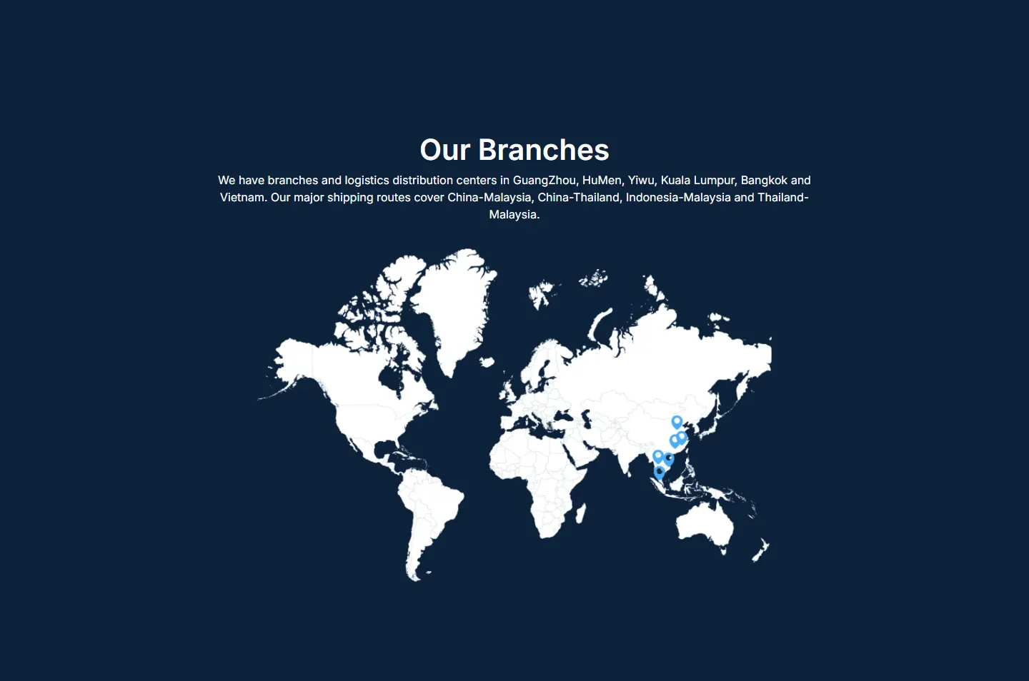
Guangzhou, Humen, Yiwu, Kuala Lumpur, Bangkok and Vietnam read like a list. On a map they form a chain from China down to Malaysia, and a shipper can see where the company sits along the way.
Handerson says its priority is service that makes logistics simple for customers. The site should feel the same: short, in a clear order, with nothing to work out.
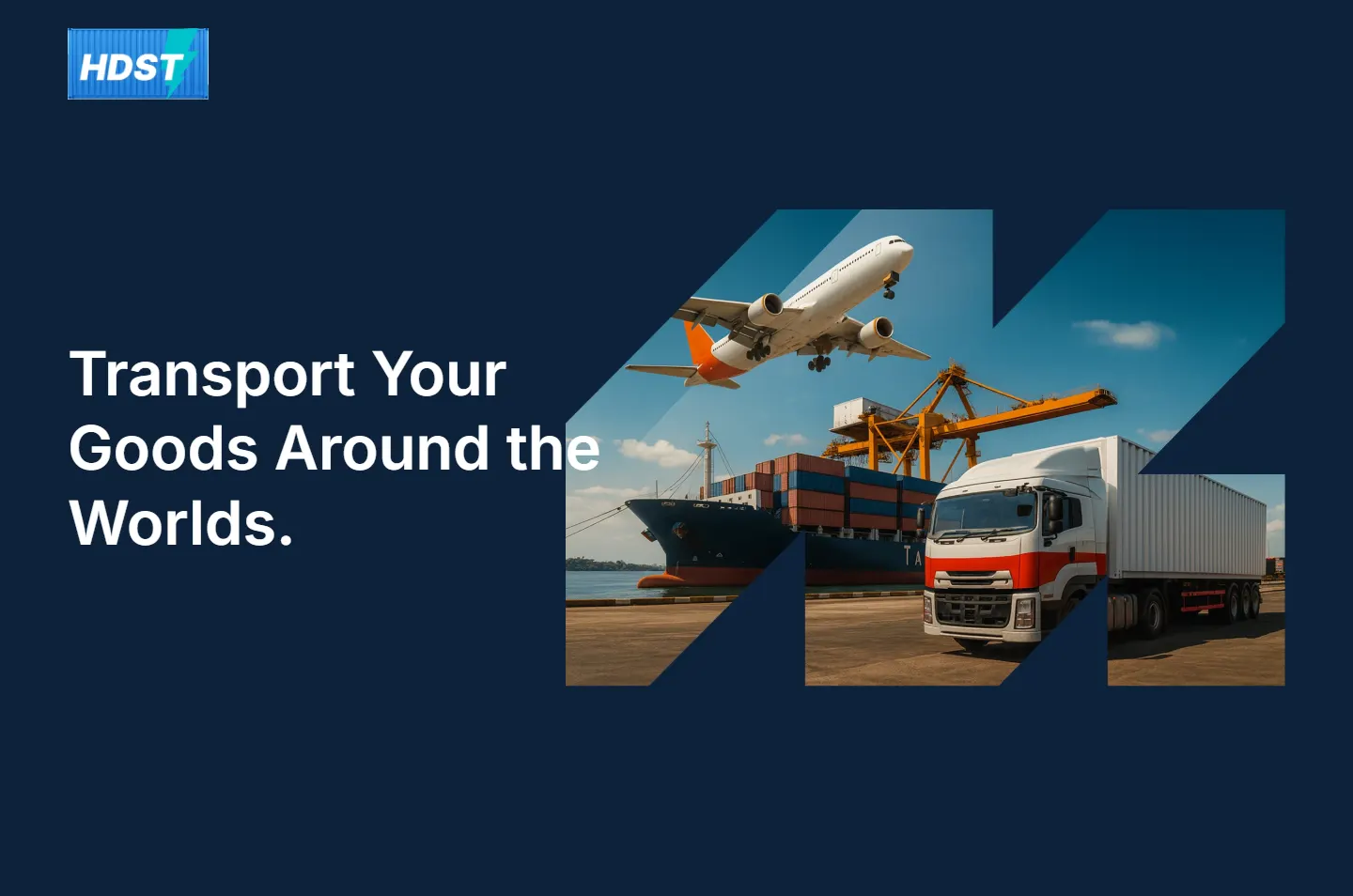
Multimodal transport is a hard phrase to explain to a customer. It only means one shipment can move by more than one kind of transport. So the site says it with one picture: a ship, a plane and a truck share a single frame, cut into a shape that points forward. The rest of the page carries on in that direction, in one colour and one order.
 1
The picture
Ship, plane and truck in one frame.
 2
The story
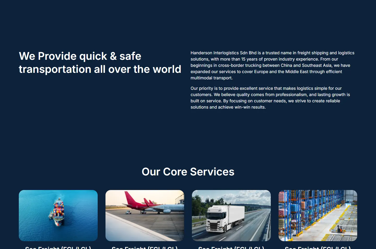
From cross-border trucks to wider routes.
 3
How it moves
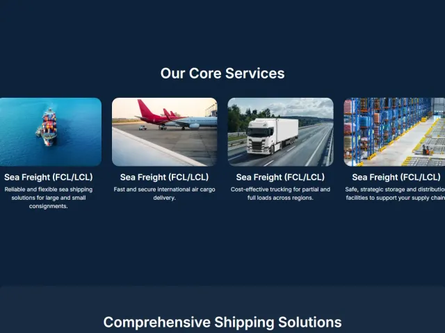
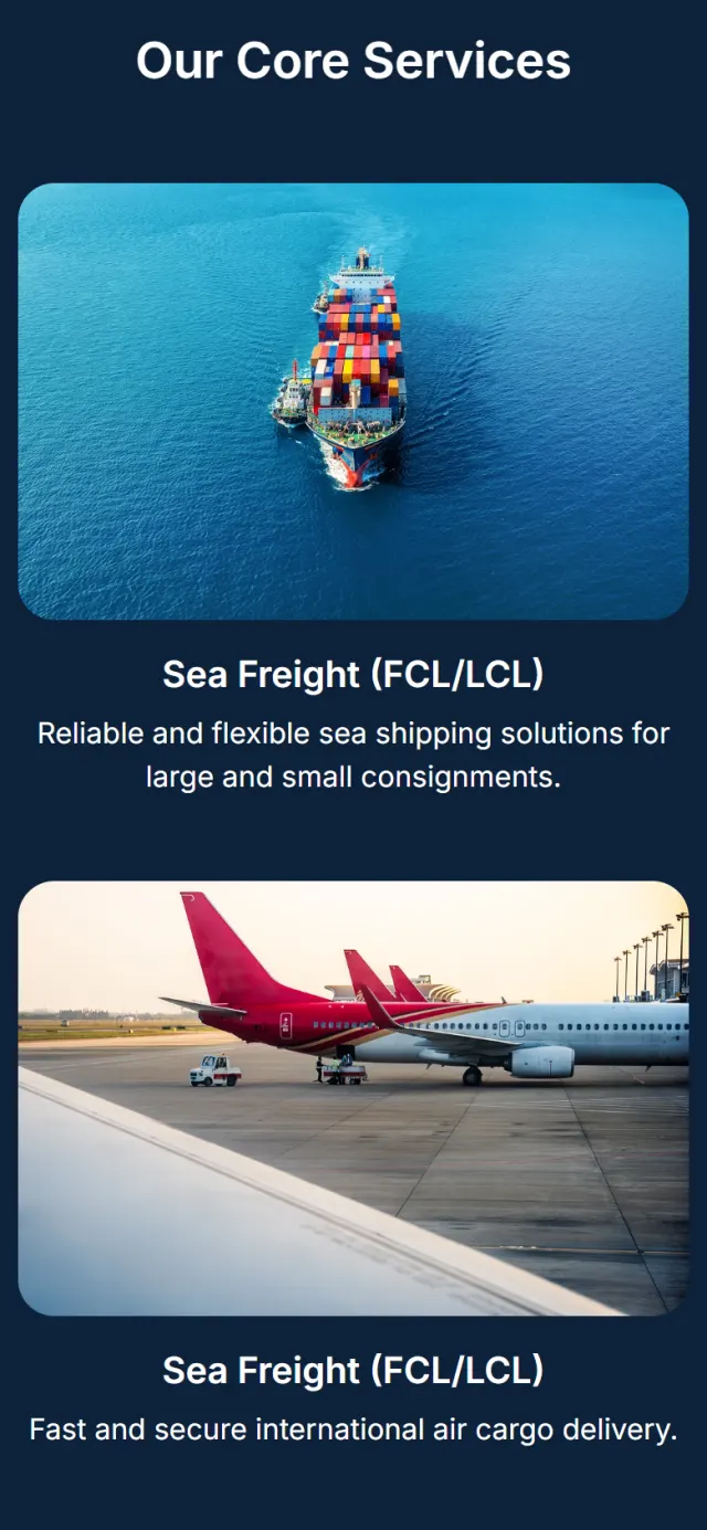
Sea, air, road and storage on four cards.
 4
What it carries
Nine kinds of cargo, shown in photos.
 5
Where it goes
Six pins and four main routes.
 6
Its figures
Three numbers to finish.
A blue shipping container with a teal lightning bolt at one end. The container says freight and the bolt says speed. The bolt leans the same way as the diagonal cuts in the first picture.
Handerson grew from one kind of transport into several. That is why the first picture holds the ship, the plane and the truck together, and does not show them one at a time.
Blue sea, orange cranes, stacks of bright fabric. Freight is full of colour already, so the page stays one dark navy and leaves the colour to the pictures.
The page has almost no decoration. Deep navy, white text, rounded photographs and one typeface, Inter, keep it steady. Only the small footer line uses another face. A company that moves other people’s goods should feel this calm.
#0E223AThe page background#182B43The lighter cargo panel#FFFFFFHeadlines, text, the map and the footer#2685DBThe logo#02C2CCThe lightning bolt in the logoTeal appears only in the logo, and bright blue only in the logo, the six map pins and the footer credit. Apart from navy and white, the rest of the colour comes from the photographs.
Transport Your Goods Around the World.
Inter · One typeface: the main headlineOur Core Services
Inter · Section headingsCost-effective trucking for partial and full loads across regions.
Inter · Reading text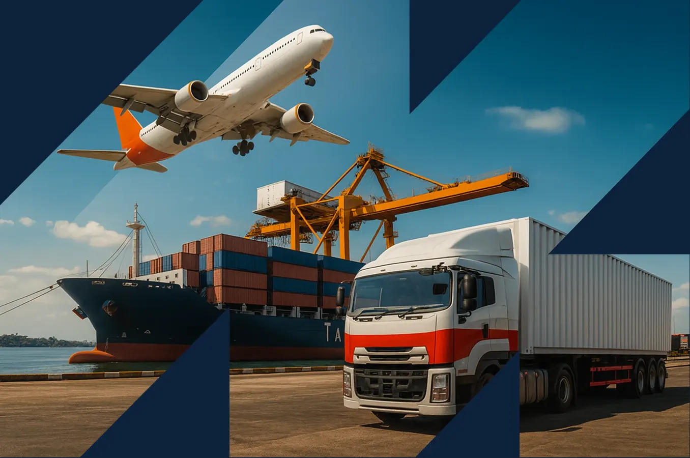
The first picture is cut along sharp diagonals, so the ship, plane and truck sit inside a shape that points up and to the right. Every other photo on the page has soft rounded corners, which is why the eye goes here first.
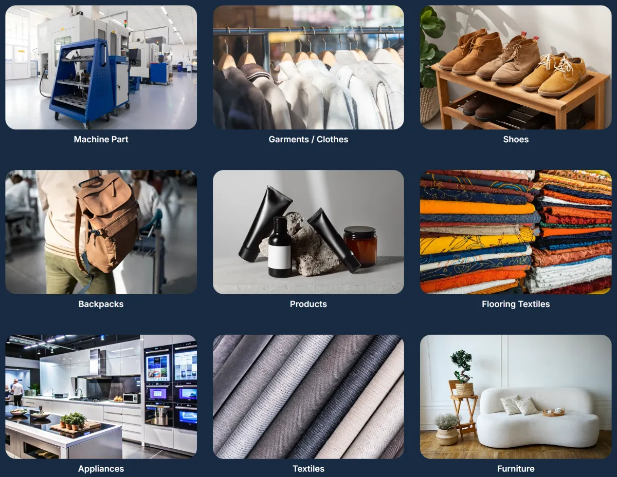
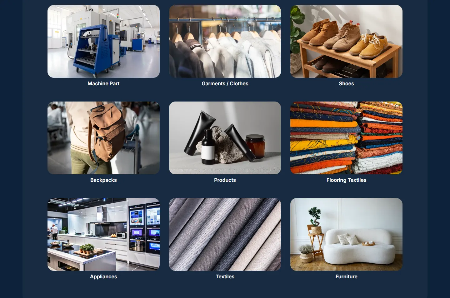
Nine photos in three rows on one lighter panel. Each kind of cargo gets the same size and a short label, so a visitor can find their own goods in moments.
The bar above is the real page, to scale. Nearly all of it is one navy, with a lighter band for the cargo panel. Long pages often change colour to stay interesting. This one leaves that to the photographs, so it reads as one unbroken trip.
Six stops, in the order a shipper reaches them. Each highlight marks a design decision, and the note gives the reason for it.
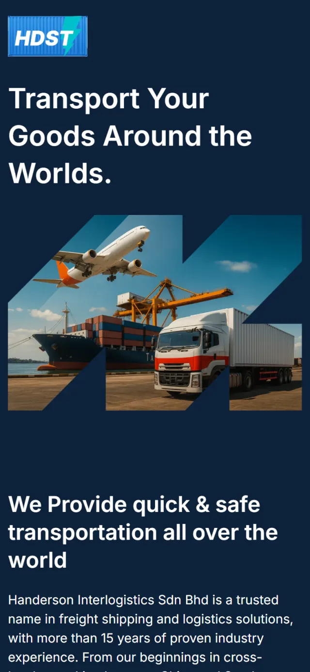
The first screen has the logo, a headline and one large picture: a plane overhead, a container ship at the quay and a truck in front, all inside the arrow shape.
Why A visitor sees the full range before reading a word, and knows this is freight at once.
A headline on the left, and on the right the history: where the company started, how it grew and how it looks after customers.
Why Before handing over their goods, people want to know who they are dealing with. A start in trucking between China and Southeast Asia gives the company real roots.
Sea freight, air cargo, trucking and warehousing each get a photo and one sentence.
Why Equal cards say these are equal parts of the business. Trucks may be where it began, but no service looks like a sideline.
Nine photos show what Handerson carries, from machine parts and garments to appliances and furniture. They sit on the only lighter panel on the page.
Why People look for their own goods first. A row of shoes on a rack speaks to a shoe trader faster than a long list would.
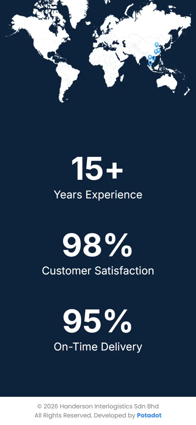
A short paragraph names the branches and the main routes. Below it, a white world map carries six blue pins across China and Southeast Asia.
Why The six pins run from China down to Malaysia, the stretch that three of the four main routes travel. A shipper sees that chain without reading a single city name.
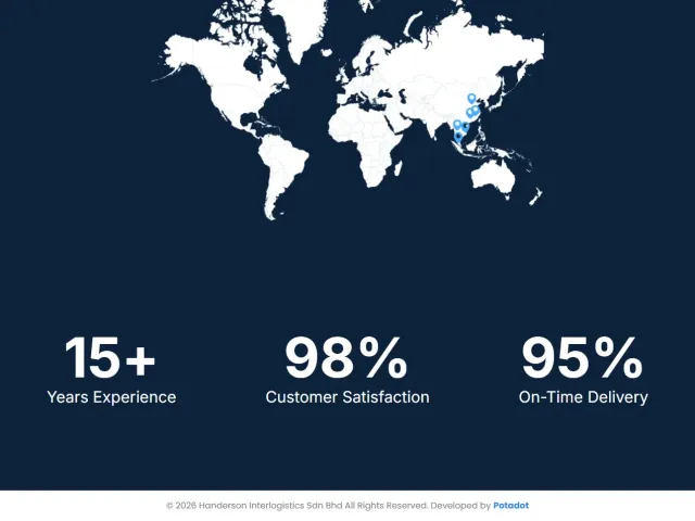
The page ends on the figures Handerson states for itself: 15+ years of experience, 98% customer satisfaction and 95% on-time delivery. Each one counts up from zero when it comes into view.
Why After the pictures, a shipper wants something to measure. Large numbers on plain navy are the last thing they read.
One frame, three modesWhere it started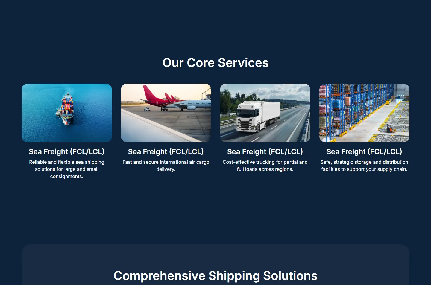 Four core servicesNine cargo categoriesSix pins, four routes
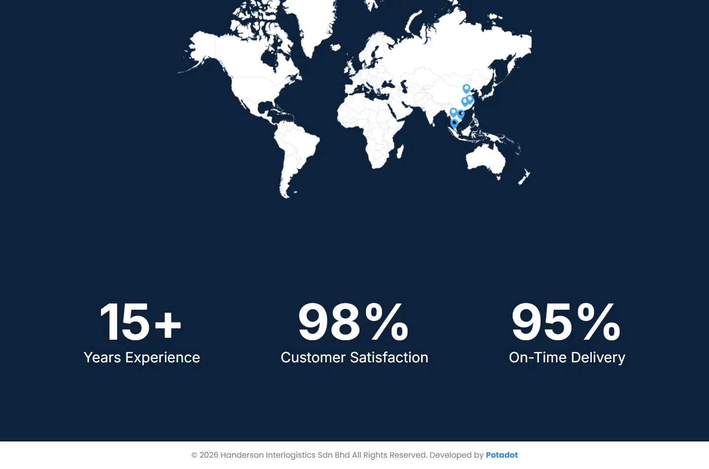 Counts up on arrival
On a phone the page becomes a single column in the same order, so it still runs from the first picture to the last figure.
The page carries 16 images, so it cannot afford to be heavy. These details help Google read it and hold each photo back until it is needed.
The page title leads with Malaysia Freight Shipping Solutions, and the description names sea, air and road freight and warehousing.
Structured data describes the page, the website and the breadcrumb, so Google can tell what it is looking at.
Pictures further down load only as a visitor gets near them, and all of them are in the lighter WebP format.
Every Potadot project starts by understanding the client's situation before anything is designed. See all seven steps
What Handerson moves, on which routes, and what a shipper needs to see before trusting a company with a consignment.
The company story, four services, nine cargo categories and the branch list, set out as short sections in English.
The arrow picture and the navy set the tone, then each section was laid out for desktop and phone in WordPress and Elementor.
A page title that leads with Malaysia Freight Shipping Solutions, a description naming each service, and structured data, then launch.
Running a freight or logistics business? Tell Ricky about it on WhatsApp at +6011-1142 1029.
We worked out the concept, organised the content, designed the page and built the site in WordPress, with the page title, description and structured data set up.
Handerson’s services work together, so the site shows them together. One page in a set order takes a visitor from services to cargo, branches and figures without having to pick a path.
Freight pictures are full of colour: blue sea, orange cranes, stacked containers. One dark background lets them stand out, and it gives the page a steady feel.
Yes. We start from what your business actually does and look for the one idea that explains it. For Handerson, that was one picture holding three kinds of transport. Tell us about your company and we will show you how we would approach it.