Give people a way in
A brand name means little to a first-time visitor. The site needed a starting point that anyone can use without knowing the range.
T.One Hair CareHair care · Multi-brand online shop
The website for T.One Hair Care, a multi-brand select shop at KSL City, Johor Bahru. A first-time visitor may not know the brands on its shelves. So right after the opening, the home page asks about their hair, and the brands come later.
T.One Hair Care is a multi-brand professional hair care select shop at KSL City in Johor Bahru, serving Malaysia and Singapore. Its website, designed and built by Potadot, is in English. The home page starts where a customer starts, with their own hair. After one collection in the opening, six photo tiles ask what the hair or scalp needs today. Best sellers, the featured brand, the four brands and customer reviews follow, all on pale backgrounds so the packaging brings the colour. Product pages then offer a cart or a WhatsApp message that already names the product.
T.One Hair Care describes itself as a multi-brand professional hair care select shop. Its address is KSL City in Johor Bahru, it opens from 10am to 10pm daily, and it offers guidance through its sales consultants.
The online shop lists 82 products across shampoo, conditioner, serum, treatment and mask, tonic, curl cream, accessories and hair dryers. The home page presents four brands: M LEVEL, Le’JE, J.itorii and HEAD HEALTH.

In a shop, a consultant can ask a few questions and reach for the right shelf. On a website nobody is standing there, so the page has to do that part of the work.
A brand name means little to a first-time visitor. The site needed a starting point that anyone can use without knowing the range.
Each brand has its own bottles, colours and labels. Side by side, they could easily look like a noisy shelf.
T.ONE offers guidance through its consultants. The site had to keep that door open, not replace it with a checkout alone.
T.ONE serves Malaysia and Singapore from Johor Bahru, so customers on both sides need to see prices in their own currency.
T.ONE says it helps customers “shop by hair condition, scalp concern and routine needs.” A website for that kind of shop should not open with a wall of logos. So one collection sits in the window, and the first thing below it is a question about the visitor’s own hair. The shelves, the brands and the reviews all come after that.
 1
Window
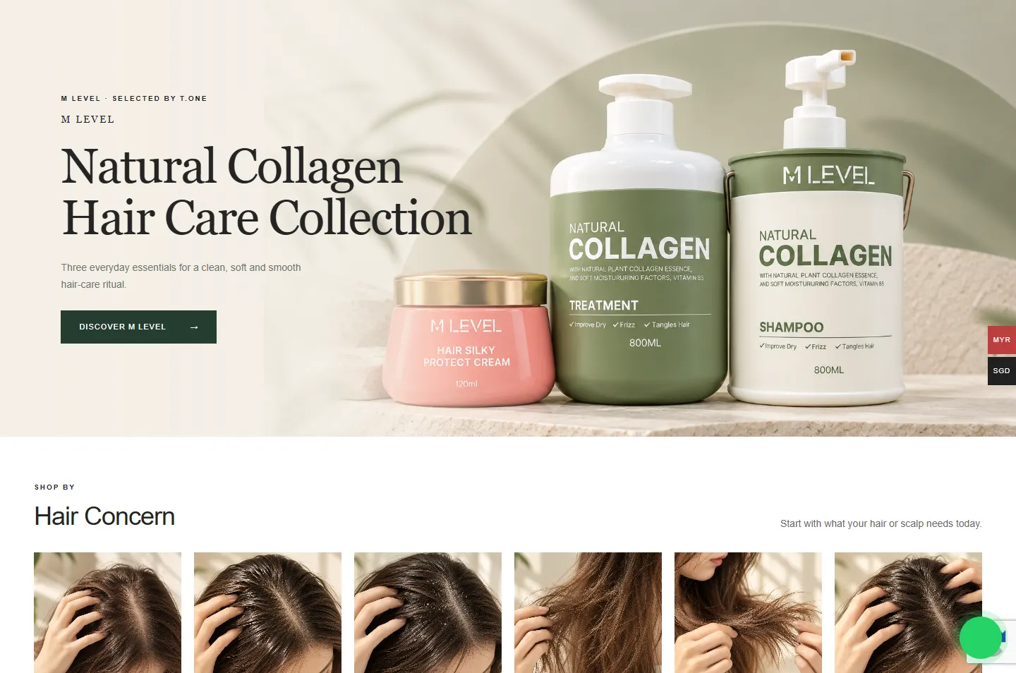
One collection on a stone shelf.
 2
Ask
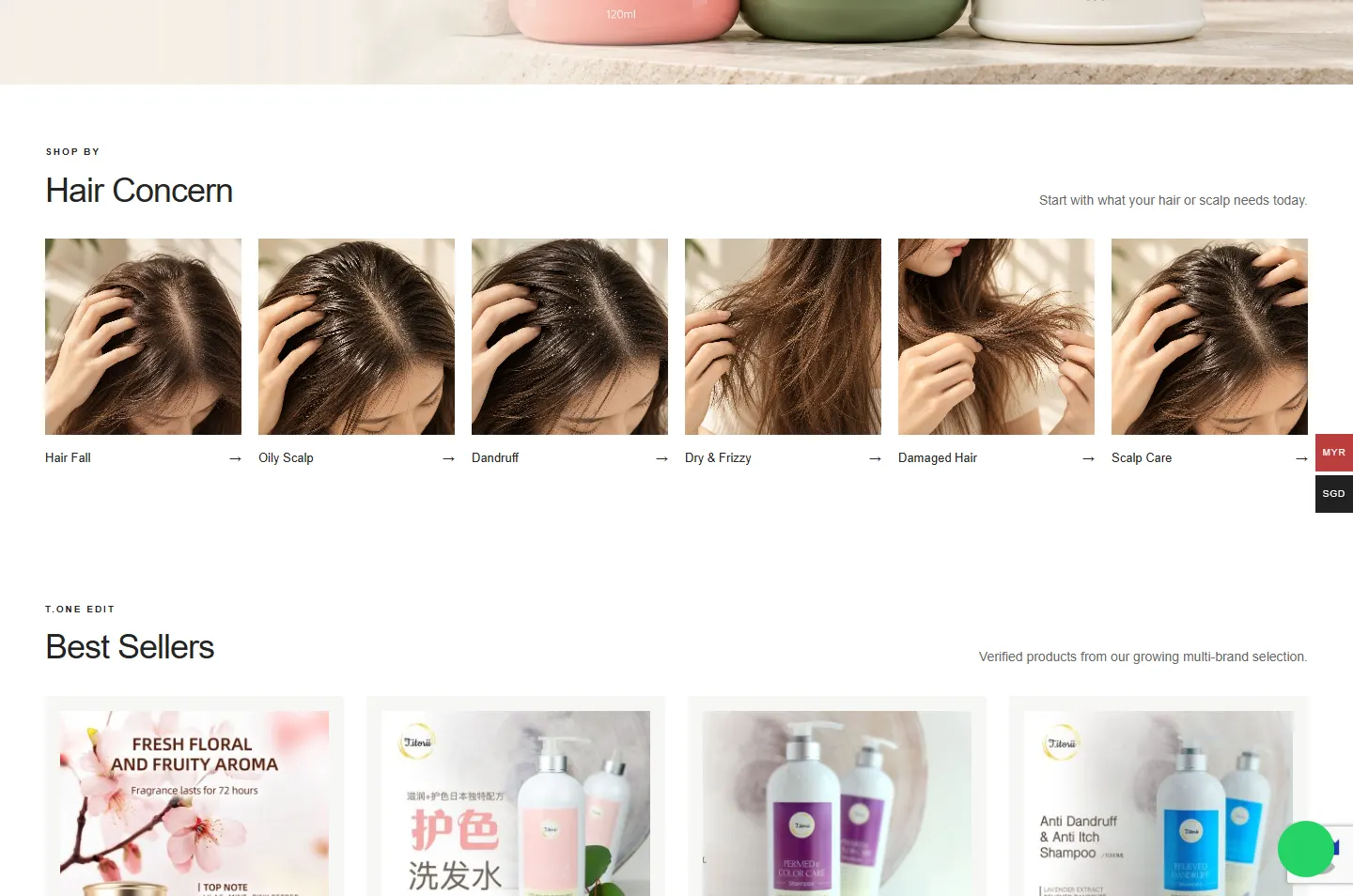
Six hair concerns, in photos.
 3
Shelf
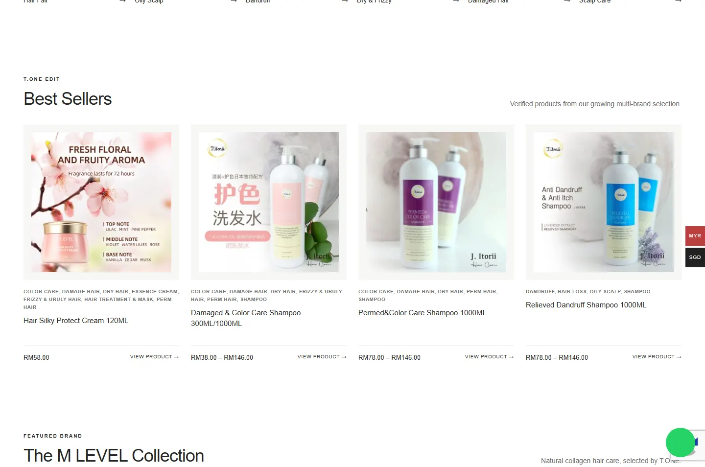
Best sellers, tagged by concern.
 4
Range
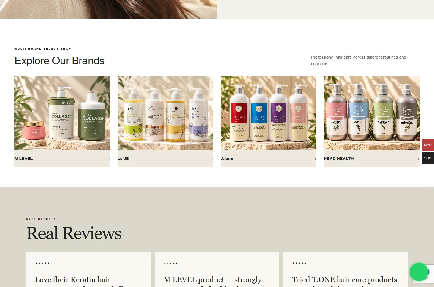
Four brands, one setting.
 5
Trust
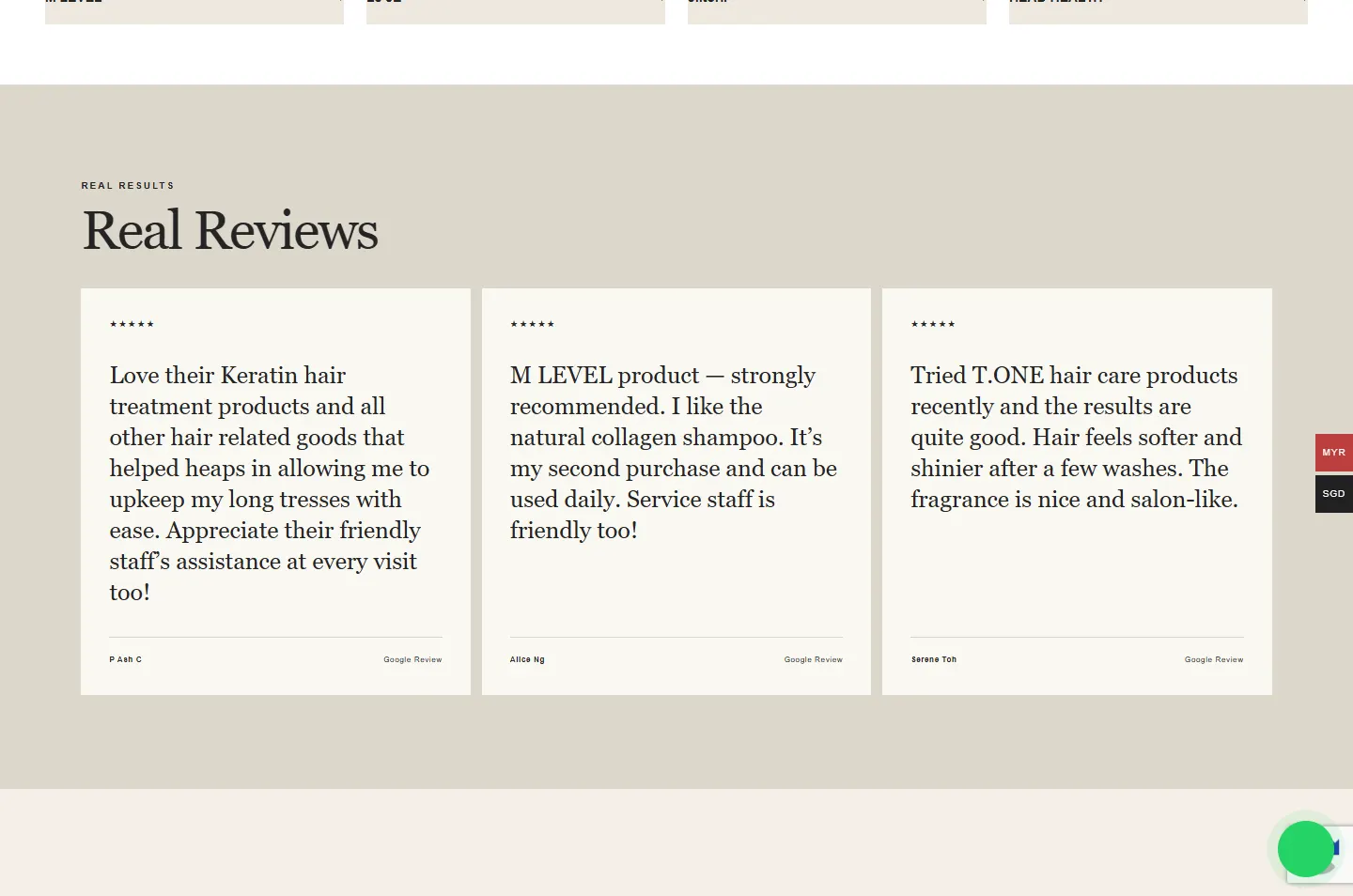
Named Google reviews.
 6
Order
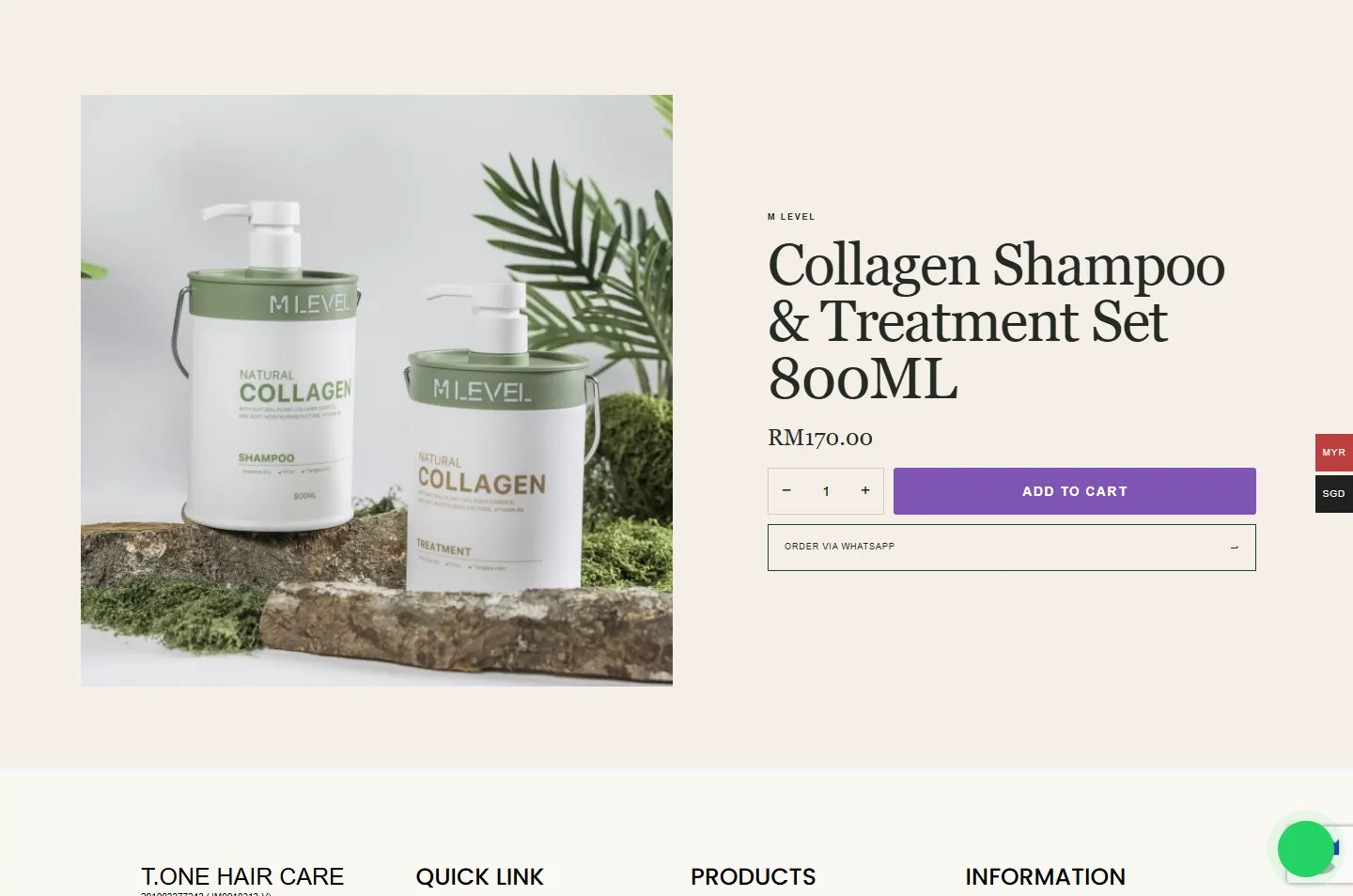
A cart, or a WhatsApp message.
T.ONE offers guidance through its sales consultants. That is the habit the page copies: ask about the customer first, then go to the shelf.
M LEVEL’s olive, cream and coral set the mood in the opening photo. Every other colour on the page stays quiet around them.
Pale stone, warm light and leaf shadows appear in the photos of all four brands. They give products with very different labels one shared home.
A select shop stocks packaging it did not design. The page stays in white, cream and warm stone, so a red label and a lilac label can share one shop without a fight.
#FFFFFFChapters with things to choose#F4EFE6The opening and About#F3F1EBThe two photo bands#DDD7CCThe reviews#242424Headlines and text#263D32The main buttonIn the home page chapters, forest green fills only the first button. Every other button is a thin outline, so the strongest colours in those chapters come in with the products.
Hair care, thoughtfully selected.
Georgia · Sentences: main headlines and reviewsStart with what your hair or scalp needs today.
Arial · The shop: chapter titles, products and prices
Each brand stands on the same pale stone, in the same warm light, with leaf shadows behind it. The labels change from brand to brand and the setting does not, which is what makes four brands read as one shop.

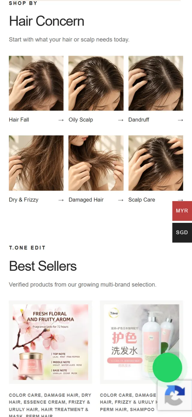
Six photos and six short labels, with no product in sight. Each tile shows hair or a scalp, so visitors can spot their own concern before they read a word.
White chapters hold the things to choose from. The tinted chapters slow the page down with a photo, a sentence or a customer’s words. The bar above runs from the M LEVEL opening to the footer, to scale.
Follow a customer from the M LEVEL shelf to the product page. The highlight marks the part to look at, and the note explains the choice.
The page opens on M LEVEL, labelled “Selected by T.ONE”. There are three products on a stone shelf, a large serif headline and one dark green button.
Why A good shop window shows one thing well, not the whole stock. The visitor sees a shop with taste before any choosing begins.
Right below, the page says “Start with what your hair or scalp needs today.” Six photo tiles follow, from Hair Fall to Scalp Care.
Why A visitor may not know a single brand, but they know their own hair. So the page starts with the one subject every visitor already knows.
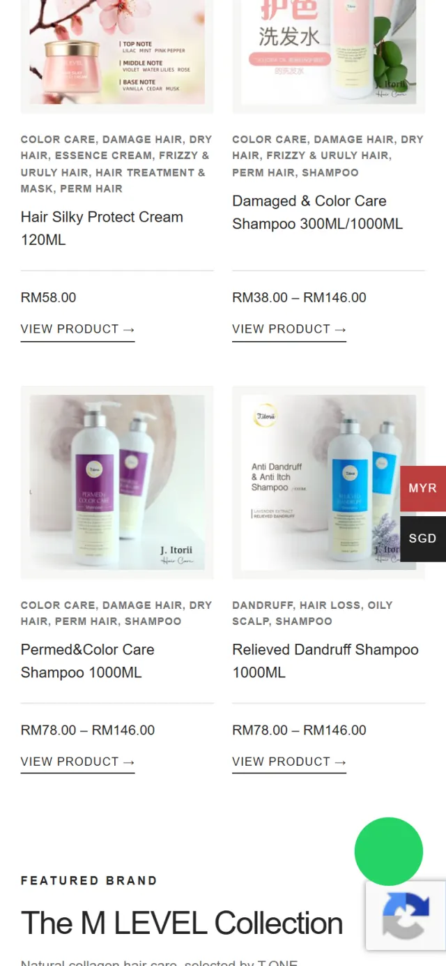
Each best seller lists the hair types and concerns it belongs to, above its name and price. A link leads to the product.
Why The tags carry the hair question onto the shelf. A visitor can see whether a product fits before opening it.
A band with a large photo invites visitors to answer five questions and find a routine. The small line under the button marks this as coming in phase two.
Why A routine finder is the same idea taken further, from one question to five. The page already has a place for it.
Four tiles, one for each brand. Press one and the shop opens with that brand already chosen.
Why A returning customer may know exactly what they like. They should not have to answer a question to find it.
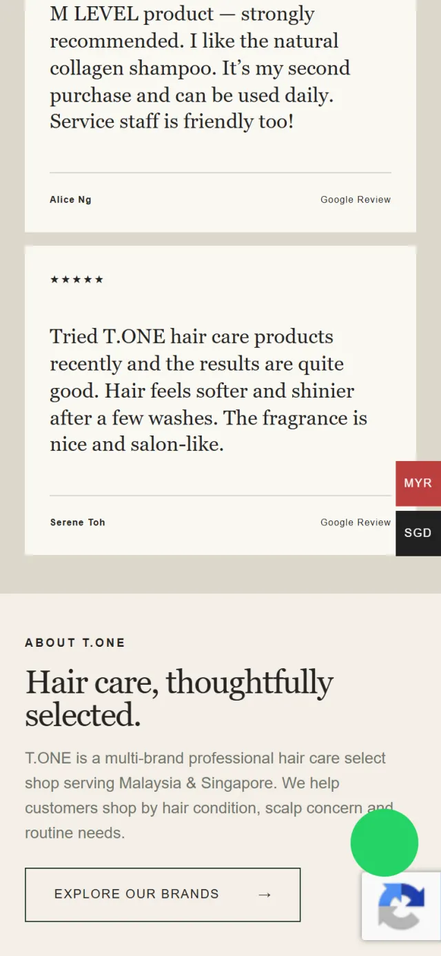
Three Google reviews sit on pale cards, each with the customer’s name, on the only stone-coloured band of the page.
Why After shelves of small labels, the type grows and the pace drops. The size asks the visitor to stop and read.
On a product page, Add to Cart sits right above Order via WhatsApp. The WhatsApp button opens a message that already names the product.
Why Some customers are happy to check out alone. Others want a person first, and the message starts that talk for them.
One collection, one buttonSix hair concernsConcerns above each name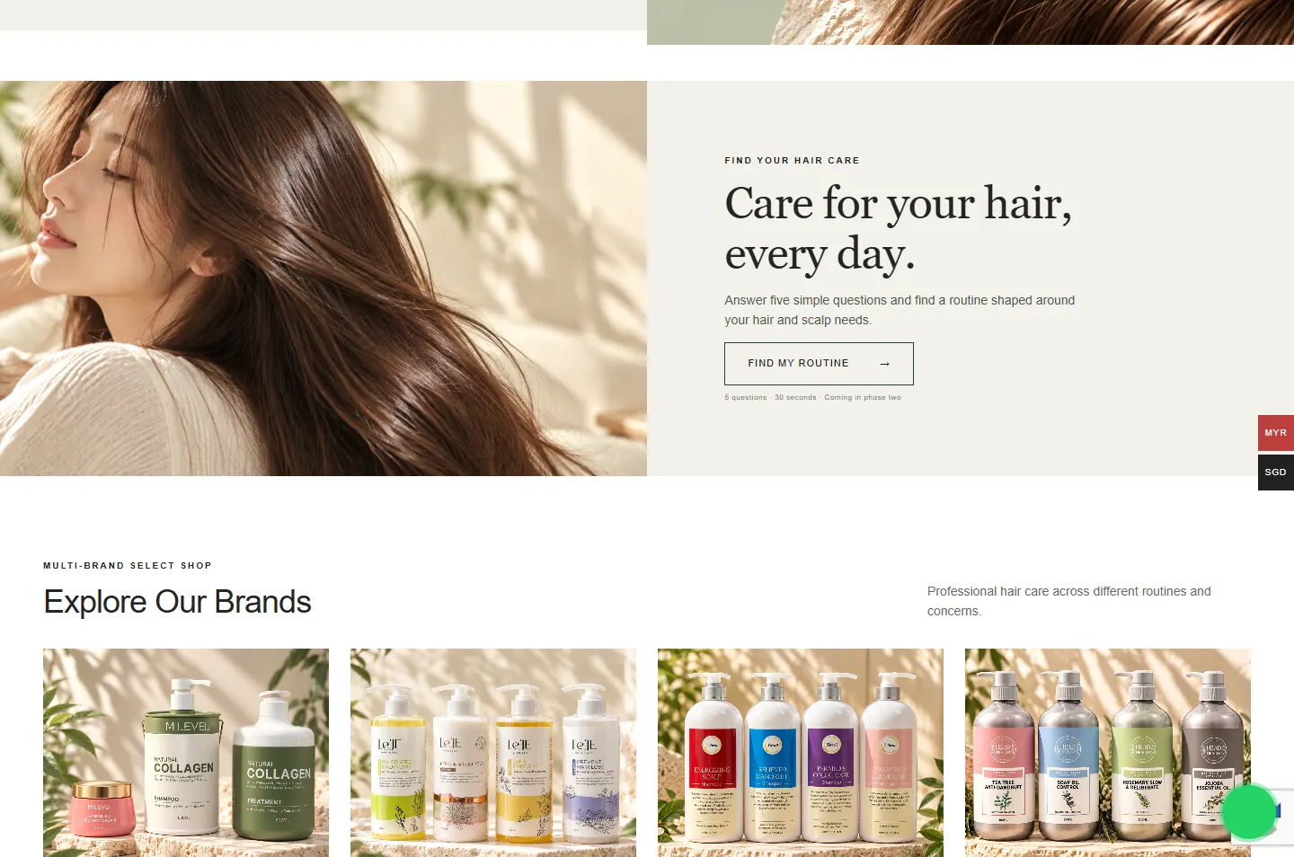 Five questions, in phase twoOpens the brand’s rangeNamed Google reviewsA cart or a conversation
The page gets longer on a phone, so the chapters were arranged to keep choices close together.
Behind the pale pages is a working shop with 82 products. These parts handle the ordering, the prices and the questions that come after the browsing.
Order via WhatsApp opens a message that names the product. A green button also stays on screen as visitors move around.
A switch on the side of the screen changes between Malaysian ringgit and Singapore dollars.
Tabs for each product type, a brand filter and sorting by price, popularity or rating.
My Account is linked from the footer, so returning customers can sign in from any page.
Delivery terms, refund and return policy, privacy policy and an order guide each have their own page.
The home page describes the site and its page structure in a format Google can read.
Every Potadot project starts by understanding the client's situation before anything is designed. See all seven steps
How T.ONE sells: many brands, consultants who guide, and customers who start from a hair concern.
We kept the words short and put the customer’s concern ahead of the brand names.
We set the pale palette and the stone setting, built the home page around the hair question, then added the brand filter, currency switch and WhatsApp ordering.
Page titles for the shop and its product pages, search data for Google, then launch and support.
Selling more than one brand? Tell Ricky about your shop on WhatsApp at +6011-1142 1029.
We worked out the concept, shaped the content, designed the pages and built the online shop in English, with brand filters, two currencies, WhatsApp ordering and search setup.
A first-time visitor may not know M LEVEL or J.itorii, but they know what they want for their hair. Starting there gives everyone a way in, and the brand tiles are further down for people who already have a favourite.
Some people want to ask before they buy. The button opens a message that already names the product, so the question is half written, and people who need no help can go straight to the cart.
Yes. We start from how your customers choose and how your staff help them at the counter, so the site follows your shop, not a template. Tell us which brands you carry and how customers ask for them, and we will show you how we would approach it.