Look fit for the room
A cluttered website raises a doubt about a supplier to controlled environments. The page itself had to show care and order.
STMTIndustrial supply · Company website
The website for STMT, a Penang trading house that supplies cleanroom products and industrial hardware to manufacturers. Its cleanroom customers work in rooms where nothing gets in without a reason, so the page follows the same rule.
STMT is Sit Tha Mat Thu Sdn. Bhd., a hardware trading company based in Penang that supplies cleanroom products and industrial hardware to manufacturers across Northern Malaysia. Potadot designed and built its website in English. The home page is run like a cleanroom. Two photographs open and close it, and between them seven chapters share one pale surface, with red as the only marking colour. The order follows the way a manufacturer checks a new supplier: who are you, what do you carry, why you, what is certified, do you know my industry, who vouches for you, and how do I reach you.
Sit Tha Mat Thu Sdn. Bhd., known as STMT, is a hardware trading company based in Butterworth, Penang. It serves local manufacturers and multinationals across Northern Malaysia, and its team comes from a manufacturing background.
The range runs from wipers, masks and gloves to fasteners, sensors and inspection tools, along with custom-engineered parts. The site names semiconductor, medical device, pharmaceutical and electronics work among its experience, and its featured brands include 3M, Ansell, Bosch and Mitutoyo.

Nobody buys cleanroom wipers on impulse. A purchasing or engineering team wants to know what a supplier carries and whether it belongs near a controlled process. The site has to answer that before anyone picks up the phone.
A cluttered website raises a doubt about a supplier to controlled environments. The page itself had to show care and order.
STMT calls itself one-stop, from masks to fasteners to gauges. A visitor should see that range in one chapter, without opening a menu.
The reviews on the site come from engineering, manufacturing, procurement, operations and purchasing staff. The page has to make sense to all of them.
Certification, industries, reviews and brand names are what a new vendor is judged on. Each needed a chapter, not a line in a paragraph.
A cleanroom works by control. What comes in is decided, and everything has its place. STMT’s cleanroom customers live by that rule every day, so we let it run the page: one pale surface, one colour for marking what matters, and one card for every product group. Anything that did not help a buyer check a supplier stayed outside.
 1
Enter
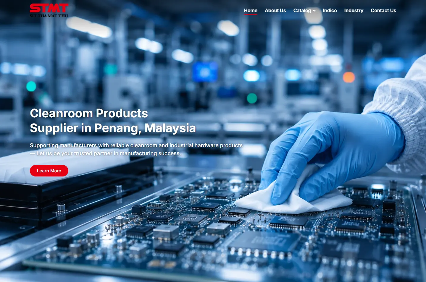
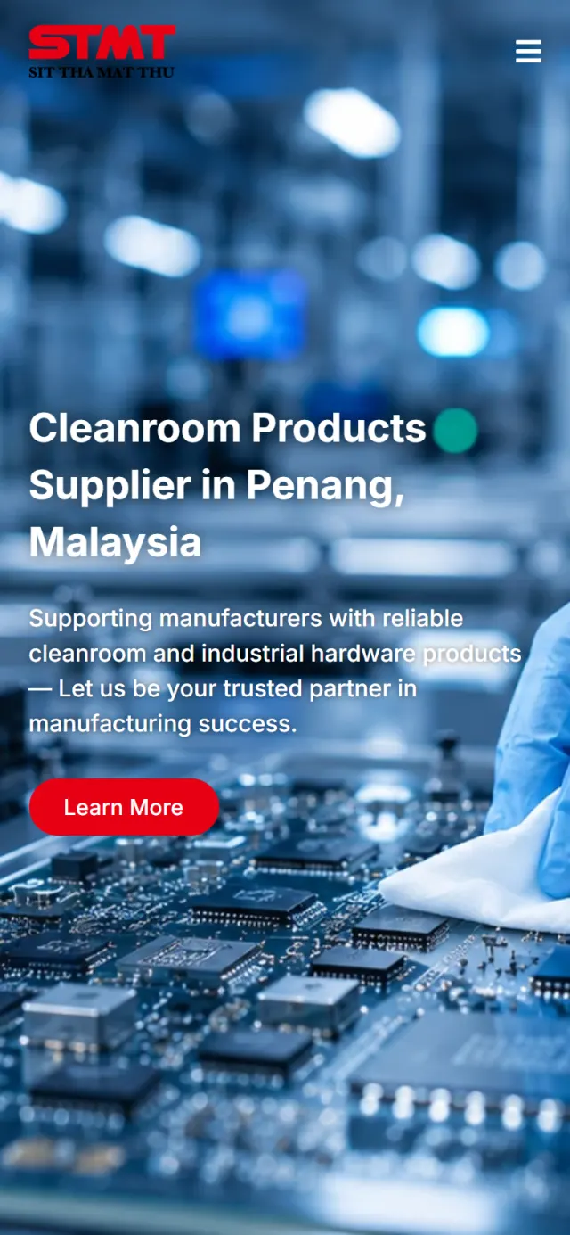
A gloved hand, a wipe and a circuit board.
 2
Supply
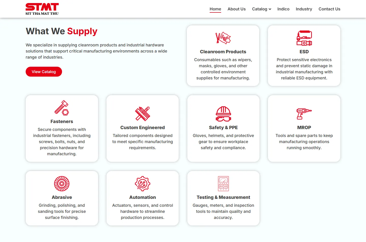
Nine product groups, one card each.
 3
Check
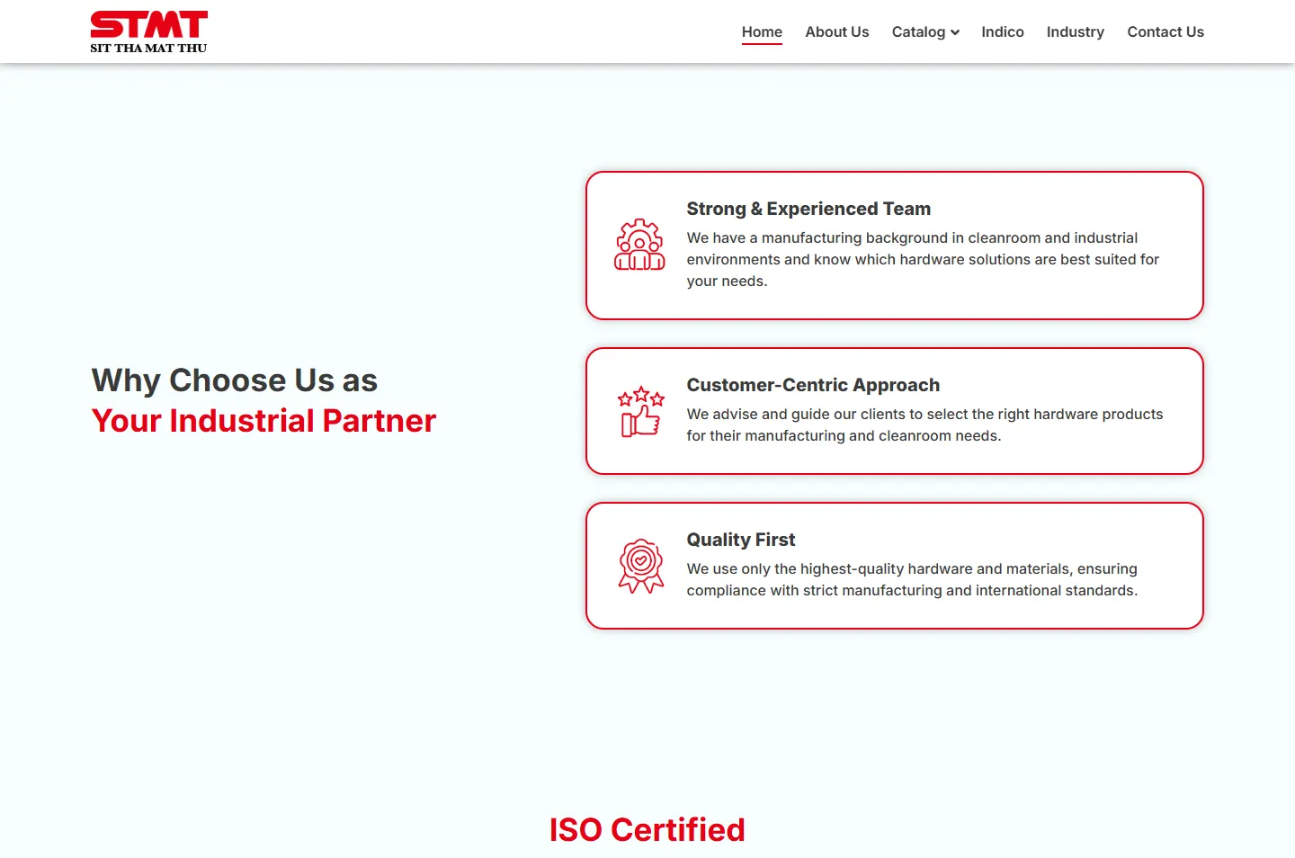
Three reasons, then the ISO chapter.
 4
Match
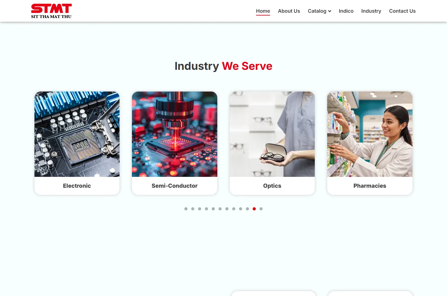
Twelve industries in one slider.
 5
Verify
Client reviews and eighteen brand logos.
 6
Call
Phone, email, hours and address.
A cleanroom is pale, bright and orderly. That is why all the chapters sit on a near-white surface with a trace of blue, with no coloured bands between them.
A heavy red STMT above the company name in black. That red is the one strong colour the design adds, and it goes on the buttons, the icons and the key words of each heading.
The order comes from how a manufacturer checks a new supplier: who are you, what do you carry, why you, is it certified, do you know my industry, who vouches for you, and who do I call.
The page runs on a near-white surface and charcoal text. Red marks the key word in each heading, the icons and the buttons.
#F8FEFFThe surface of every chapter#FFFFFFCards and logo tiles#3A3A3AHeadings and reading text#E70013Buttons, icons and key heading wordsIn the chapters between the photographs, red covers less than 2% of the screen. It stands out because so little else does. The blue comes from the two photographs, not from the design.
Cleanroom Supply Solutions
Inter · Headings and card titlesTrusted by Manufacturers Across Northern Malaysia
Montserrat · The reviews heading and the copyright lineConsumables such as wipers, masks, gloves, and other controlled environment supplies for manufacturing.
Inter · Reading text and buttons
A blue glove wiping a circuit board says cleanroom and electronics before a word is read. The blue returns in the last photograph, so the page opens and closes on the same colour.
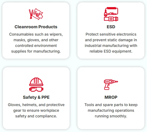
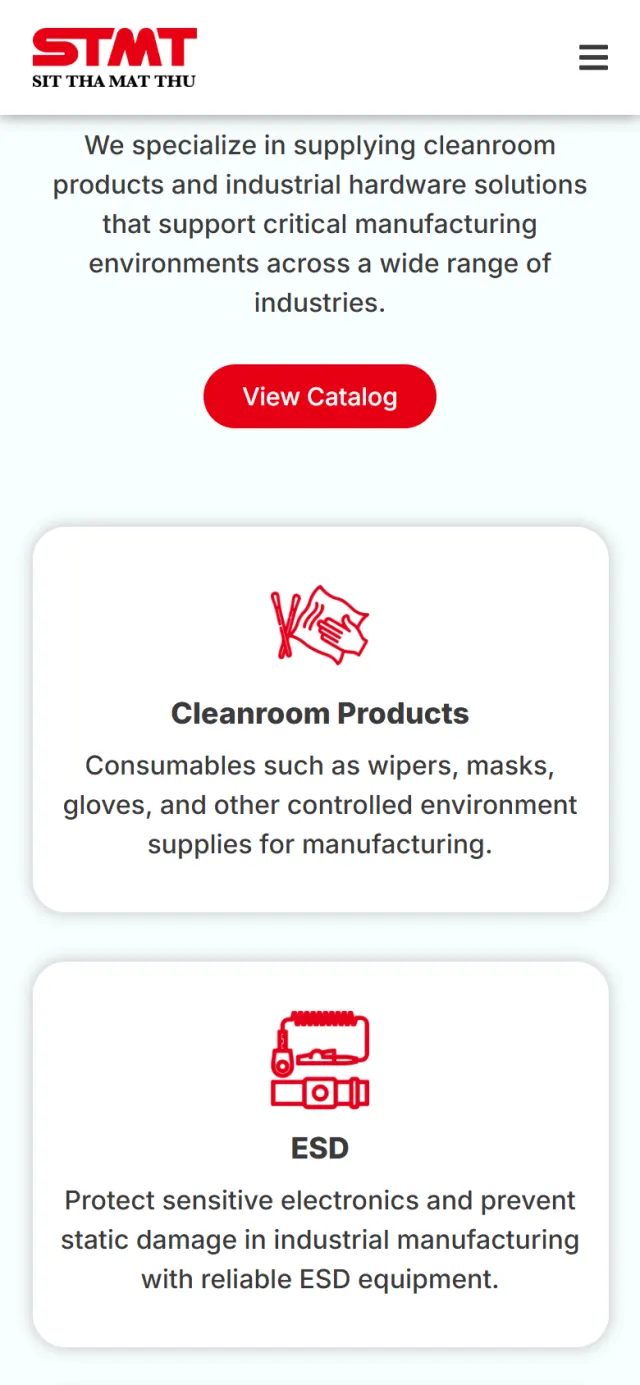
Every product group gets the same white card: a red line icon, a bold name and a short description. The icons are what a buyer scans, so the range reads at a glance.
The bar above is the real page, to scale. Long pages usually swap colour bands to break up the scroll. This one keeps all seven chapters on one surface, and the two photographs act as the doors in and out.
Follow the page the way a purchasing officer would. The highlight shows what to look at, and the note says why it is there.
A full-screen photograph of a gloved hand at a circuit board, with one line over it: Cleanroom Products Supplier in Penang, Malaysia. Under that sit a short sentence and one red button.
Why Product, place and next step are clear before the first scroll. The page title opens with nearly the same words, so the search result and the page agree.
Cleanroom Products and ESD sit up beside the heading. Fasteners, Custom Engineered, Safety & PPE, MROP, Abrasive, Automation and Testing & Measurement follow in the same card design.
Why One-stop is easy to claim. Nine matching cards let a buyer see it in seconds, and View Catalog is right there for anyone who wants more.
Three reasons to choose STMT: a team with a manufacturing background, advice on picking the right product, and quality first. These are the only cards drawn with a red line.
Why The product cards are there to scan. These are there to read, so they look different.
ISO Certified Cleanroom Products is set as a large heading over a wide banner for the Indico range, showing wipes, gloves, a mask and a garment.
Why A buyer in a strict industry looks for this early. A full chapter is hard to miss, and a sentence in a paragraph is easy to miss.
Four picture cards show at a time. Twelve dots stand for the twelve industries on the list, from food and beverage to automotive.
Why A manufacturer wants to see its own industry named. A picture card makes each one quicker to spot than a line of text.
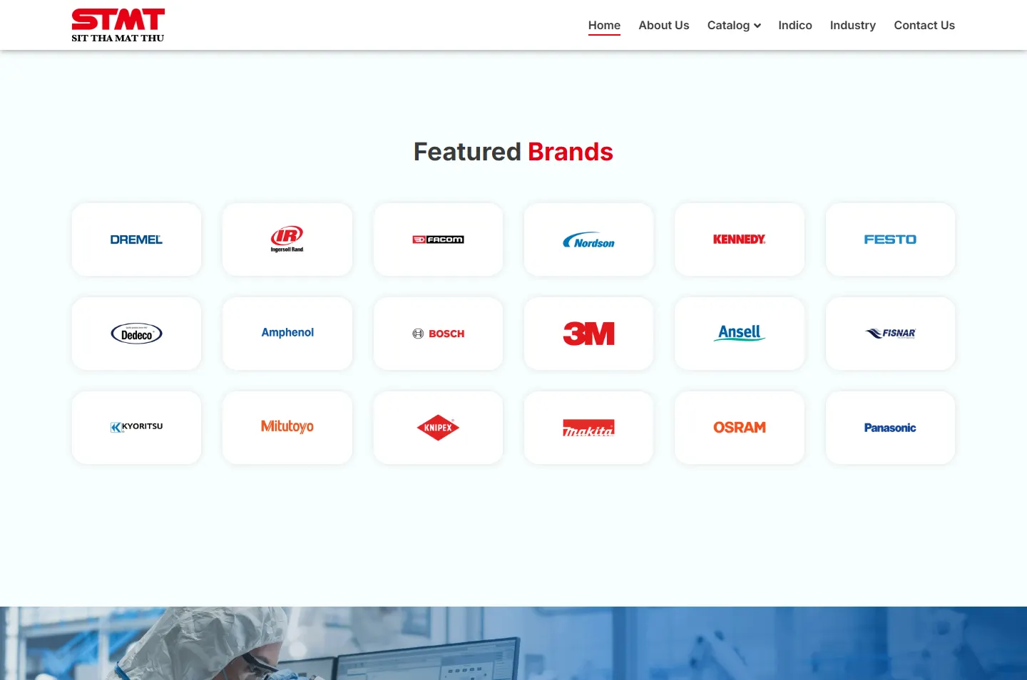
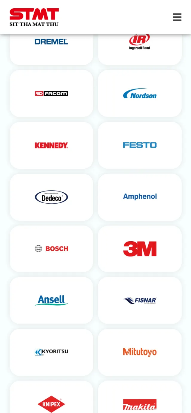
Eighteen brand logos sit in a grid of six by three, each on its own white tile: 3M, Ansell, Bosch, Festo, Mitutoyo, Panasonic and more.
Why These logos bring their own colours, and a buyer already knows the names. Equal white tiles keep the wall in order.
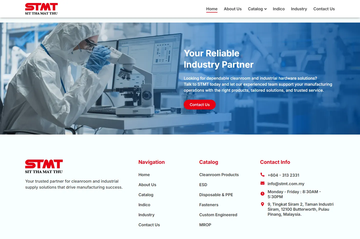
A second photograph closes the page with a single Contact Us button. Below it, the footer lists the phone number, email, office hours and address.
Why After the checks comes one question: who do I call? The answer is all in one place.
Product, place, one buttonThe range in one chapterOutlined in red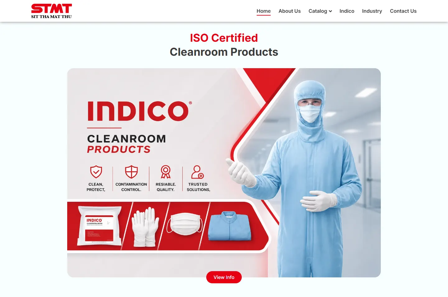 Heading and bannerTwelve industriesEighteen brandsWho to call
On a phone the page gets longer, not messier. The order stays the same. The product cards and brand tiles just take up fewer columns.
Behind the calm look, a few plain decisions help buyers find STMT and find their way around.
The page title and the main heading both say cleanroom products supplier, along with the location.
Structured data describes the organisation, the website and the breadcrumb path in a format Google can read.
Six product categories sit under Catalog in the main menu, each with its own page.
The menu stays at the top as you scroll, clear over the photograph and solid white over the pale chapters.
The phone number is a live link, so a buyer on a phone can ring the office straight away.
The site runs on WordPress with Elementor, so new pages can be added without rebuilding the site.
Every Potadot project starts by understanding the client's situation before anything is designed. See all seven steps
What STMT carries, which industries buy it, and what a purchasing team checks before adding a new vendor.
We sorted the range into clear product groups and wrote the home page around the questions a buyer asks.
We set the pale surface, the red markings and one card style, then fitted the nine product groups and eighteen logos to phone and desktop.
Page titles written around cleanroom products and Penang, structured data added, the catalog linked from the menu, then launch.
Supplying manufacturers yourself? Tell Ricky about your business on WhatsApp at +6011-1142 1029.
We worked out the concept, organised the content, designed the pages and built the site in English, with search setup around what STMT supplies.
STMT’s cleanroom customers work in controlled environments, so an orderly page suits them. It also lets a buyer reach the range, the proof and the phone number quickly.
Because one-stop is STMT’s main point. Showing the range straight away tells a buyer whether STMT is relevant, and the catalog is one press away for anyone who wants the detail.
Yes. Every site starts from the client’s own business and buyers, so yours would have its own idea. Tell us what you supply and who buys it, and we will show you how we would approach it.