Show where it comes from
Pro Eco Health has its own bee farm. That is the strongest thing it can say, so the farm had to be on the home page and not left to an inner page.
Pro Eco HealthHoney and propolis · Company website and shop
The website for Pro Eco Health, a Kuala Lumpur company selling stingless bee honey and propolis. It opens on “A Spoonful Of Nature’s Bliss”, then follows that honey back to the bottle, the farm and the bees.
Pro Eco Health Sdn Bhd sells stingless bee honey and propolis from Kuala Lumpur. Ow Yong Chee Kong started the company on 25 February 2016. Potadot designed and built its website in English, Chinese and Bahasa Melayu, with one online shop. The home page runs the company’s own line, “From hive to jar”, in reverse. It opens on honey running off a wooden dipper, shows the two products, goes back to the farm and the bees, then closes at the shop.
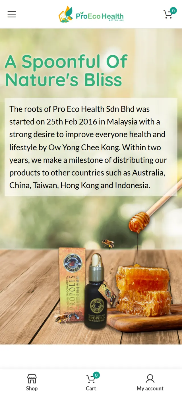
Ow Yong Chee Kong started Pro Eco Health Sdn Bhd on 25 February 2016. Within two years its products had reached Australia, China, Taiwan, Hong Kong and Indonesia. The office is in Warisan Cityview, Kuala Lumpur.
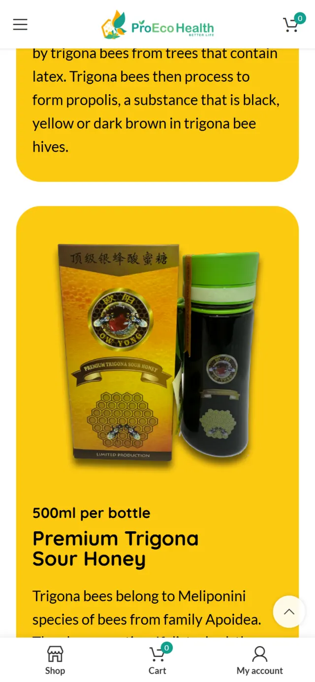
The shop has two signature products under the Ow Yong label: Premium Trigona Sour Honey in a 500ml bottle and Trigona Green Propolis in a 10ml bottle. The contact page also lists five distributors, three in Johor and two in Selangor.

Nobody can taste a bottle through a phone, and “natural” is a word any label can use. The site has to give a buyer better reasons to trust this one.
Pro Eco Health has its own bee farm. That is the strongest thing it can say, so the farm had to be on the home page and not left to an inner page.
Everyone knows honey. Far fewer people know Trigona bees, sour honey or propolis. The site has to explain them in a few plain lines.
Halal is one of the first things many Malaysian food buyers look for. It needed a clear place on the home page, large enough to see at a glance.
The story has to end somewhere people can order. The English, Chinese and Bahasa Melayu home pages each have to read properly, then lead to the same shop.
The company’s own line is “From hive to jar”. That is the order the honey travels, but it is not the order a buyer thinks in. A buyer starts with what is in front of them, then asks where it came from. So the home page runs the line in reverse. It opens on “A Spoonful Of Nature’s Bliss”, then goes to the bottles, the farm and the bees. Each chapter answers the question the last one raises.
 1
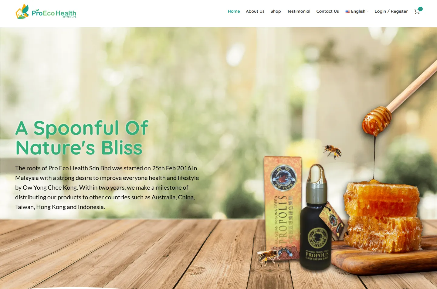
Spoon
Honey runs off a wooden dipper beside the product.
 2
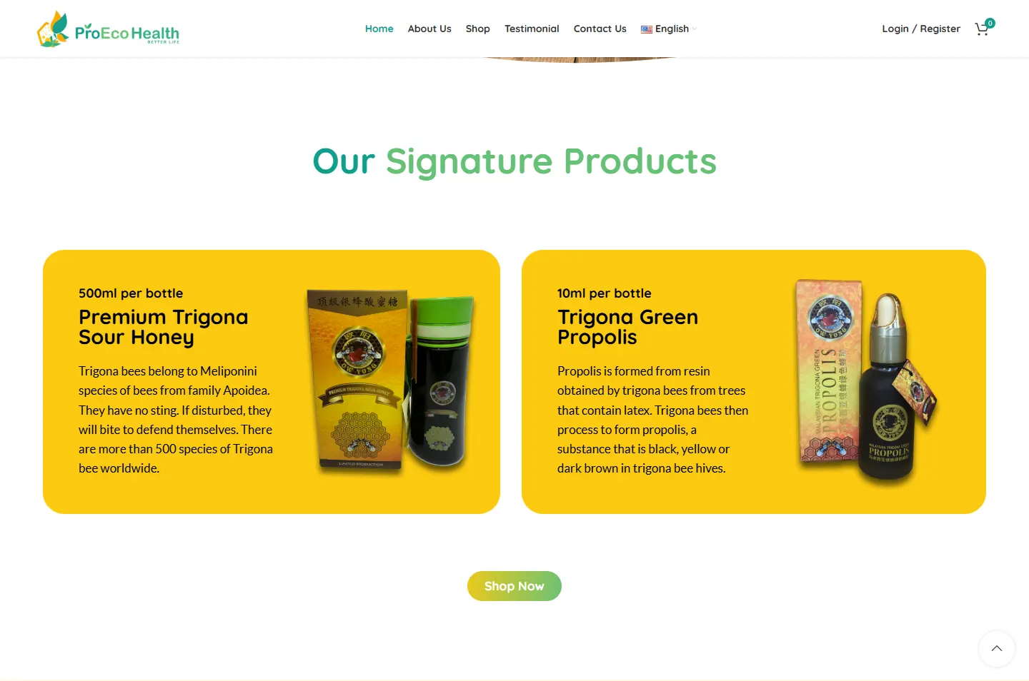
Bottle
Two products on two gold cards.
 3
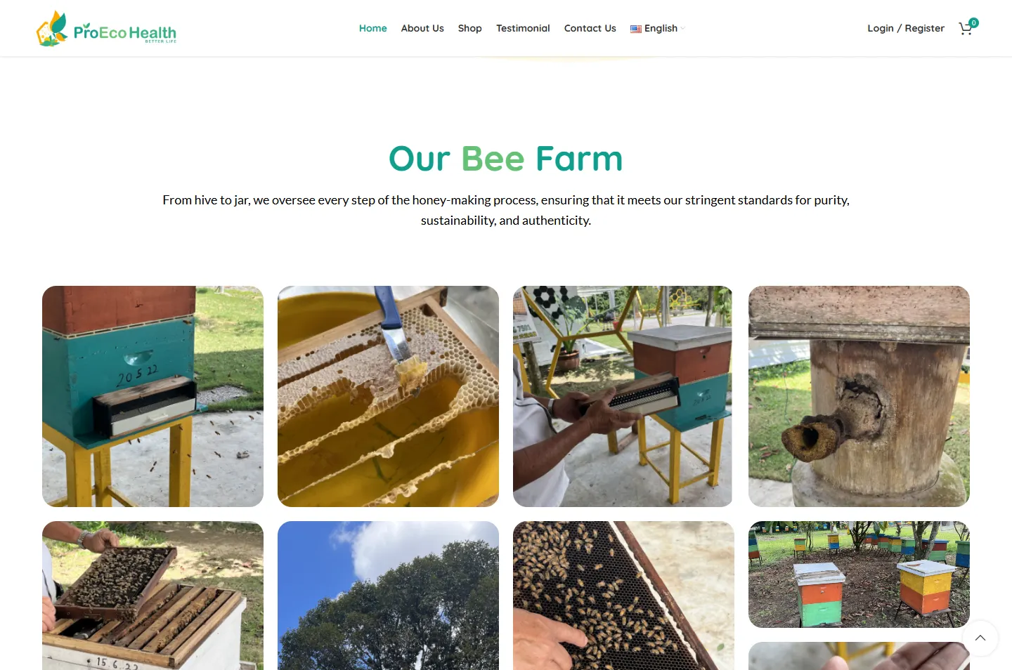
Farm
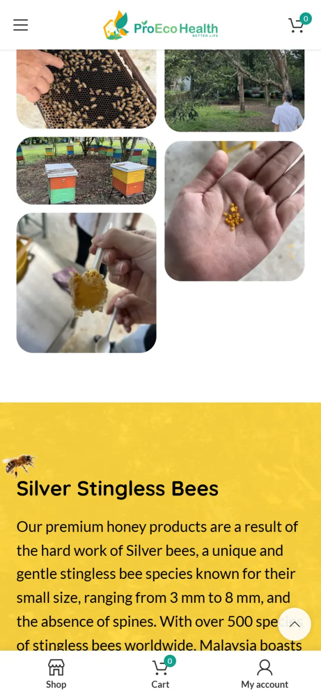
Ten photos of hives, combs and hands.
 4
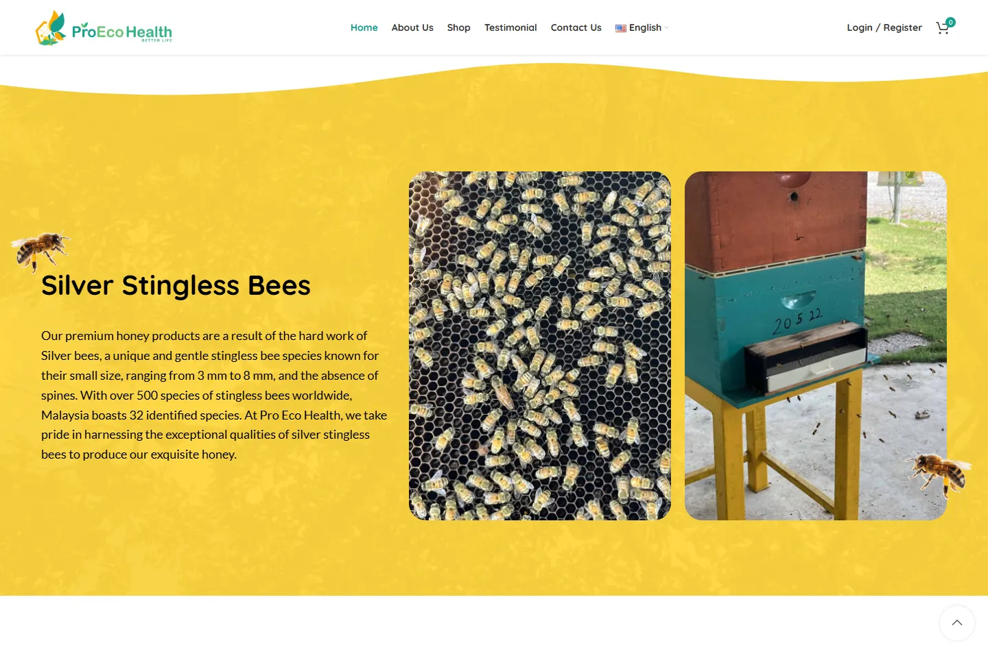
Bees
The silver stingless bee, up close.
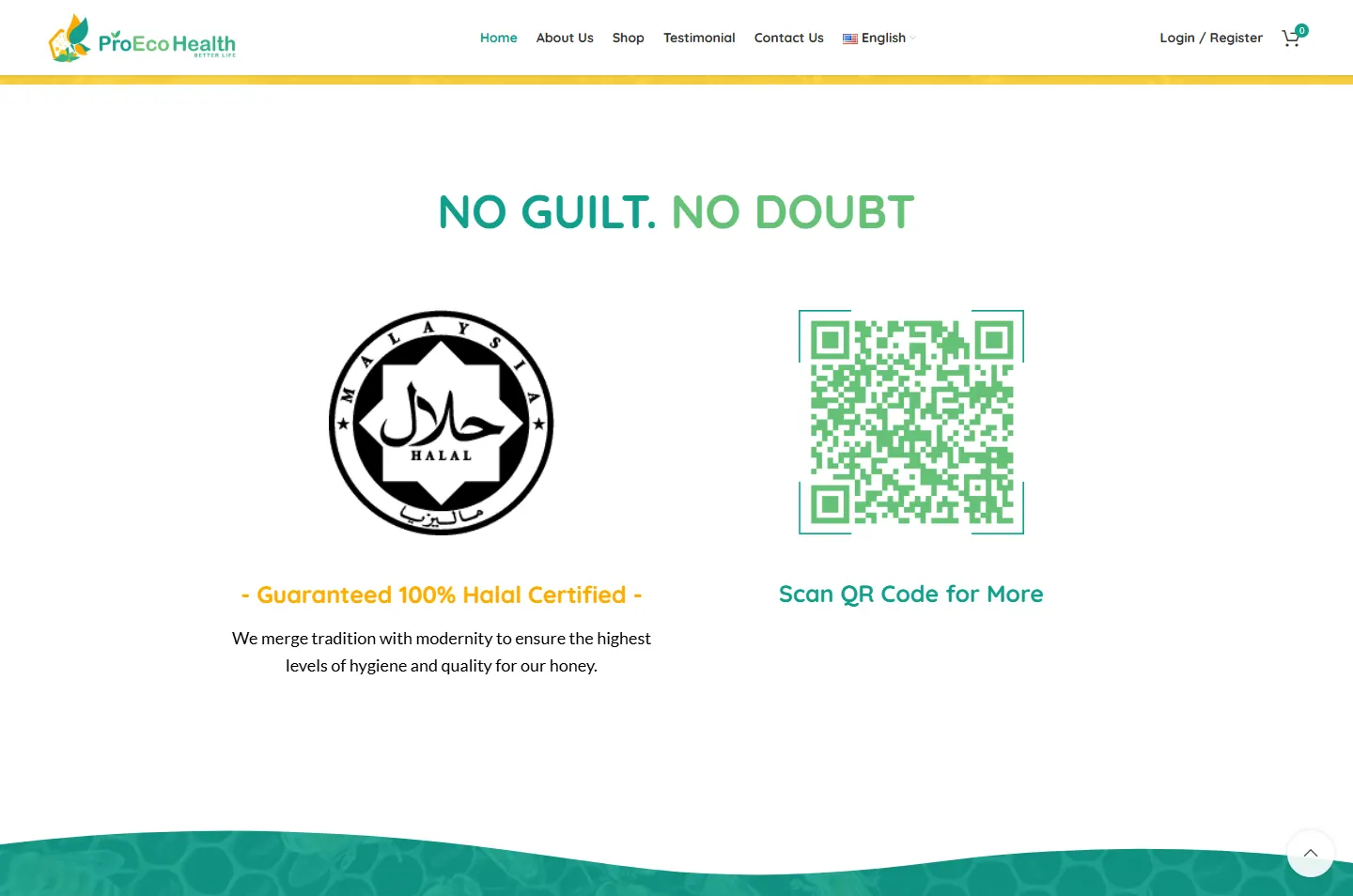 5
Halal
The halal logo, shown large.
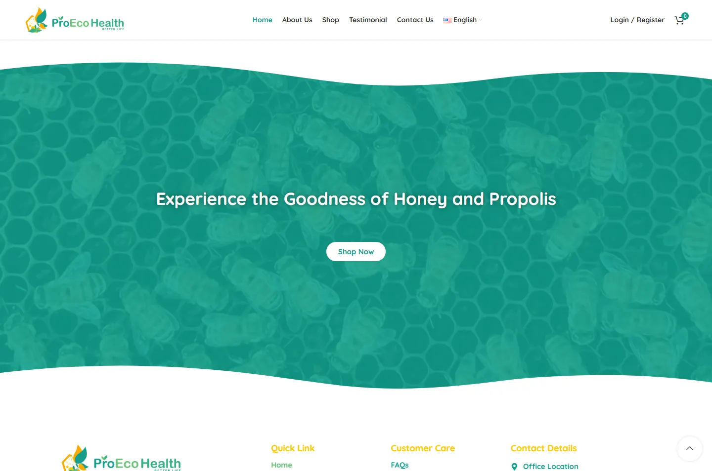 6
Shop
A teal band with one Shop Now button.
The home page says “From hive to jar, we oversee every step of the honey-making process”. A line like that needs showing, so the farm is the tallest chapter on the home page.
A honeycomb hexagon, wings made of leaves, and a rounded wordmark in teal and green. Those colours run through the site, and Quicksand’s round letters carry on from the wordmark.
One hive box in the farm photos is teal on a yellow stand, the same pair as the logo. The farm shows up in the colour bands too: the yellow one holds a faint photo of a durian tree, the teal one a photo of bees on a comb.
Teal and yellow come from the logo, and the same pair turns up in the farm photos, on a teal hive box with yellow legs. Plenty of white keeps the page feeling clean, which matters for something people eat.
#FFFFFFProduct, farm and halal chapters#FFFAE7The honey chapter#FFD63EThe bees chapter#FCCA11Product cards#119F8DHeadings, the closing band#65C177Second colour in headingsFour chapter headings change colour partway through, from teal to leaf green. It is a small touch, and it carries the logo’s two-tone wordmark down the page.
A Spoonful Of Nature’s Bliss
Quicksand · The opening lineOur Signature Products
Quicksand · Chapter headingsFrom hive to jar, we oversee every step of the honey-making process
Lato · Reading text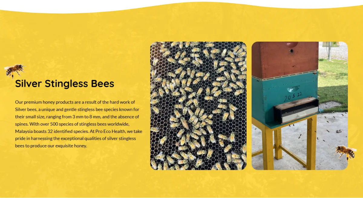
Honey has no corners, so the yellow chapter gets a wavy edge in place of a straight line. Behind the colour sits a faint photo of a durian tree, and a photographed bee rests at each side of the band.
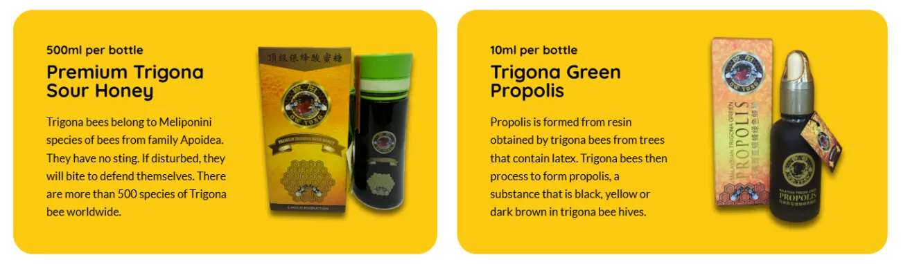
The cards take the gold of the honey box, so pack and card read as one object. The size comes first, then the name, then a few plain lines on the bees or the propolis.
White chapters carry the facts, and colour marks the turns: cream for the honey chapter, yellow for the bees, teal for the close. The farm is the longest stretch on the page, as it should be. The bar above follows the real page, to scale.
Each chapter goes one step further back along the chain. The frame marks the part to look at, and the note beside it explains the choice.
A wooden dipper drips honey onto a stack of comb, with the propolis box and bottle beside it and a garden blurred behind.
Why A table and a garden put the product somewhere real, and being real is what this brand has to prove.
Two large cards carry the range: Premium Trigona Sour Honey and Trigona Green Propolis. Each gives the size, the name and a short note on the bees or the propolis, and one Shop Now button sits below.
Why With two products there is no need for a catalogue. Two large cards make a short range look deliberate and easy to choose from.
Under “Our Bee Farm” comes the line “From hive to jar”, then ten photos in a rounded grid: hive boxes, frames of comb, a durian tree and the hands working among them.
Why A hand lifting a frame out of a hive says more than the word “natural”. These are field photos, not studio shots, and that is why people believe them.
A yellow chapter with a wavy edge names the silver stingless bee. A close-up of bees on their comb sits beside a teal hive box on its yellow stand, with a short note on size and species.
Why Many buyers have never heard of stingless bees. Naming the bee and showing it gives them something to remember, and this is where the walk back ends.
Under “NO GUILT. NO DOUBT” the Malaysia halal logo sits large on white. A QR code of the same size stands beside it, with the words “Scan QR Code for More”.
Why Many Malaysian buyers look for this before they buy, so it gets a chapter of its own and not a small icon in the footer.
A teal band closes the page with “Experience the Goodness of Honey and Propolis” and one white Shop Now button. Behind the colour is a faint photo of bees on a comb.
Why The visitor has now seen where the honey comes from. One button is all that is left to say, and the bees are still in the background when they press it.
Honey, bottle, combThe whole rangePhotos from the farmThe start of the chainLogo and QR codeOne button to the shopSomeone buying honey on a phone should not have to look for the cart. The phone version keeps every chapter and adds a bar for shopping.
The farm earns the trust. These parts let someone act on it.
Two products in two categories, Honey and Propolis, with a cart, a Buy Now button and customer accounts. All three languages lead here.
English, Chinese and Bahasa Melayu sit in one menu at the top. Each version of the main pages has its own address, marked for Google.
Page titles and descriptions name honey and propolis, and the company is described in a format Google can read.
A FAQ page lists ten questions, from placing an order and paying to storing honey.
The contact page lists five distributors, medical halls and herb shops in Johor and Selangor, each linked to Google Maps.
WhatsApp, phone, email and a contact form, with the office address linked to Google Maps.
Every Potadot project starts by understanding the client's situation before anything is designed. See all seven steps
What Pro Eco Health sells, why a buyer should believe it, and what a first-time buyer of stingless bee honey needs to see.
We shaped the company story, the product notes and the farm photos into short chapters for the English, Chinese and Bahasa Melayu pages.
Logo colours and rounded type set the look. Each chapter had to work on phone and desktop, and the shop, cart and accounts had to match.
Page titles, descriptions and company details set up for Google, the three language versions linked, then launch and support.
Selling something customers need to trust? Tell Ricky about your business on WhatsApp at +6011-1142 1029.
We worked out the concept, shaped the content, designed the pages and built the site in English, Chinese and Bahasa Melayu, with one online shop and search setup.
The company’s line is “From hive to jar”, but a buyer starts at the jar. Opening on the honey and then going back to the farm and the bees follows the questions a buyer asks.
Having its own bee farm is the strongest thing this company can show, and photos show it in a way words cannot.
Yes. We start with what your customers need to believe before they buy, then shape the site around that, so yours would have its own idea and its own look. Tell us what you sell and what buyers doubt about it, and we will show you how we would approach it.