Put the price on the car
People comparing rentals look at the daily rate first. Each car needed its price right beside its name, with no need to ask.
Aurora Car RentalCar rental · Company website
The website for Aurora Car Rental in Kuching, Sarawak. Someone arriving in town wants a car, a price and a way to book. So the site has no menu to get lost in, just one straight run from the cars to a WhatsApp chat.
Aurora Car Rental rents out cars in Kuching, Sarawak, with pick-up and return at Kuching Airport and in the town area. Potadot designed and built its website as one English page with no menu. The page runs in a single line: six cars with daily prices, where to collect them, why Aurora, three steps, photos of renters and five common questions. All 15 booking and contact buttons open the same WhatsApp chat.
Aurora Car Rental, whose logo reads Rent Now Car Rental by Aurora, rents out cars in Kuching, Sarawak. Its list covers the Perodua Axia, Bezza, Myvi and Alza and the Proton Saga, starting from RM90 a day.
Renters can take a car by the day, the week or the month, and collect and return it at Kuching Airport or in the town area. The site gives two phone numbers and a WhatsApp button.

Renting a car in a new town is a small decision, made quickly. The site has to answer the first questions and then hand the visitor over to a person.
People comparing rentals look at the daily rate first. Each car needed its price right beside its name, with no need to ask.
A visitor cannot plan a trip without knowing where to collect the car. Kuching Airport and the town area had to be stated plainly.
A rental comes down to which car, which dates and where to meet. The site had to lead straight to that conversation.
Renting from a company you have never met takes some trust. Renter photos, the documents needed and two phone numbers had to be easy to find.
The first picture on the site is a road running through the hills, and the page is built the same way. There is no menu and there are no side pages, so nobody can take a wrong turn. A visitor goes straight down the page, each stop answers one question, and all 15 buttons open the same WhatsApp chat.
 1
Set off
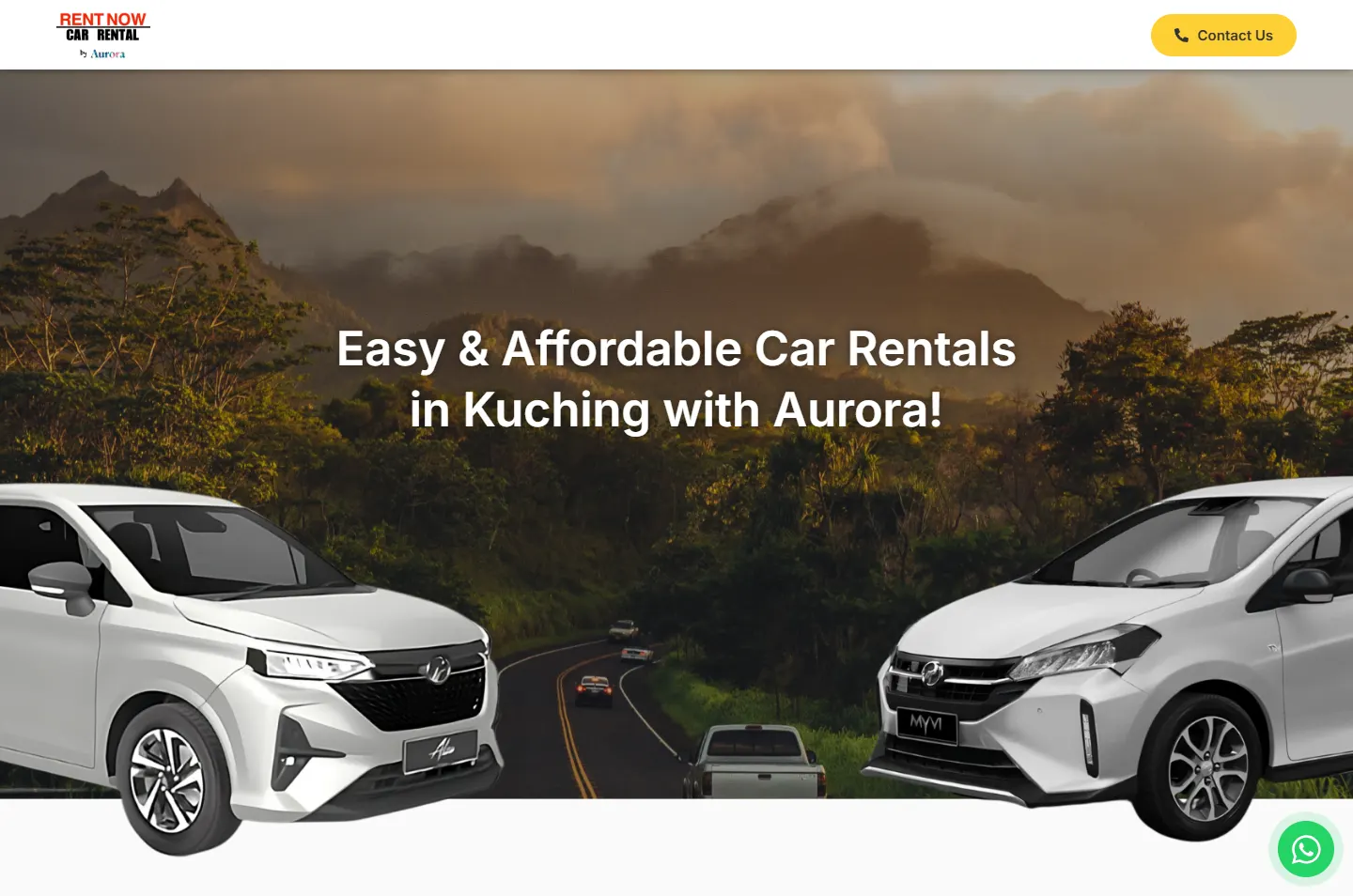
A road, two cars and one headline.
 2
Choose
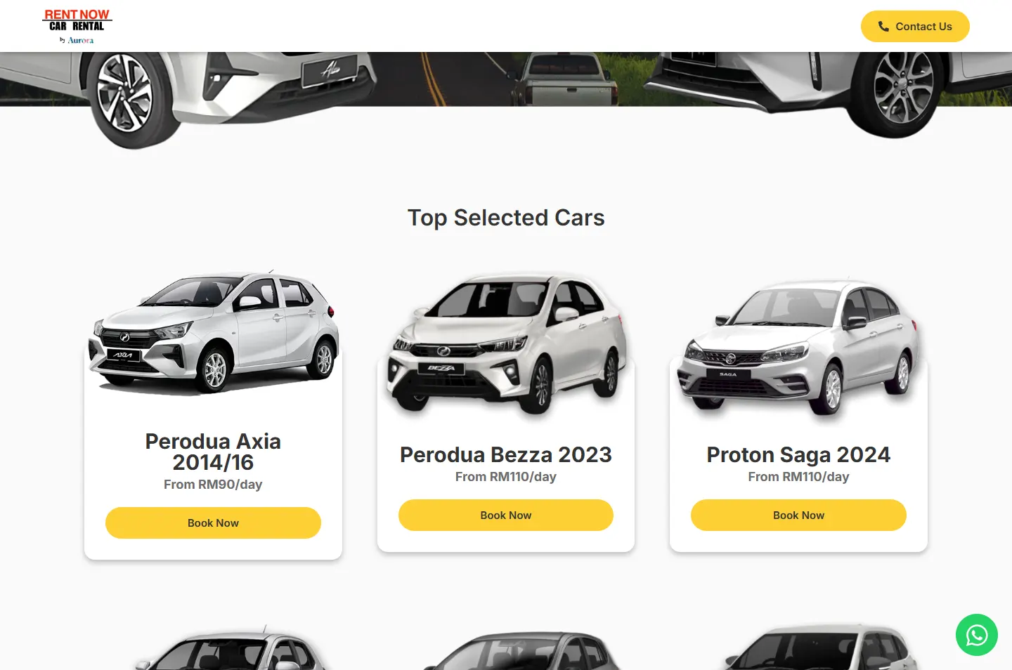
Six cars, each with its daily price.
 3
Collect
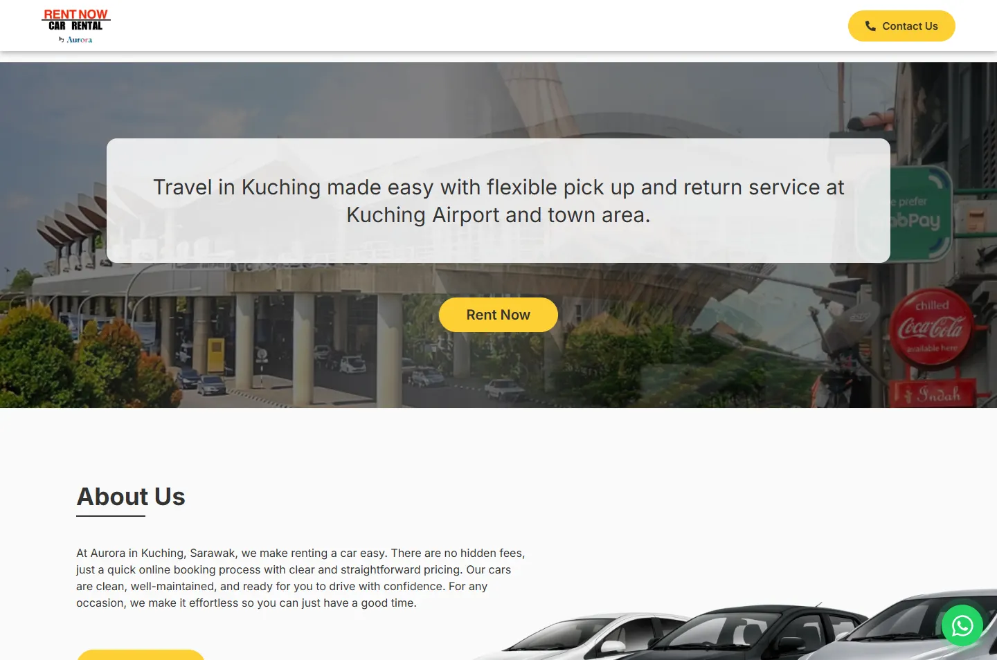
Kuching Airport or the town area.
 4
Decide
Four reasons on four white cards.
 5
Plan
Book, pick up, return.
 6
Arrive
Real renters, five answers, then the chat.
The opening photo shows a road curving away through misty hills. That picture gave the page its shape: one direction and nothing to stop for.
Someone who needs a car in Kuching is often just arriving. They want to know what they can drive, what it costs and where to collect it, so those three things come first.
The road in the photo has a double yellow line down the middle. The page carries yellow the same way, through the buttons, the icons, the steps panel and the FAQ bars.
The page sits on light grey and white, so the photos and the cars stand out. Yellow does the directing, and one typeface, Inter, carries all the words.
#FAFAFAPage background#FFFFFFHeader, car cards, reason cards#FDCF34Buttons, icons, steps panel, footer#333333Headings, text, the renter photo band#25D366WhatsApp buttonsThe red in the logo stays in the logo. Yellow leads the way, and green is kept for WhatsApp.
Easy & Affordable Car Rentals
Inter · Main headlineWhy Choose Aurora?
Inter · Section headingsOur cars are clean, well-maintained, and ready for you to drive with confidence.
Inter · Reading text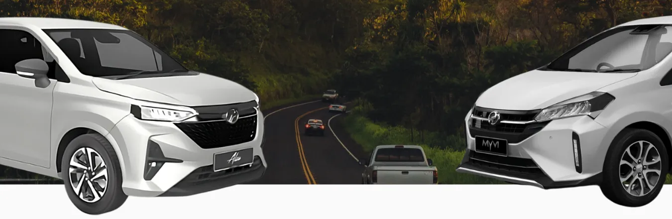
The two cars stand on either side of the road and leave the middle open, so your eye runs down it. Their front wheels drop past the bottom of the photo onto the page, which brings them closer than the hills behind.
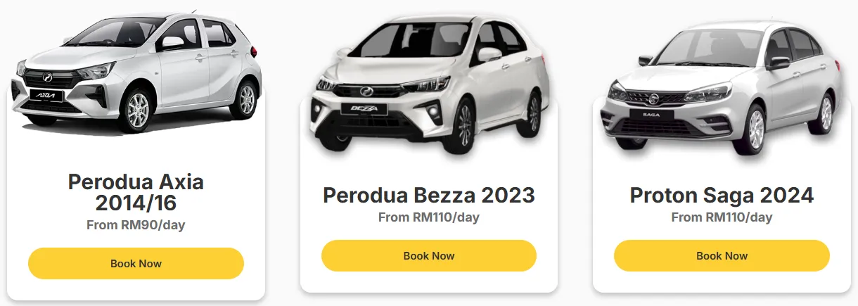
The rate list uses the same trick. Each car breaks out over the top of its white card, with the name, daily price and a yellow Book Now button below. Nothing else competes on the card.
Photo bands and light reading bands take turns, so a long run has landmarks. The bar above is the real page, in order and to scale. Yellow grows towards the end, where the steps panel, the FAQ bars and the footer sit.
Go down the page the way someone arriving in Kuching would. The highlight marks each stop, and the note says why it sits there.
The first screen is a road through the hills with a white car on each side. The headline sits above them and says what this is and where: car rentals in Kuching.
Why A visitor should know in one look that this is about cars in Kuching. The road also sets the direction for everything below it.
Six cars run in rows of three. Each card has a picture, the model and year, a daily price and a yellow Book Now button.
Why The daily rate is what renters compare first. With the price on the card, nobody has to send a message just to find it out.
One sentence on a pale panel: pick-up and return at Kuching Airport and in the town area. A yellow Rent Now button sits below it.
Why A visitor needs to know this before choosing. The photo says it too, with the airport on the left and a town street on the right.
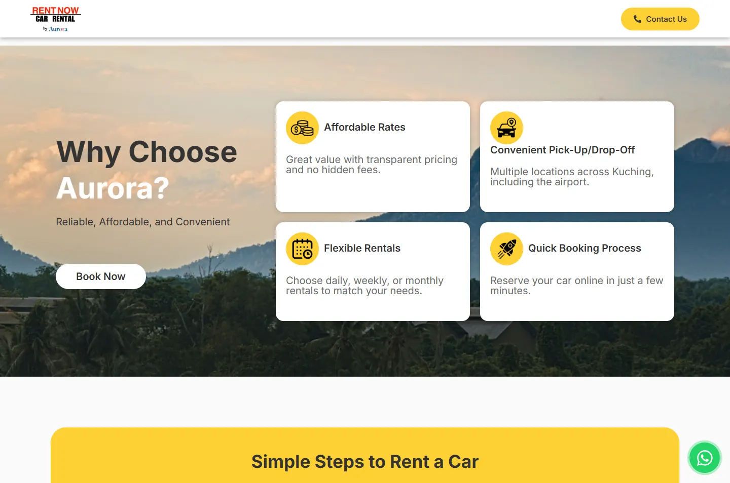
Over a photo of hills under a warm sky, four white cards cover rates, pick-up and drop-off, rental periods and booking. Each has a round yellow icon.
Why These are the doubts people have about a rental company they do not know. Short cards can be read in passing, and the visitor keeps moving.
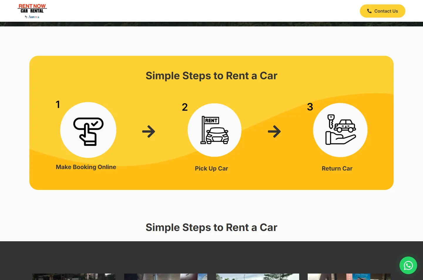
Make Booking Online, Pick Up Car, Return Car. Three round icons with numbers and arrows, on a yellow panel with a deeper yellow wave running through it.
Why It shows how short the whole thing is. Someone who has never rented a car can see the full journey at a glance.
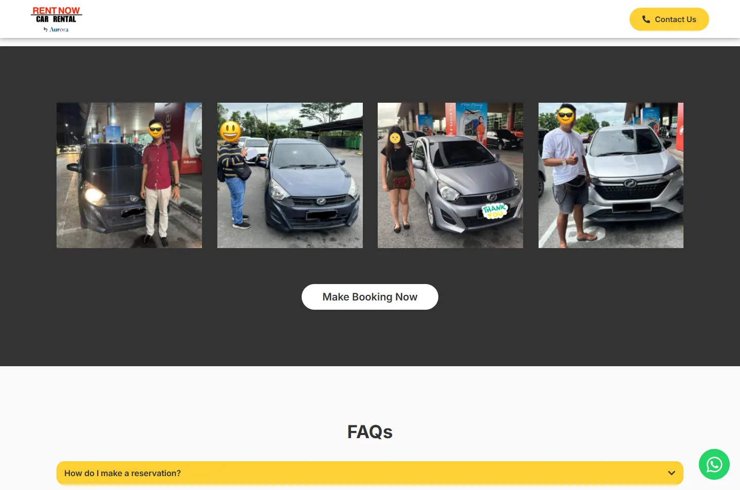
A dark band holds a sliding gallery of seven renter photos, some with airline banners behind them. Faces are covered with stickers, and a white Make Booking Now button sits underneath.
Why Clean cut-out pictures show the range. Ordinary snapshots show that people really do collect these cars. The dark band also gives the long run a pause.
Five yellow bars open to answer questions on booking, documents, driving outside Kuching, extending a rental and returning elsewhere. A green WhatsApp button sits right below.
Why Anyone with a doubt left finds the answer here, and the next thing they see is the way to reach a person.
Two cars, one open roadModel, price, buttonAirport and townRates, pick-up, periods, bookingBook, pick up, returnRenters with their cars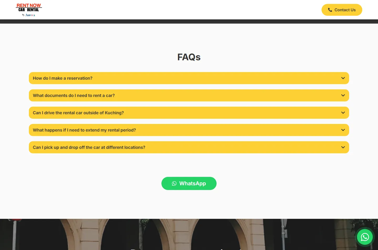 Five answers, one button
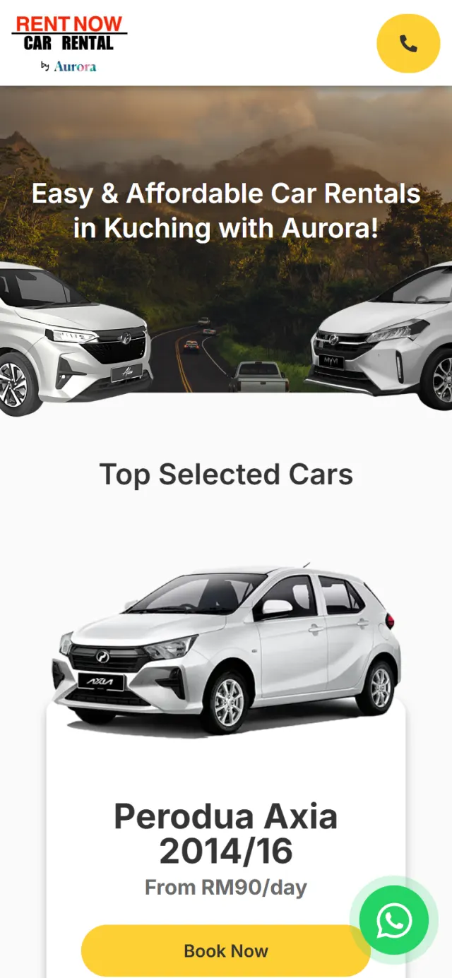
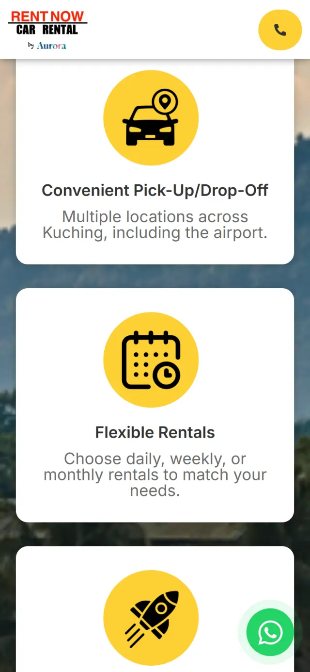
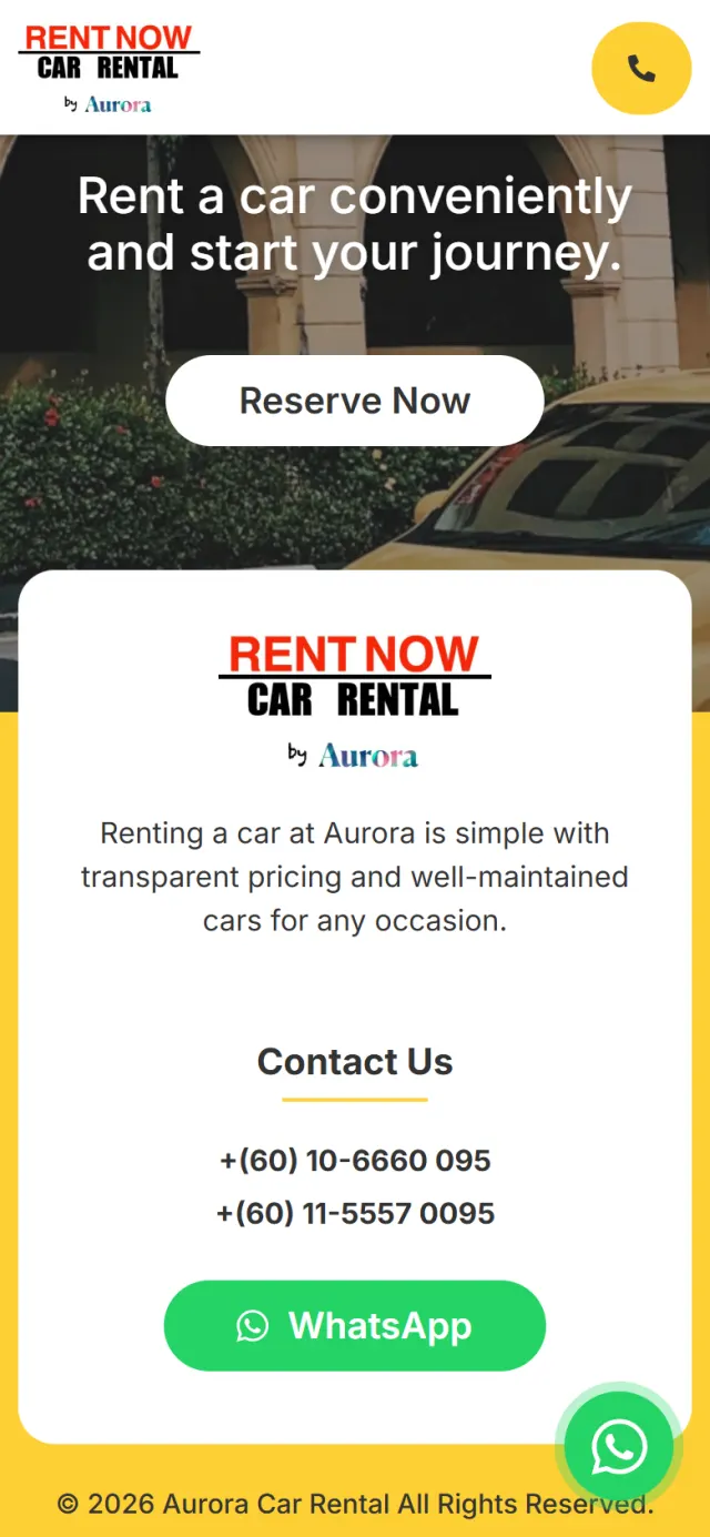
On a phone the page keeps every stop in the same order, one column wide, so the straight run gets even straighter.
Most of these are easy to miss. They keep the way to the chat short, and they tell Google what the page is about.
Each WhatsApp link opens the chat with an opening line already typed, so the visitor only has to press send.
The Contact Us button in the header and the round WhatsApp button stay on screen as you scroll.
Both phone numbers in the footer are call links, for anyone who would rather talk.
The page title reads Kuching Car Rental, and the page description mentions pick-up and return at the airport.
The five FAQ answers are also set out as structured data, so Google can read them as questions and answers.
People in the gallery have their faces covered with stickers, and number plates are blocked out.
Every Potadot project starts by understanding the client's situation before anything is designed. See all seven steps
Who rents a car in Kuching, what they ask first and how Aurora takes a booking.
Short lines for the rate list, the pick-up service, the three steps and the five common questions.
The road photo, the cut-out cars and the yellow set the look, and each stop was built for phone and desktop.
Page title, description and FAQ data set up for Kuching searches, then launch and support.
Running a rental or service business? Tell Ricky about it on WhatsApp at +6011-1142 1029.
We worked out the concept, prepared the content, designed the page and built the site in English, with search setup and WhatsApp links throughout.
The page exists to bring a visitor to WhatsApp ready to book. A menu would only add turn-offs, so the header keeps a single Contact Us button.
A rental comes down to the car, the dates and the place to meet, and a chat settles those easily. The page has no booking form. The visitor sends the details, and Aurora’s team confirms the booking.
Yes. Every site starts from the client’s own business and customers, so yours would have its own idea, but the same thinking applies. Tell us what you rent or sell, and we will show you how we would approach it.