Make appliances feel at home
A floor washer normally lives in a cupboard. The site had to show it as something you would not mind leaving out.
QuumaHome appliances · Online store
The website and online store for Quuma, a home appliance brand based in Johor. Before it shows a price, it shows a room, so a floor washer gets the kind of look you would give a chair.
Quuma is a home appliance brand operated by QUUMA SDN BHD, with its office and warehouse in Iskandar Puteri, Johor. Potadot designed and built its website and online store in English. The home page treats appliances like furniture. A floor washer rests in a calm living room on the first screen, the three product ranges appear as three rooms, and the products then stand alone on pale grey, like pieces on display. On desktop, search, cart and account stay in the header all the way down.
Quuma is a brand operated by QUUMA SDN BHD (1504399-W), with its office and warehouse in Taman Nusa Idaman, Iskandar Puteri. It sells online in three ranges: Kitchen Appliance, Home Appliance and Personal Care.
The home page features a BBQ grilling system, an All in 1 floor washer, a hair dryer and vacuum food storage. Among the three things the brand says it stands for, “Elegant Design” sits beside technology and quality. That gave the website its direction.

Appliances are usually sold on what they do. Quuma also wants its products to add to the look of a home, and someone buying online cannot walk up and judge that in person. The site has to do it for them.
A floor washer normally lives in a cupboard. The site had to show it as something you would not mind leaving out.
Visitors need to find a product, see the price and reach the cart. The calm look could not get in the way of that.
A perfect room only goes so far. Actual users had to be on the page too, speaking for themselves.
Buying online means paying a company you have not met. The company’s name, address, phone number and policies all needed a clear place.
Furniture is sold in rooms. You see it, you picture it at home, and only then do you check the price. Quuma’s own words point the same way: “Creating appliances that enhance your home’s aesthetic.” So the page runs like a walk through a furniture showroom: rooms first, then pieces on display, then other people’s homes.
 1
Living room
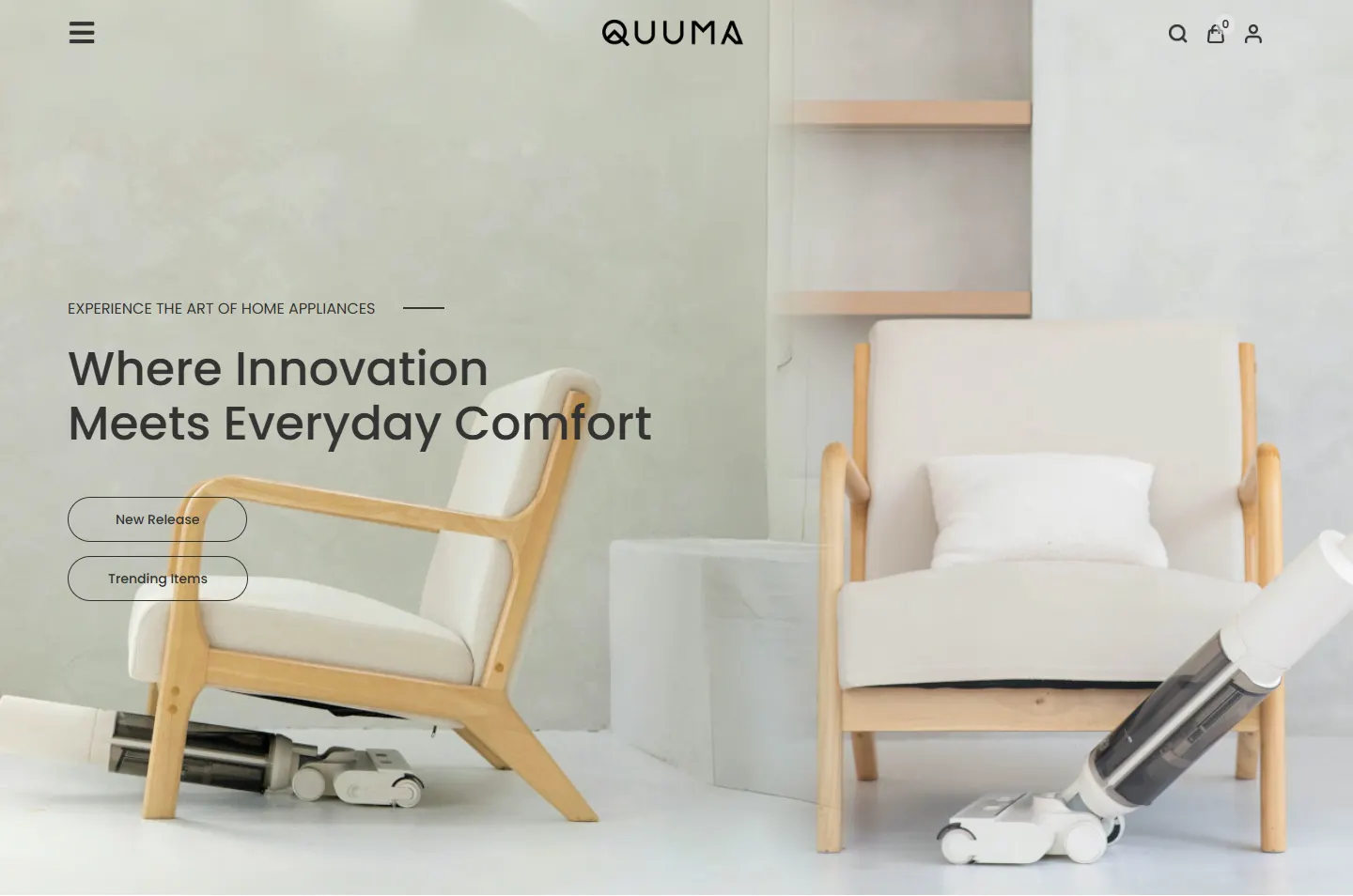
A floor washer rests in a room, with one headline and two buttons.
 2
Three rooms
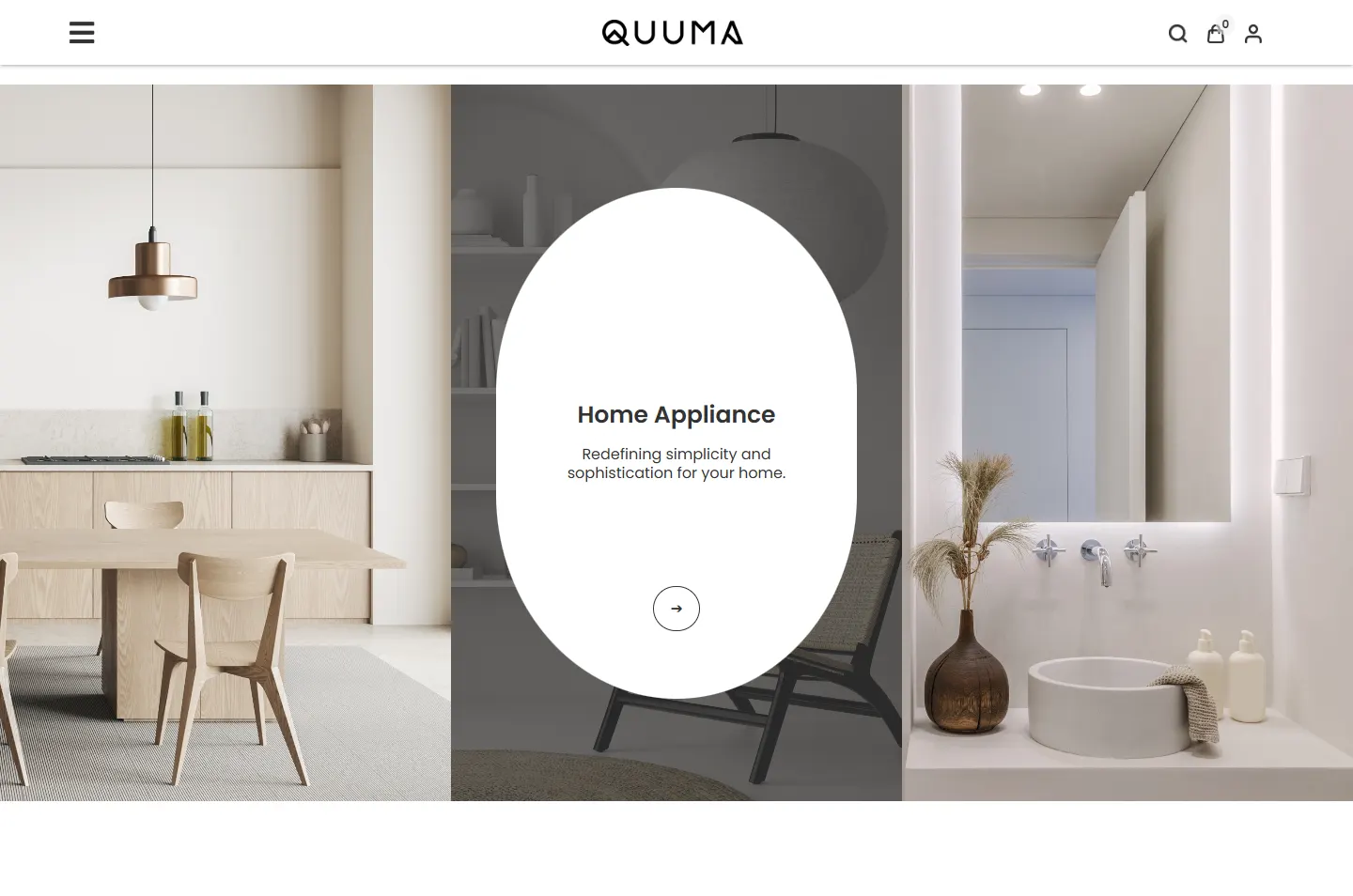
A kitchen, a living area and a bathroom, one for each range.
 3
Shelf
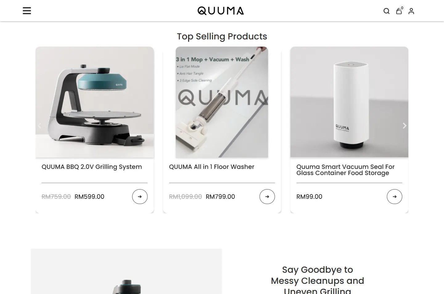
Top sellers on white cards, with names and prices.
 4
Close look
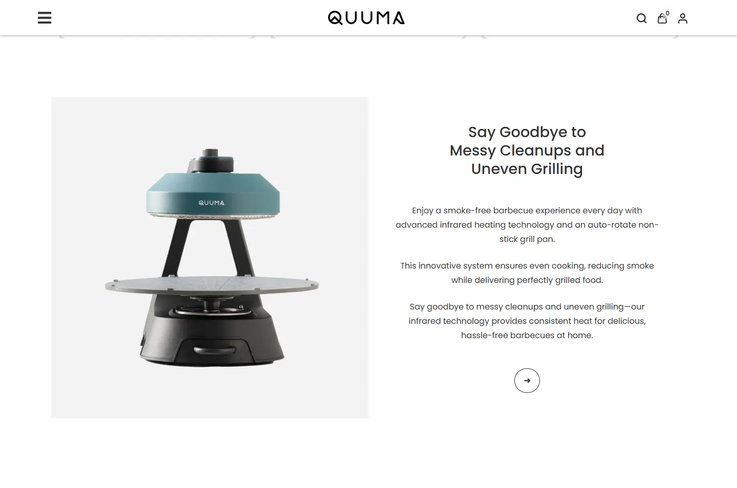
One grilling system gets a chapter to itself.
 5
Gallery
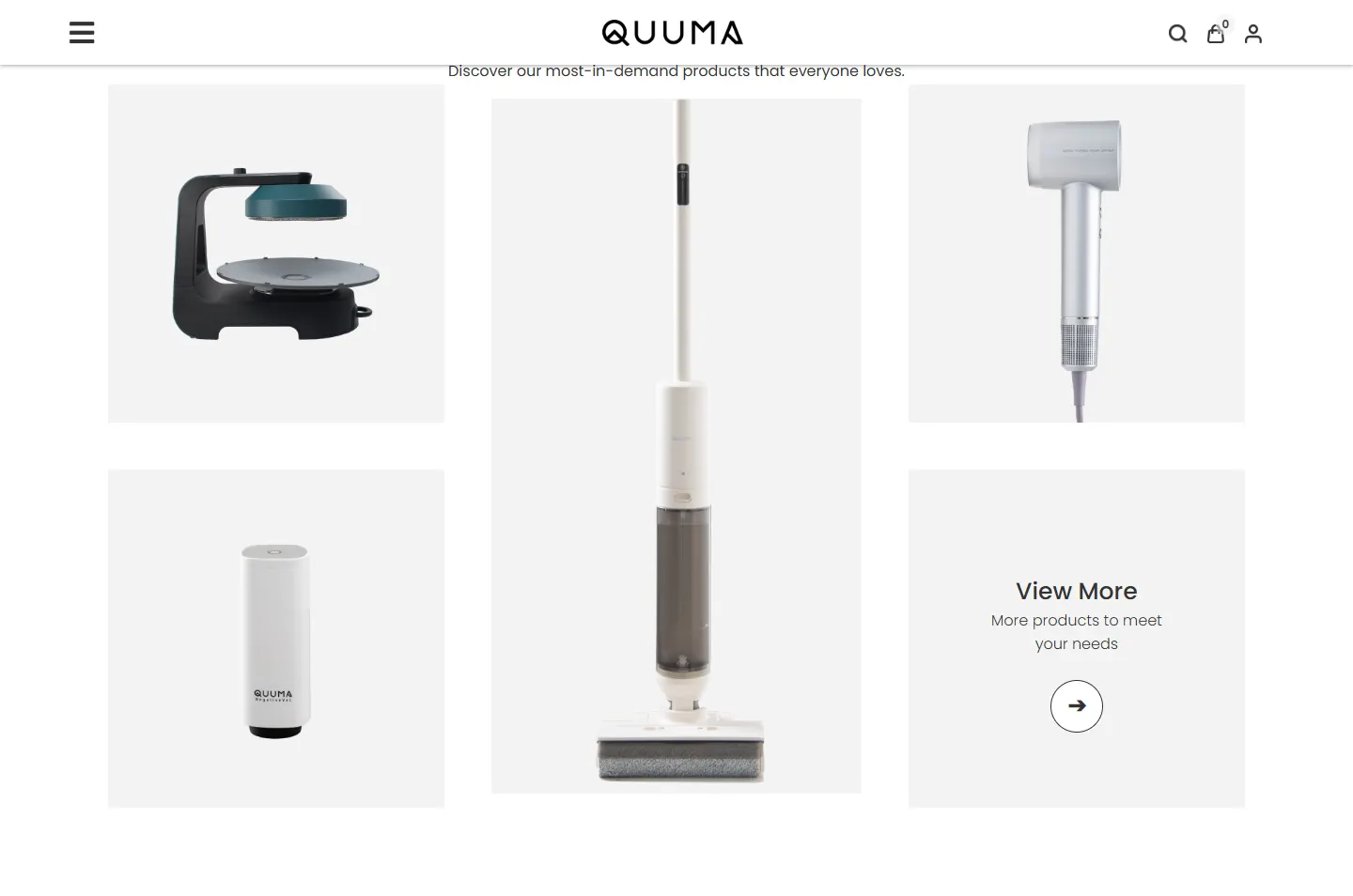
Four products on pale grey, like pieces on display.
 6
Other homes
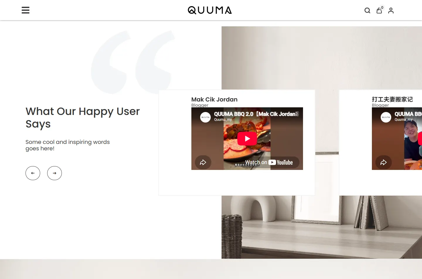
Eleven users, in written quotes and on video.
“Modern Minimalism, Timeless Elegance.” People say that about interiors, not machines. So the look comes from interiors: pale walls, light wood and soft daylight.
One even black line, with a small peak inside the Q. The outline icons, the round arrow buttons and the fine rules on the product cards keep to the same idea: a plain stroke and no fill.
The floor washer, vacuum sealer and hair dryer are all white or pale grey, with simple shapes. That is why a photo of one product on an empty grey tile is enough.
The colour comes from the photographs. The site itself stays almost black and white, so nothing competes with the rooms.
#FFFFFFPages and product cards#F3F3F3Tiles behind products, the search box#333333Text, icons and button outlines#000000The logoThe page adds no colour of its own. The warmth comes from the wood and fabric in the photos, and the teal lid of the grilling system stands out because so little else on the page is coloured.
Where Innovation Meets Everyday Comfort
Poppins · Headlines on the home pageCreating appliances that enhance your home’s aesthetic.
Poppins · Reading textYour cart is currently empty.
Jost · Shop pages such as the cart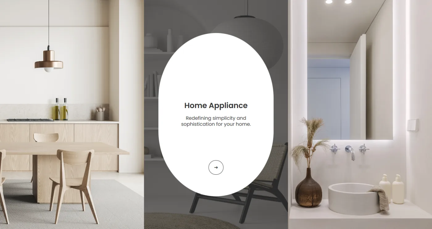
Hover over a room and it dims while a white oval appears with the name, a short line and an arrow. The soft curve suits the round paper lamp in the Home Appliance photo, and it keeps words off the pictures until a visitor wants them.
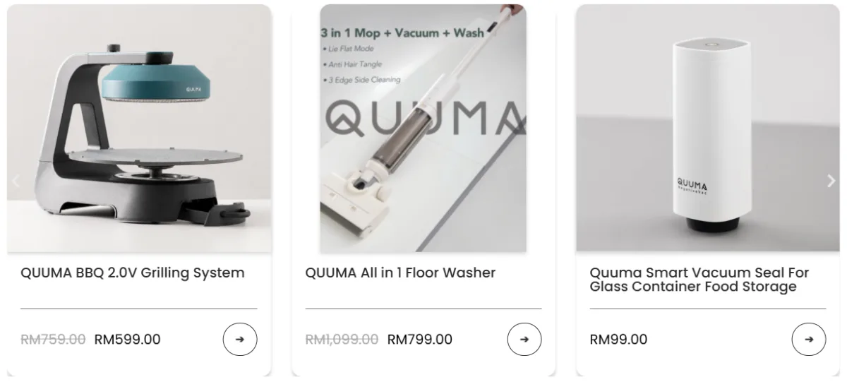
Every product card follows one pattern: photo, name, fine rule, price, round arrow. Old prices are struck through in grey so the current price reads first. The same arrow returns on the room ovals, the close-up and the View More tile, so visitors learn it once.
Full-width photos open the page, break it up and close it, with white and pale grey product chapters in between. The bar above is the real home page, to scale. The page starts in one room and ends in another just above the footer, so the shop never leaves the home.
Follow a shopper from the first room to the last user video. Each highlight marks one decision, and the note explains it.
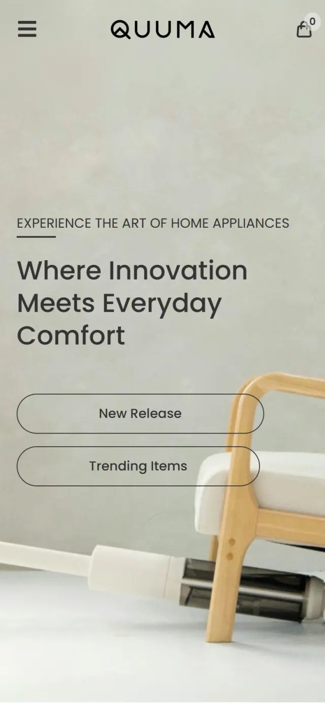
The first screen is a room with two armchairs. One floor washer lies flat under the first chair and another leans beside the second. Over the photo sit a small line, one headline and two outlined buttons.
Why You notice the home before the machine, and that is the whole argument. New Release and Trending Items still give anyone in a hurry a quick way to the products.
“Modern Minimalism, Timeless Elegance” sits above three short notes: Innovative Technology, Elegant Design and Exceptional Quality, each with a simple line icon.
Why Before any product appears, the visitor knows what the brand wants to be judged on. The icons are plain outlines like the logo, so the page stays quiet.
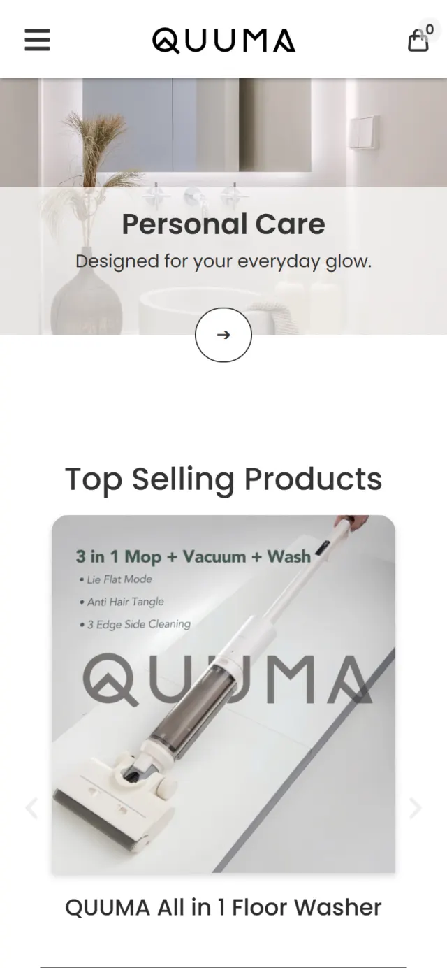
Kitchen Appliance, Home Appliance and Personal Care fill the width as three tall photos. Hover over one and a white oval appears with its name, a short line and an arrow.
Why Ranges often appear as a plain list. Here the visitor picks a kitchen, a living area or a bathroom, which is how people think about what they need.
Top Selling Products moves to white cards, three at a time, from a carousel of five. Each card has a photo, a name, a price and a round arrow.
Why After the rooms, people want a name and a price. Laying them out the same way on every card makes products easy to compare.
The grilling system stands alone on a pale grey square, with a heading, three short paragraphs and one arrow beside it.
Why An indoor grilling system takes some explaining, and a small card cannot do that. This chapter gives it the room, and the pause changes the pace of the page.
Four products stand on pale grey tiles, with the floor washer running the full height of the middle column. The last tile says View More.
Why There is nothing here but the object, as in a gallery. The tall tile exists because the floor washer is tall, so the product sets the layout.
A carousel holds 11 voices: three written quotes and eight YouTube videos, from mothers and a former chef to bloggers, a YouTuber, an actor and a singer.
Why Every room so far has been styled. These voices show real people using the products, and some are people a visitor may already follow.
Room first, product second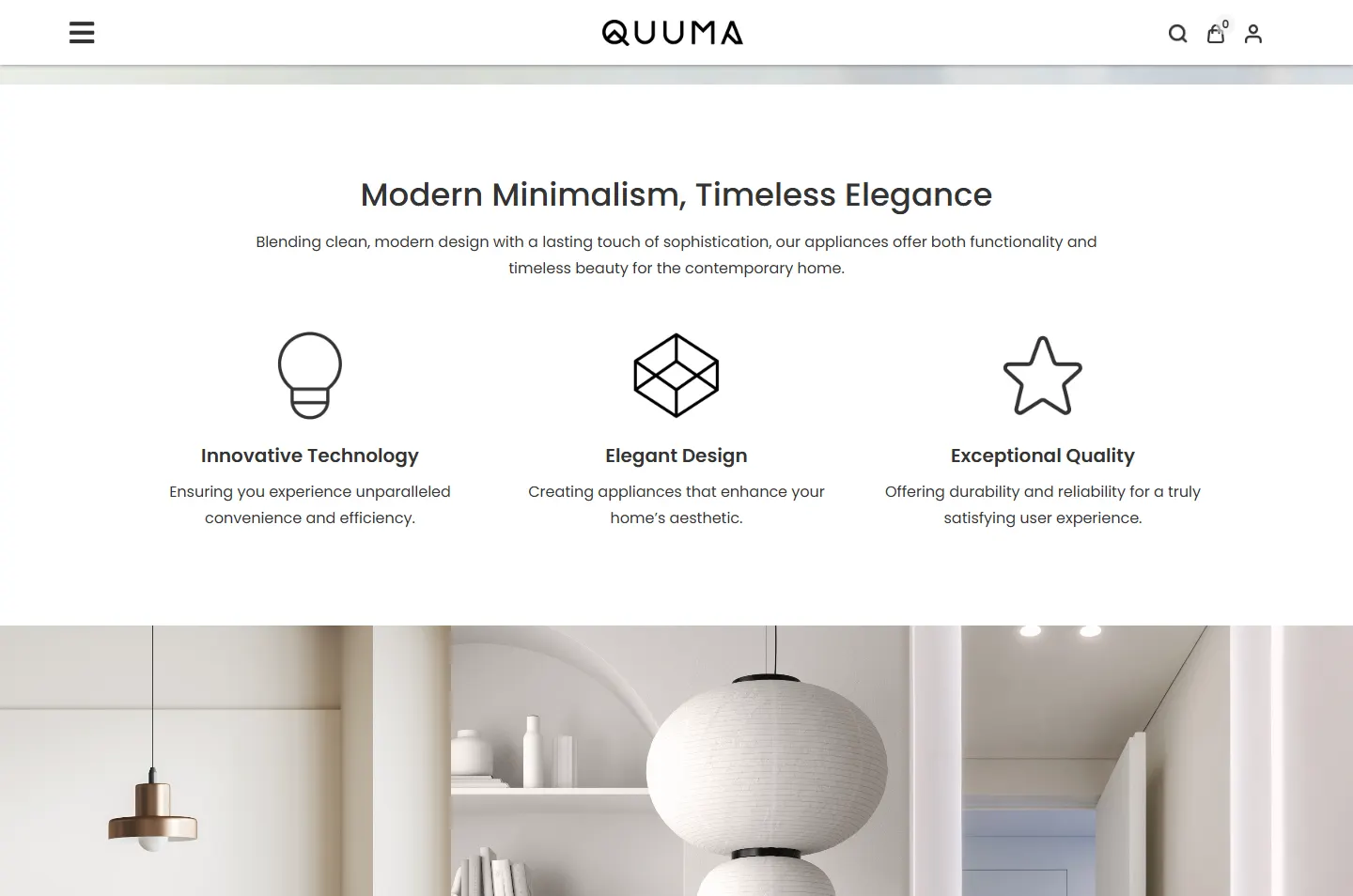 Three short promisesThe oval appears on hoverName, price, one arrowRoom to explain one productOnly the objectsEight of the 11 are videos
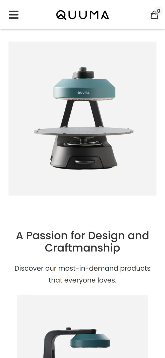
On a phone the rooms and white space stay, stacked into a single column with nothing running off the side of the screen.
The calm front only works if the shop behind it is practical. These are the parts that do that work.
The search icon in the desktop header opens one large box and nothing else, so finding a product stays simple.
The cart icon stays in the header on phone and desktop, with a count on it. On desktop the account icon sits beside it. Customers can log in or register.
An icon in the footer opens WhatsApp with a greeting already written, so a customer only has to press send.
FAQs, privacy, terms, delivery and refunds each have their own page, linked from the footer.
The page describes the organisation, the site, its breadcrumbs and its search box in a format Google can read.
The footer gives the company name and number, phone, email, warehouse address and a Google map.
Every Potadot project starts by understanding the client's situation before anything is designed. See all seven steps
What Quuma sells, why looks matter to the brand, and what a shopper needs to see before buying an appliance online.
We wrote the short promises and range lines, and sorted the products into three ranges.
The rooms, pale grey tiles and round arrow set the look. Each chapter and the shop pages were then laid out for phone and desktop.
Page titles, search data and the policy pages set up, then launch and support.
Selling products online? Tell Ricky about your brand on WhatsApp at +6011-1142 1029.
We worked out the concept, wrote the content, designed the pages, built the website and online store, and set up SEO.
Quuma cares how its appliances look in a home, and a room shows that faster than any list of features. The names, prices and cart follow straight after, so nothing is hidden from people who came to buy.
Yes. It is a working online store with product search, a cart and customer accounts, and the footer links to the delivery and refund policies.
Yes. We would start from your products and how your customers choose them, so your idea may have nothing to do with rooms and furniture. Tell us what you sell and we will show you how we would approach it.