Show what cannot be smelled
Nobody can smell a bottle through a phone. Colour, light and texture had to suggest each fragrance before a visitor reads about it.
LuveraPersonal care · Online shop
The website for Luvera, a Malaysian brand of body wash and shower tablets. The home page shows no prices. It sets the products out the way you might at home, and the shop is one button away.
Luvera Sdn Bhd sells body wash and shower tablets in four named scents. Potadot designed and built its online shop in Chinese and English. The home page is arranged like a bathroom shelf: linen, a woven tray, products in arched niches and soft light, with no price in sight. Each product line gets a full screen, and a single button leads to its page. The pastel colours you see come only from the packaging and its photographs, so colour on the page always points to a product.
Luvera Sdn Bhd (Registration Number 1526583-U) makes two things: body wash in 500 ml bottles, and shower tablets that come in a pouch of six. Both are built around fragrance, and every scent has its own name, from Ray of Sunshine to Walking My Winter.
The brand’s line, printed on its packs, is “Redefine Your Shower Experience”. It sells through its own website, and it is also on Facebook, Instagram, TikTok and Xiaohongshu.

In a store you would open the cap. Online, the website has to carry what the nose cannot, and it has to treat a daily item as something worth slowing down for.
Nobody can smell a bottle through a phone. Colour, light and texture had to suggest each fragrance before a visitor reads about it.
Luvera says a shower can be more than a routine. A busy page of offers would undo that message in a few seconds.
Most people know body wash. Fewer have used a shower tablet, so the site had to show the pouch, the packets inside and how the range fits together.
Body wash runs out, so the first order should not be the last. The site needed member accounts and a clear reason to sign up.
Luvera’s whole argument is that a shower can be a small pleasure. A home page full of prices and offers would argue against that. So we arranged it like the place these products end up: linen, a woven tray, arched niches in a warm wall, and one thing to look at on each screen. Visitors browse the shelf first and go to the shop when they are ready.
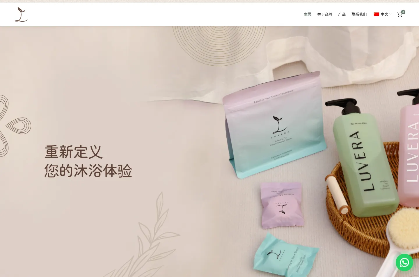 1
Step in
Linen, a woven tray and one line.
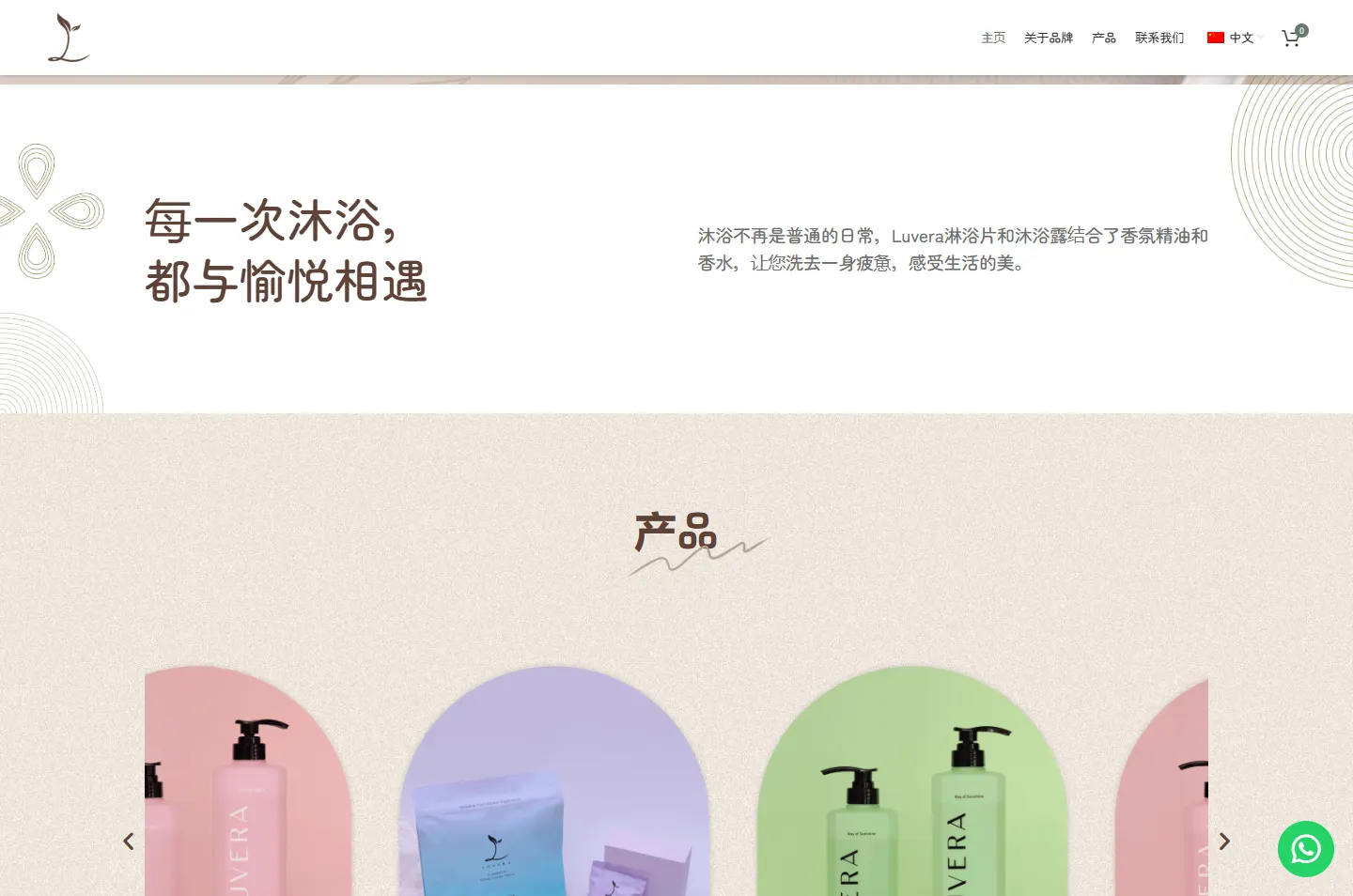 2
Pause
A white band with a single thought.
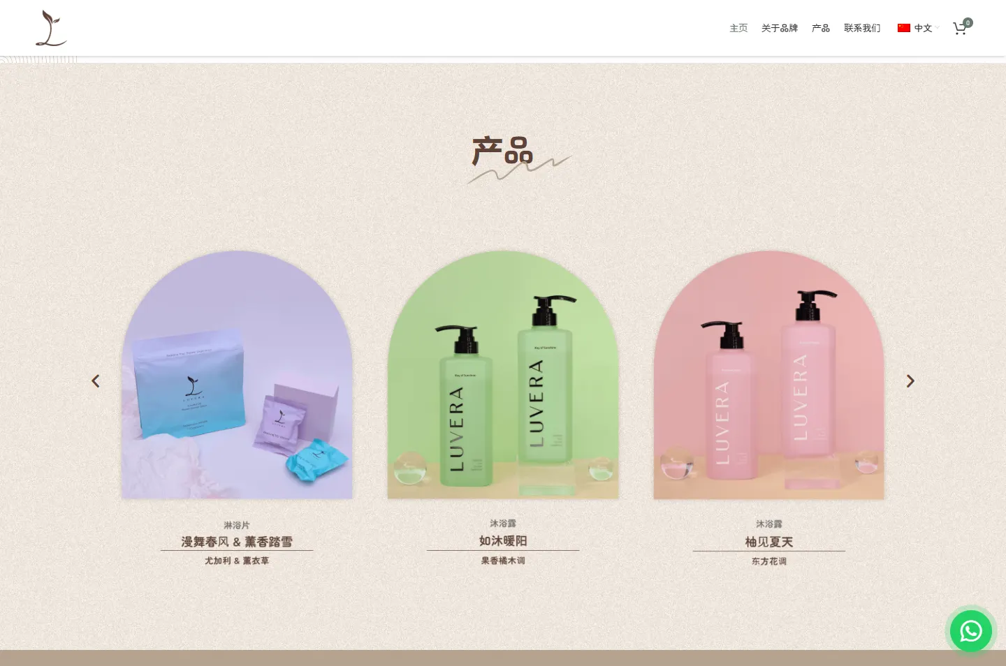 3
Shelf
Three arched niches, one product each.
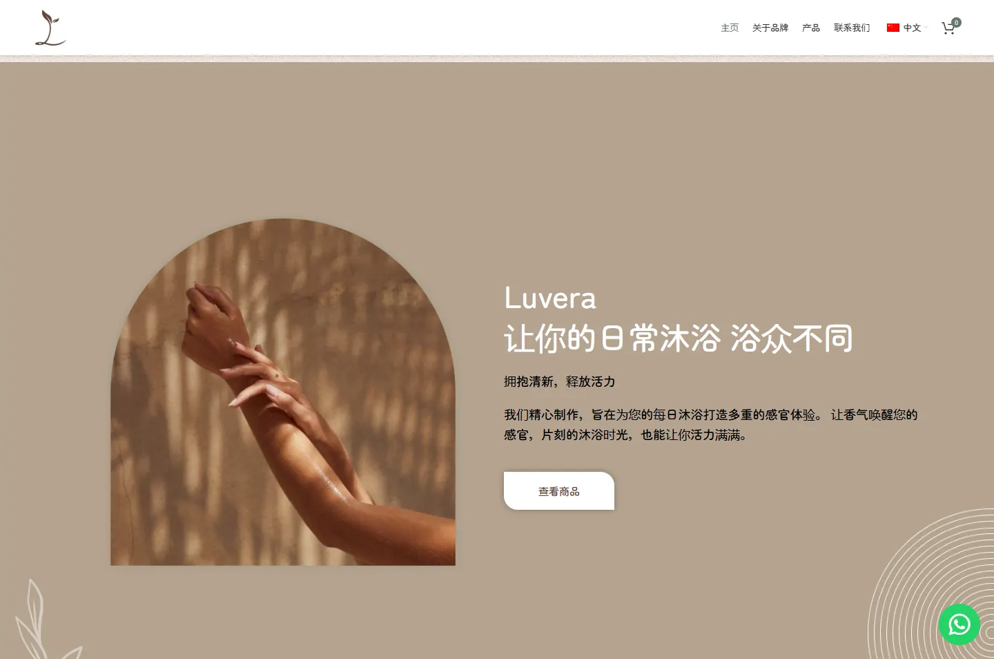 4
Warmth
Sunlight on skin, and no product at all.
 5
Pick up
Body wash, then tablets, a full screen each.
 6
Stay
An invitation to become a member.
A young shoot whose stem curves into an L. Its leaves return in the line-drawn sprigs behind several chapters and in the leaf-shaped buttons.
Soft pink, green, lilac and aqua on the bottles and pouches. We kept those colours out of the site’s own palette, so they appear only where the product does.
Rings spreading like ripples and four teardrops set out as a flower sit faintly in the corners of the page. They add the feeling of water without another photo.
The site itself is brown, sand and white. Against that calm, the soft colours of the packs look bright without anything having to shout. The site is set in one rounded typeface, Zen Maru Gothic, in a few sizes, so the letters stay as soft as the colours.
#FFFFFFThe pause, the menu, the footer#B5A490The warm chapter#5E4236Logo, headings and buttons#707070Reading text on white#65796CThe active menu link, the cart countThere is no pink or lilac in this list. Those colours reach the page only through photographs of the products, so wherever you see them, you are looking at Luvera.
Redefine Your Shower Experience
Zen Maru Gothic · The brand lineWhere Refreshment Meets Relaxation
Zen Maru Gothic · Chapter headingsShowering is no longer just a routine.
Zen Maru Gothic · Reading text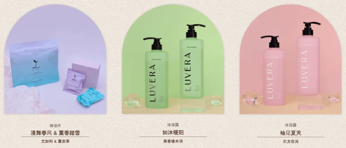
Each product stands in an arch, like a bottle in a niche set into a bathroom wall. The next chapter puts an arm in warm light inside the same shape, so the person and the product share one frame.
The buttons have two square corners and two rounded ones, which gives them the outline of a leaf. The round badges above are drawn in the same brown as the logo.
After the short white pause, almost every chapter is one screen tall, so only one idea is on show at a time. The bar above is the real page, to scale, and photo chapters take the colour that fills them. No chapter is darker than the sand, which keeps the whole scroll soft.
The site opens in Chinese, with English in the menu, so these screens are in Chinese. They run in the order a visitor scrolls, from the linen to the member invitation.
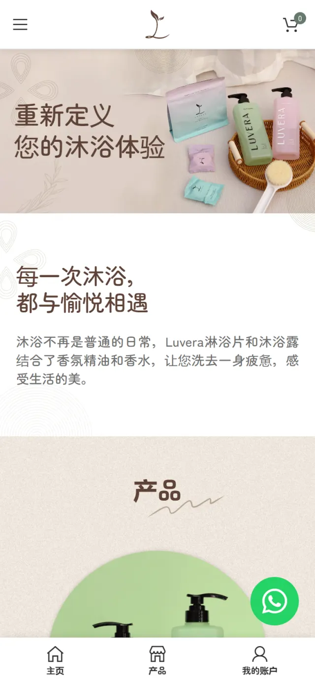
Bottles, pouches and a woven tray rest on pale linen. The only words are the brand line in brown on the left, the Chinese version of “Redefine Your Shower Experience”.
Why The first thing a visitor sees is what the products look like at home. The page asks for nothing yet.
Next comes the shortest chapter on the page: a plain white band with one heading about pleasure in every shower, and two lines on the oils and perfume in the products.
Why Luvera says a shower is not just another routine. After a full-screen photo, a band of empty space slows the visitor down before that line is read.
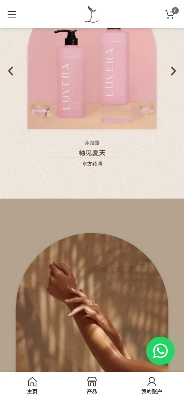
Products stand in a slider of arches on a sand texture. Under each one are the product type, the scent’s own name and its scent family.
Why Leading with the scent name lets people choose by mood. Prices stay on the product pages, for after that choice.
An arm in warm sunlight fills the same arch, on solid sand. Beside it is a Chinese pun: 浴众不同 changes one character of the phrase for “one of a kind” into the character for bathing.
Why So far the page has shown things. This chapter shows a feeling, which is what a scent has to sell on a screen.
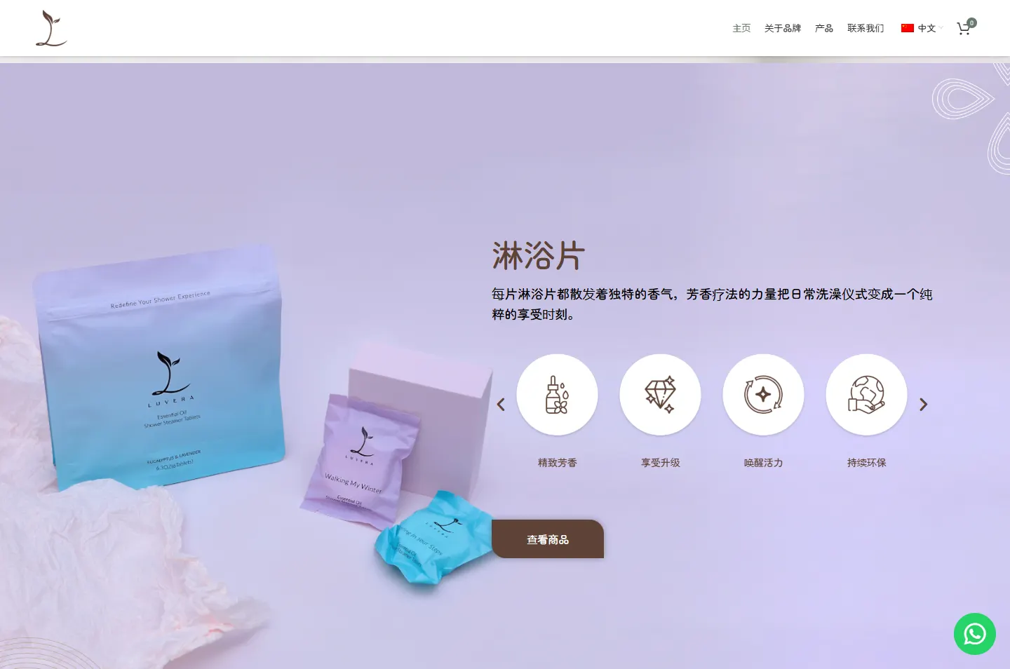
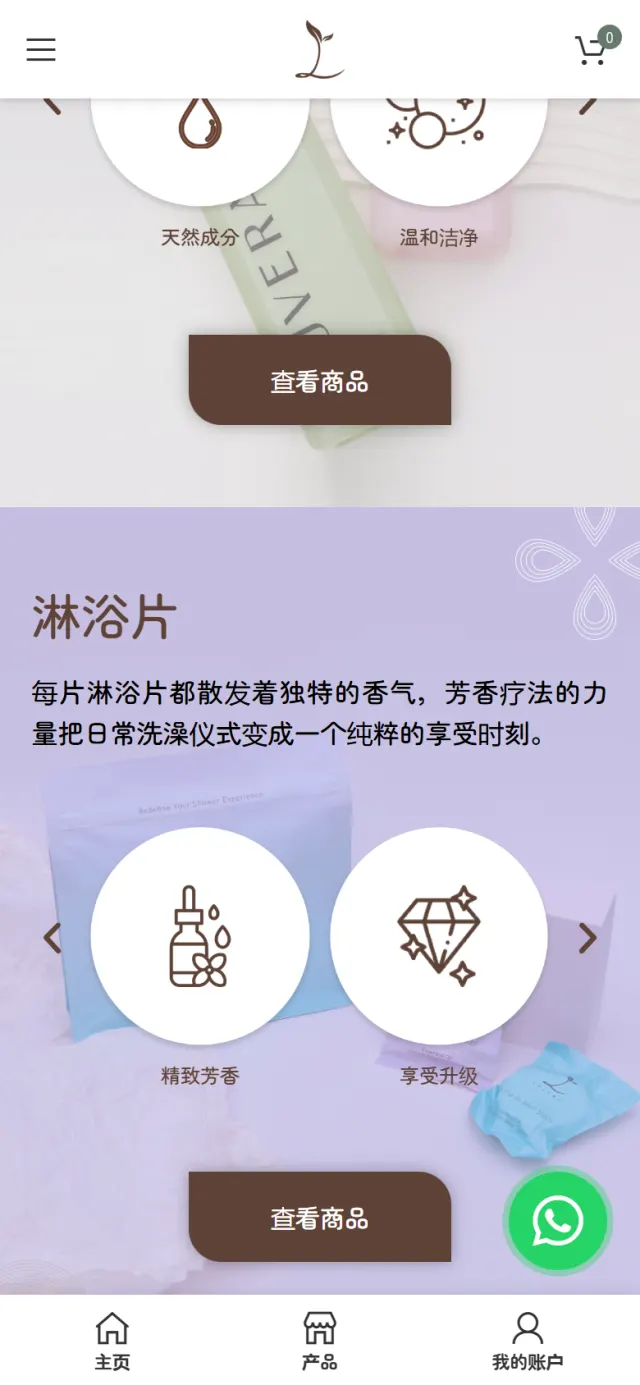
The photo does the first part of the talking. On the left sit a heading, a short note, a row of round badges that slides sideways and one button.
Why That button goes straight to the body wash page, because a visitor who stops here is already interested in it.
The picture moves to the left, on a lilac backdrop, with the pouch standing beside the small packets from inside it. The words take the right side, with badges of their own and the same button.
Why Turning the layout stops two similar chapters feeling like a repeat. Showing the pouch and packets together explains a less familiar product at a glance.
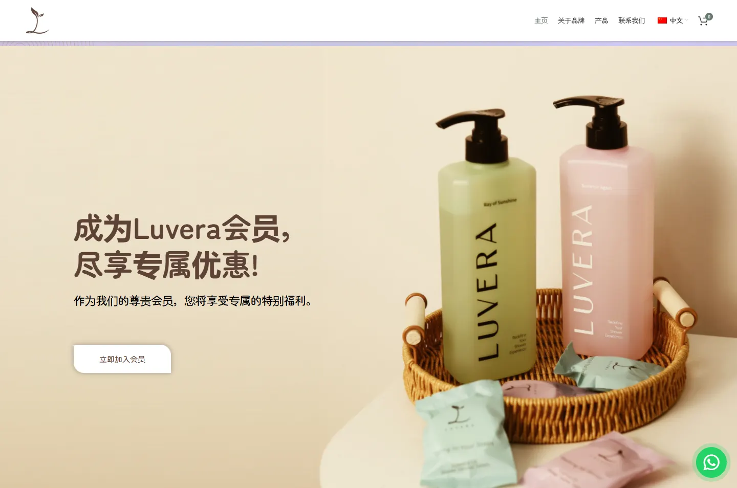
The last chapter returns to the tray and both products, in warm peach light, with one heading about becoming a member and one white button.
Why A member account keeps order history in one place and brings occasional member offers, which gives a buyer a reason to return when the bottle runs out.
One line, no offerOne thought, then spaceScent names, not pricesThe feeling, then one button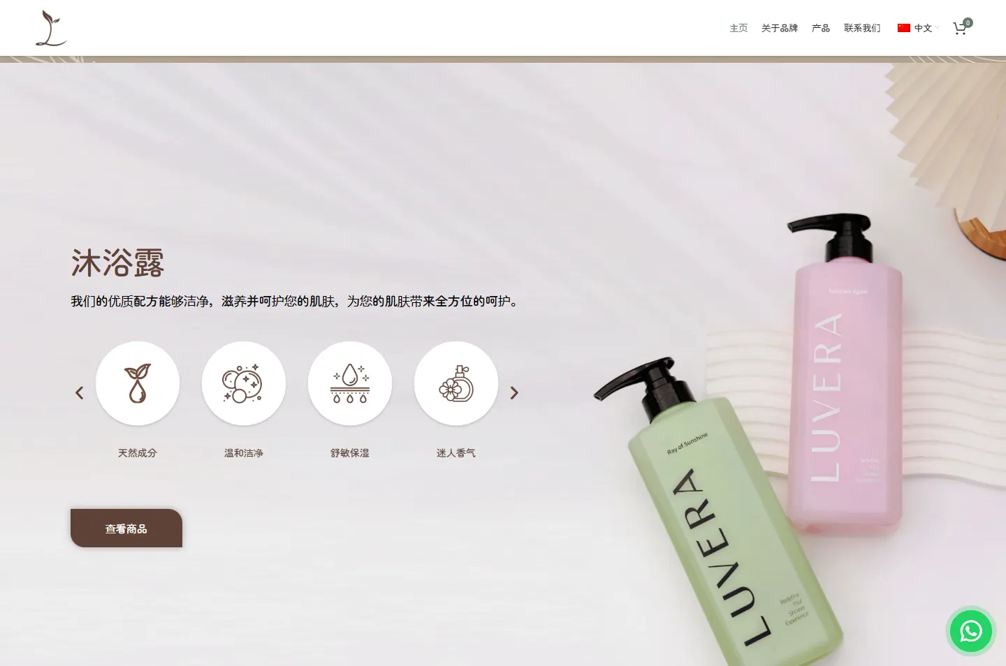 Badges and one buttonSame parts, other sideOne invitation
Luvera has accounts on Instagram, TikTok and Xiaohongshu, and links from those apps open on a phone. The phone version keeps the calm of the desktop page and adds a quicker way to move around.
The home page can stay calm because the working parts sit one step behind it.
Each product has its own page with Add to Cart and Buy Now, and the cart slides in from the side of the screen.
Chinese and English sit on one menu switch. English has its own address, and each version is marked for Google.
Buyers can register to check order status and history, and to receive occasional member offers.
The main pages have their own titles and descriptions, and the brand and site are described in a format Google can read.
A green button stays in the corner of the screen and opens WhatsApp with the first message already written.
Product pages list the top, heart and base notes of each scent, so buyers can picture a fragrance before ordering.
Every Potadot project starts by understanding the client's situation before anything is designed. See all seven steps
What Luvera sells, how people choose a scent online, and why the home page is in no hurry to sell.
We wrote short lines for each chapter, in Chinese and English, and gave each product line its own screen.
The home page chapters for phone and desktop, with their arches, line drawings and leaf-shaped buttons, then the product pages, cart and member accounts.
Titles and descriptions for the main pages, language tags for the Chinese and English versions, then launch and support.
Selling a product people want to try first? Tell Ricky about your brand on WhatsApp at +6011-1142 1029.
We worked out the concept, shaped the content, designed the pages and built the online shop in Chinese and English, with member accounts and search setup.
The home page is there to create interest in the products and their scents. Prices are on the product pages, where a visitor has already chosen what to look at.
Luvera’s packs already carry soft pink, green, lilac and aqua. Keeping the site to brown, sand and white makes those colours the first thing a visitor notices.
Yes. We start from your product and what makes people want it, so your shop will have its own idea and its own look. Tell us what you sell and we will show you how we would approach it.