Give simple homes real presence
These are single-storey terrace homes, not a luxury tower. The site had to make them feel worth the drive, without pretending to be something else.
Taman Kamunting PutraProperty · Housing project website
The website for Taman Kamunting Putra, a housing project in Taiping, Perak. It takes a buyer through the homes the way a sales visit would, then books the viewing on WhatsApp.
Taman Kamunting Putra is a housing estate off Jalan Bukit Jana in Kamunting, Taiping, developed by Taiping Bukit Jana Development Sdn Bhd, part of DSK Group. Potadot designed and built its website as one long page in English and Bahasa Melayu. The page follows the path of a real site visit: arrive, step through, compare the two house types, inspect the specifications, see what is nearby, then book a viewing on WhatsApp.
Taman Kamunting Putra is developed by Taiping Bukit Jana Development Sdn Bhd, part of DSK Group. Phase 2A is a row of single-storey terrace homes off Jalan Bukit Jana, close to the green hills and a short drive from Taiping town.
The homes come in two lot sizes, 20′ × 65′ and 20′ × 70′, each with three bedrooms and two bathrooms. Phases 2B, 2C and 2D are still to come.

Most buyers look a project up on their phone long before they visit. The site has to give them enough to say yes to a viewing.
These are single-storey terrace homes, not a luxury tower. The site had to make them feel worth the drive, without pretending to be something else.
Price, size, tenure, completion date, ownership rules and distance to schools. A buyer should find every answer without having to call.
People here would rather WhatsApp a sales team than wait for an email, and many prefer Bahasa Melayu. The site had to meet them there.
Housing adverts in Malaysia must show the developer’s licence, permit and approval details. They needed a proper place on the page.
A buyer wants to do the same things online as they would on site: see the house, walk in, compare the layouts, check how it is built and find out what is nearby. So we built the page in that order. Scrolling down is the visit.
 1
Arrive
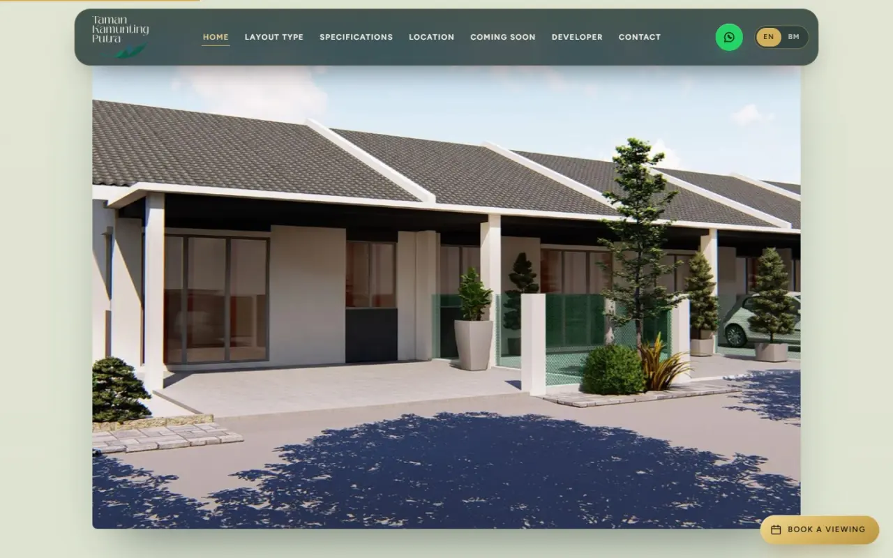
The estate name and the homes fill the screen.
 2
Step through
An arched window opens onto the street.
 3
Compare
Two house types, one switch.
 4
Inspect
Close-ups, then the full specification.
 5
Find it
Schools, shops and the highway, by distance.
 6
Book
A viewing request, sent by WhatsApp.
“Where the green hills of Bukit Jana meet the quiet streets of Kamunting.” That line set the palette: hill greens, soft sage and an open sky.
A leaf with a line of hills inside it. Its greens run through every chapter, and its gentle curves are why nothing on the page has a hard edge.
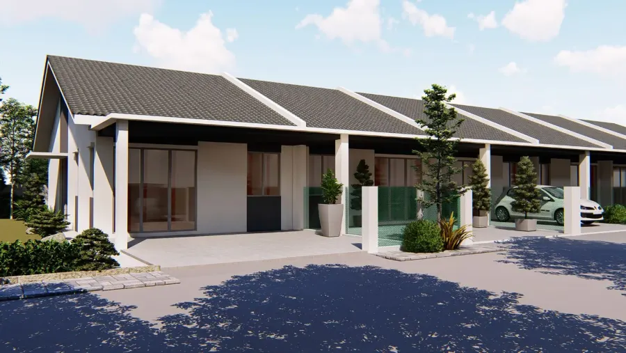
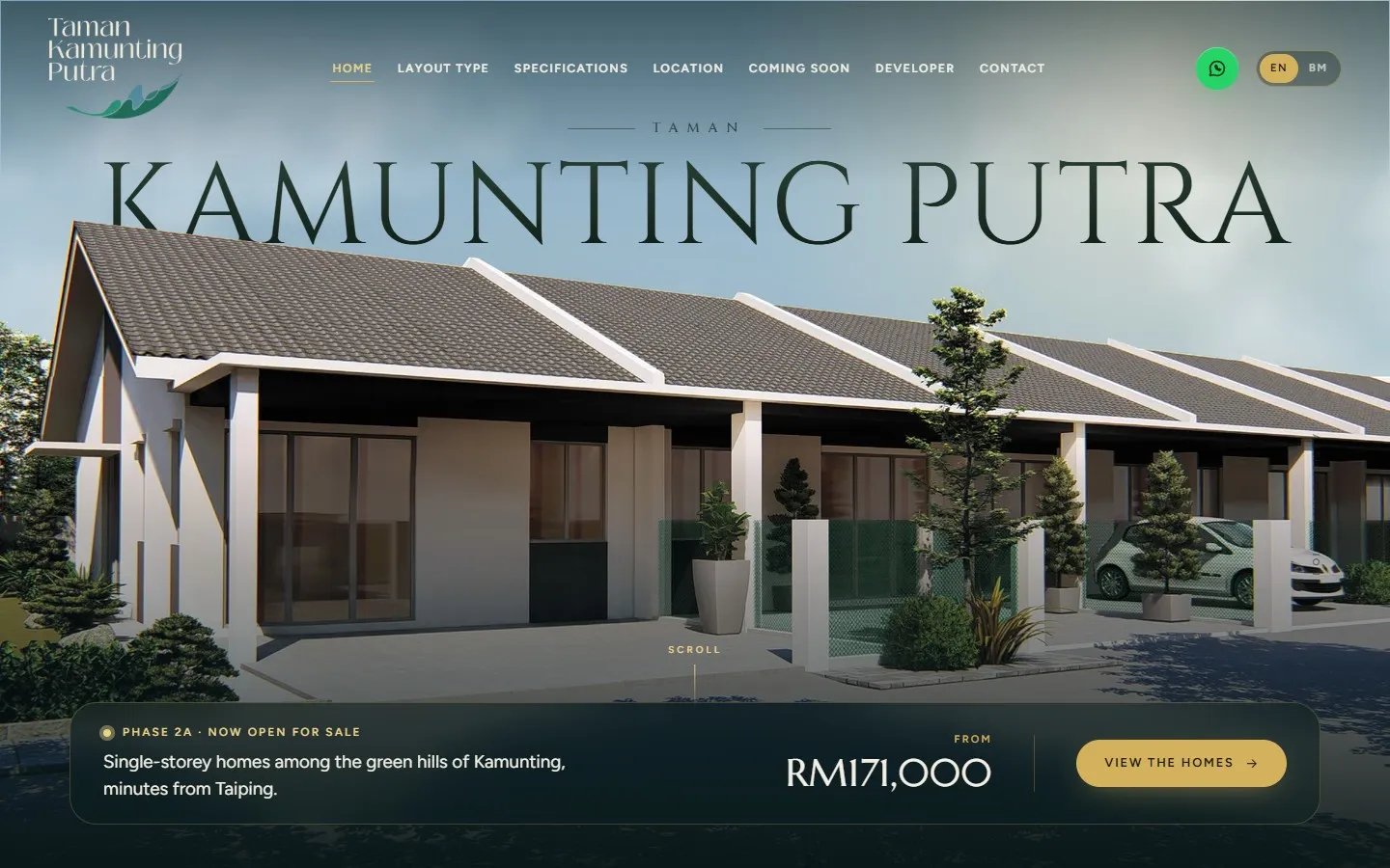
A long, low roofline. The first screen is built around it, with the estate name set behind the roof like a sign on the horizon.
The homes are modest, so the design does not shout. It borrows the calm of a premium launch: deep colour, classic letterforms and plenty of space.
#0A1D1DDark chapters and the footer#10302FCards and panels#E2E6D6Reading chapters#F3EFE4Text on dark, soft backgrounds#5F8A63The second line of a headline#D4B15CPrices, numbers and buttonsGold is used sparingly on purpose. When it appears, it marks a number worth reading or the next step.
KAMUNTING PUTRA
Cinzel · The estate nameBuilt simply, finished with care.
Marcellus · Headlines and numbersSingle-storey homes among the green hills of Kamunting, minutes from Taiping.
Figtree · Reading text and formsThe arch is the doorway of the page. It is the window you scroll through near the top, and every coming-soon phase sits inside one.
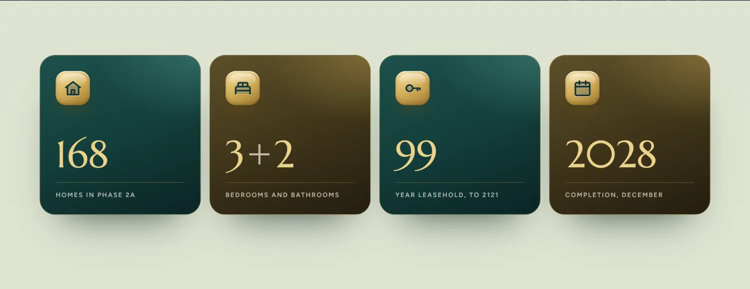
The figures a buyer looks for sit on deep cards with soft gold tiles, so they stand out as the page goes by. The same tile returns on the distance line.
Dark chapters set the mood and light chapters carry the detail. The bar above is the real page, to scale. Taking turns keeps a long scroll from feeling like one long wall.
Scroll through the site the way a buyer sees it. The highlight shows what to look at, and the note says why it is there.
The name, the homes, and one bar along the bottom with the phase, the starting price and a single button.
Why A buyer should know what this is and what to do next before they scroll.
Once the street opens up, the key numbers follow: homes in the phase, bedrooms and bathrooms, tenure and completion.
Why People compare projects on these numbers, so they should never have to hunt for them.
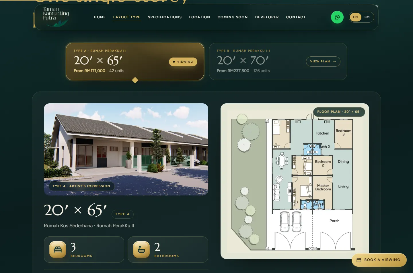
Two cards show each lot size with its starting price and number of units. Tap one and the picture, floor plan and details change with it.
Why Comparing in one place beats opening two pages. The enquiry button also carries the chosen type down to the form.
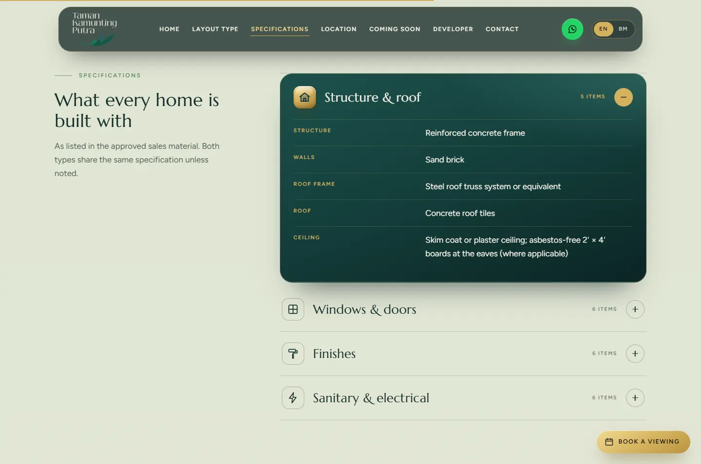
Structure, windows, finishes and fittings are grouped into four panels, with one open at a time.
Why A serious buyer wants the full list. Everyone else can scroll past it.
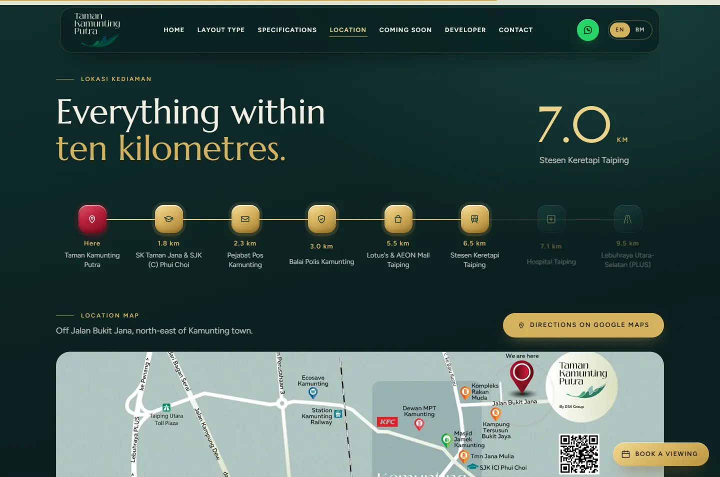
A line runs from the estate past the school, post office, police station, shops, train station and hospital to the highway. The map sits right below.
Why “Near everything” is easy to say. 1.8 km to the school is easier to believe.
Phases 2B, 2C and 2D each get an arch and a Notify Me button, which opens WhatsApp with the phase already named.
Why Someone who is not ready for Phase 2A can still ask to hear about the next one.
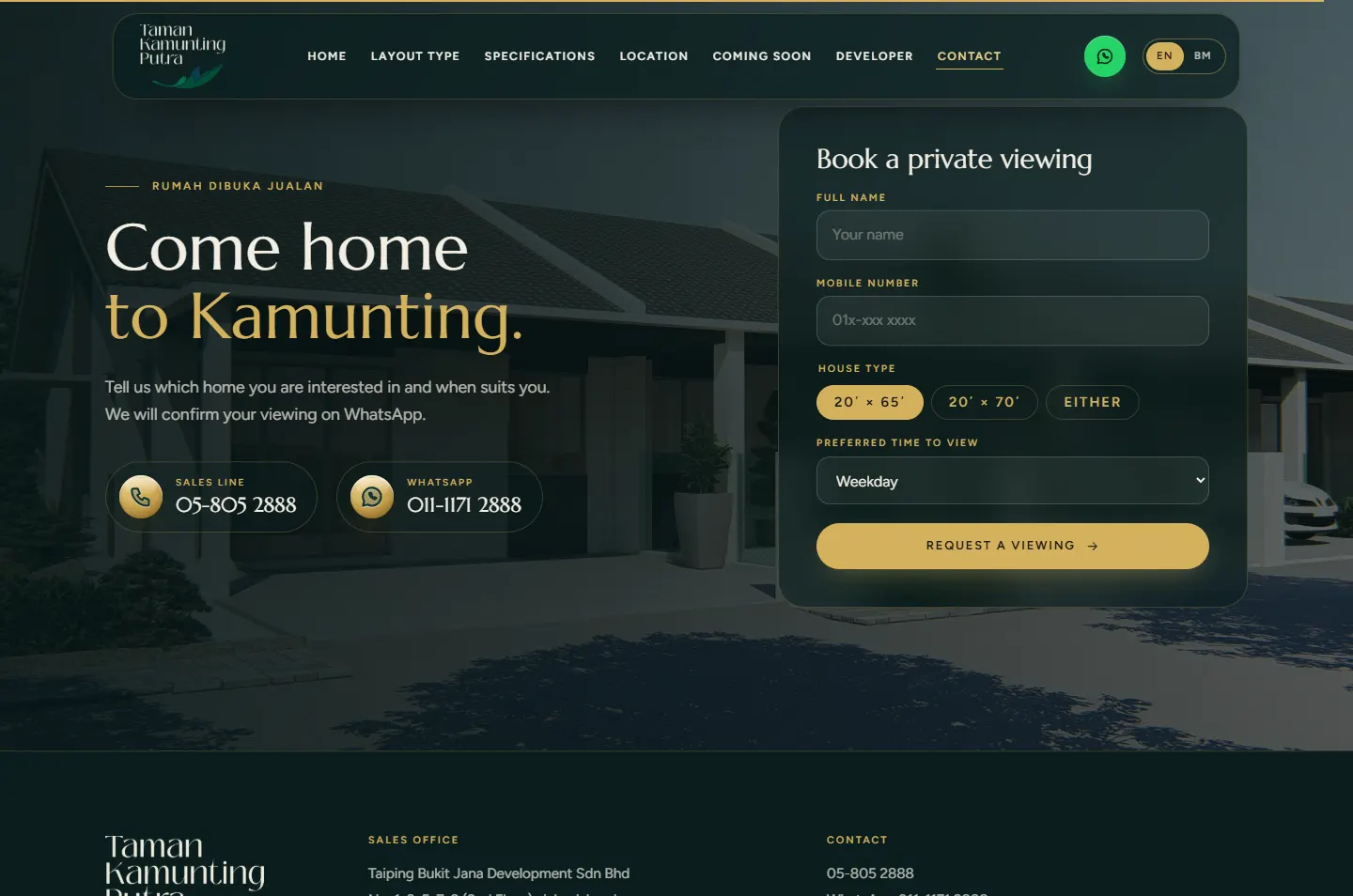
Name, mobile number, house type and preferred time. Press the button and WhatsApp opens with the message already written, in the language the visitor chose.
Why No email to wait for. The sales team gets the details it needs, in the app it already uses.
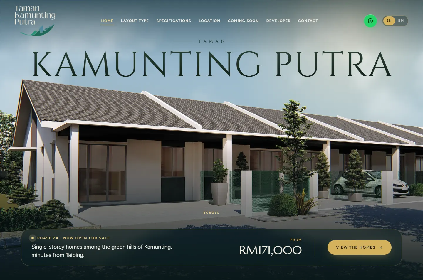 One bar, one button
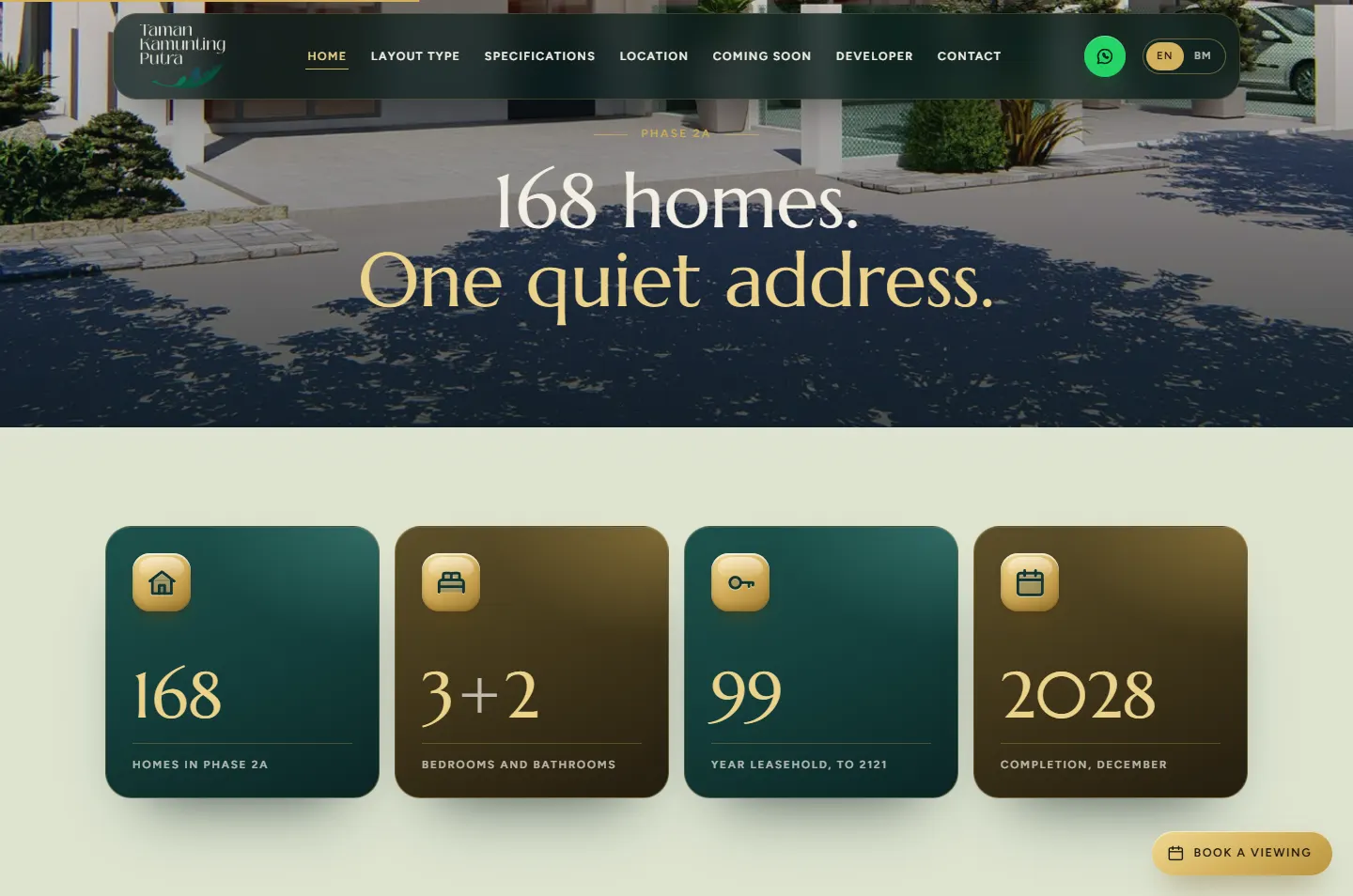 The four key figuresTap to switchOne panel open at a timeFills as you scroll
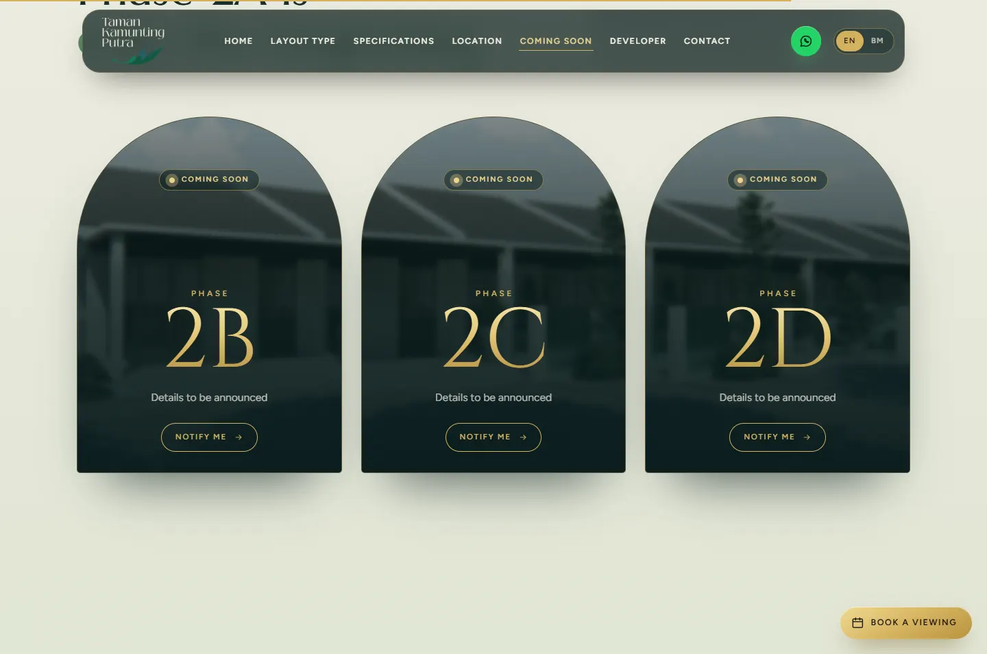 Notify Me goes to WhatsAppOpens WhatsApp
These are recordings of the live site. Each animation follows the scroll, so the visitor stays in control of the pace.
As you scroll, the estate name sinks behind the roofline, the house comes forward and the sky turns to evening.
Why It turns a picture into a place, and moves your attention from the name to the home.
A small arched window grows until it fills the screen and the whole street comes into view.
Why This is the moment of stepping inside: the idea of the site visit in a single movement.
The gold line draws from stop to stop while the number counts from 0 to 9.5 km.
Why It turns a list of places into a short drive you can picture.
A property link is usually opened on a phone first, so every chapter was rearranged for a small screen, not just shrunk.
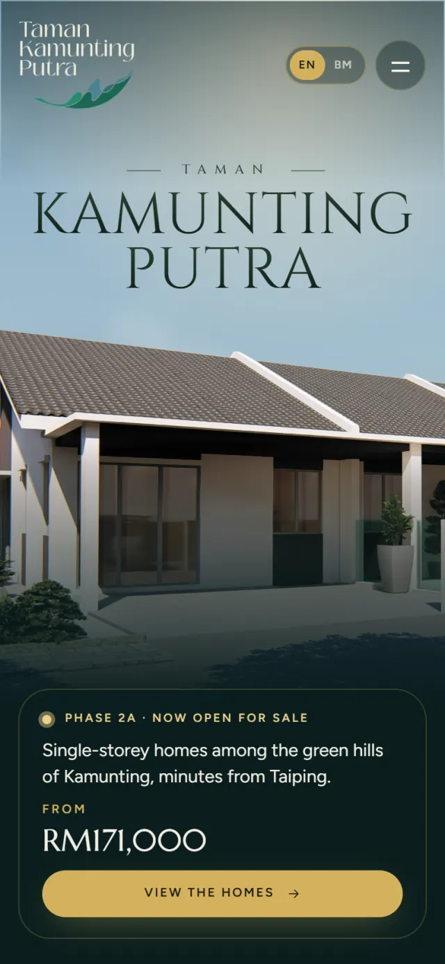
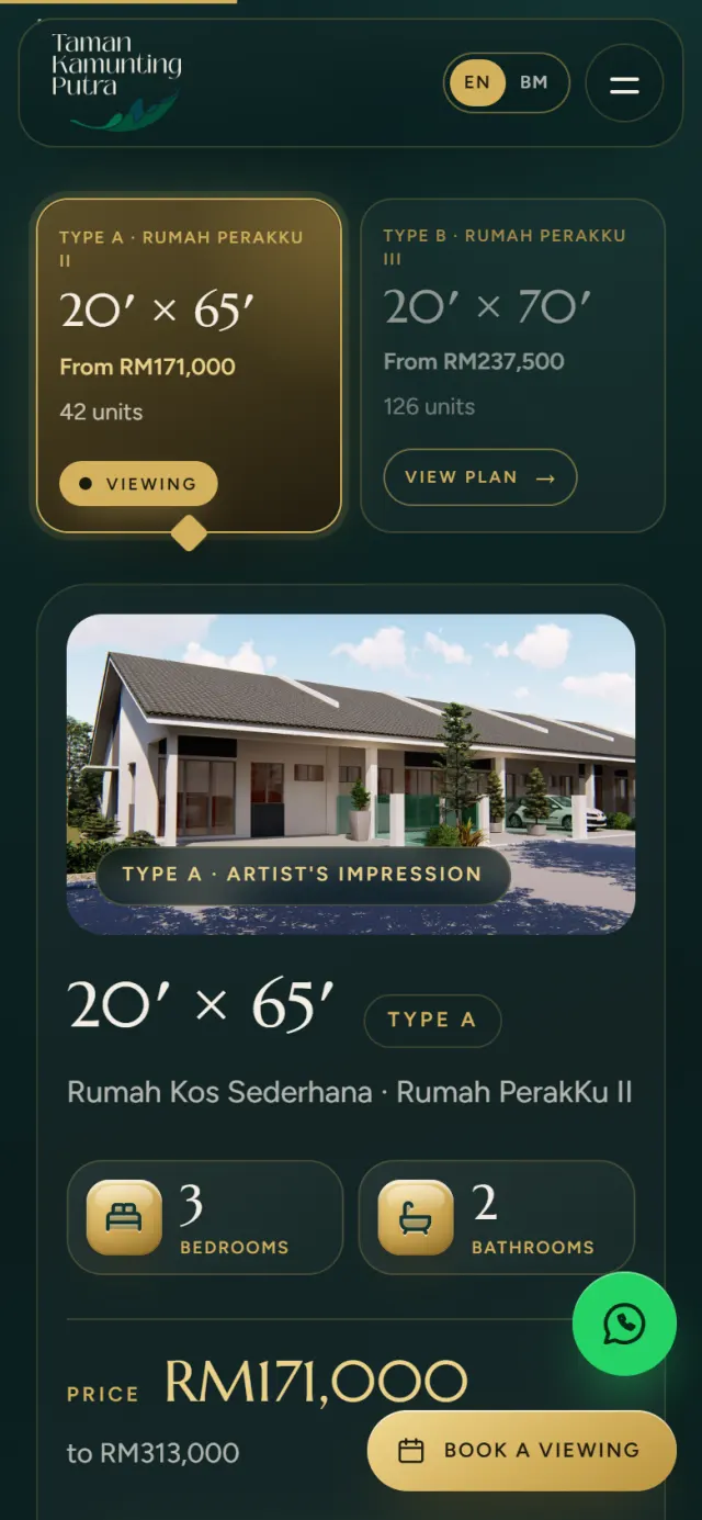
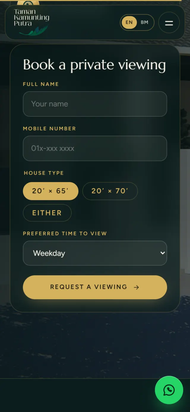
A good look is only half of it. These details make the site work for buyers and for the sales team.
The form writes the message for the visitor, with their name, number, house type and preferred time.
English and Bahasa Melayu on one switch. The choice is remembered, and each language has its own address for Google.
The page describes the developer, both house types, their price ranges and common questions in a format Google can read.
Licence, permit, approval and price details sit in full in the footer, in the form housing adverts require.
The questions buyers ask most are answered on the page, from tenure to ownership rules.
If a visitor’s device is set to reduce motion, the animation turns off and every chapter still reads properly.
Every Potadot project starts by understanding the client's situation before anything is designed. See all seven steps
What is being sold, who is buying it, and what they need to know before they will visit.
We turned the approved sales material into short chapters, in English and Bahasa Melayu.
Palette, type and the arch came first, then each chapter for phone and desktop, then the motion.
Titles, search data and both language versions set up, then launch and support.
Planning a launch? Tell Ricky about your project on WhatsApp at +6011-1142 1029.
We worked out the concept, wrote the content from the approved sales material, designed the page and built the site in English and Bahasa Melayu, with search setup and WhatsApp booking.
A housing project site has one job: to get a buyer to book a viewing. One page in a set order means nobody gets lost, and the menu still jumps straight to each chapter.
Yes. Each animation is adjusted for a small screen. If a device is set to reduce motion, the animation turns off and every chapter still reads properly.
Yes. Every site starts from the client’s own project and buyers, so yours would not look like this one, but the same thinking applies. Tell us about your launch and we will show you how we would approach it.