Explain what planning is worth
Axvision sells a way of working: “Not just videos. Strategic visual communication.” That is hard to show in a reel, so the website had to make the case itself.
Axvision MediaVideo production · Company website
The website for Axvision Media, a video production and content marketing studio in Malaysia. Axvision says brands stay visible through planned, steady content. As you scroll, the page shows you what happens without it.
Axvision Media is a video production and content marketing studio in Malaysia, with its production team based in Penang and Kuala Lumpur. Potadot designed and built its website in English and Chinese. The home page is told in one colour. A yellow circle rises over the showreel and fills the screen, two sentences about inconsistent content appear one after the other, and the yellow drains to black. The same circle comes back to open the chapter on how Axvision works.
Axvision Media makes corporate and commercial videos, social media content and short-form pieces such as Instagram Reels and TikTok. It works with brands across Malaysia and Singapore, and its logo wall includes names like A&W, Exsim and Blossom Suites by Kobay.
The work on the home page ranges from a Chinese New Year music film to event coverage and Reels for a retro brand. The company also has a studio space, with its own page on the site.

A showreel proves a team can film. It does not prove the team can plan months of content across platforms. The site had to show both.
Axvision sells a way of working: “Not just videos. Strategic visual communication.” That is hard to show in a reel, so the website had to make the case itself.
People judge a video company by its eye. The site had to feel as considered as the films, starting from the first screen.
One company needs a launch film. Another wants a steady social feed. Each should find its own route without having to ask.
Axvision works with brands across Malaysia and Singapore, and its own logo wall mixes English and Chinese names. The site needed both languages.
Axvision’s argument is that regular content is not enough: without a plan it starts to feel inconsistent, and the brand slips out of view. A page can say that, or it can make it happen. So yellow became the brand being seen. It fills the screen, then drains away just after you read the word “inconsistent”. Everything after that is about getting the yellow back.
 1
Promise
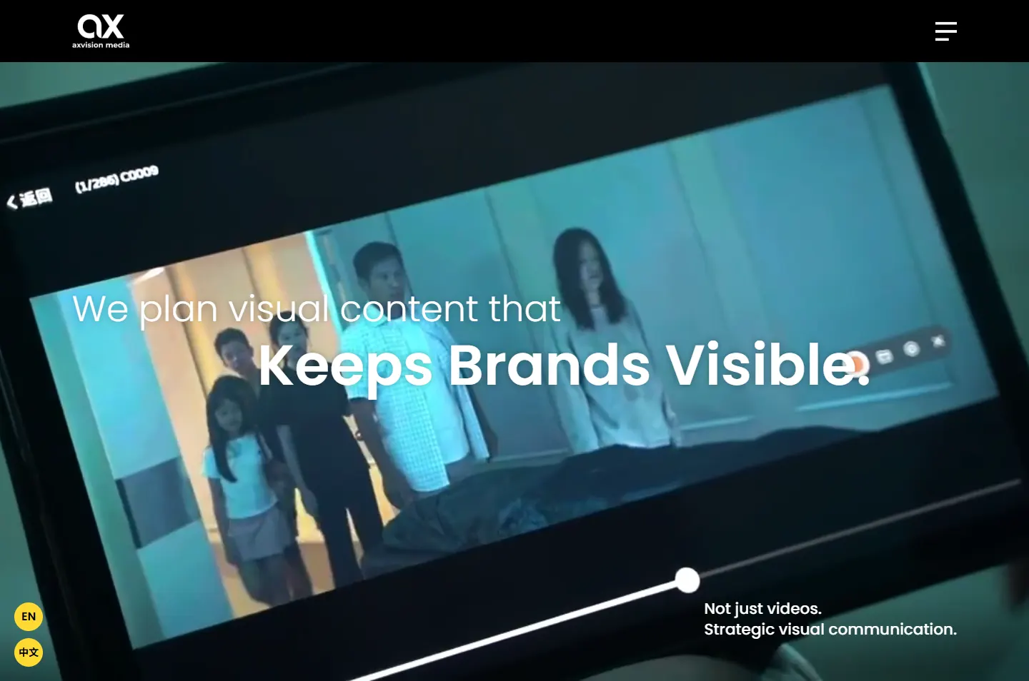
The showreel plays behind “Keeps Brands Visible.”
 2
Fade
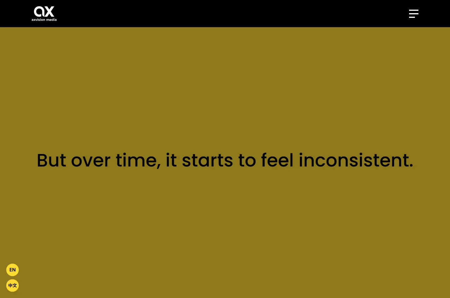
Yellow fills the screen, then drains to black.
 3
Choose
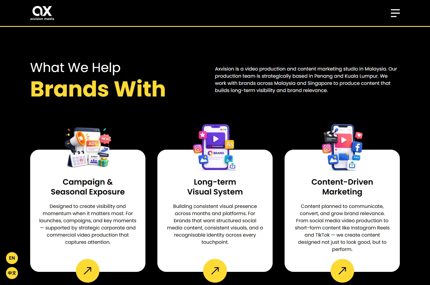
Three solutions, one card each.
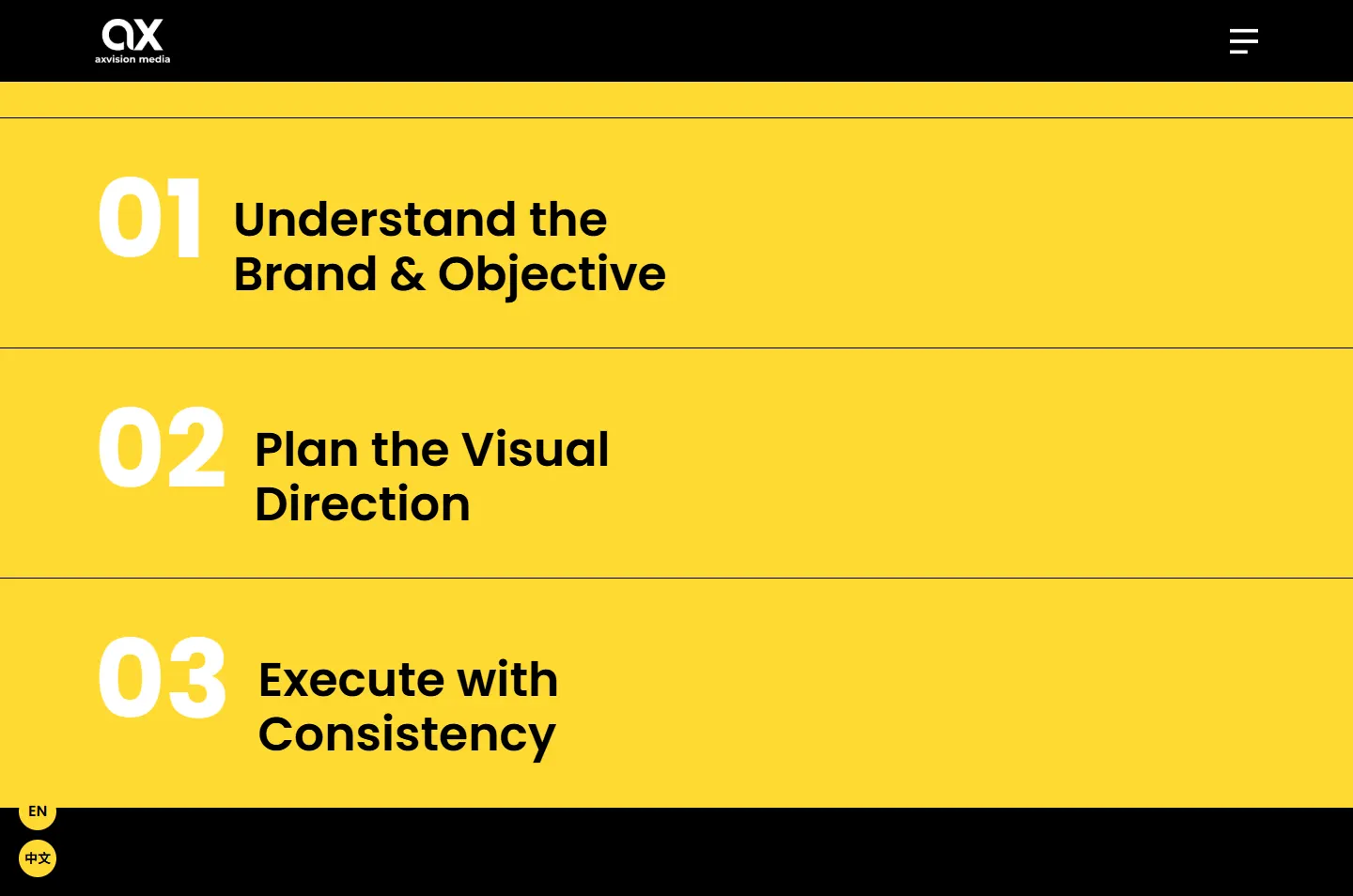 4
Return
The circle comes back with a three-step method.
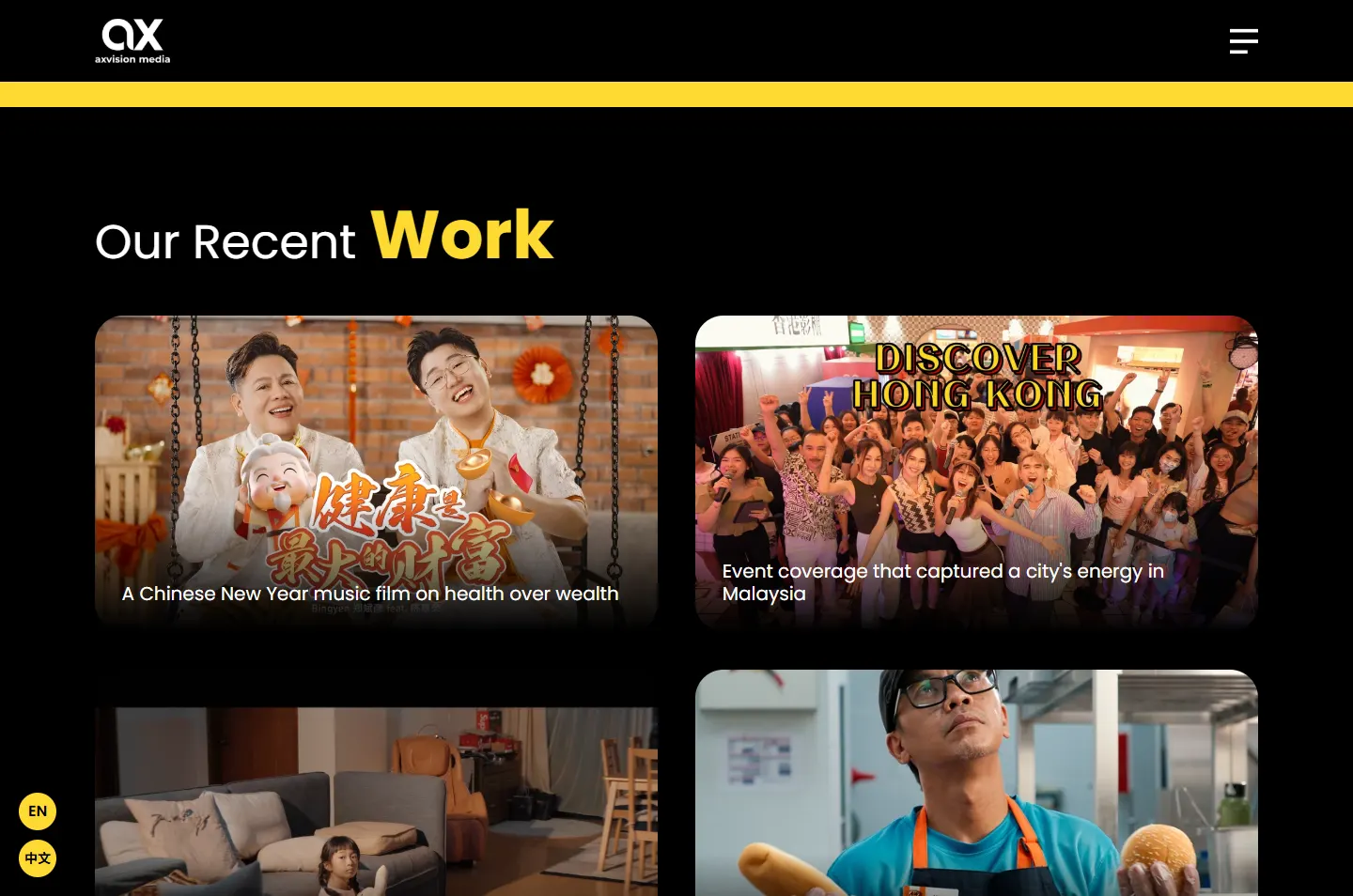 5
Proof
Moving work, logos and client reviews.
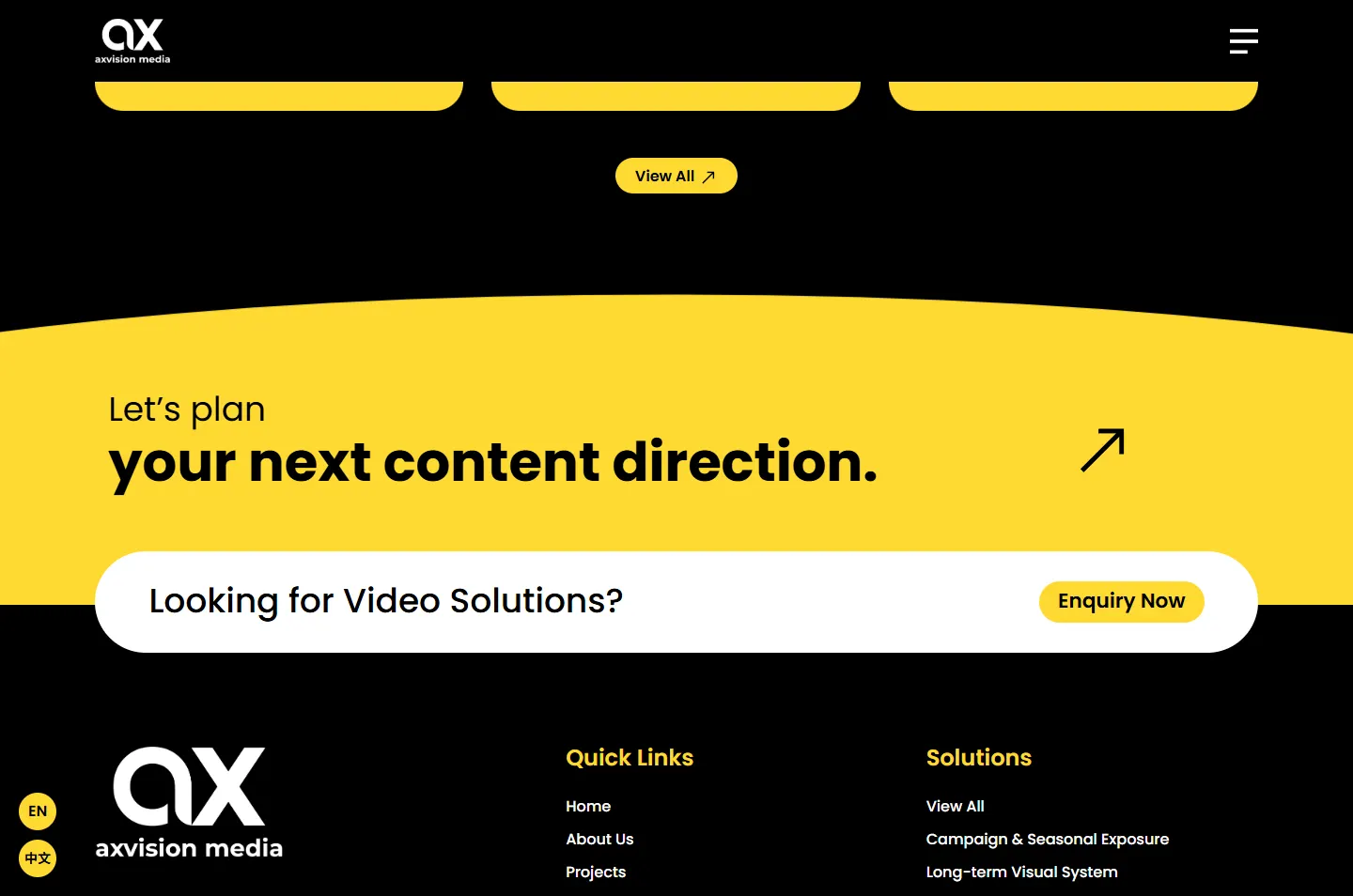 6
Plan
The last chapter is yellow, with one enquiry button.
“Keeps Brands Visible.” If visibility is what Axvision sells, it should be something a visitor can watch happen on screen.
A round lowercase a beside a sharp x. The moving circle picks up that round shape, and it returns in the round yellow arrow and language buttons.
Video looks best in a dark room, so black holds the showreel and the work. Yellow is kept for the chapters that make the argument.
Two colours do nearly everything. That restraint is what lets one colour fading out feel like an event.
#000000Showreel, services, work, footer#FED931The circle, the argument, buttons#FFFFFFService cards, the reviews band, text on black#33373DMenu linksYellow marks what the page wants you to remember: a key word in a heading, the next step, or a whole chapter that makes the case.
Keeps Brands Visible.
Poppins · The promiseWhat We Help Brands With
Poppins · HeadingsBuilding consistent visual presence across months and platforms.
Poppins · Reading text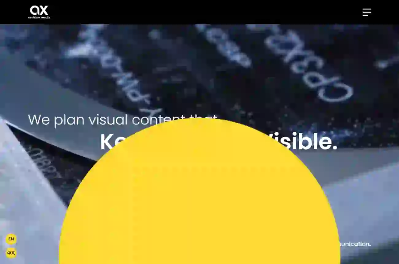
One circle carries the story. It rises out of the reel and grows until the screen is yellow, and later it rises again out of black.
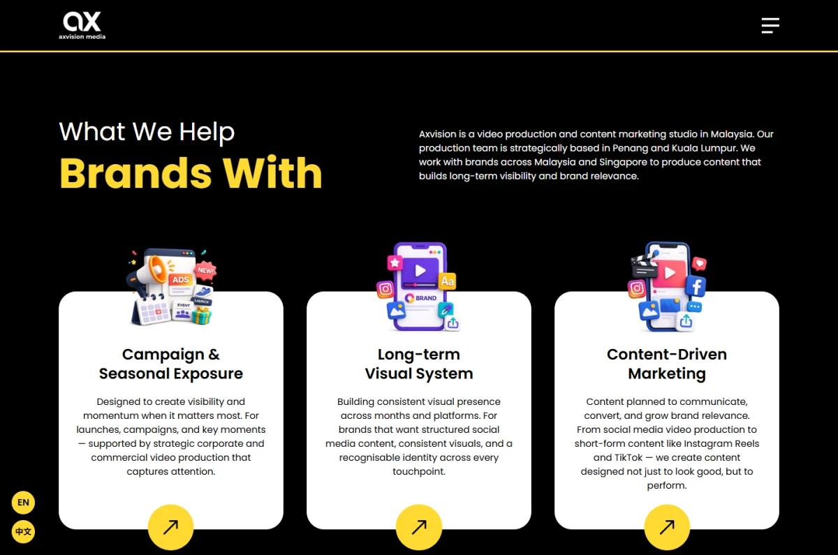
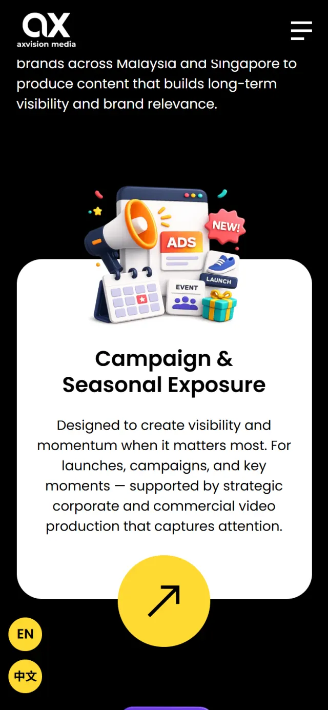
Each illustration breaks out of the top of its white card, and a yellow arrow hangs off the bottom. Your eye runs down the card and lands on the next step.
Black and yellow take turns, with one white band for the reviews, so each return of yellow is noticed. The bar above follows the real page in order, with the yellow chapters at their resting height. The thin band near the end is the closing call to action.
Watch where the colour goes as you scroll. The highlight shows what to look at, and the note says why it is there.
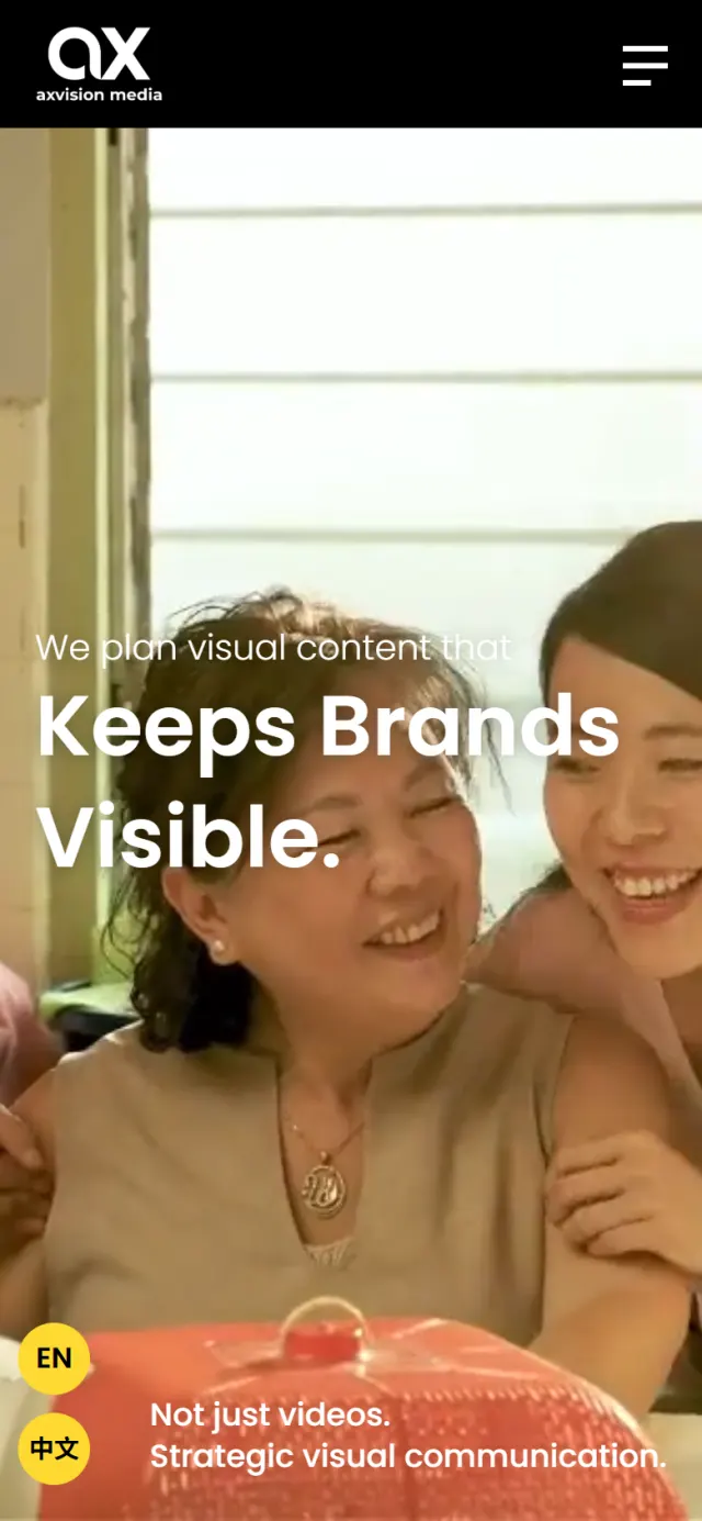
The reel plays full screen behind one line: “We plan visual content that Keeps Brands Visible.” A smaller note in the corner adds “Not just videos.”
Why The reel shows the craft at once, which leaves the words free to talk about the thing a reel cannot show: planning.
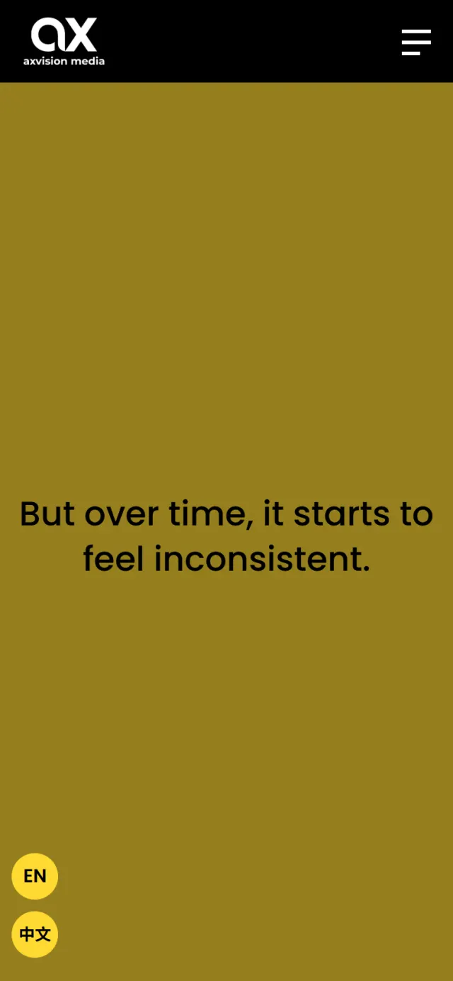
Yellow fills the screen and two sentences appear in turn, each sweeping in from the left: “Content is being produced regularly. But over time, it starts to feel inconsistent.” Then the colour sinks to black.
Why Plenty of owners post regularly and still feel the feed has lost its direction. Watching the colour go says more than a paragraph about consistency.
Out of the dark come three cards: Campaign & Seasonal Exposure, Long-term Visual System and Content-Driven Marketing. Each has an arrow to its own page.
Why The problem was just shown, so the answers arrive when people want them. The cards also sort buyers by what they need.
The same circle rises out of black and turns the screen yellow again. Three large numbered rows set out how Axvision works: understand, plan, execute.
Why Yellow returns at the exact moment the page explains how. The answer to fading is a process, and the colour says so.
Four recent projects sit in a grid. Each card plays a short muted clip once it is on screen, with a brief caption on the idea behind the film.
Why A still frame says little about a video company. A moving card shows the pace and the look before anyone opens it.
Under “Trusted by Brands Across Malaysia & Singapore”, three rows of client logos slide across the black. The client reviews follow straight after.
Why After seeing the work, a business owner wants to know who else trusted this team. The logos answer that in a few seconds.
A curved yellow band says “Let’s plan your next content direction.” A white bar below it asks “Looking for Video Solutions?” and holds one button, Enquiry Now.
Why The page has shown a brand fading. It closes with the colour back and a plan on offer, so the enquiry feels like the next step.
The whole promise, one lineThe colour drains hereOne card per needThree numbered stepsClips, not stills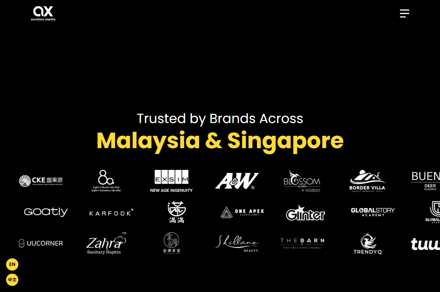 Rows of client logosOne button to enquire
The phone version keeps the whole story. The circle takes up more of the narrow screen, and the service cards stack into one column.
The fade gets the attention. These details help people find Axvision and get in touch.
English and Chinese sit on two round buttons that stay on screen, and each version is marked for Google.
The page describes the company, its address, its contact details and its services in a format Google can read.
Each of the three solutions has its own page, so a card on the home page leads somewhere specific.
Articles & Insights covers topics like what to prepare before a shoot and how to plan a festive campaign calendar.
Client logos and reviews sit together on the home page, close to the work they back up.
The Enquiry Now button at the end of the home page opens WhatsApp with the first message already written.
Every Potadot project starts by understanding the client's situation before anything is designed. See all seven steps
What Axvision really sells, who buys it, and why a plan matters more to them than a single video.
We shaped the argument into short lines, then set out the three solutions and the three-step method, in English and Chinese.
Black, yellow and the circle came first, then each chapter for phone and desktop, then the scroll story that links them.
Page titles, business details and services marked up for Google, the English and Chinese versions linked, then launch and support.
Want a website with one clear idea behind it? Tell Ricky about your business on WhatsApp at +6011-1142 1029.
We worked out the concept, shaped the content, designed the pages and built the site in English and Chinese, with search setup.
Axvision’s message is that inconsistent content costs a brand its visibility. Letting the colour drain away shows that problem before the page offers the answer.
Video looks best on black, and one bright colour is easy to remember. With so few colours, a visitor notices when the yellow disappears and when it returns.
Yes. We start from your business and the one idea it stands for, so your site will have a look and a story of its own. Tell us what you do and we will show you how we would approach it.