Make the idea easy to picture
RFID and IoT are words many owners have heard but few can picture. The site had to show how the parts connect before asking anyone to read about them.
JW Connect TechnologyTechnology · Company website
The website for JW Connect Technology, an RFID and IoT company in Singapore. Its product works through a signal you cannot see, so the home page is built around drawings that show how everything connects.
JW Connect Technology Pte Ltd is an RFID and IoT solutions provider in Singapore. It supplies tags, hardware and software, with services across Singapore, Malaysia and Vietnam. Potadot designed and built its website. The technology is hard to picture, so the home page explains it with drawings: a network on the first screen, a tablet wired to eight scenes, then four cards and a five-stage service flow. Product pages and a contact page follow.
JW Connect Technology helps businesses track assets and stock with RFID and IoT. It is based at Paya Lebar in Singapore, and its About page lists services in Singapore, Malaysia and Vietnam.
The range runs from tags and readers to printers, smart cabinets and software that works with a company’s existing ERP or WMS. The home page names five groups of customers, from fashion retail to healthcare.

Many business owners have never looked closely at an RFID reader. Before they get in touch, they need to understand what JW Connect does, what it sells and how a project runs.
RFID and IoT are words many owners have heard but few can picture. The site had to show how the parts connect before asking anyone to read about them.
Tags, readers, printers, cabinets, sensors and software make a long list. It needed a few simple groups on the home page and the full list one click away.
A fashion retailer and a hospital have very different stock to track. Both should see their sector named on the page.
This is a project, not a box in the post. A buyer needs to see the stages, from the first study to after-sales.
An RFID tag can be as plain as a sticker, and the signal it sends is invisible. There is nothing to photograph in action. JW Connect’s logo already held the answer: a frame with signal arcs leaving one corner. So we treated the home page as one long diagram. Lines join the desks to the server, a tablet connects to eight scenes, and a dashed line walks through the service flow. A visitor sees how the system fits together before reading a single specification.
 1
Network
Servers, desks and people joined by lines.
 2
Hub
A tablet wired to eight scenes.
 3
Parts
Four cards, each under a round icon.
 4
Path
Five stages on one dashed line.
 5
Range
Each tag on its own card.
 6
Reach
Address, map and form side by side.
JW in a rounded frame, with three arcs leaving the top right corner. Those arcs say “signal” without a word, and they return, much larger, on the tablet in the middle of the home page.
RFID works through the air, between a tag and a reader, and leaves nothing to see. A drawing can show the connection that a photograph would miss.
Retailers, factories, logistics firms and hospitals are all named on this site. One photograph would speak to one of them. Drawn scenes of trucks, factories and buildings leave room for all of them.
Headings stay in two blues on white and pale blue, with black reading text. The warm colour is kept for the drawings.
#FFFFFFReading chapters and cards#D6F5FEFirst screen, angled sheets and footer#003E92Logo, headings and buttons#0673EAThe second half of headings#000000Reading text#25D366The floating chat buttonOrange is not in the headings at all. It stays inside the drawings, on the signal arcs around the hub and on the small figures, so a mostly blue page still has one warm point for the eye to land on.
Empowering Your Assets and Inventory
Arial Black · Arial at its heaviest weight, for headingsEmpower Your Business with IoT Technology
Roboto · The Get In Touch bandEmpowered by RFID and IoT, we unlock real-time data to enhance efficiency, productivity, visibility, and connectivity.
Arial · Reading text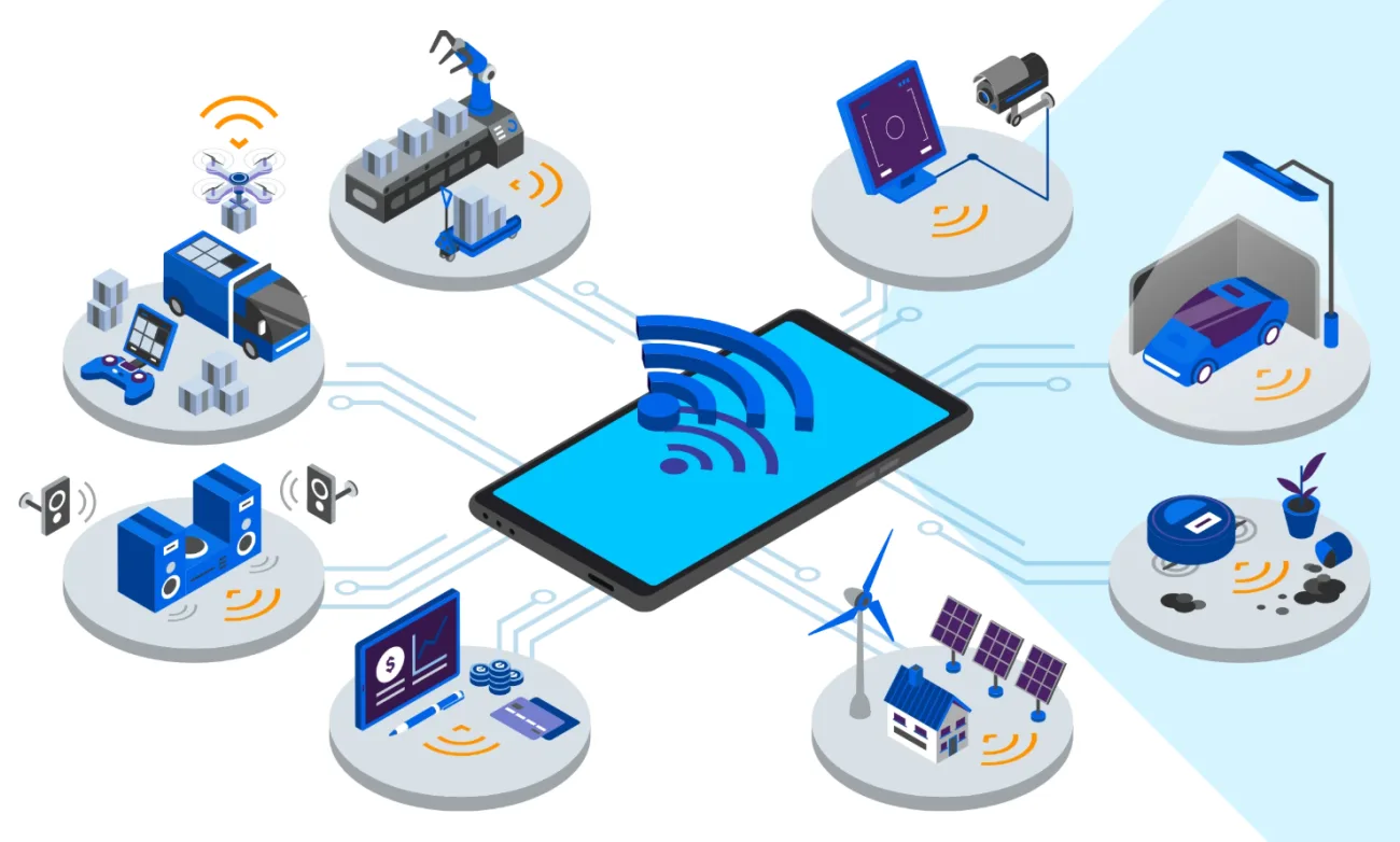
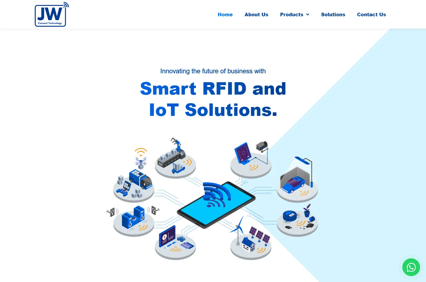
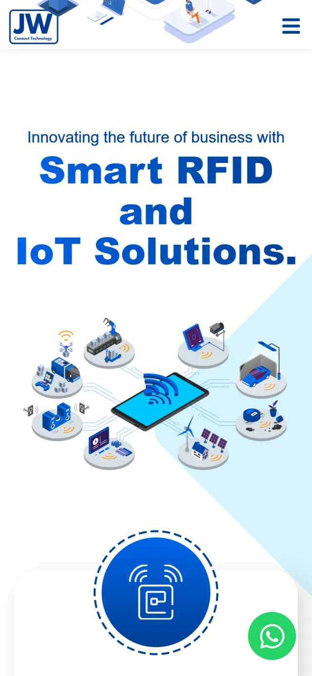
A tablet lies in the centre with signal arcs on its screen. Thin circuit lines run out to eight round platforms: a factory, a delivery truck, a car under a street light, a home with solar panels and more. It says what IoT means faster than a paragraph could, so it sits directly under “Smart RFID and IoT Solutions.”
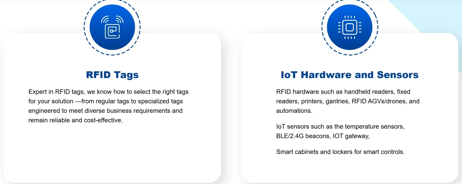
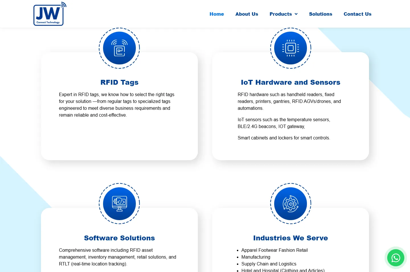
Each group sits in a white card with a round blue icon half outside it. A dashed ring circles the icon, and the service flow uses the same kind of dashed line, so the products and the process look like parts of one system.
The home page is mostly white, with pale blue at the top and the foot. Angled sheets of the same blue sit behind the chapters in between, so a long white page never looks flat. The bar above is this home page, drawn to scale.
Five stops on the home page, then the RFID Tags page and the contact page. Each highlight marks what to look at, and the note says why we put it there.
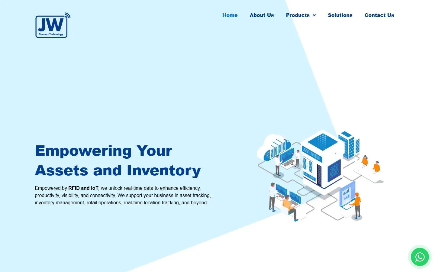
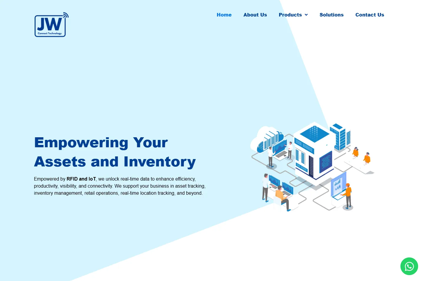
The headline names what JW Connect works on: assets and inventory. Beside it, grey lines join a server block, a cloud, desks and people.
Why Before reading a word about RFID, a visitor can see that this company is about things being connected.
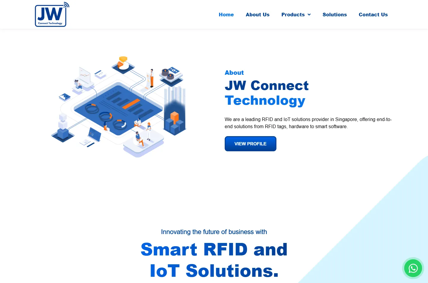
The company name sits in two blues above one sentence: an RFID and IoT provider in Singapore, from tags and hardware to smart software. VIEW PROFILE leads to the About page.
Why Someone comparing RFID suppliers wants to know what this one covers. Tags, hardware and software are named in one line, and anyone who wants more has one button to press.
A tablet sits in the middle with circuit lines running out to eight platforms. Each one carries the same orange arcs, from the factory to the home with solar panels.
Why IoT is a hard word to define. Eight small scenes wired to one screen explain it with no definition at all.
RFID Tags, IoT Hardware and Sensors, Software Solutions and Industries We Serve each get one card, with a round blue icon and a dashed ring on top.
Why A long range becomes four things to remember. Three cards say what JW Connect sells, and the fourth says who it is for.
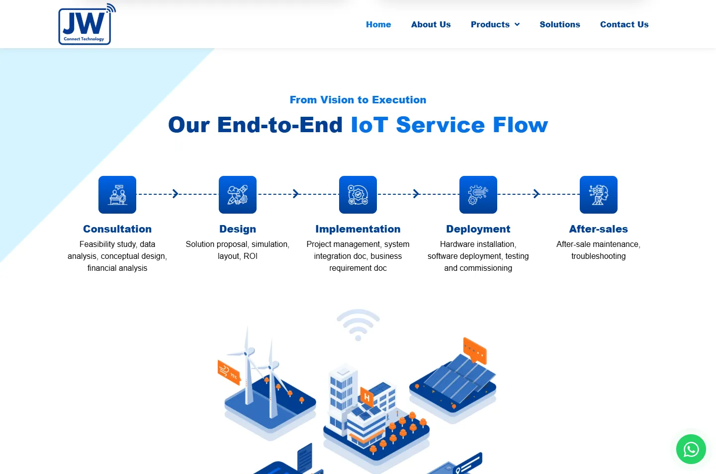
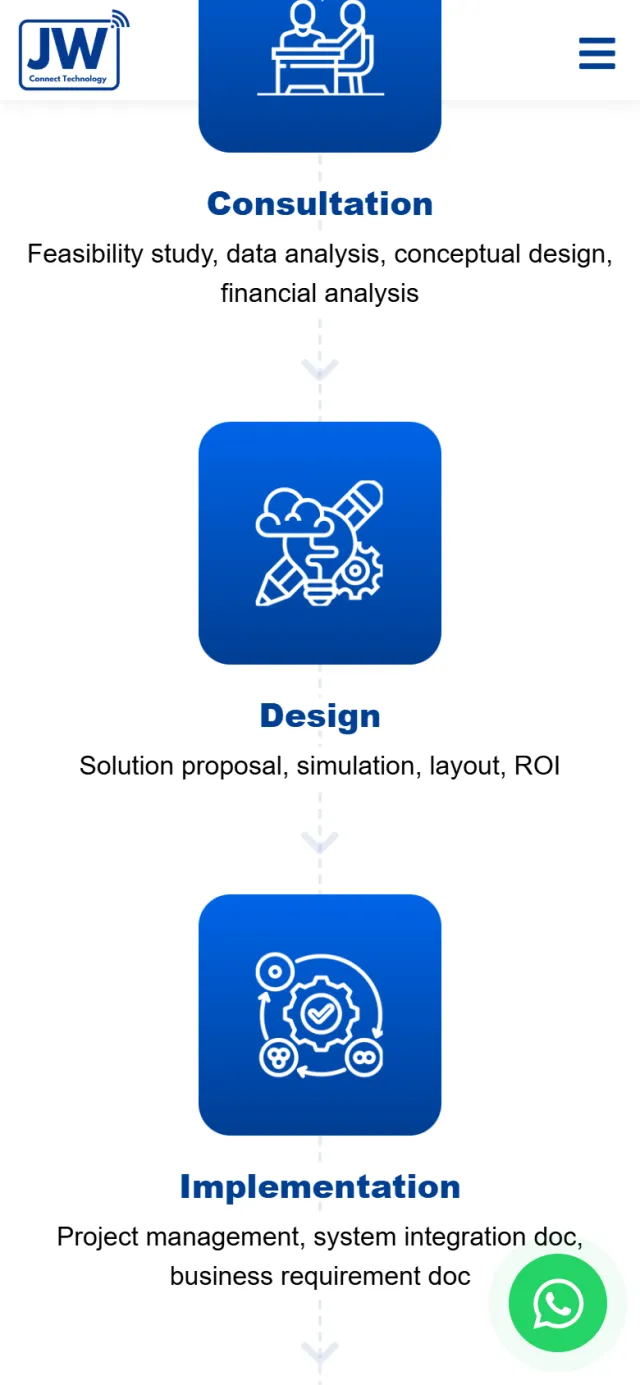
Consultation, Design, Implementation, Deployment and After-sales run left to right, joined by a dashed line with arrows. Each stage lists its real work, such as a feasibility study or testing and commissioning.
Why RFID is a project more than a purchase. The line shows a buyer that the work carries on after installation.
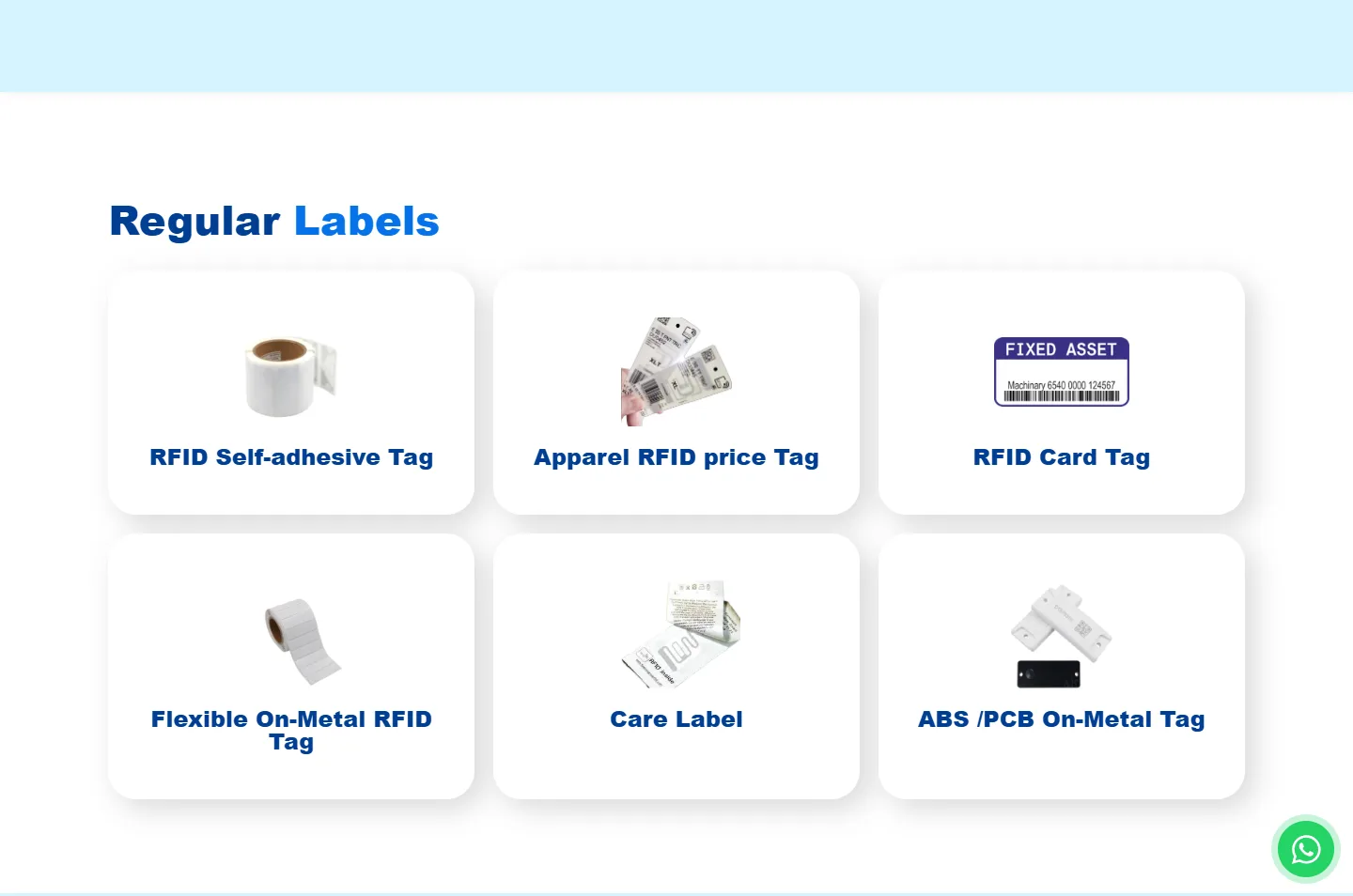
The RFID Tags page splits the range into Regular Labels and Special Labels. Each tag has a product photo and a name on a white card, starting with six regular ones.
Why After the drawings, a buyer wants to see the actual thing. This is where the invisible technology becomes something you can hold.
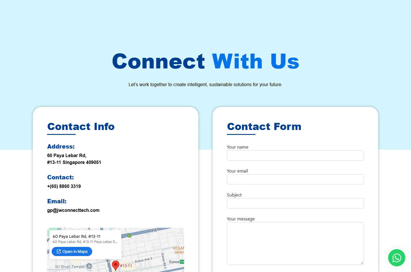
The contact page puts the address, phone, email and a map in one card, and a form with name, email, subject and message in the other.
Why After reading through tags and readers, a buyer should not have to hunt for a phone number. The address, phone, email, map and form are all here.
 Words left, network right
 Who they areOne hub, eight scenesFour cards, four answersOne line, five stagesRegular Labels, six cardsDetails left, form right
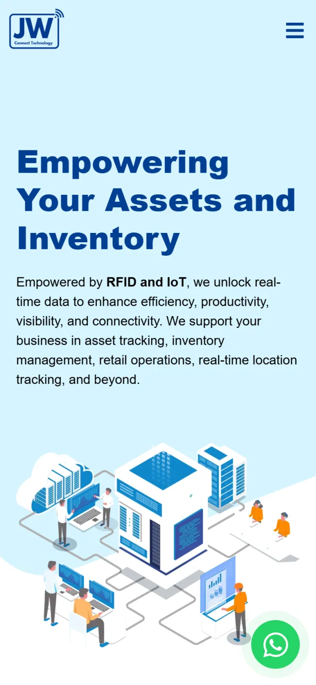
The home page keeps its order, from the network drawing down to the Get In Touch band. The drawings shrink to the width of the screen and stay clear, and nothing scrolls sideways.
A buyer looking for an RFID supplier in Singapore will not notice most of this. It helps them find JW Connect and reach the team.
The home page title reads “RFID & IoT Solutions Provider | JW Connect Technology Singapore”, and the description names asset tracking and inventory management.
The product pages have their own titles, such as “RFID Tags Supplier in Singapore | Wide Range of RFID Solutions” and “IoT Hardware Supplier in Singapore”, so each one speaks to its own search.
Structured data tells Google that JW Connect Technology is an organisation, and sets out the breadcrumb path of the page.
The green button stays in the corner of the screen. Pressing it opens a chat with JW Connect with “Hi, I contact you through your website!” already typed, so the team can see where the message came from.
The menu stays at the top as you scroll. Products opens to RFID Tags, IoT Hardware and Software Services.
The form on the contact page uses reCAPTCHA to help keep out automated messages.
Every Potadot project starts by understanding the client's situation before anything is designed. See all seven steps
What RFID does, what JW Connect supplies, and what a business owner has to grasp before asking for help.
We sorted a long range into four cards, then set out the five-stage service flow in short lines.
We took the blue and the signal arcs from the logo, then placed the five drawings down the home page and reworked each chapter for the phone.
Page titles and descriptions written around RFID and IoT terms, with Singapore named in the main ones, then launch.
Selling something that is hard to picture? Tell Ricky what it does on WhatsApp at +6011-1142 1029.
We worked out the idea of drawing the signal, sorted the range into four cards and a service flow, designed the pages and built the site, with search setup, a WhatsApp button and a contact form. The footer of the live site reads “Developed by Potadot”.
A photograph of a warehouse does not show RFID at work, because the signal is invisible. A drawing can show the lines between things. Real product photos come later, on the product pages, once the idea is clear.
We do not try to. The home page sorts everything into four cards, and the Products menu leads to separate pages for tags, hardware and software, where each item has its own place.
Yes. When buyers have to understand how something works before they ask for a quote, the first step is the same: find the one picture that explains it. Tell us what you sell and who has to understand it, and we will talk through what that picture could be.