Make the problem easy to picture
Being unknown to AI is hard to see. The site needed images and comparisons an owner can grasp at a glance, with no technical background.
BroccolinkAI marketing · Company website
The website for Broccolink, a Malaysian AI marketing service. Business owners read the words on the page. AI tools can read the data underneath. The site is built for both.
Broccolink is an AI marketing service run by Be Broccoli Inspiration House Sdn. Bhd. in Malaysia. Potadot designed and built its website as one long page in English and Chinese. The page asks business owners a single question, “Does AI know your story?”, then explains the idea, shows the method and ends on WhatsApp. Under the visible page, structured data describes the company, its service and four common questions in a format machines can read.
Broccolink is run by Be Broccoli Inspiration House Sdn. Bhd. (Reg No. 201901033374). Its service is content: material about a brand, written so that AI tools can recognize it, remember it and recommend it.
The site names three platforms for that content: a Brand Biography, a record of Corporate Milestones and a Brand FAQ Center. It closes with a limited offer of 1,000 Pioneer slots.

Google is familiar to every owner. What an AI tool says when a customer asks for a recommendation is a newer question. The site has to raise that question and answer it on a single page.
Being unknown to AI is hard to see. The site needed images and comparisons an owner can grasp at a glance, with no technical background.
A company that tells owners to make their brand readable by AI needs a site that is readable by AI. The data behind the page matters as much as the words on it.
The page runs in English and Chinese, so each language needed a complete version, from the first question to the last button.
A curious owner should not have to fill in a form. One WhatsApp message is enough to start.
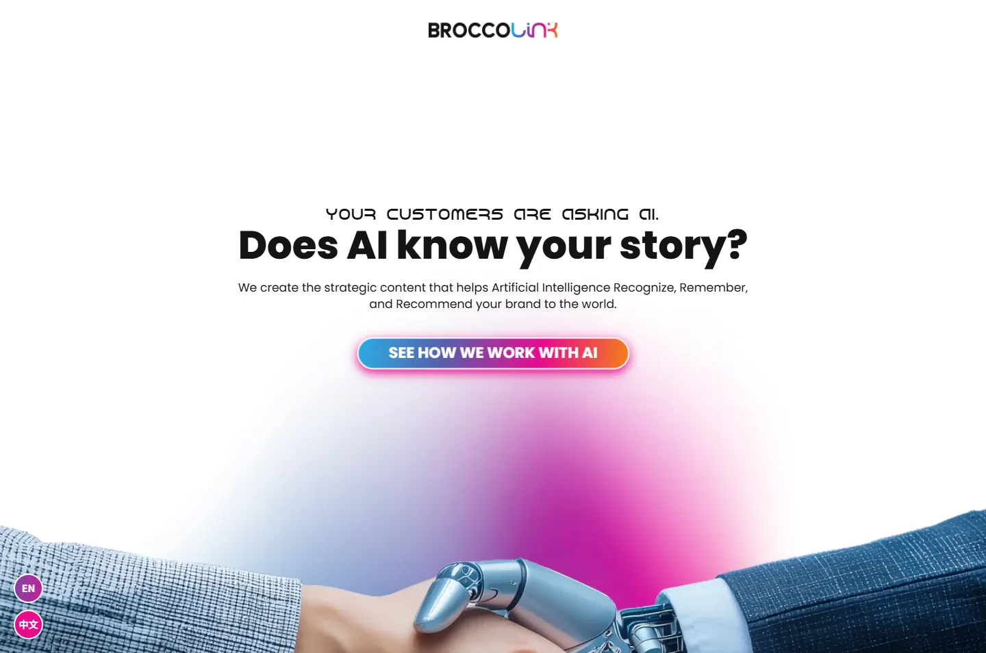
Broccolink’s argument is short: AI can only recommend what it has read. A site making that argument has to live by it, so this page speaks to two readers at once. The owner gets a plain story in big type. The machine gets structured data about the company and its service. The handshake near the top, one human hand and one robot hand, says the same thing in a single picture.
 1
Ask
The first screen asks one question.
 2
Hush
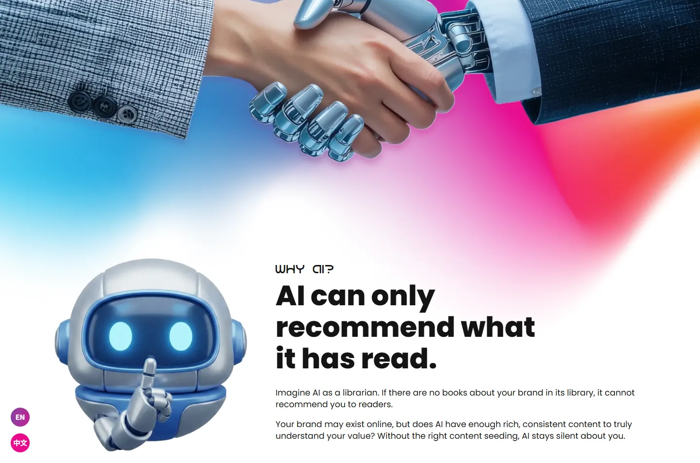
A robot with a finger to its lips shows what silence looks like.
 3
Follow
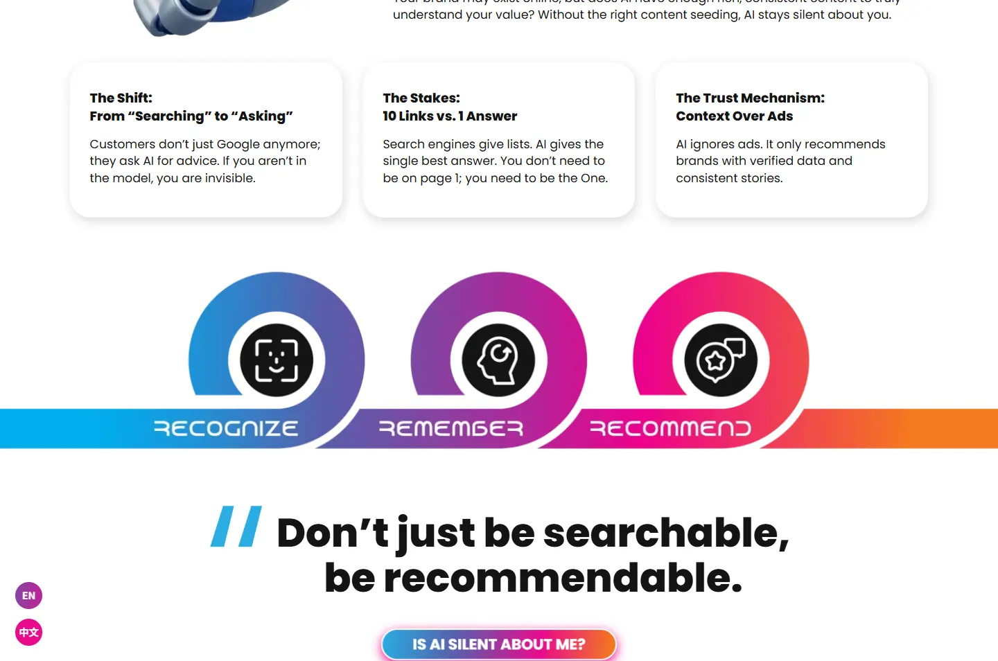
One ribbon carries Recognize, Remember and Recommend.
 4
Open
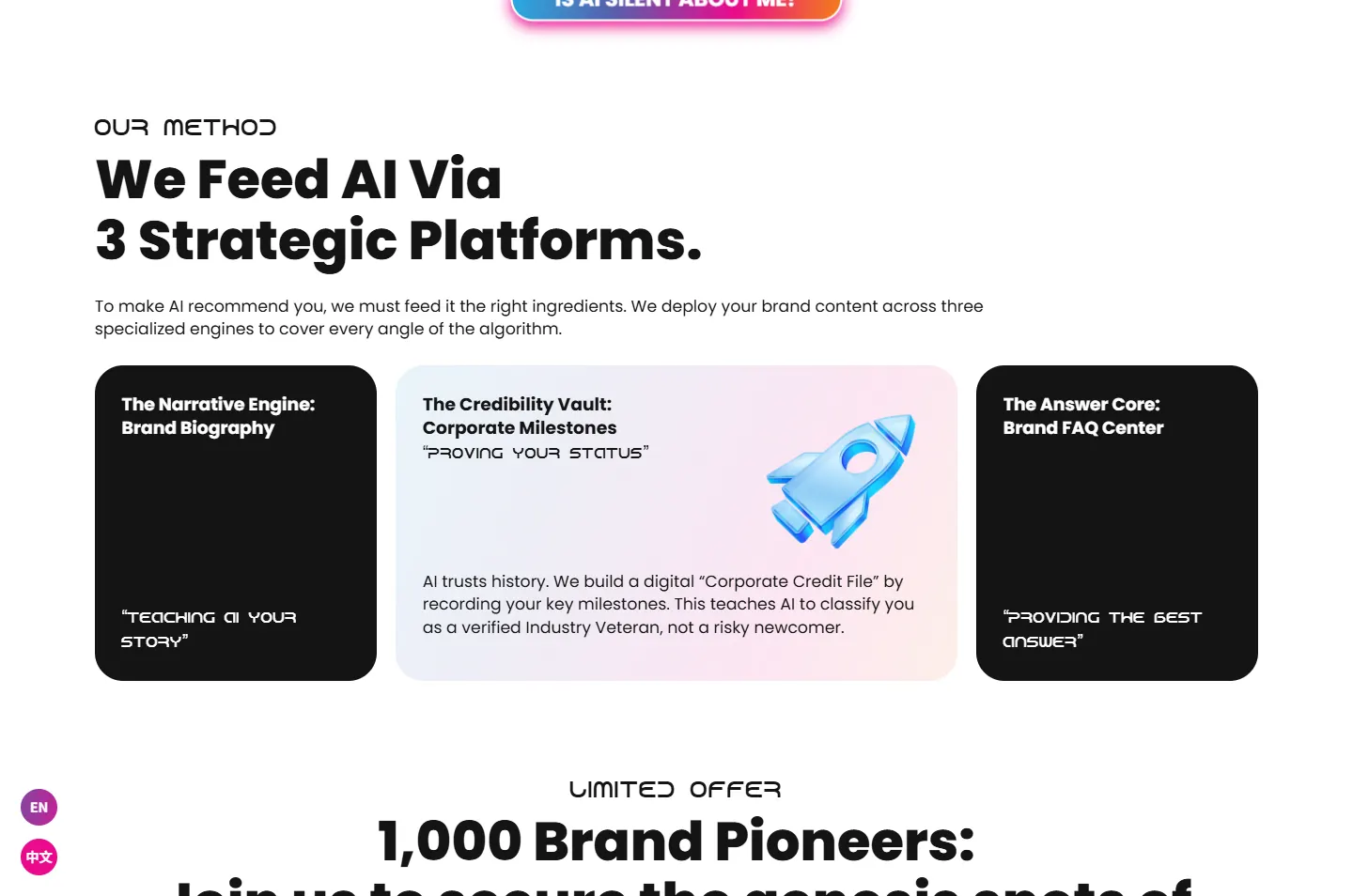
Three platforms, one card open at a time.
 5
Decide
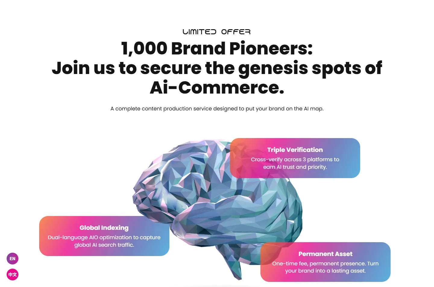
Three notes around a brain, then the offer.
 6
Reply
The last button opens WhatsApp.
BROCCO in solid black, LINK in thin coloured strokes. The logo already splits the name in two: heavy letters to read, colour for the link. The whole page follows that split.
The site compares AI to a librarian who cannot recommend a brand with no books in the library. That one comparison carries the page, because it turns a technical idea into something any owner can picture.
A human hand meets a robot hand over a glow of the brand colours. It stands near the top of the page because that meeting is what the service is about, and it is what the word link means.
The page is mostly white, with very heavy black headlines. The colour comes from one gradient, blue through magenta to orange, taken from the word LINK in the logo. It shows up on the things that connect: the handshake, the ribbon and the buttons.
#FFFFFFThe page itself#141414Headlines, closed cards, the footer wordmark#2AACE2Start of the gradient, the quote marks#EA0A8CMiddle of the gradient, the slots badge#F47A1FEnd of the gradientWhite and its pale tints cover about three quarters of the page, so the gradient stands out every time it arrives.
Does AI know your story?
Poppins · The opening question, extra bold on the live siteAI can only recommend what it has read.
Poppins · Chapter headlines, the same size and weight thereImagine AI as a librarian. If there are no books about your brand in its library, it cannot recommend you to readers.
Poppins · Reading text
Three spirals on one ribbon, with the colour moving from blue to orange as it goes. Recognize, Remember and Recommend read like stages on a road. The lettering looks like Android 7, the site’s second typeface, a squared, machine-like face used for the label above each headline.
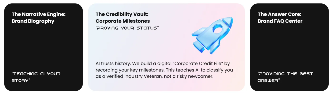
On a computer, one card is open and pale while the other two stay closed and black. Point at a closed card and it opens in turn. Three long explanations become one at a time, and the closed text stays in the page’s code.
The page stays white and lets short bursts break it: the handshake, the ribbon, the black cards and the giant wordmark at the foot. The bar above is this page to scale, with each chapter in its strongest colour.
From the first question to the last button, each highlight marks one part of the argument and the note gives the reason for it.
A small line says customers are asking AI. Below it, the biggest words on the screen ask “Does AI know your story?” One sentence and one button follow.
Why A question makes an owner check their own position. A statement about AI would be easy to skim past.
Beside the line “AI can only recommend what it has read”, a robot holds a finger to its lips. The text compares AI to a librarian with no books about your brand.
Why The problem here is something missing, which is hard to show. A robot saying shh makes it easy to picture.
The Shift, The Stakes and The Trust Mechanism each get a plain white card and a short headline, such as “10 Links vs. 1 Answer”.
Why Each headline makes sense alone, so an owner who is only skimming still picks up all three reasons.
A ribbon crosses the full width of the screen and curls into three spirals, Recognize, Remember and Recommend, with an icon in each.
Why Three words in a list are easy to forget. On one unbroken ribbon they read as a single journey with a clear end.
The method is three platforms. Point at a card and it widens, turns pale and shows its icon and explanation, while the other two stay closed.
Why Owners see all three names at once and read the detail only for the one they choose.
Under the 1,000 Brand Pioneers headline, a faceted brain sits in the middle with three gradient notes around it: Triple Verification, Global Indexing and Permanent Asset.
Why The brain is the second reader, the one the whole page is about. Pinning the notes to it stops them reading like a plain list.
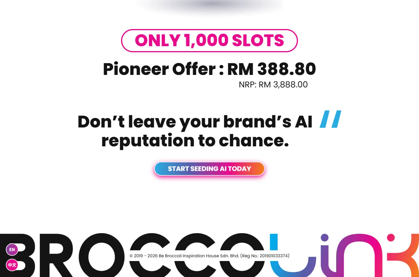
The offer comes first, then a closing line and a button that opens WhatsApp. Below it, the Broccolink wordmark runs the full width of the screen.
Why By this point an owner has one thing left to do. The very large name is the last thing they see before leaving.
One question, one buttonThe robot and the librarian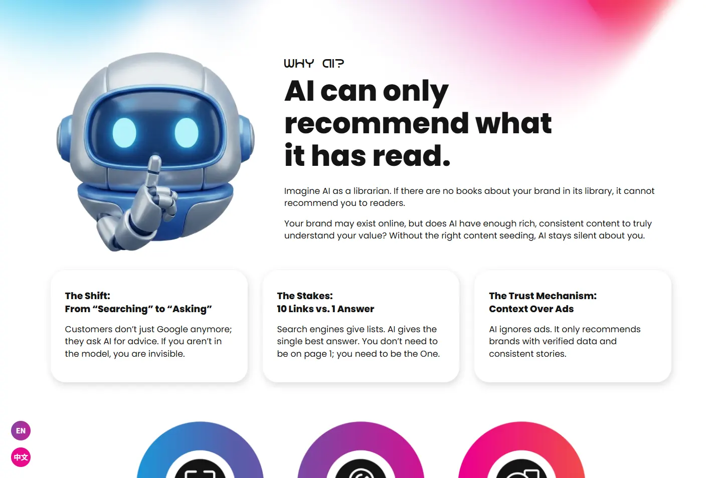 Three cardsRecognize, Remember, RecommendPoint to openThree notes, one brainOffer, button, wordmark
On a phone there is no mouse to point with, so the page changes how it shows things. The order of the story stays the same.
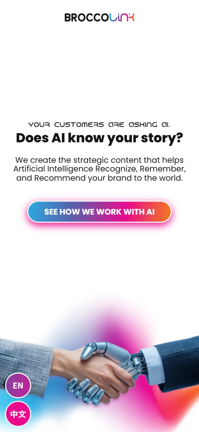
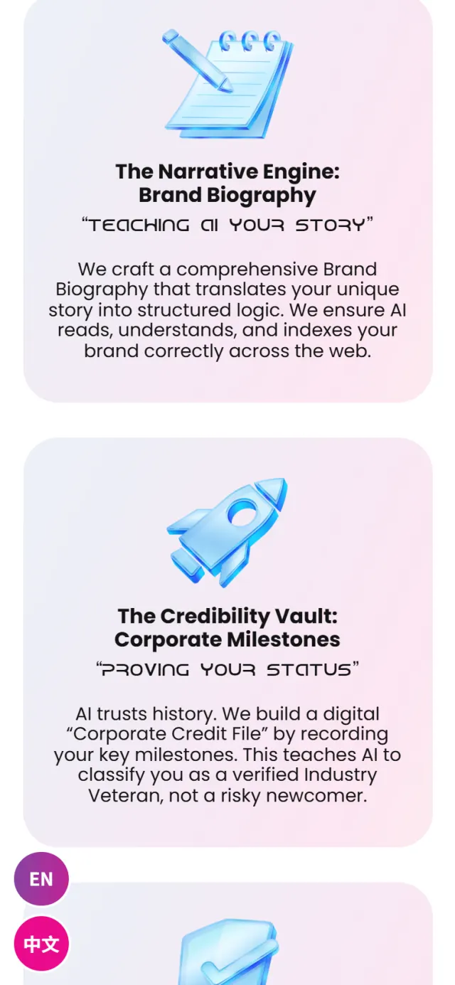
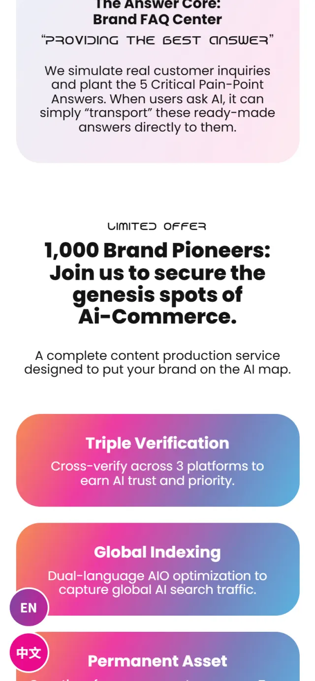
The first three cards are written for machines, and a visitor never sees them. On this site they are the point. The other three make sure a person can read the page and reach the company.
Structured data states the company name, its logo, a short description and that it serves Malaysia.
A second block names the service as Answer Engine Optimization and ties it to Broccolink.
Four common questions, such as “What is AEO?”, are written out as FAQ data behind the page.
Each language has its own address, linked by language tags. Two round buttons stay at the lower left of the screen for switching.
All three gradient buttons open a chat with the same number, so there is no form to fill in.
Phones cannot hover, so the method cards show everything there. On a computer, the closed cards’ text is still in the page’s code.
Every Potadot project starts by understanding the client's situation before anything is designed. See all seven steps
What Broccolink sells, who needs it, and how to explain AI visibility to an owner who has never thought about it.
Short headlines and plain comparisons for each chapter, in English and Chinese.
The gradient, the ribbon and the opening cards first, then every chapter for computer and phone.
Titles, language tags and structured data for the company, service and FAQ, then launch.
Have a new service to explain? Tell Ricky about it on WhatsApp at +6011-1142 1029.
We worked out the concept, wrote the content, designed the page and built the site in English and Chinese, with search setup, structured data and WhatsApp links.
Broccolink’s idea takes a few steps to explain, and each step depends on the one before. One page in a set order keeps them together.
It is information in a page’s code that describes a company and its services in a format machines can read. It matters twice on this site, because being readable by machines is also what Broccolink sells.
Yes. If customers need something new explained before they buy, we start by looking for the plain comparison that does it, as the librarian does here, then shape the page around it. Tell us what you sell and we will show you how we would approach it.