Carry the weight of the profession
A visitor judges a law firm before reading a word. The first screen had to look as formal as the work.
J. Lee & Co.Legal · Law firm website
The website for J. Lee & Co., a law firm in Kuala Lumpur. The first screen is all stone and formality. A short scroll later, visitors meet the lawyer who leads the firm, by name and by face.
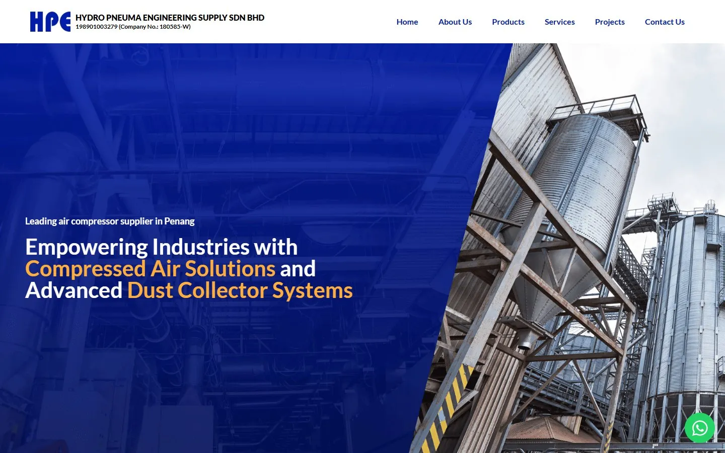
J. Lee & Co. is a full-service law firm in Kuala Lumpur, led by Mr. Lee Shoue Jie (Jack). Potadot designed and built its website. The home page turns on one idea. It opens on a dark photograph of columns and steps, because the law is formal and a firm needs that weight. Then it moves to a white page and a large portrait of the lawyer, because people bring a problem to a person, not to a building. The rest of the page sets out what the firm believes, how it works, what it handles and how to reach it.
Messrs. J. Lee & Co. is a full-service law firm serving individuals and businesses across Malaysia, with its office in Menara Dungun, Damansara Heights.
The firm is led by Mr. Lee Shoue Jie (Jack), an Advocate & Solicitor of the High Court of Malaya whose focus is civil and corporate litigation. Its work falls into three groups: dispute resolution, corporate advisory and retainer services, and probate and conveyancing.

Someone looking up this firm may be holding a letter of demand or chasing an unpaid invoice. They want to know two things: is this firm proper, and can I talk to them?
A visitor judges a law firm before reading a word. The first screen had to look as formal as the work.
People want to know who they would be dealing with. The lawyer who leads the firm had to appear early, by name.
Fifteen services cover court disputes, advisory work and paperwork. A visitor should be able to scan them in three groups before reading any one of them.
Getting in touch with a lawyer can feel like a big step. A call, a WhatsApp message or a short form all had to be close at hand.
The law feels like a large stone building: old, formal and a little hard to approach. The site starts there, because a firm needs that weight. Then it turns. Inside, the page goes white, the lawyer appears, and the firm starts speaking plainly in its own words.
 1
Approach
Columns, steps and one plain line.
 2
Meet
The lawyer who leads the firm.
 3
Listen
What the firm does not believe in.
 4
Trust
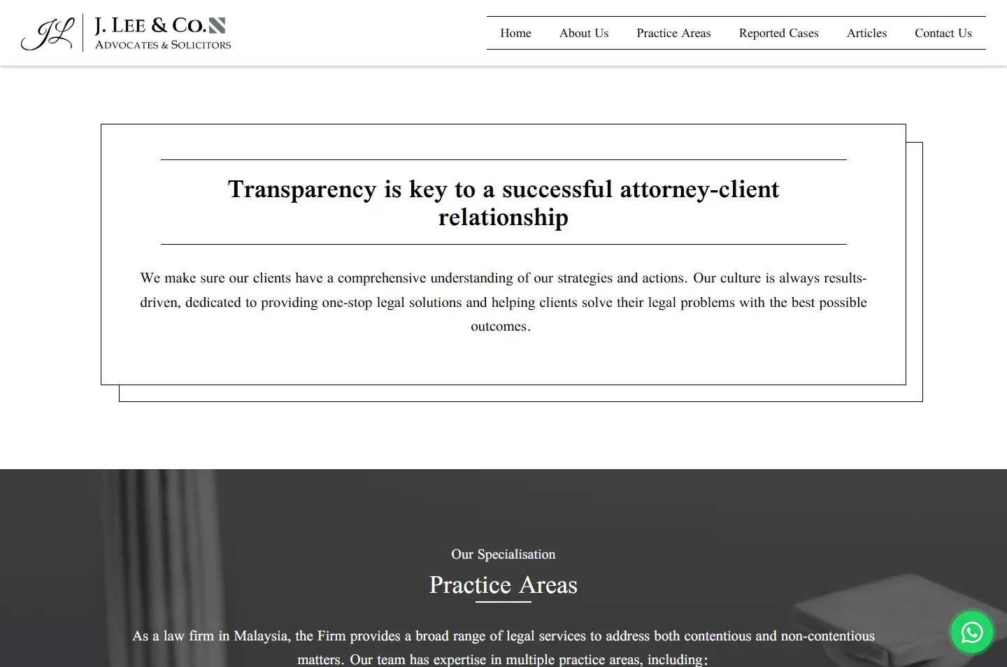
How the firm keeps clients informed, in a frame.
 5
Choose
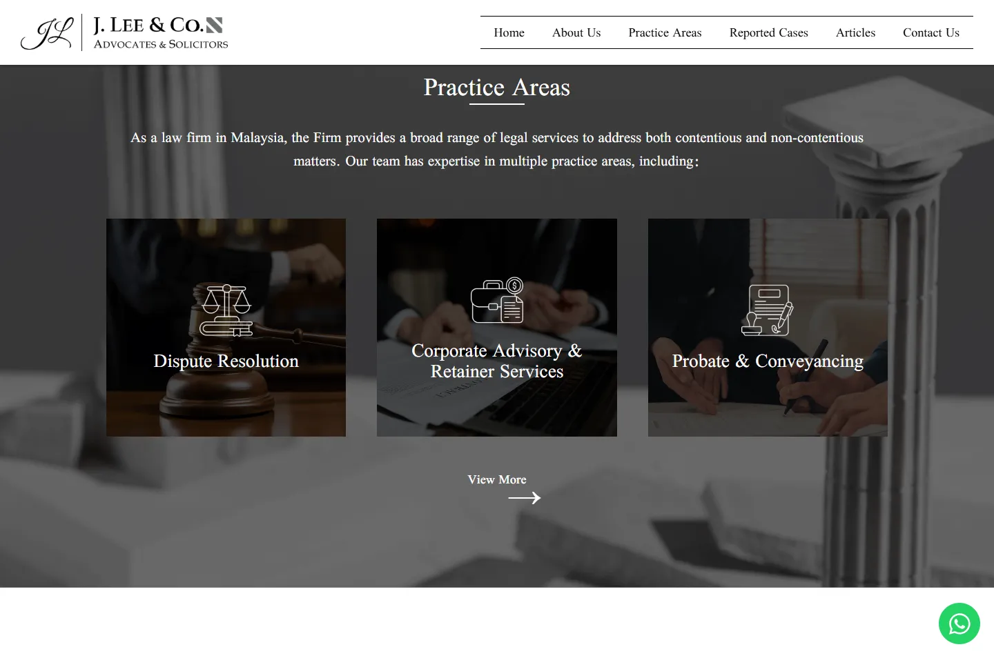
Three practice areas, three cards.
 6
Read
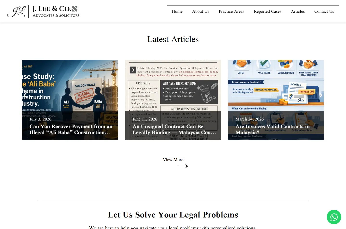
Articles before any phone call.
A flowing handwritten JL beside the name in formal capitals. Personal on one side of the line, letterhead on the other. The whole page makes the same move.
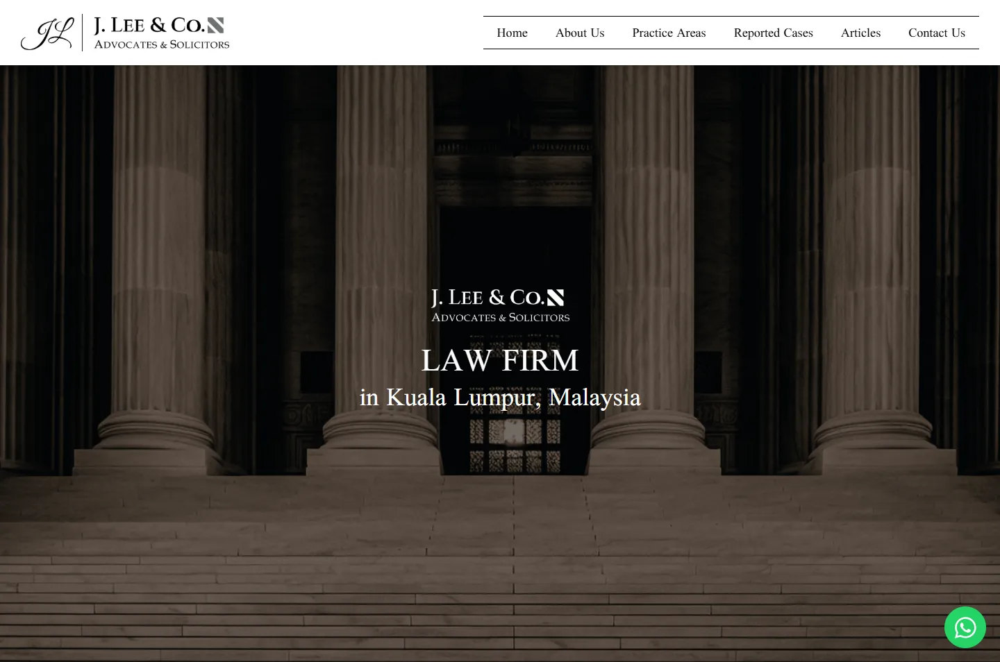
Columns, steps and a dark doorway in deep sepia. The photograph says “law” before any text does, so the words over it can stay short.
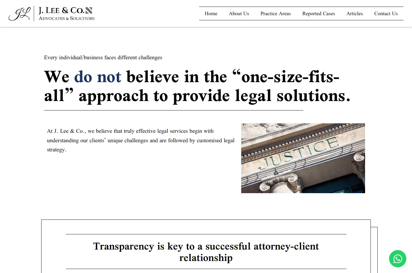
“We do not believe in the ‘one-size-fits-all’ approach.” If every client is different, the site cannot stop at a picture of a building. It has to show who you would be working with.
The palette stays as formal as a letterhead: dark photographs, white pages and a single navy. That restraint is what lets one portrait stand out.
#FFFFFFChapters the firm speaks in#000000Headlines and photo tints#1D3561Portrait band, “do not”, footer#25D366The WhatsApp button onlyNavy is the firm’s one colour, and it marks the parts that count: the portrait band, the words “do not”, the Contact Us button and the footer. Green belongs to the WhatsApp button alone, so it is always easy to find.
LAW FIRM in Kuala Lumpur
Scheherazade New · The opening lineWe do not believe in the “one-size-fits-all” approach
Scheherazade New · Statements, set larger and bolderWe are here to help you navigate your legal problems with personalised solutions.
Scheherazade New · Reading text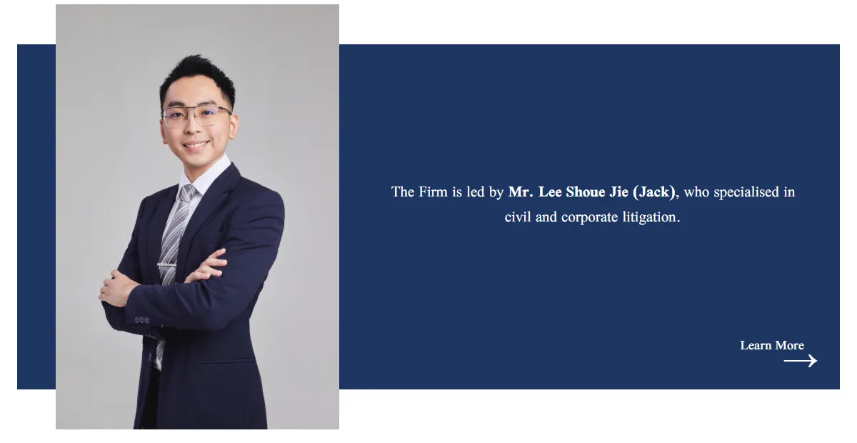
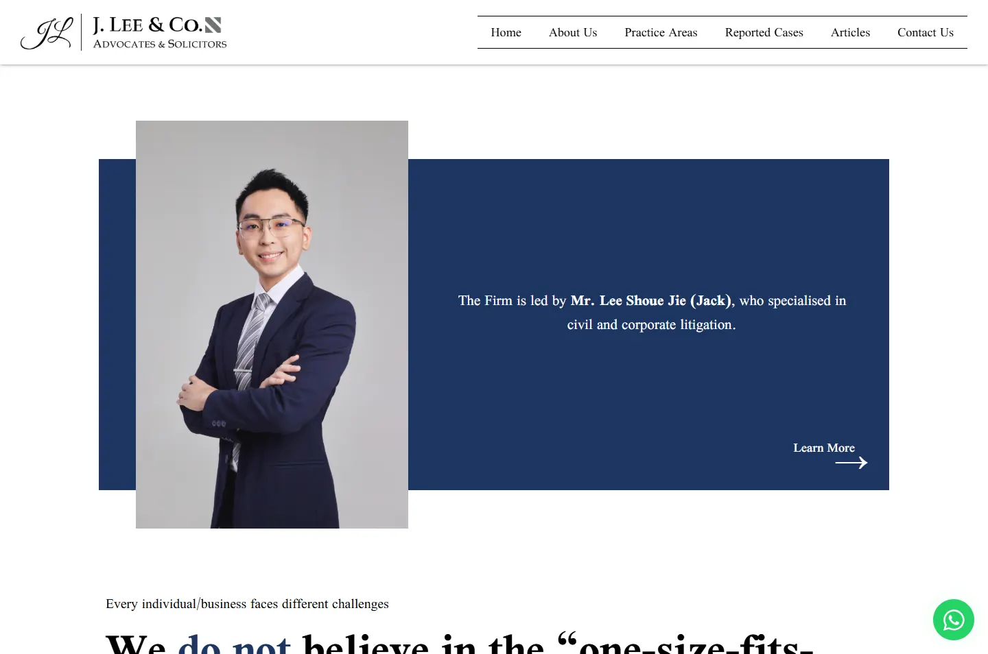
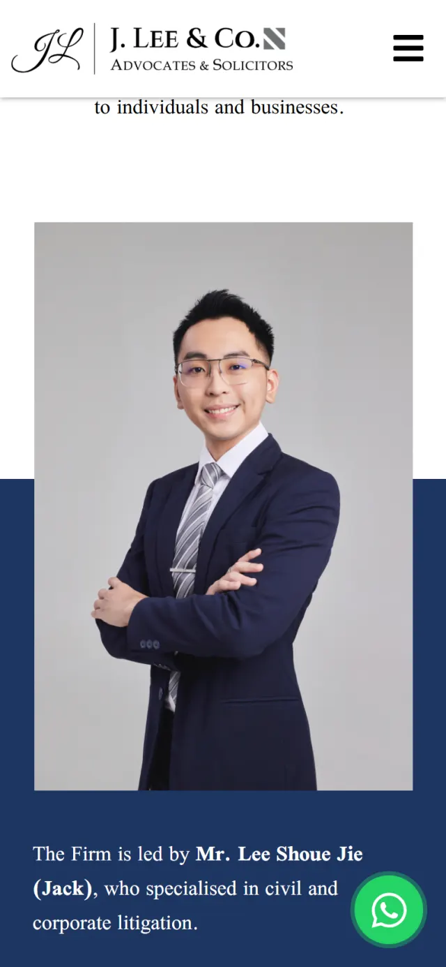
The portrait is taller than the navy band behind it, so Mr. Lee stands clear of it at the top and the bottom. The rest of the page sits in straight rows and boxes. This one small break pulls the eye to him.
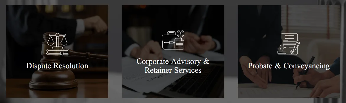
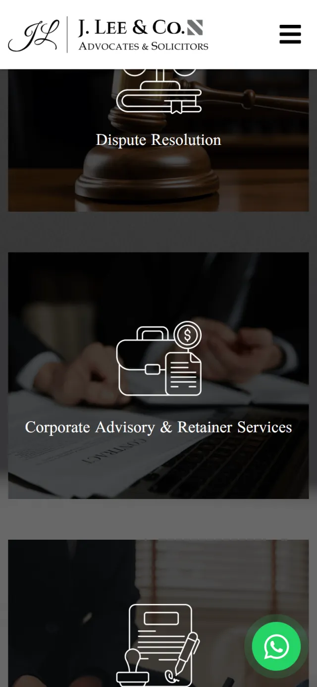
Each practice area is a dark photograph with a thin white icon and a short name. The icons are drawn in fine line, like the rules used elsewhere on the page, so three busy photographs still look like one set.
Dark bands open, divide and close the page, and the white chapters between them carry the firm’s reasoning. The navy portrait band comes third, so a face appears before the reasoning starts. The bar above is the real page, to scale.
Seven stops down the home page, in the order a visitor sees them. The highlight shows what to look at, and the note says why it is there.
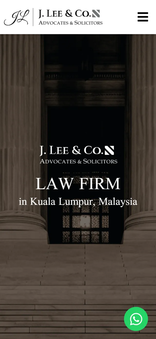
A sepia photograph of columns, steps and a doorway fills the screen. Over the doorway sit the firm’s logo and one plain line: Law Firm in Kuala Lumpur, Malaysia.
Why Anyone arriving from a search learns what this is at once. The picture carries the weight, so the words can stay simple.
After a short About Us, the page shows Mr. Lee in a large portrait on a navy band. His name is in bold beside him, with the area of law he focuses on.
Why A visitor has just seen a building. Now they see who leads the firm, and it stops being an institution.
The largest type on the page says the firm does not believe in a “one-size-fits-all” approach. The words “do not” are in navy.
Why A list of values is easy to skim past. A flat “do not” takes a side, and two navy words are enough to make you stop and read it.
The next statement sits in a thin double frame, with a rule above and below its heading. It says clients should understand the firm’s strategies and actions.
Why A plain outline with nothing filled in suits a point about openness. It also reads like a clause set apart in a legal document.
Back on a dark band with a stone column behind it, the work comes down to three cards. View More leads to the full list of services.
Why Someone with a legal problem does not want 15 services at once. Three groups help them find the right door, and the detail waits one click away.
A row of dated articles answers real questions, such as whether an invoice is a valid contract. Arrows move through more, and View More opens them all.
Why Reading a clear explanation lets a visitor see how the firm thinks before they decide to get in touch.
The page ends with a short offer of help and a single navy Contact Us button. Below it, the footer gives the firm’s registration number and phone lines.
Why The section gives one clear next step. The registration number is there for anyone who wants to check who they are dealing with.
Logo and one lineTaller than its bandTwo words in navyA double frameThree cards, one linkDated articles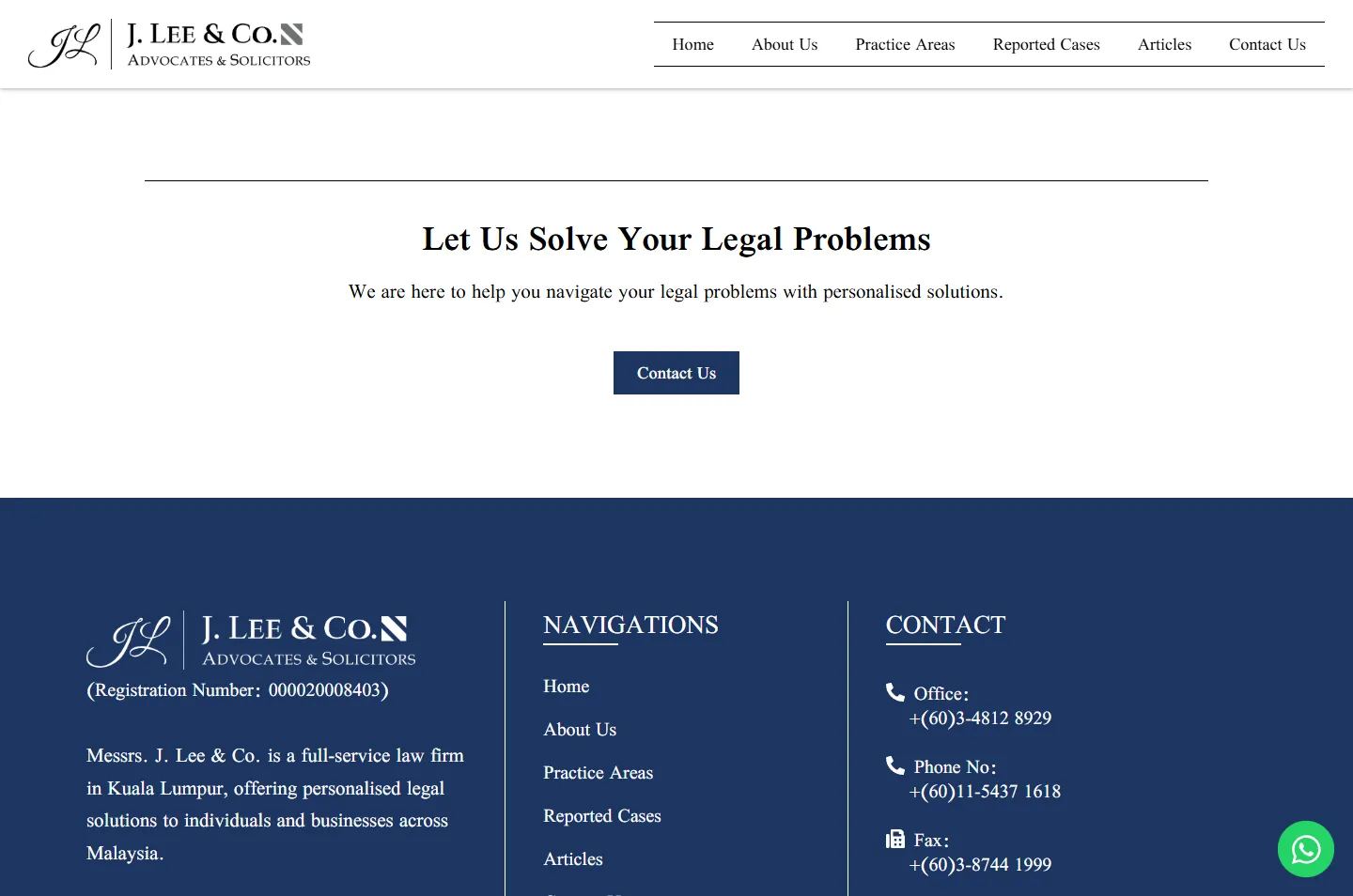 Contact Us, then the details
Phones keep the same order: the building, then the person. The portrait grows to nearly the full width of the screen, and each chapter is rearranged so nothing has to be zoomed.
A visitor can call, message or write in, then check the firm’s registration or read its articles.
A green button stays in the corner of the screen. A tap opens WhatsApp with a short greeting already written.
The office and mobile numbers are phone links, so a visitor on a phone can call without copying anything.
The Contact Us page has a five-field form: name, phone, email, subject and message. The office hours sit beside it.
The home page describes the firm, the site and the page trail in a format Google can read.
The firm’s registration number is in the footer, with a link to view its certificate of registration.
Articles are dated posts on WordPress. The list runs from August 2024 to July 2026 and holds 12 so far.
Every Potadot project starts by understanding the client's situation before anything is designed. See all seven steps
The firm’s 15 services, the people who bring them problems, and what someone worried needs to see first.
We kept the wording short and let the firm’s own beliefs lead, with its work presented as three practice areas.
Dark photographs, one navy and one typeface set the tone. The portrait band was built around Mr. Lee, and every chapter was arranged for phone and desktop.
Page titles, the firm’s details in a format Google can read and an article section ready to grow, then launch and support.
Running a law firm or a professional practice? Tell Ricky about it on WhatsApp at +6011-1142 1029.
We worked out the concept, organised the content, designed the pages and built the site in English, with search setup, a contact form, a WhatsApp button and an articles section.
The building sets the tone. It tells a visitor this is a proper law firm before they read anything. The portrait then means more, because it comes straight after all that stone.
The firm lists 15 services across three groups. Three cards are quick to scan, and View More opens the full list for anyone who wants the detail.
Yes. The columns and the portrait suit this firm. Yours would get its own idea, drawn from your work and the people who come to you. Tell us about your practice and we will show you how we would approach it.