Show the destination
A reader may never have lived in Singapore. The site had to make the place feel real before saying anything about the firm.
A Plus ConsultingProfessional services · Company website
The website for A Plus Consulting, a Singapore immigration and business consultancy. Before anyone picks an adviser, they want to know why Singapore, and then why this firm. The home page answers in that order.
A Plus Global Consulting Pte Ltd, known as A Plus Consulting and in Chinese as 最佳环球咨询有限公司, is a Singapore immigration and business consultancy at Paya Lebar Square. Potadot designed and built its website in Chinese and English. The home page follows the two questions a person asks before moving country: why Singapore, and why this firm. Each question gets eight answers. Black and gold frame the page, and photographs of the city bring the colour.
A Plus Global Consulting Pte Ltd, known as A Plus Consulting, advises foreigners who want to settle in Singapore, and helps companies with work passes, hiring and company registration. It is part of A Plus Group, and its office is at Paya Lebar Square, near Paya Lebar MRT.
The work runs on two lines: immigration consulting and business services. The firm states more than 18 years of industry experience, and names certified accountants, lawyers, investment advisers, study-abroad consultants, banks and fund companies among the partners it works with.

Nobody moves country on a whim. A family or a company owner comes to this site still deciding, so it has to show them the place, point them to the right service and give them a reason to trust a stranger with private details.
A reader may never have lived in Singapore. The site had to make the place feel real before saying anything about the firm.
Someone relocating a family and someone running a company need different help. Each needed a clear way in.
This work touches family, money and personal papers. A visitor has to see who the firm is and how it treats that information.
The site’s main address is in Chinese, and the firm is on WeChat and Xiaohongshu. It had to work in Chinese first, with English beside it.
The headings on the English version of the site ask two questions: Why Singapore, then Why A Plus. That order is the whole plan. The first half of the page is about the country and says little about the firm. Once the reader wants to go, the firm steps forward with the same number of reasons.
 1
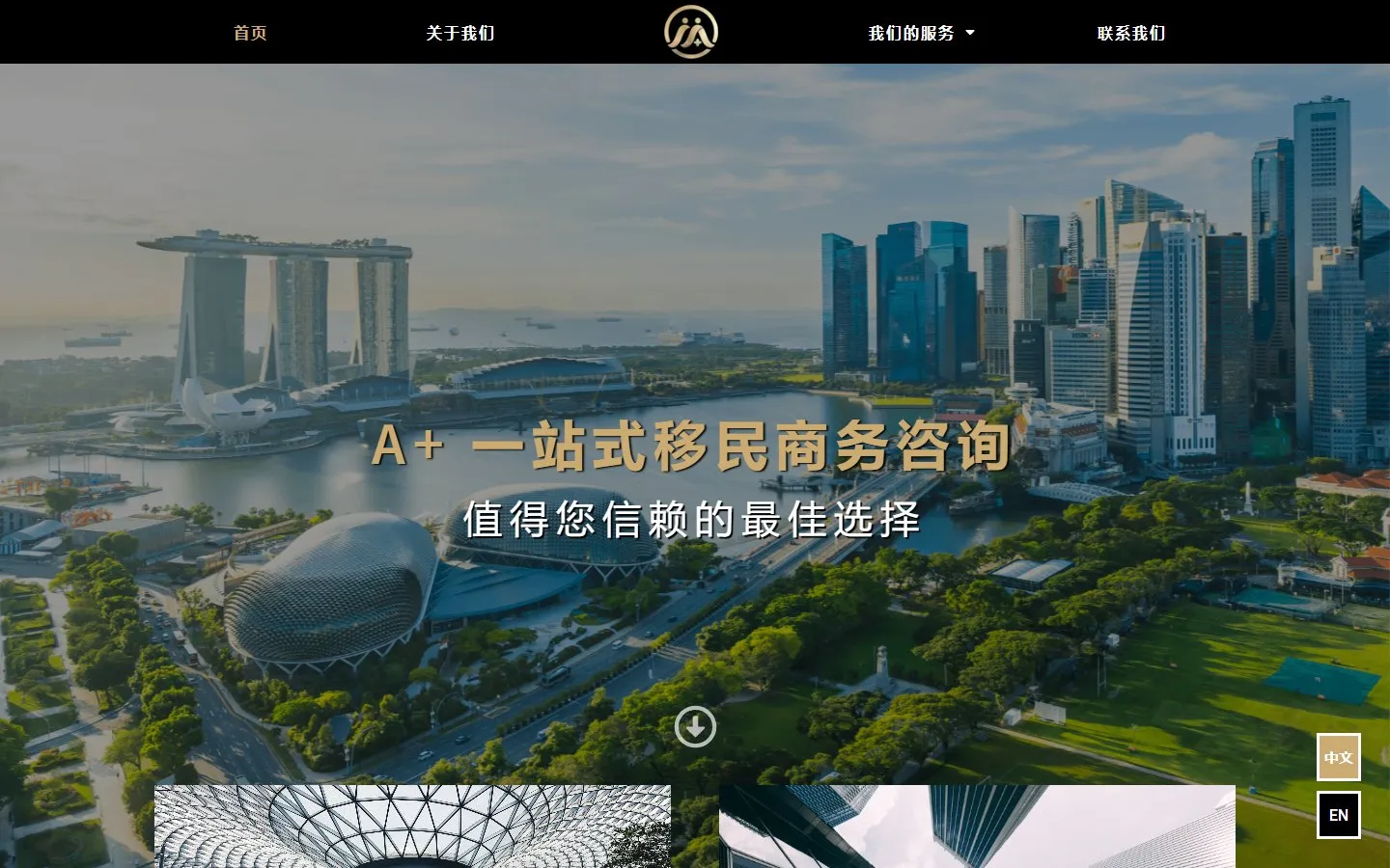
The city
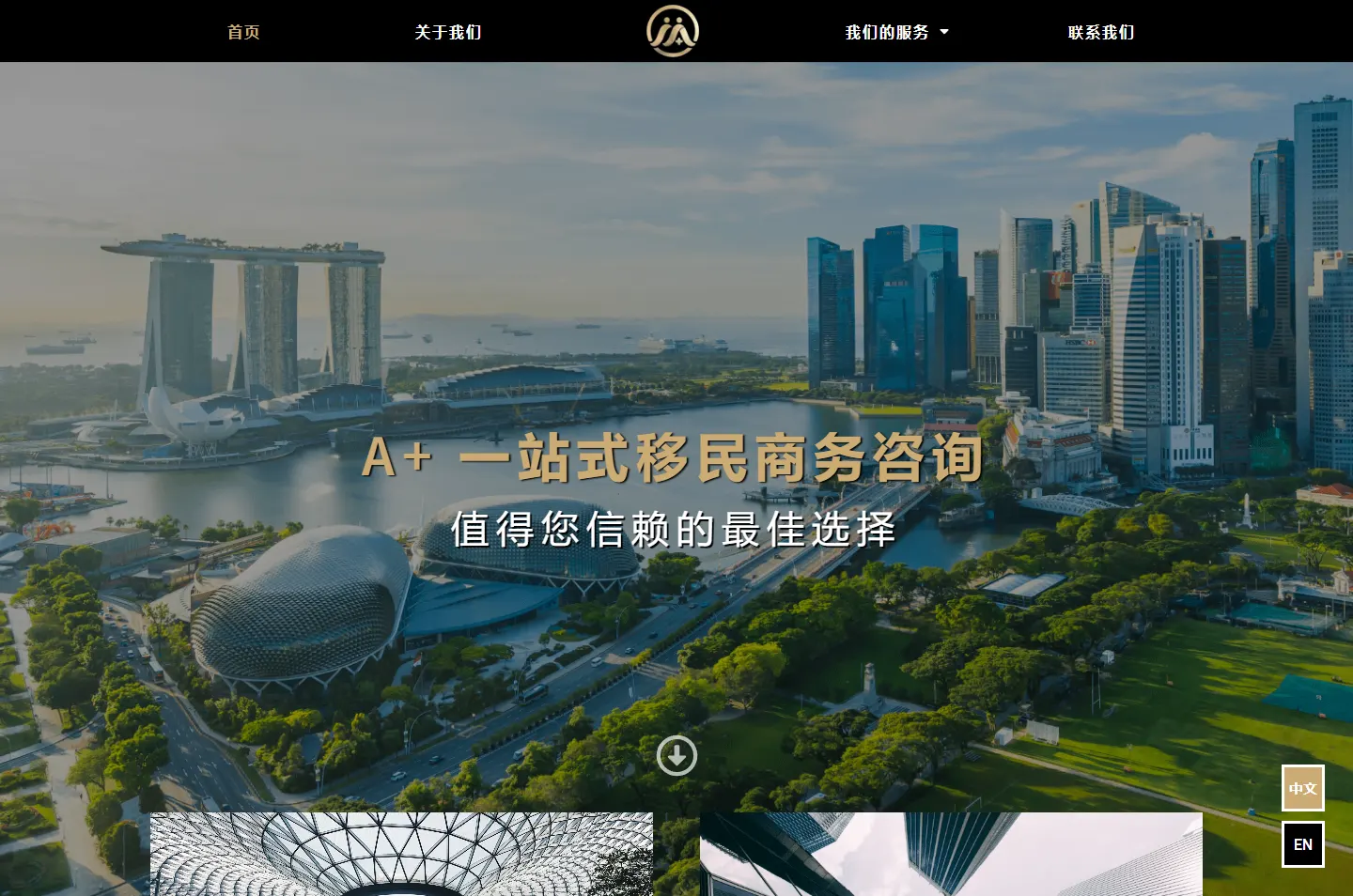
Singapore fills the screen.
 2
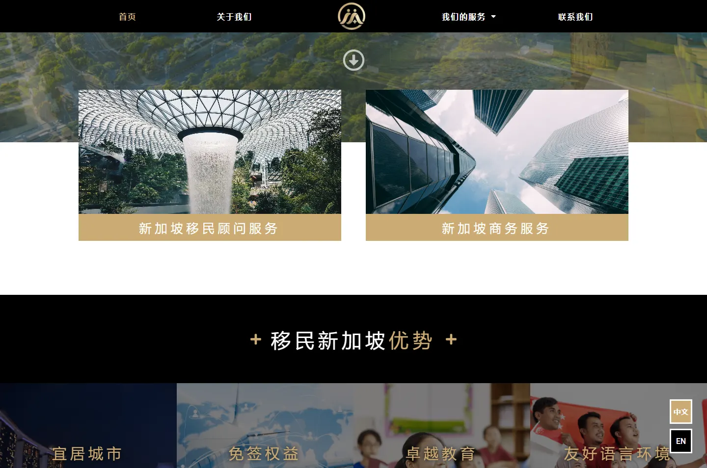
Choose
Immigration or business, side by side.
 3
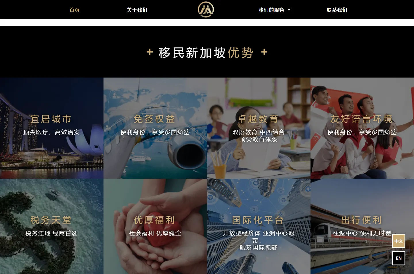
Why Singapore
Eight reasons, eight photos.
 4
Meet the firm
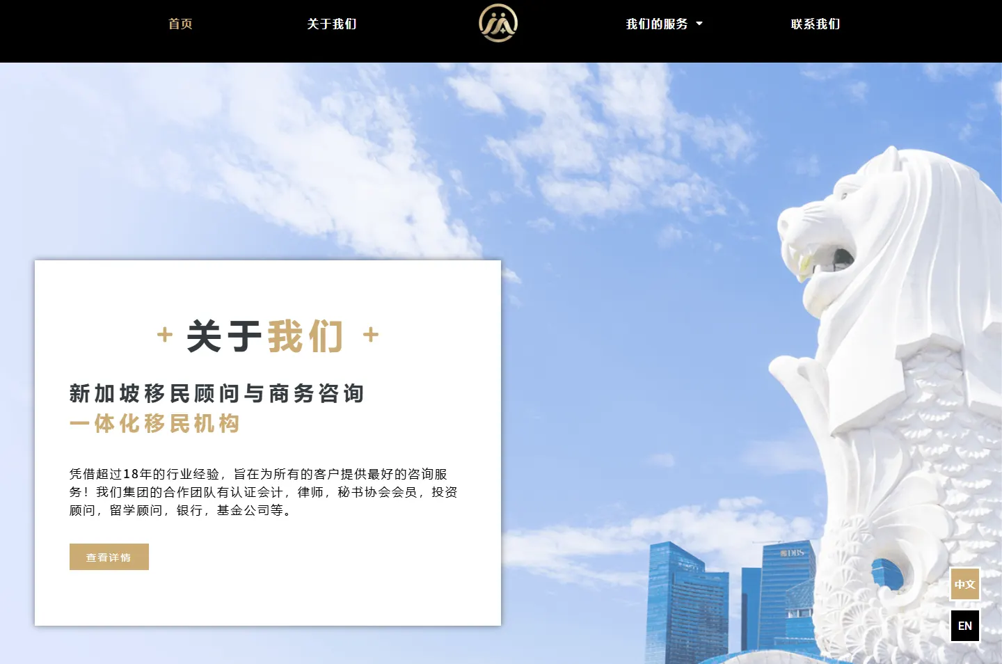
One card beside the Merlion.
 5
Why A Plus
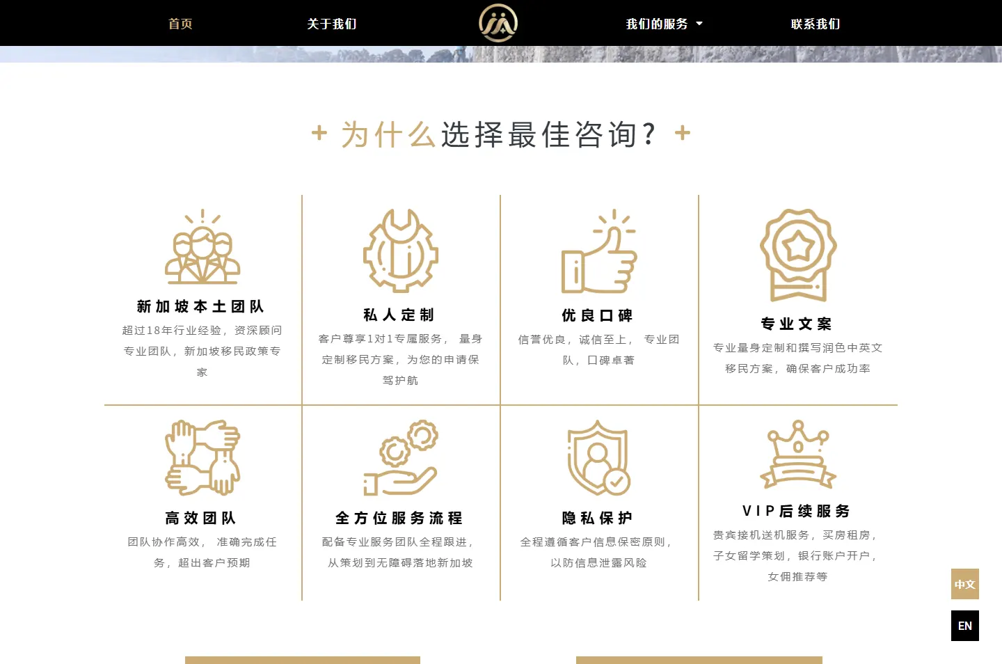
Eight reasons in a gold grid.
 6
Get in touch
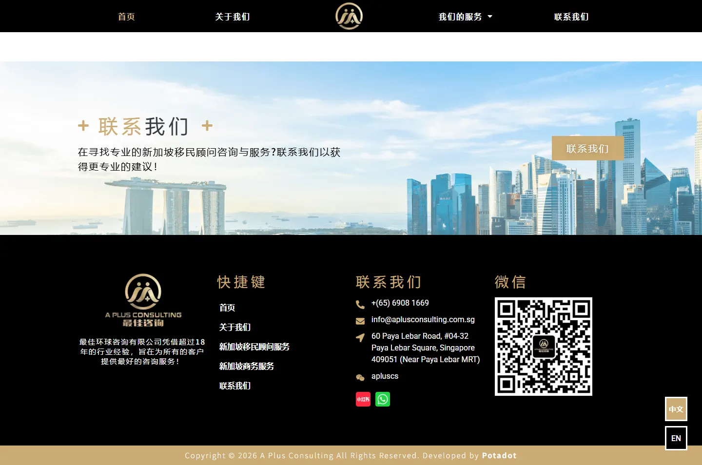
Every contact channel in the footer.
A plus sign is a small thing to build on, but it is the name. So a gold plus stands on each side of every section heading, and the reader sees it all the way down.
Two figures inside a gold circle, with a small plus at their feet. It gave the site its black and champagne gold, and a sense of being looked after.
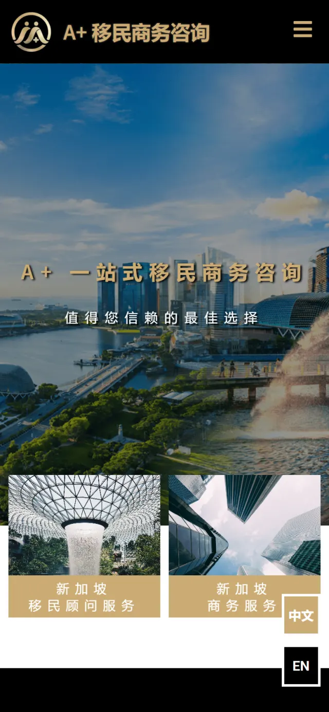
Marina Bay, the Merlion, the waterfall at Jewel Changi Airport. These places carry the first half of the page, because the reader came to look at Singapore.
Immigration is a private and serious decision, so the frame is formal: a black bar, a black band, a black footer and fine gold lines. Inside that frame the photographs are open and full of daylight.
#000000Header, reasons band and footer#FFFFFFReading chapters and the About card#CCAB73Logo, headings, buttons and lines#343A40Headings on white#707070Small text on whiteGold is the only brand colour. The blues on the page come from the sky and the sea in the photographs, so Singapore supplies the colour and the firm supplies the frame.
A+ 一站式移民商务咨询
Noto Sans SC · Headings and reading text60 Paya Lebar Road, #04-32 Paya Lebar Square, Singapore 409051
Roboto · Contact details in the footer
The A+ in the name becomes a heading device. Two gold pluses stand either side of each section title, on black and on white, so a plain heading still carries the brand.

The Why A Plus grid drops the photographs. Thin gold lines divide eight cells, each with one gold icon, a bold title and a short note, so the reasons read like a list of commitments.
The bar above is the real page, to scale. Photo, white and black take turns, and black returns at the end, so the page closes on the same frame it opened with.
Follow the page the way someone weighing up a move would. Each highlight marks one stop, and the note gives the reason for it.
Two views of Marina Bay fade into each other across the full screen, one with the Merlion in front. The firm’s line sits over the city in gold, with a second line in white below it.
Why A person thinking of moving wants to see the place first. A skyline also says at once where this firm works, without a word of explanation.
Two photo cards overlap the bottom of the opening photo: immigration consulting with the waterfall at Jewel Changi Airport, and business services with office towers seen from the street. Each has a gold label and leads to its own page.
Why A family and a company owner need different pages. The split comes early, so neither has to read about the other’s situation.
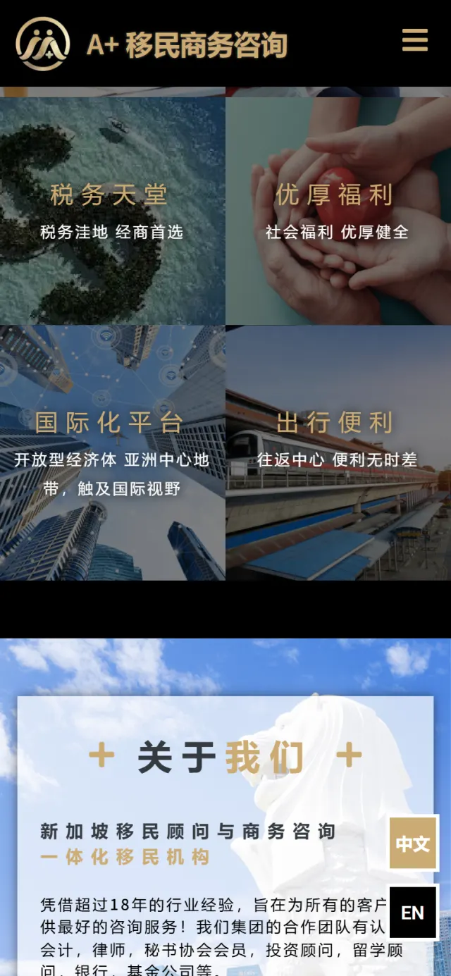
A black band carries the first question: Why Singapore on the English version, 移民新加坡优势 on the Chinese. Below it, eight tiles cover daily life, visas, schooling, language, tax, welfare, the economy and getting around, each with a gold title on its own darkened photo.
Why A reader stops at the reason that matters to them. A parent looks for the classroom, a business owner for the tax tile, and neither has to read a long paragraph.
The page turns bright. A white card sits on the sky beside a white Merlion, with what the firm does, its 18-plus years and the kinds of professionals it works with. One button leads to the About page.
Why The reader now knows why Singapore and wants to know who is advising them. The firm waits for that moment, and the Merlion keeps the city in view.
The second question gets a white grid with gold lines. Eight cells cover the local team, one-to-one service, reputation, application writing, teamwork, full follow-through, privacy and VIP follow-up.
Why The firm gives itself as many reasons as the country, so the two halves balance. The plain grid suits this part, because the reader is now checking and no longer dreaming.
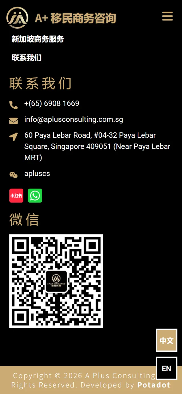
A contact banner leads into the black footer, with the phone number, email, address and WeChat ID, a WeChat QR code, and buttons for Xiaohongshu and WhatsApp. WhatsApp opens with a greeting already written.
Why One reader may be on WeChat in another country and the next may be a Singapore company that prefers email. Nobody should have to look for their usual channel.
 The firm’s line, over the cityImmigration or businessThe Why Singapore questionWho is giving the adviceThe Why A Plus questionEvery channel
On a small screen the order stays: Singapore first, the firm second. What changes is how each part is laid out.
The home page sets out the two questions. The rest of the site does the detailed work for readers who are ready to go further.
Chinese sits at the main address and English at /en/. Two buttons stay on screen, and each version points Google to the other.
Phone, email, map link, WeChat, Xiaohongshu and WhatsApp, listed in the footer of every page.
A form for name, number, email, subject and message sits with the office hours, and reCAPTCHA runs on the site.
The immigration page explains six routes one by one. The business page lists its passes, HR and company services.
It sets out the company, the group behind it, the founder and the firm’s aims, for readers who want to check.
Structured data tells Google who the firm is, what the site is and where each page sits.
Every Potadot project starts by understanding the client's situation before anything is designed. See all seven steps
Who is moving, what they ask first, and which of the firm’s two service lines each visitor needs.
We fixed the order of the two questions and kept each reason to a title and a short line, in Chinese and English.
Black and gold from the logo set the frame. The plus headings, photo tiles and grid were then laid out for phone and desktop.
Page titles and search data in Chinese and English, with each version linked to the other for Google. Then launch and support.
Advising clients on a big decision? Tell Ricky about your firm on WhatsApp at +6011-1142 1029.
We worked out the concept and the order of the page, shaped the content, designed the site and built it in Chinese and English, with search setup and the contact channels.
Because that is the order people think in. Someone who has not settled on Singapore will not compare advisers yet. Once the place feels right, they are ready to hear about the firm.
Yes. Here each language has its own address and its own headings, written for that reader, and the switch is always on screen.
Yes. Yours would start from your own firm and clients, so it would look different, but the thinking carries over. Tell us what your clients ask before they call you, and we will show you how we would approach it.