Let the stones lead
An ammonite is bought for its colour and surface. The site has to stay out of the way and let the photo do that work.
StoryoftGRetail · Essential oil and crystal boutique website
The website for StoryoftG, a Singapore boutique of essential oils and crystals. Behind everything sits pure black, like space at night, so most of the colour on the page comes from the stones.
StoryoftG is the brand of The Green Consultancy Pte. Ltd., based at Liang Seah Street in Singapore. It sells essential oils and crystals and offers consultations, event support and workshop support. Potadot built its website with an online boutique of 201 pieces, in English and Chinese. The logo is a ringed planet, so the site is laid out as a night sky: stars at the top, an eclipse at the end, and pure black between them. The stones and the photos of them are what shine.
StoryoftG belongs to The Green Consultancy Pte. Ltd. (201929260E), at 1 Liang Seah Street in Singapore. The boutique has three collections: Elegance with 30 pieces, Embody with 81 and Element with 90. They range from essential oils to meteorite, ammonite and quartz.
The business is more than a shop. The Our Services page lists consultations for homes and workplaces, Feng Shui art pieces and guidance for events and exhibitions, and support for crystal workshops.

These are objects people want to hold and turn in the light. Online, the site has only photos to work with, and it also has to carry a shop, a service business and a library of articles.
An ammonite is bought for its colour and surface. The site has to stay out of the way and let the photo do that work.
A long list of stones can feel like a warehouse. Three named collections give the stock a shape a visitor can remember.
Most pieces show no price, and some are tied to a workshop or an event. The shop has to show them all and still give people a way to ask.
The business serves English and Chinese readers, and some stones go by a Chinese name. Both have to feel at home.
StoryoftG already thinks in planets: its logo is one, its About page opens on the words Unlocking the Secrets of the Universe, and its stock includes pieces of meteorite. So the home page is treated as a night sky. Stars open it, an eclipse closes it, and everything between sits on black. Black also works like a jeweller’s velvet tray, because the reds and greens of an ammonite look brighter against it.
 1
The sky
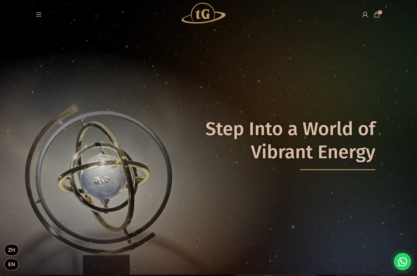
Stars and a gold ringed sculpture.
 2
The display
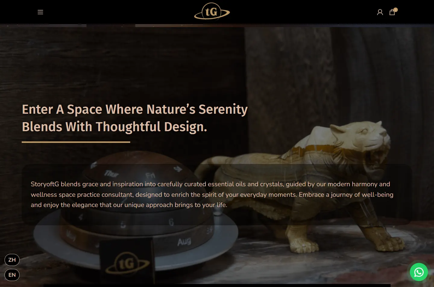
The sky gives way to a stone tiger.
 3
The collections
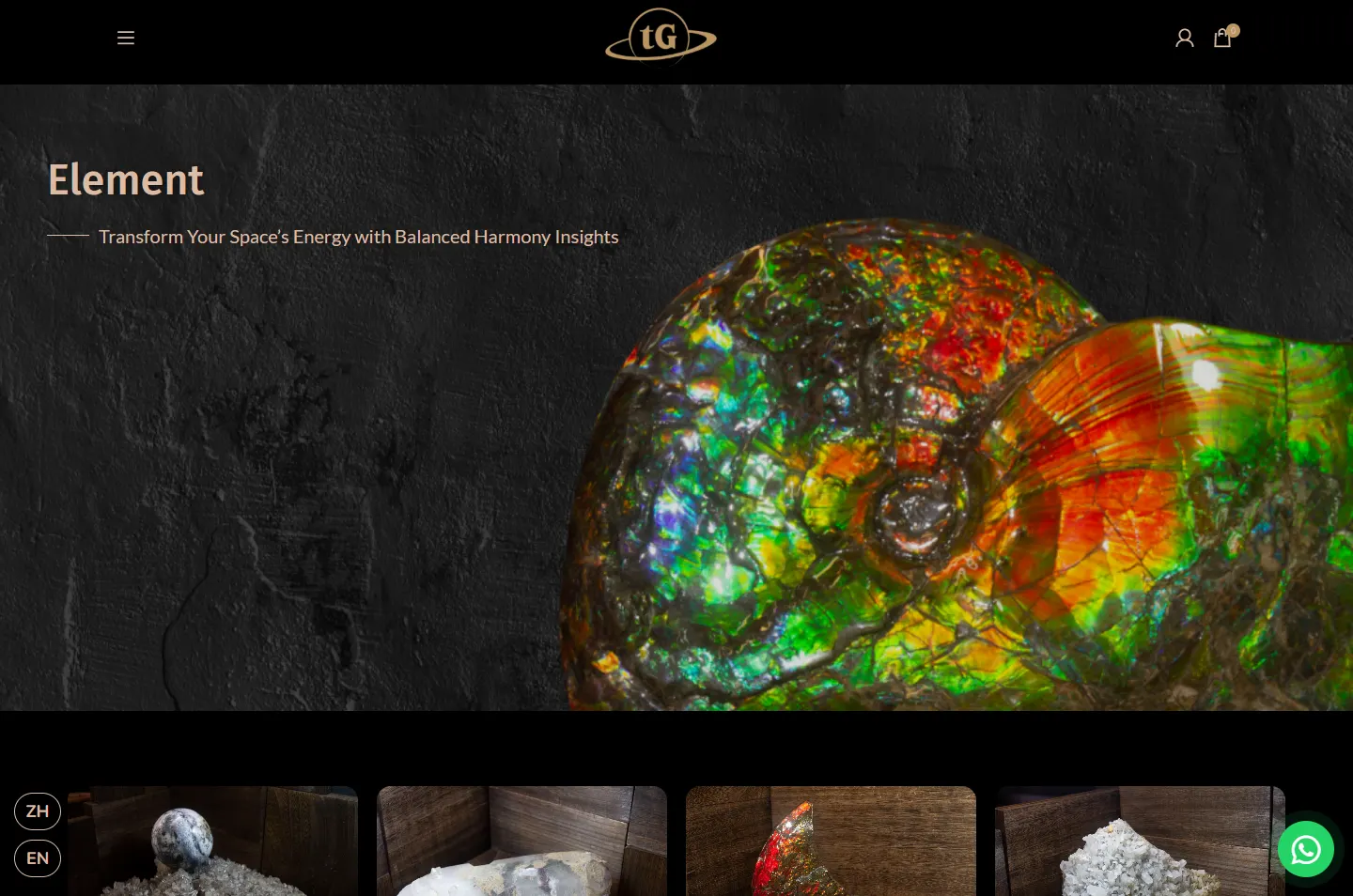
Three photos open three ranges.
 4
The room
The sculpture again, on a real cabinet.
 5
The journal
Four articles in gold frames.
 6
The eclipse
One circle, one link to the boutique.
A ring around a planet. Rings return in the sculpture on the first screen and the circle returns in the eclipse on the last, so the page starts and ends on the logo’s shapes.
Meteorite, ammonite, black quartz. Many of these pieces are dark with flashes of colour, which is why a dark page suits them better than a white one.
Most pieces are photographed in a corner of dark wood. That warm brown keeps the black from feeling cold, and the gold and blush type come from the same family.
Gold and blush carry the headlines and reading text and black does the rest, so the design never competes with what is for sale.
#000000The base of the whole page#0F0F0FThe side menu and cart drawer#BC9762The logo, buttons and section titles#DABCA5Headlines and reading text#25D366The chat buttonThe logo’s gold goes on the View and View All buttons, so the next step always looks the same. The green is the one bright colour the design adds, so the chat button is easy to find on any screen.
Step Into a World of Vibrant Energy
Fira Sans · Headlines and product namesStoryoftG blends grace and inspiration into carefully curated essential oils and crystals, designed to enrich the spirit of your everyday moments.
Nunito · Reading text
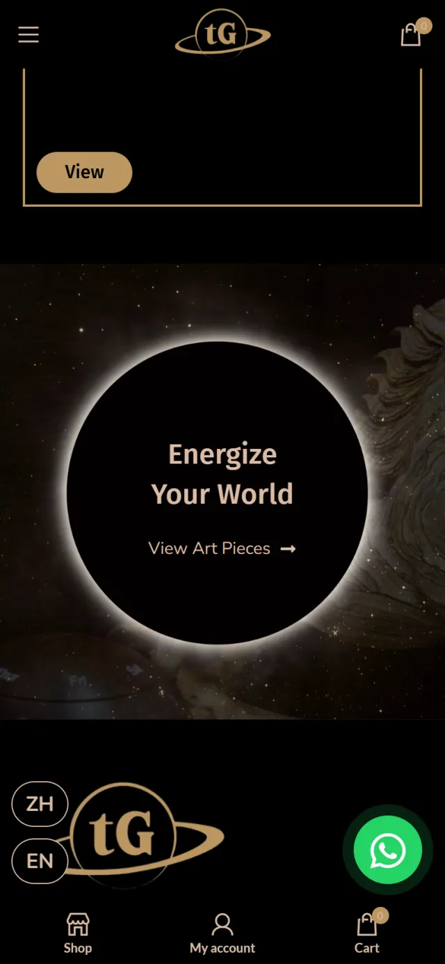
Just above the footer, the page closes on a black circle with a glowing edge. It is the planet from the logo with the light behind it, and the closing headline sits inside.
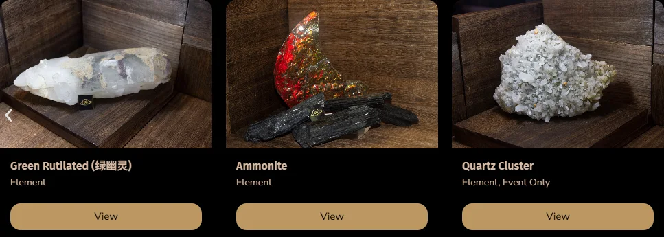
Most card photos share the same wooden corner, so a row of different stones reads as one display case. Below each photo come the name, any Chinese name in brackets, the collection and a tag such as Event Only.
Each collection repeats one pattern: a large photo, then a row of cards on black. A visitor learns it once. The bar above is the real page, to scale, with photo chapters shown in their average colour.
Scroll down the home page the way a visitor does. Each highlight marks one design decision, and the note gives the reason.
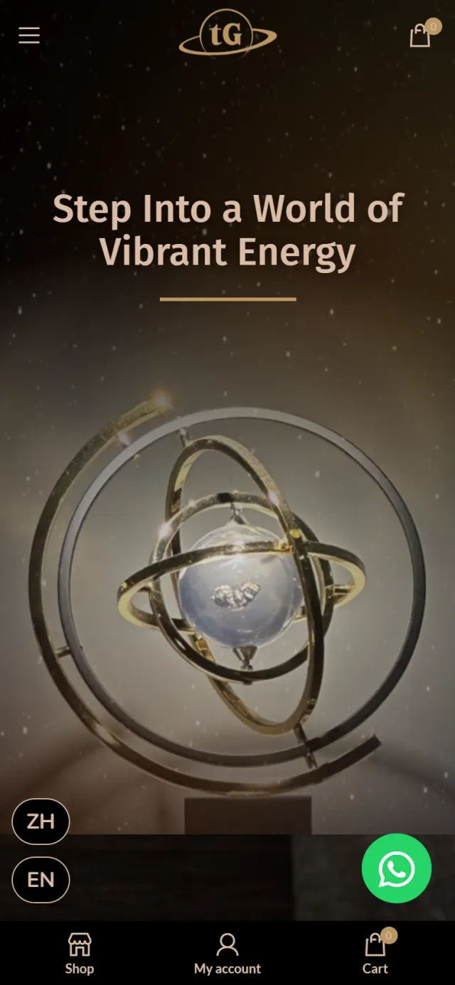
A gold ringed sculpture stands in a field of stars. A short headline in blush sits across from it, over a thin gold rule.
Why There are no prices and no product grid yet. The visitor gets the mood of a gallery before the shop begins.
The next screen cuts to a carved stone tiger against dark wood. The introduction sits on a dark, see-through panel over the photo.
Why The panel keeps the paragraph readable while the photo stays in view, so the visitor learns what the business is without leaving the scene.
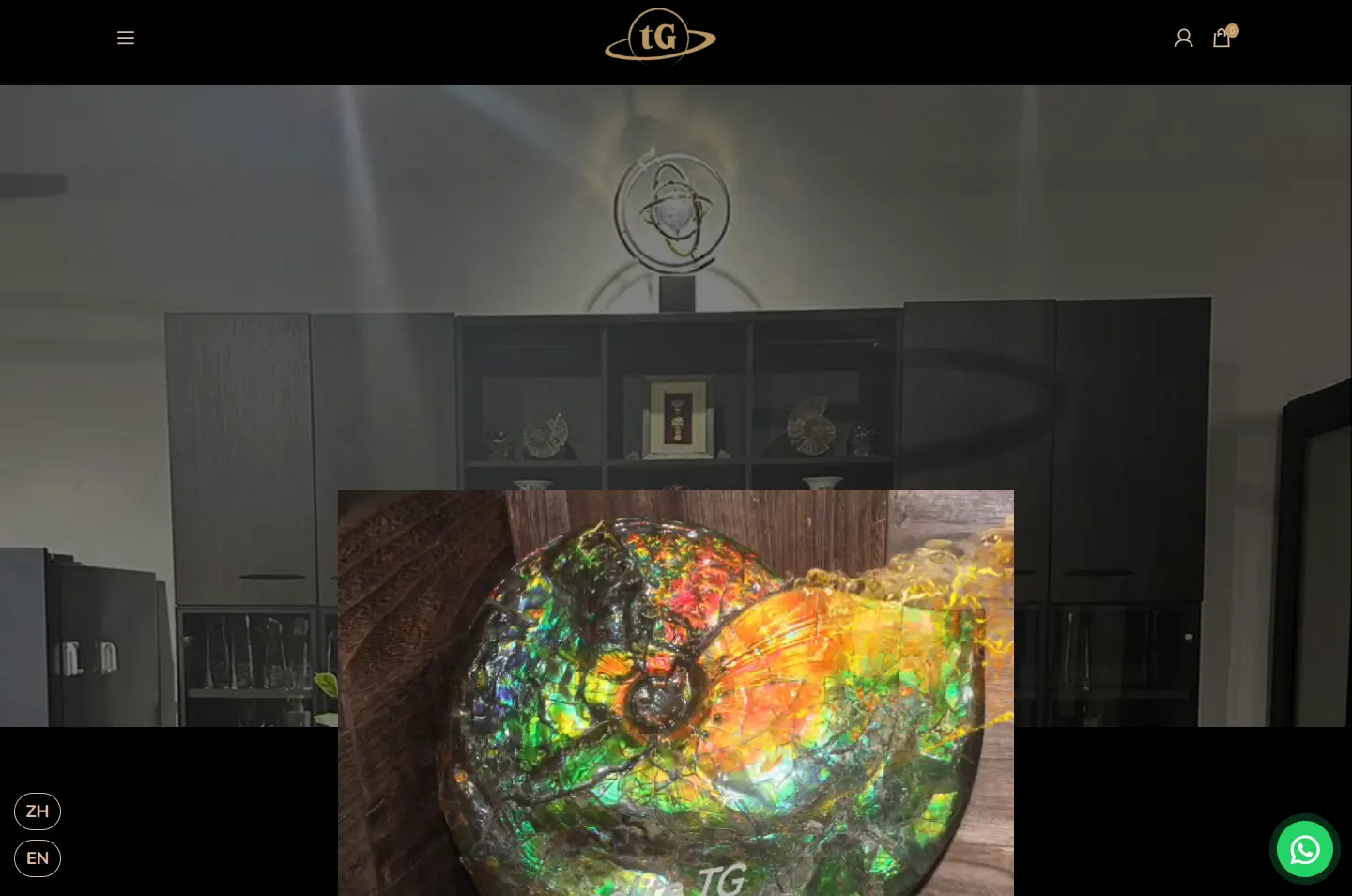
Elegance, Embody and Element each open with a full-width photo. Here the ammonite of the Element collection fills the right side of the screen.
Why Elegance opens on oil bottles on rock, Embody on a purple bead bracelet and Element on an ammonite, so each collection shows what it is before anyone reads a product name.
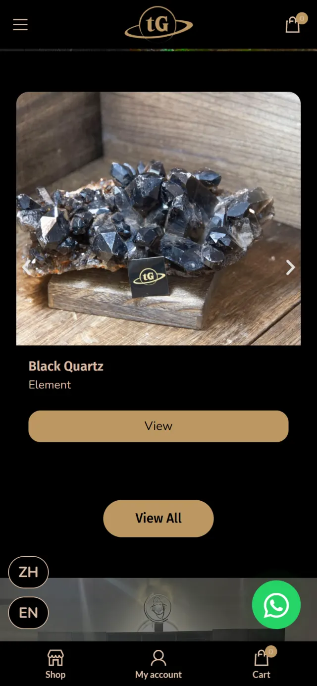
Each card shows the photo, the name, any Chinese name in brackets, the collection and a tag such as Event Only. Arrows move the row, and View All opens the full collection.
Why A buyer may know a stone by either name. The tag says early that a piece is tied to an event, before anyone presses View.
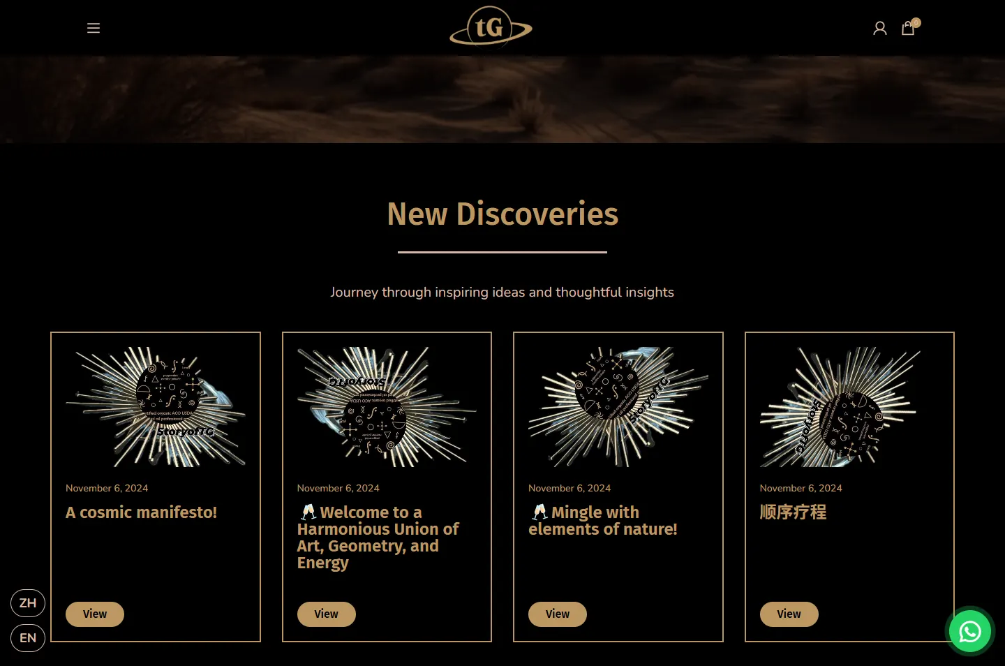
The ringed sculpture returns, this time on a cabinet in a real room. A muted video of ammolite pieces plays on its own, set over the edge of the photo.
Why After the stars on the first screen, this shows that the sculpture is a real object in a real place.
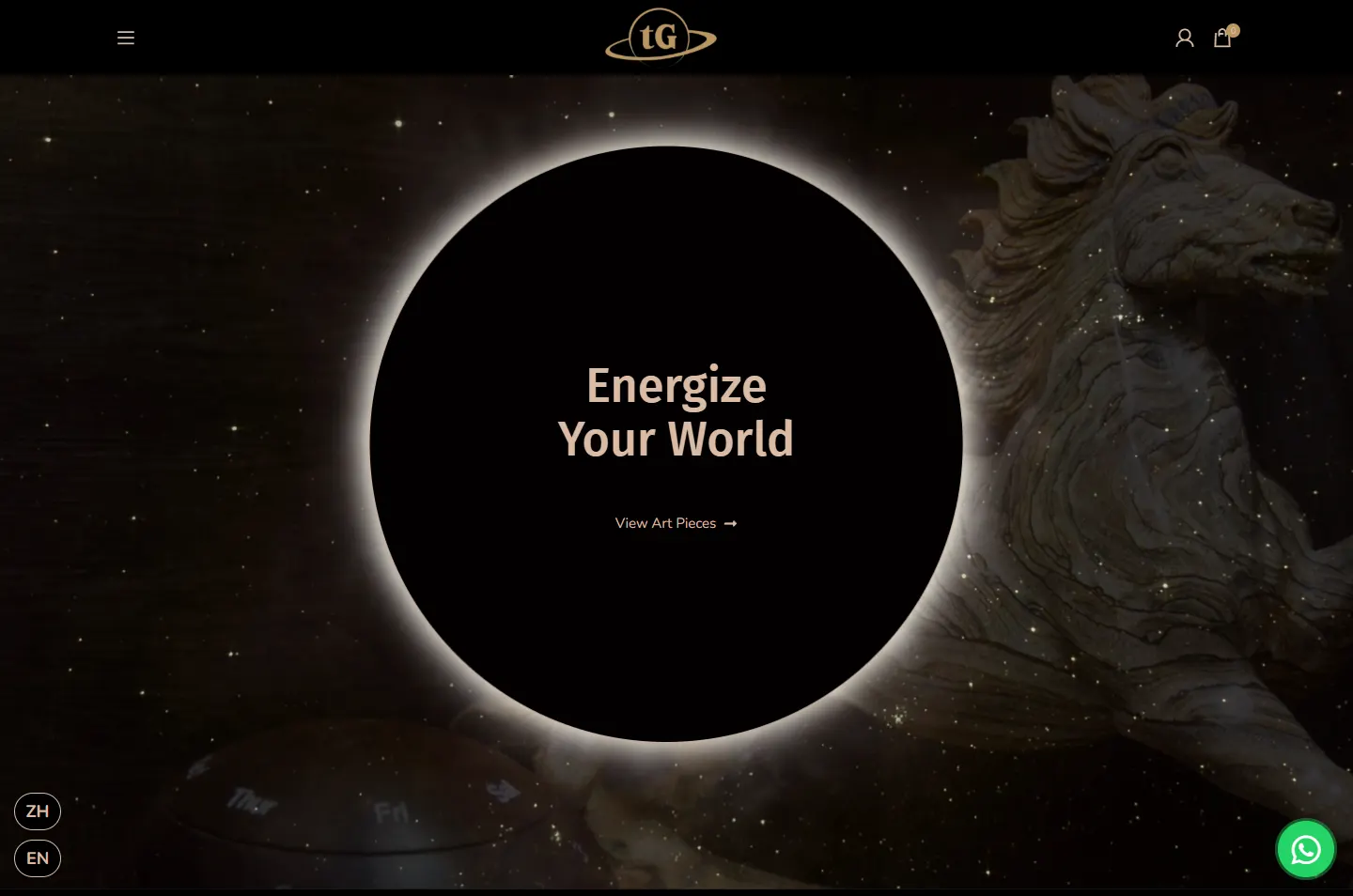
New Discoveries shows four articles, each with a date, a title and a View button. The Articles page lists 30.
Why Articles on stones such as meteorite and tourmaline give a visitor something to read before asking about a piece. Thin frames keep the cards light after so many photos.
A black circle with a glowing edge holds one headline and one link, View Art Pieces, which opens the boutique.
Why After a long page, the visitor gets one clear next step, and the sky that opened the page closes it.
One object, one headlineReading text over the photoThe photo opens the chapter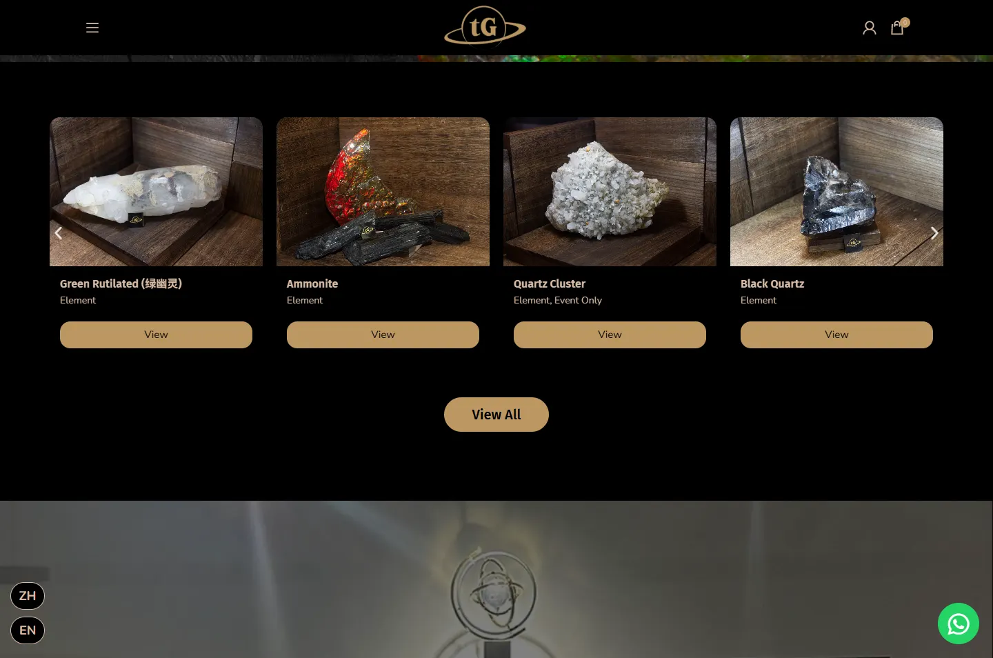 Name, collection, tagA real room, a real stoneFour articles on the home pageOne link to the boutique
The page is rearranged for a phone, and the shop stays within reach of a thumb.
The look is the part people notice. These are the parts that let the business sell, answer questions and reach two sets of readers.
A shop of 201 pieces in three collections, with sorting, a cart and customer accounts.
Most pieces show no price or cart button. Their page asks people to reach out on WhatsApp and has a button for it. A floating chat button also stays on every page.
The main pages exist in both languages, each with its own address. Two round buttons, ZH and EN, stay on screen.
The buyer sets the amount and writes a message, and the card goes to the recipient by email.
Thirty articles sit on their own page, and four appear on the home page.
Each language is marked for Google, and pages carry breadcrumb and page data in a format search engines read.
Every Potadot project starts by understanding the client's situation before anything is designed. See all seven steps
A shop, a consultancy and workshop support under one name, with stock that has to be seen to be wanted.
Collection names, short lines and product photos set out in English, with a Chinese version of the main pages.
Black, gold and the ring set the look, then the collection pattern, the shop and the phone layout followed.
English and Chinese addresses and breadcrumb data set up, then launch.
Selling something people want to look at closely? Tell Ricky about it on WhatsApp at +6011-1142 1029.
We designed and built the website: the home page, the online boutique with its cart and accounts, the gift card, the articles and the English and Chinese versions.
Many of the pieces are dark stones with flashes of colour, and black makes that colour look stronger. It also fits a brand whose logo is a planet. A black site suits this stock. It would not suit every business.
Yes. On this site most pieces show no price or cart button, and their page has a WhatsApp button so people can ask directly. The few with a price can go straight into the cart.
Yes. We start from what you sell and how people choose it, so yours would have its own look. Tell us about your products and we will show you how we would approach it.